Design
Breakpoints:
Currently displaying the mobile design.
To see designs for other breakpoints please view this page on a larger screen.
When the breakpoint ≥ 1320px wide the content is a maximum 1256px wide. The background colour fills the rest of the screen to the left and right.
Licence or registration page
Australian Business Number Registration - Australian Government
Register your Business to Receive an Identifier for Business Dealings
Licence or registration
Administered by: Australian Taxation Office
Legal obligation page
Australian Consumer Law (ACL) - Australian Government
Comply with the Australian Consumer Law
Legal obligation
Administered by: Australian Competition and Consumer Commission
Code or standard page
Food Standards Code - Victoria
Requirements for Food Supply and Standards
Code or standard
Administered by: PrimeSafe
Guidance page
Business Concierge Service - City of Melbourne - Victoria
Business Registration Assistance
Guidance
Administered by: City of Melbourne
Layouts
ABLIS sticky header is used on the Two column - guide page layout.
Bootstrap classes for header content
.col-sm-12 .col-lg-10
Default header grid layout
Layout: All layouts
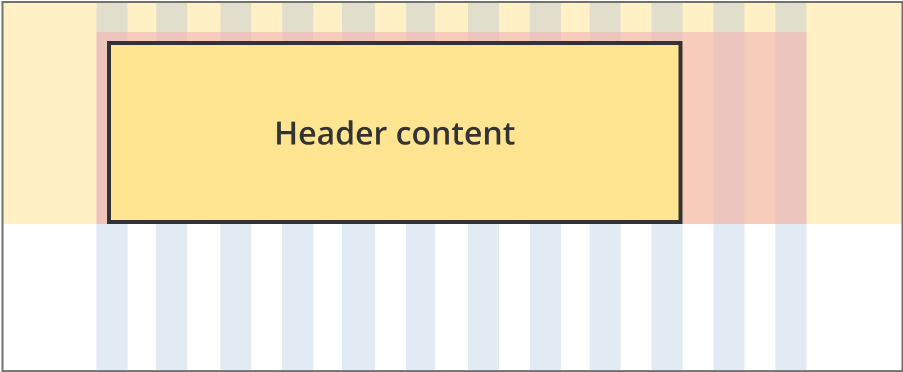
The header content area is 10 grid-columns wide.
The coloured header container is 12 grid-columns wide.
The gradient background extends full width of the viewport.
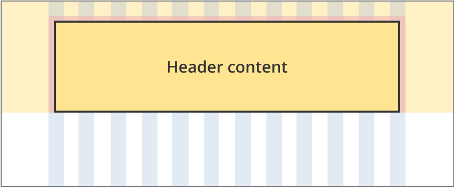
The content area is 12 grid-columns wide.
The coloured header container is 12 grid-columns wide.
The gradient background extends full width of the viewport.
Guidelines for use
Purpose:
The ABLIS information page header helps users understand what the content of the page is about and its relevance to them. It includes the primary H1 (page title), a label and a supporting page description.
When to use this component:
- Page headers are built into every ABLIS information page.
Version history
13 June, 2025
Created the component page for the ABLIS information page header.