Design
Breakpoints:
Currently displaying the mobile design.
To see designs for other breakpoints please view this page on a larger screen.
When the breakpoint ≥ 1320px wide the content is a maximum 1256px wide. The background colour fills the rest of the screen to the left and right.
Logo and BGA contact details
This version of the header is used on:
- ABLIS landing page
- ABLIS keyword search page
- ABLIS footer link pages
Logo, BGA contact details and state government details
This version of the header is used on:
- ABLIS guided search - business details page (when user selects a location in the tool location field the dropdown location updates).
- ABLIS guided search - category pages.
- ABLIS guided search - results page.
Logo and state government details
This version of the header is used on:
- ABLIS information pages
Layouts
The ABLIS site footer is used on all ABLIS pages.
Layout: All layouts
All breakpoints
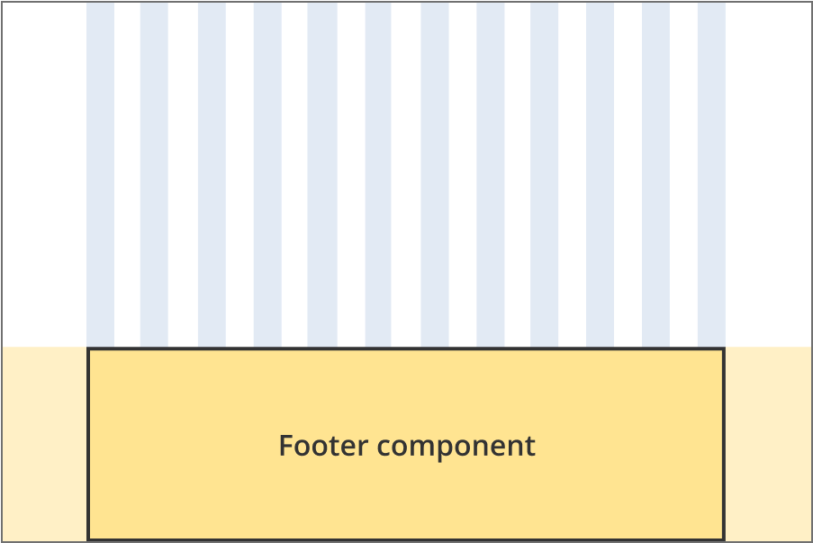
The ABLIS site footer is 12 grid-columns wide.
Guidelines for use
Purpose:
The ABLIS footer provides tertiary links and contact information. Links can be to pages within the subsite or on business.gov.au. Contact details can be for business.gov.au and/or the relevant state or territory government depending on the page context.
When to use this component:
- Used across every page of ABLIS to ensure a consistent user experience.