Design
business.gov.au branding
No branding
Breakpoints:
Currently displaying the mobile design.
To see designs for other breakpoints please view this page on a larger screen.
Lorem ipsum dolor sit amet, consectetur adipiscing elit. Integer erat arcu, venenatis et nibh non, finibus vehicula leo. Phasellus porta rhoncus ante, in sollicitudin tellus. Suspendisse auctor libero a dui vehicula fermentum. Fusce tempor sagittis fringilla. Sed sed dapibus est. Mauris ac arcu et ligula aliquet aliquet ac ac risus. In lobortis ornare ultricies.
Praesent nec magna semper, pulvinar sapien sagittis, tempor urna. Praesent pretium finibus interdum:
- Quisque ut odio faucibus, iaculis augue vel, tempor nulla.
- In rutrum risus id lectus consectetur volutpat. Donec a justo nec nunc consequat ultricies.
Phasellus venenatis nulla tempor quam egestas auctor.
Cras sed tortor a dolor dictum tincidunt ut nec enim. Fusce vitae quam suscipit, suscipit leo at, efficitur turpis.
Coloured background sections - colour variations
Lorem ipsum dolor sit amet, consectetur adipiscing elit. Integer erat arcu, venenatis et nibh non, finibus vehicula leo. Phasellus porta rhoncus ante, in sollicitudin tellus. Suspendisse auctor libero a dui vehicula fermentum. Fusce tempor sagittis fringilla. Sed sed dapibus est. Mauris ac arcu et ligula aliquet aliquet ac ac risus. In lobortis ornare ultricies.
Praesent nec magna semper, pulvinar sapien sagittis, tempor urna. Praesent pretium finibus interdum:
- Quisque ut odio faucibus, iaculis augue vel, tempor nulla.
- In rutrum risus id lectus consectetur volutpat. Donec a justo nec nunc consequat ultricies.
Breakpoints:
Currently displaying the mobile design.
To see designs for other breakpoints please view this page on a larger screen.
Apply your brand specific colours, borders and icons to the base accordion shown below.
Lorem ipsum dolor sit amet, consectetur adipiscing elit. Integer erat arcu, venenatis et nibh non, finibus vehicula leo. Phasellus porta rhoncus ante, in sollicitudin tellus. Suspendisse auctor libero a dui vehicula fermentum. Fusce tempor sagittis fringilla. Sed sed dapibus est. Mauris ac arcu et ligula aliquet aliquet ac ac risus. In lobortis ornare ultricies.
Praesent nec magna semper, pulvinar sapien sagittis, tempor urna. Praesent pretium finibus interdum:
- Quisque ut odio faucibus, iaculis augue vel, tempor nulla.
- In rutrum risus id lectus consectetur volutpat. Donec a justo nec nunc consequat ultricies.
Phasellus venenatis nulla tempor quam egestas auctor.
Cras sed tortor a dolor dictum tincidunt ut nec enim. Fusce vitae quam suscipit, suscipit leo at, efficitur turpis.
Layouts
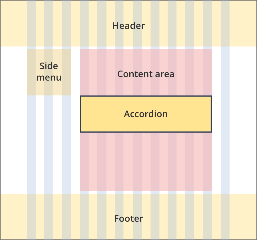
Accordions can be used on all page layouts except the Single column - navigation page layout and the two column - left filter layout.
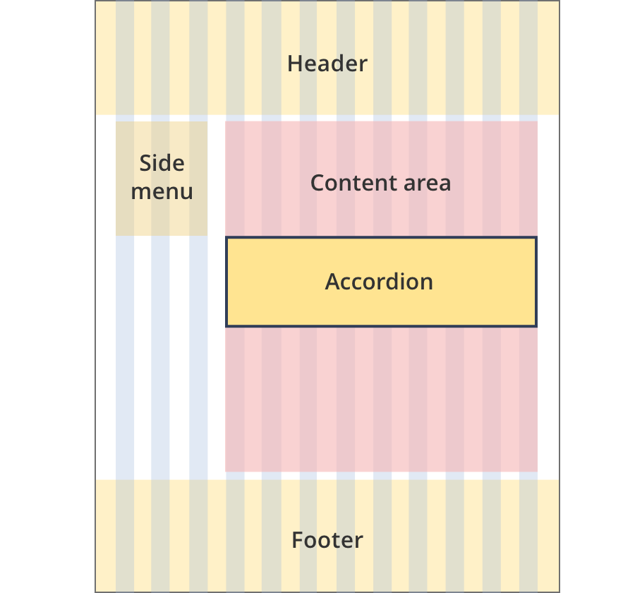
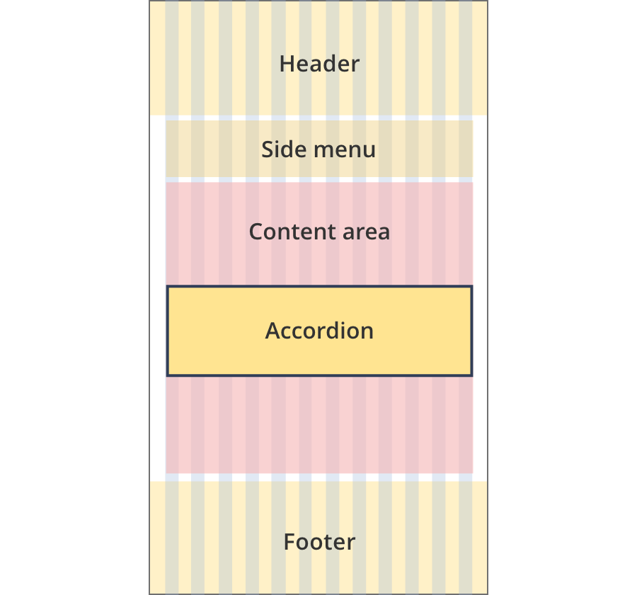
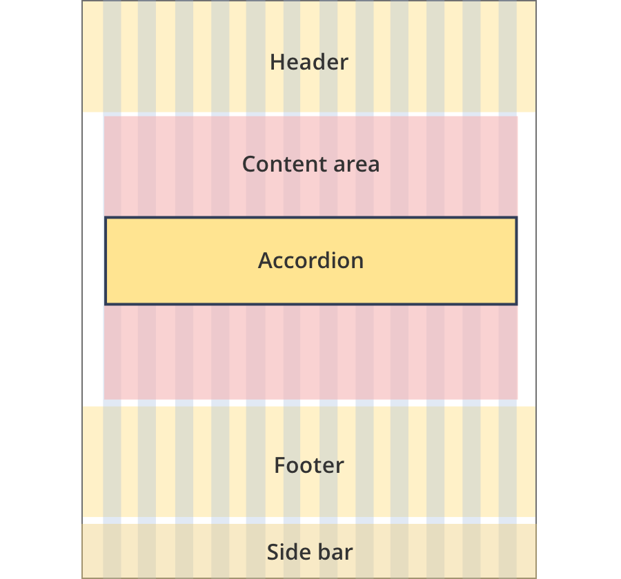
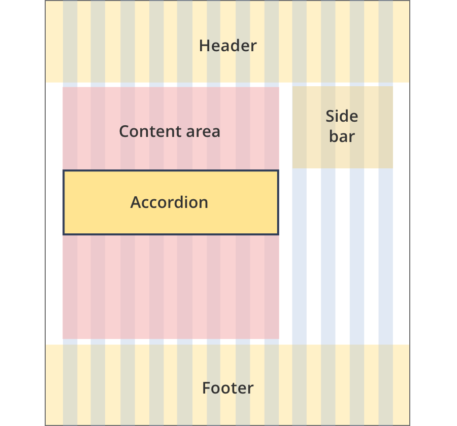
Layout:
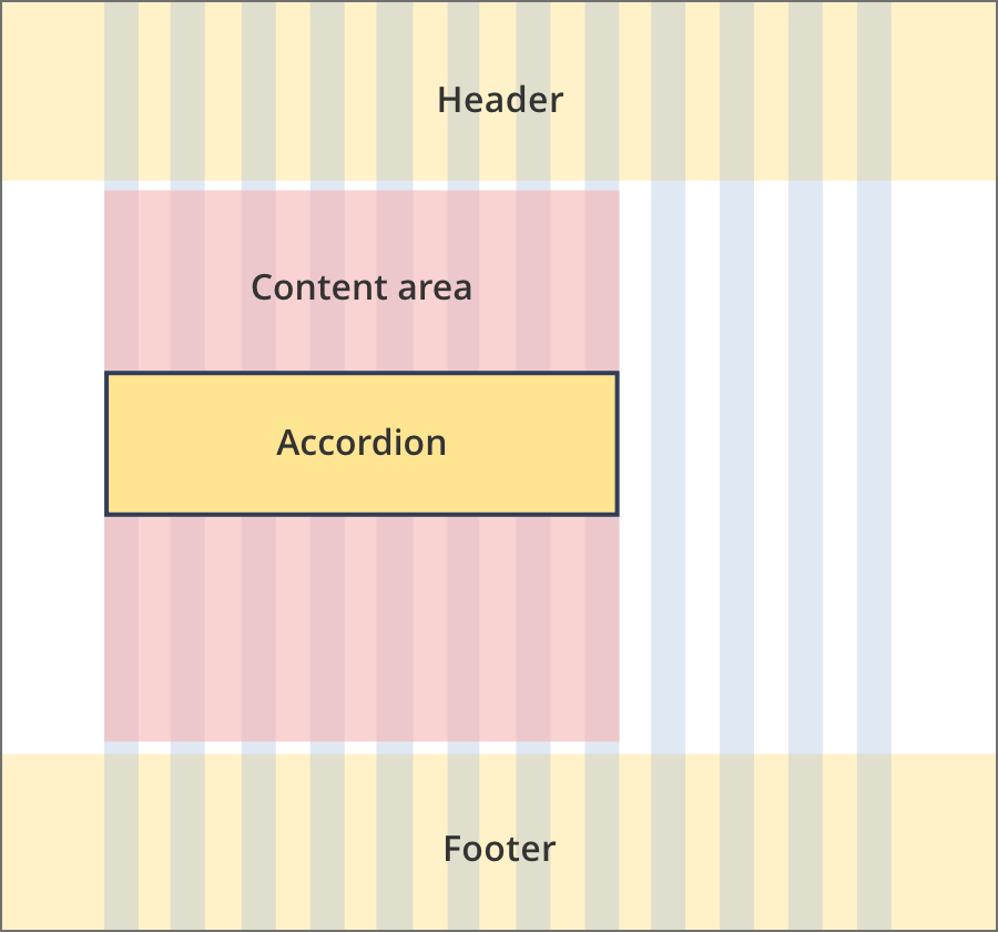
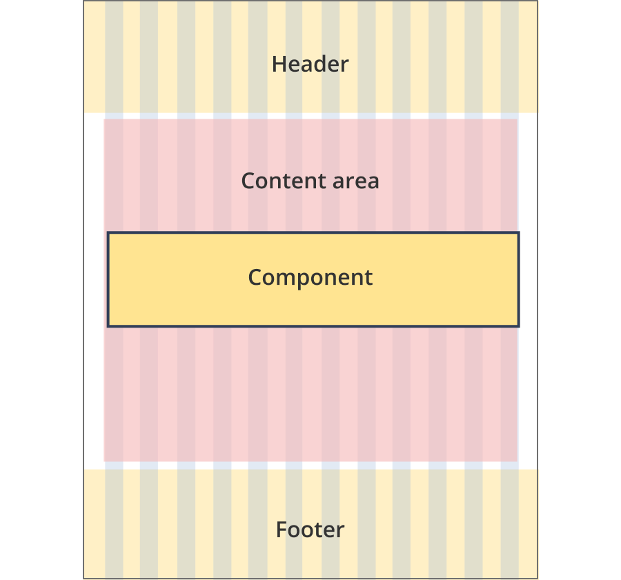
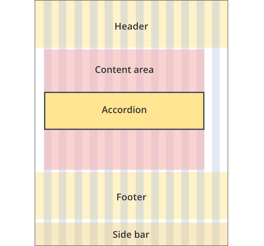
The content area is 8 grid-columns wide.
Accordions span the full width of the content area.
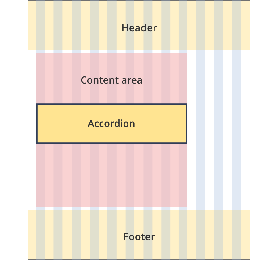
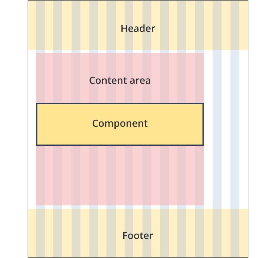
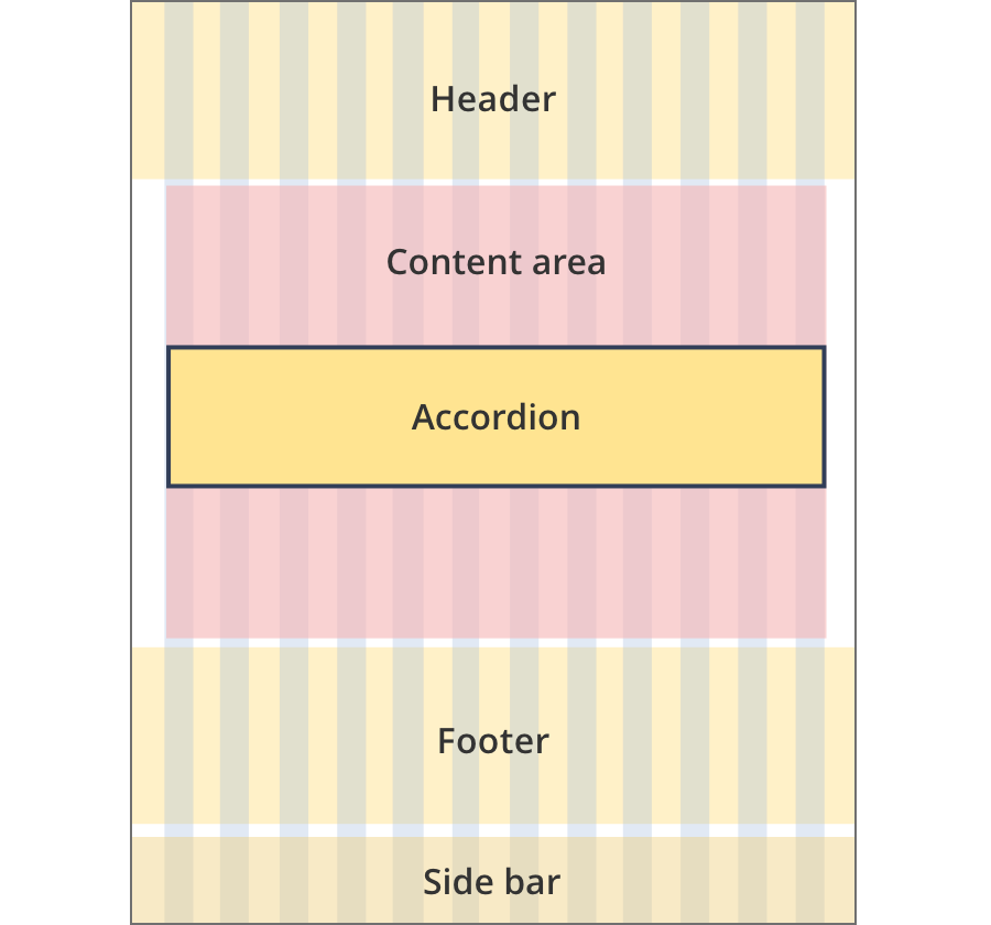
The content area is 9 grid-columns wide.
Accordions span the full width of the content area.
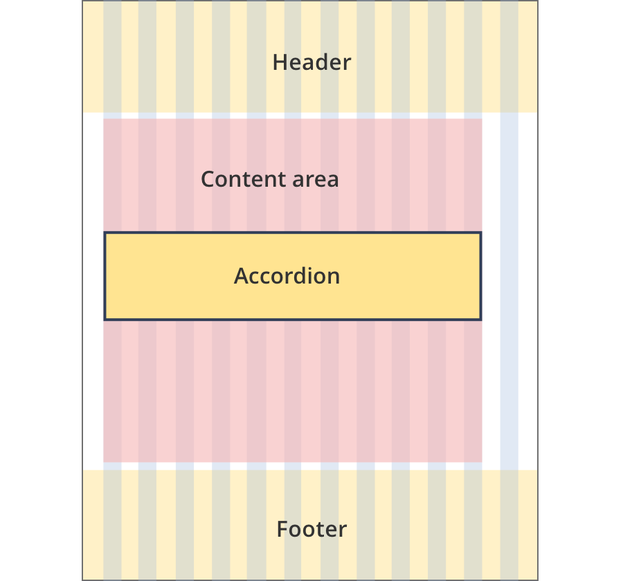
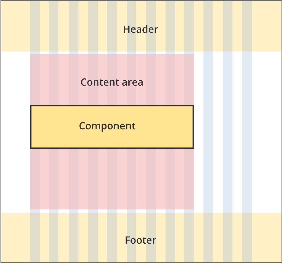
The content area is 11 grid-columns wide.
Accordions span the full width of the content area.
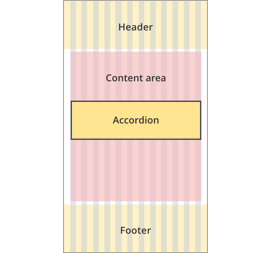
The content area is 12 grid-columns wide.
Accordions span the full width of the content area.
The content area is 9 grid-columns wide.
Accordion components span the full width of the content area.
The content area is 10 grid-columns wide.
Accordion components span the full width of the content area.
The content area is 12 grid-columns wide.
Accordion components span the full width of the content area.
The content area is 8 grid-columns wide.
Accordions span the full width of the content area.
The content area is 9 grid-columns wide.
Accordions span the full width of the content area.
The content area is 12 grid-columns wide.
Accordions span the full width of the content area.

The content area is 8 grid-columns wide.
Accordions span the full width of the content area.
The content area is 12 grid-columns wide.
Accordions span the full width of the content area.
The content area is 8 grid-columns wide.
Accordions span the full width of the content area.
The content area is 11 grid-columns wide.
Accordions span the full width of the content area.
The content area is 12 grid-columns wide.
Accordions span the full width of the content area.
Guidelines for use
Purpose:
An accordion is an expandable section with nested content. This component provides content details when opened by users on a content page. It can help to streamline the user experience by keeping content relevant to the user.
When to use this component:
- For optional content (e.g. frequently asked questions at the end of a transaction page).
- For directory type content (e.g. state and territory links).
- To streamline a transaction process.
Content rules:
- Select “open all” accordion option if you have 2 or more accordion items.
- Avoid single accordion items, although they are sometimes used on grant application pages to streamline the application process.
- Avoid using bold in accordion body content.
Version history
8 August, 2023
- Added an additional layout (the Two column - tool page alternate layout).