Design
business.gov.au branding
No branding
All breakpoints
All breakpoints
Apply your brand specific colours and borders to the base anchor menu shown below.
Layouts
Anchor menus are used on the Two column - information page layout.
Layout: Two column - information page
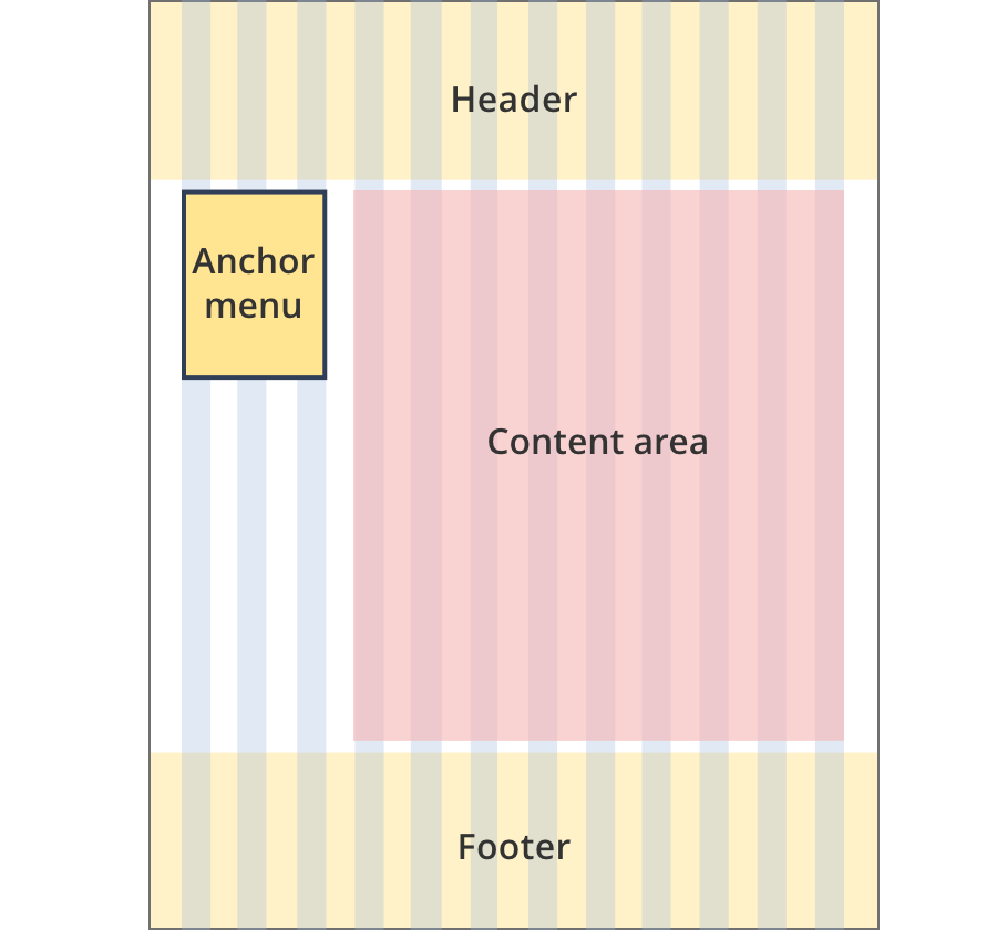
The anchor menu sits to the left of the content and is 3 grid-columns wide.
The anchor menu is persistent on the screen, as the user scrolls it is fixed to the top of the screen.
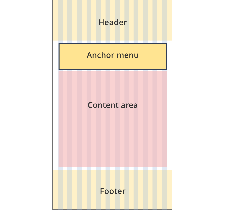
The anchor menu is 12 grid-columns wide.
The anchor menu is not fixed to the top of the screen.
Guidelines for use
Purpose:
Used to define sections of a page and add a menu item to the left-hand side navigation – on the same page.
When to use this component:
- Link names usually match the heading on page (this can be shortened if needed)
- Page section headings are usually H2