Design
business.gov.au branding
No branding
Breakpoints:
Currently displaying the mobile design.
To see designs for other breakpoints please view this page on a larger screen.
© Commonwealth of Australia.
Breakpoints:
Currently displaying the mobile design.
To see designs for other breakpoints please view this page on a larger screen.
Apply your brand specific colours, borders, icons and buttons styles to the base site footer shown below.
© Commonwealth of Australia.
Layouts
The site header is used on all business.gov.au layouts.
Layout: All layouts
All breakpoints
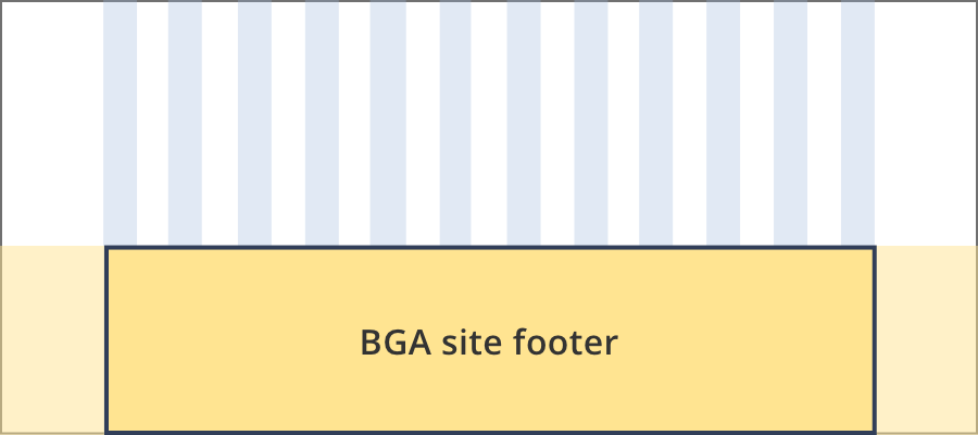
The site footer content is 12 grid-columns wide. Footer background colour extends past the content areas to full width of the screen.
Guidelines for use
The header includes the site logo, main navigation and search. It is designed to make the site easy to nagivate and establishes the site brand.
When to use this component:
- Used across every page of the website to ensure a consistent user experience.
Version history
31 October, 2023
- Updates to the social media buttons:
- Changed the Twitter icon to the new 'X' ixon.
- Added the Instagram icon.
- Removed the white border from the social media buttons.
- Reduced the size of the social media buttons below 576px from diameter 48px to 40px.
- Reduced the column-gap between the social media buttons from 24px to 16px.
- Update to the footer breakpoints. The first breakpoint of ≥992px has changed to ≥1200px.