Design
business.gov.au branding
No branding
Breakpoints:
Currently displaying the mobile design.
To see designs for other breakpoints please view this page on a larger screen.
Style note
Call to action titles can be either heading level 2, 3 or 4 (H2, H3 or H4).
Register for lorem ipsum dolor sit amet
Title Lorem ipsum dolor sit amet, consectetur adipiscing elit. Integer erat arcu, venenatis et nibh non, finibus vehicula leo. Phasellus porta rhoncus ante, in sollicitudin tellus. Suspendisse auctor libero a dui vehicula fermentum.
- Suspendisse auctor libero a dui vehicula fermentum.
- Suspendisse auctor ipsum dolor sit amet, consectetur adipiscing elit.
Breakpoints:
Currently displaying the mobile design.
To see designs for other breakpoints please view this page on a larger screen.
Apply your brand specific colours and borders to the base call to action components shown below.
Call to action
Register for lorem ipsum dolor sit amet
Title Lorem ipsum dolor sit amet, consectetur adipiscing elit. Integer erat arcu, venenatis et nibh non, finibus vehicula leo. Phasellus porta rhoncus ante, in sollicitudin tellus. Suspendisse auctor libero a dui vehicula fermentum.
- Suspendisse auctor libero a dui vehicula fermentum.
- Suspendisse auctor ipsum dolor sit amet, consectetur adipiscing elit.
Layouts
Call to action components can be used on all page layouts except the Single column - navigation page layout and the two column.
Layout:
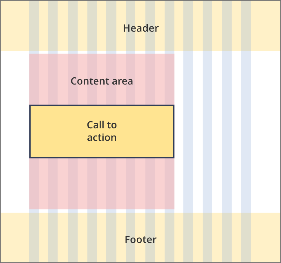
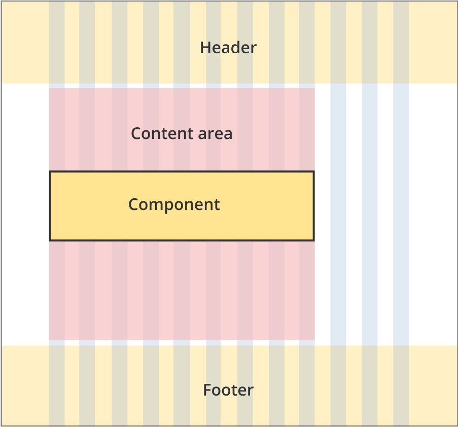
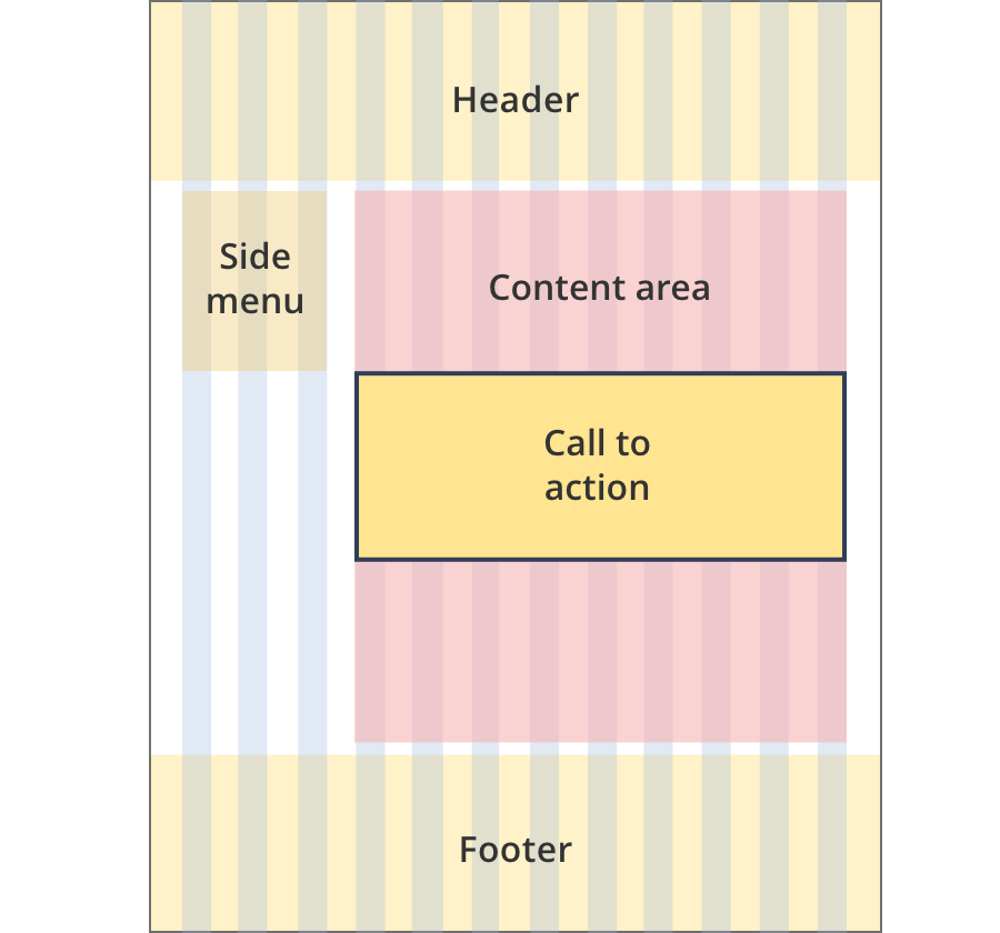
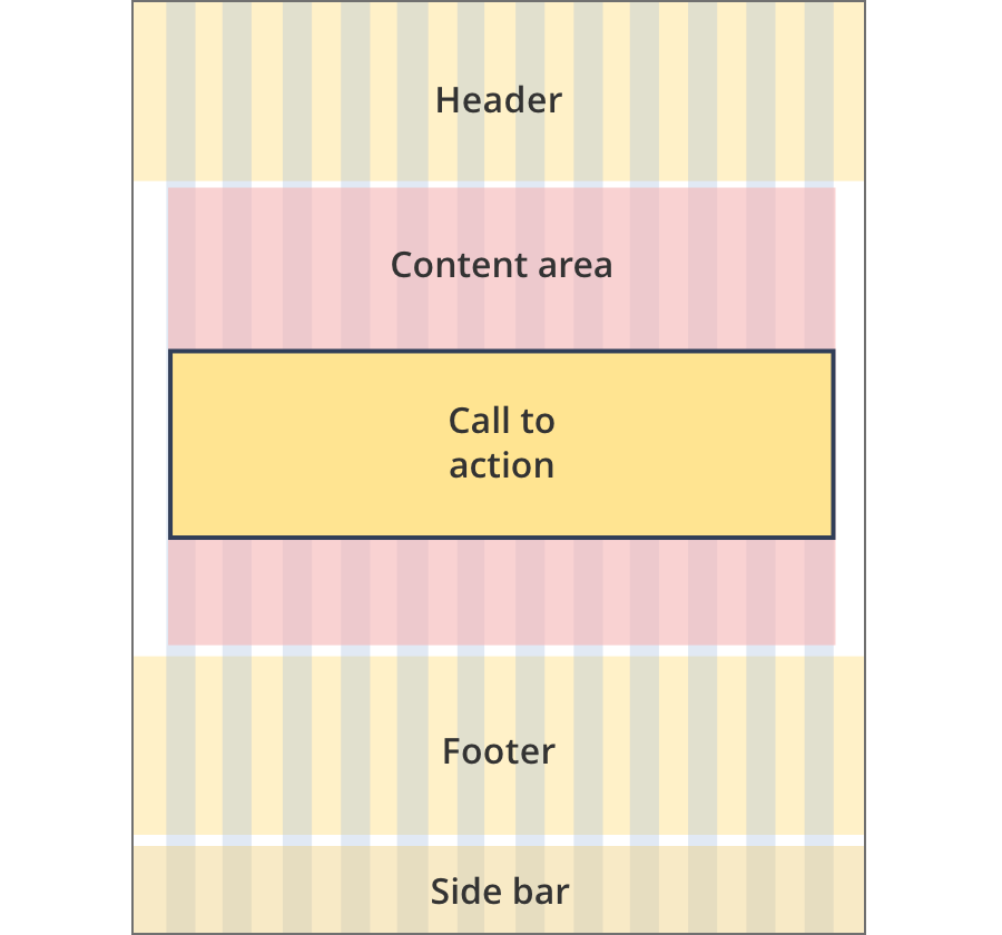
The content area is 8 grid-columns wide.
Call to action components span the full width of the content area.
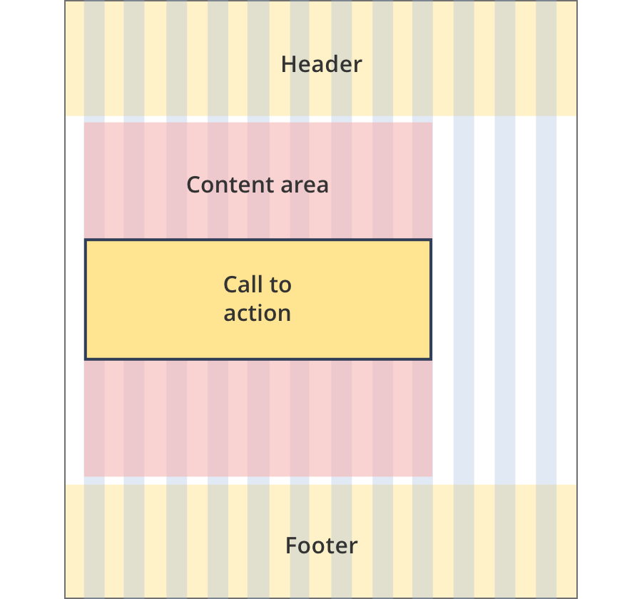
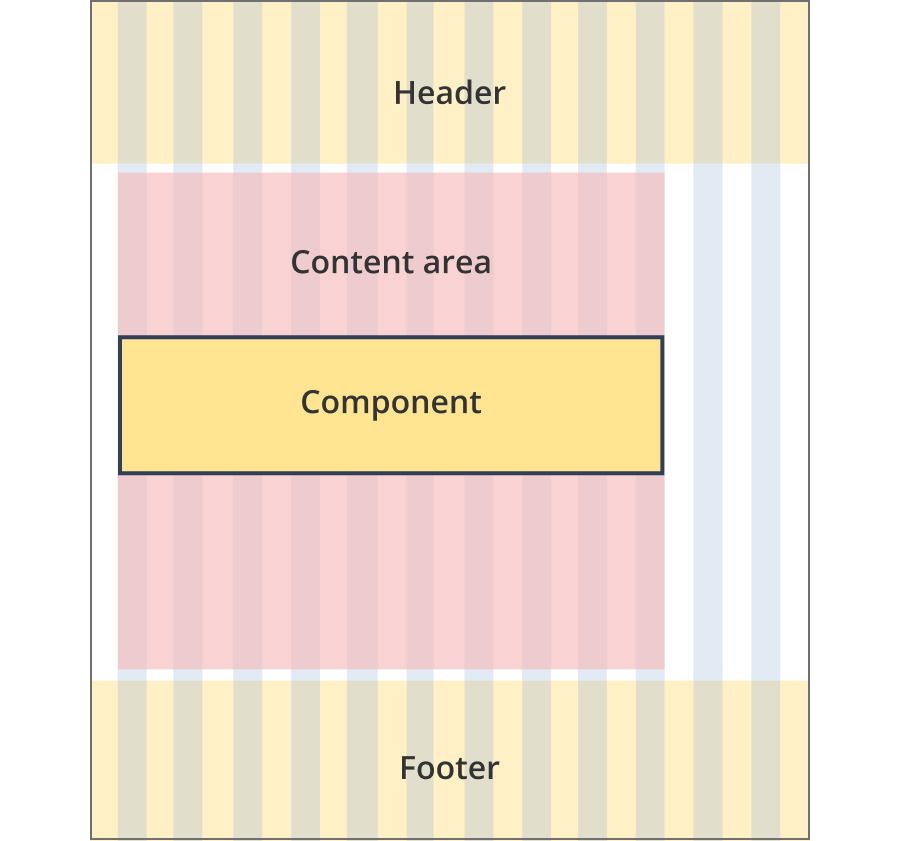
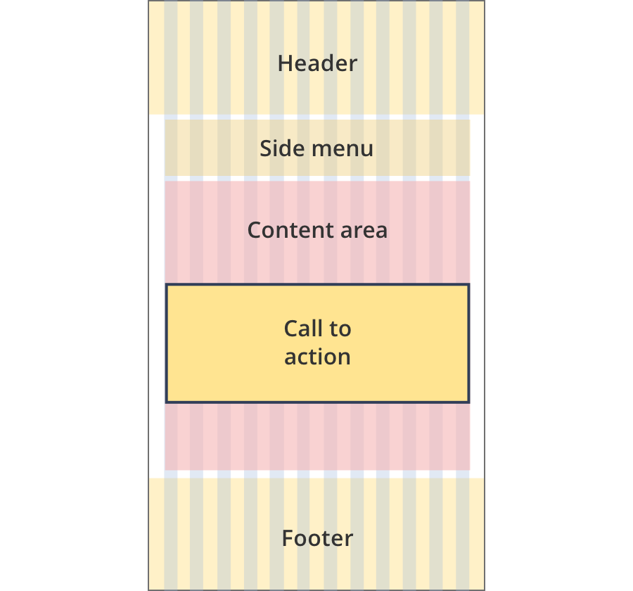
The content area is 9 grid-columns wide.
Call to action components span the full width of the content area.
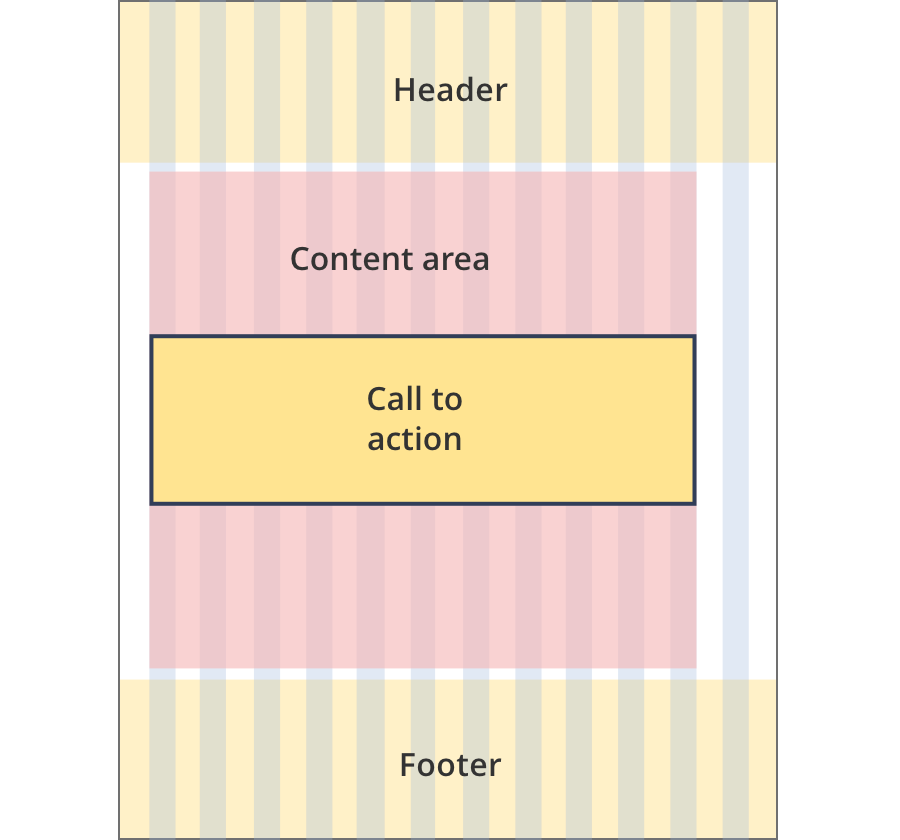
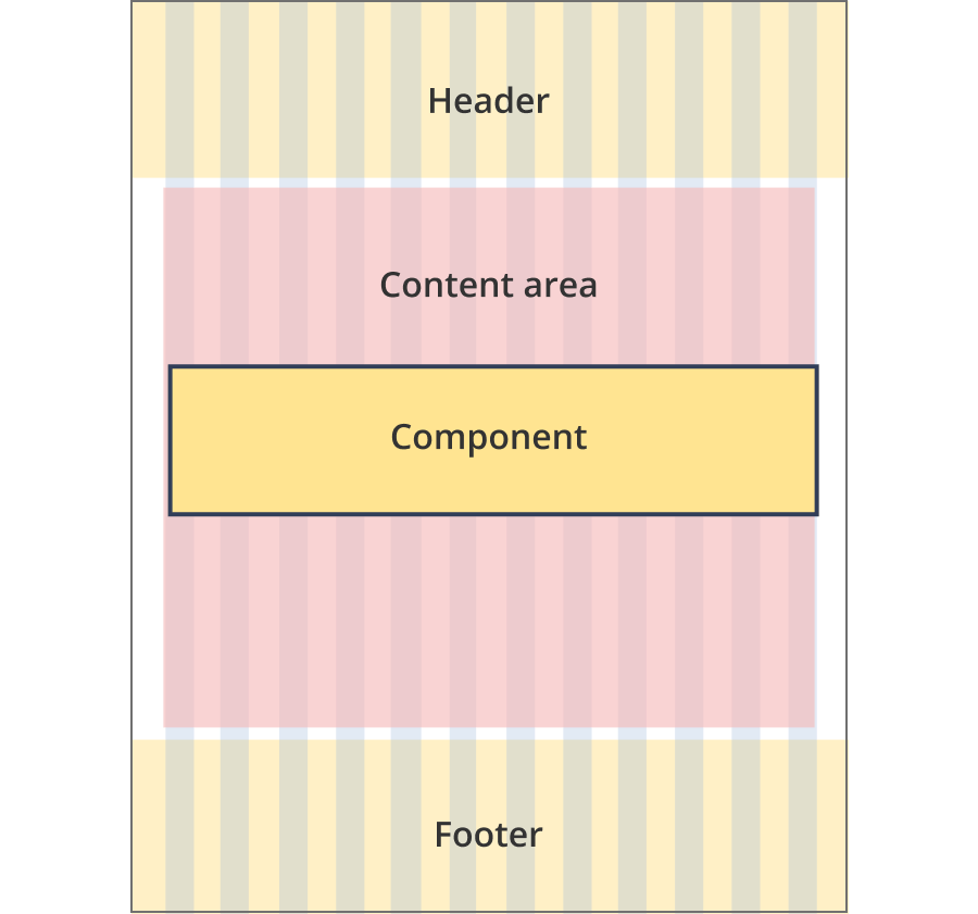
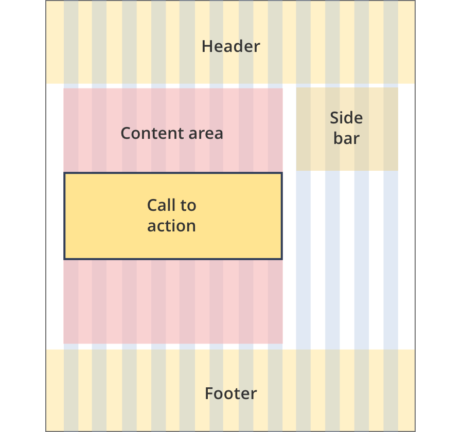
The content area is 11 grid-columns wide.
Call to action components span the full width of the content area.
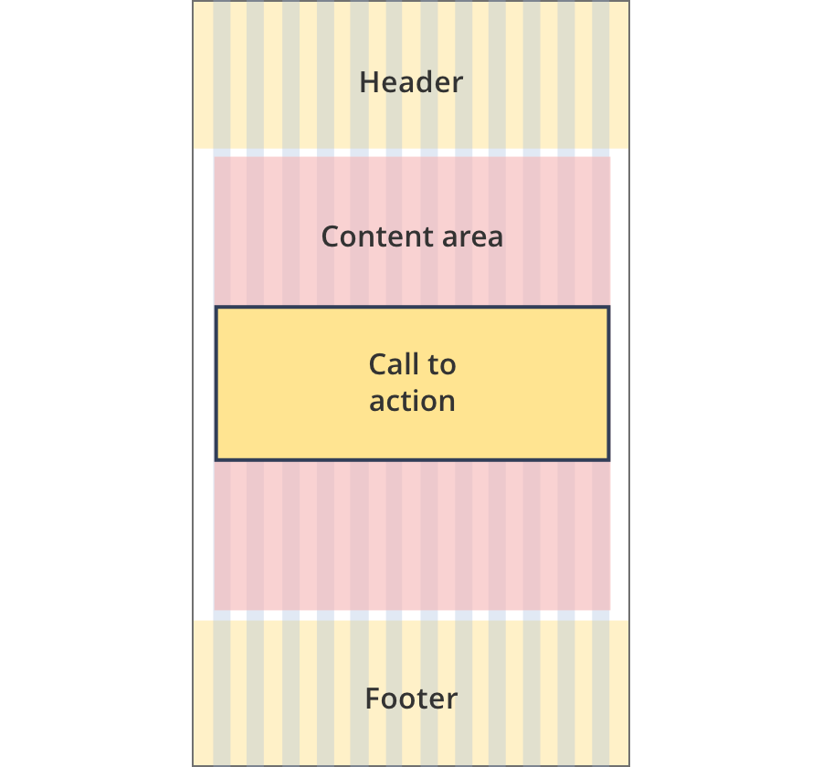
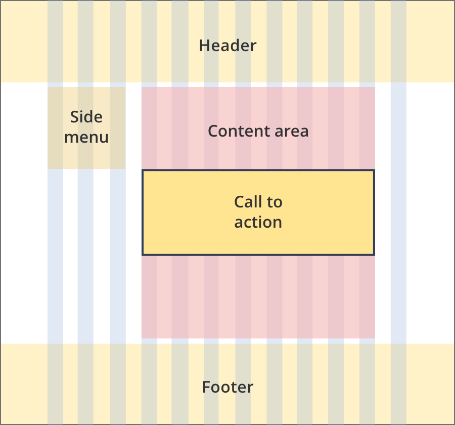
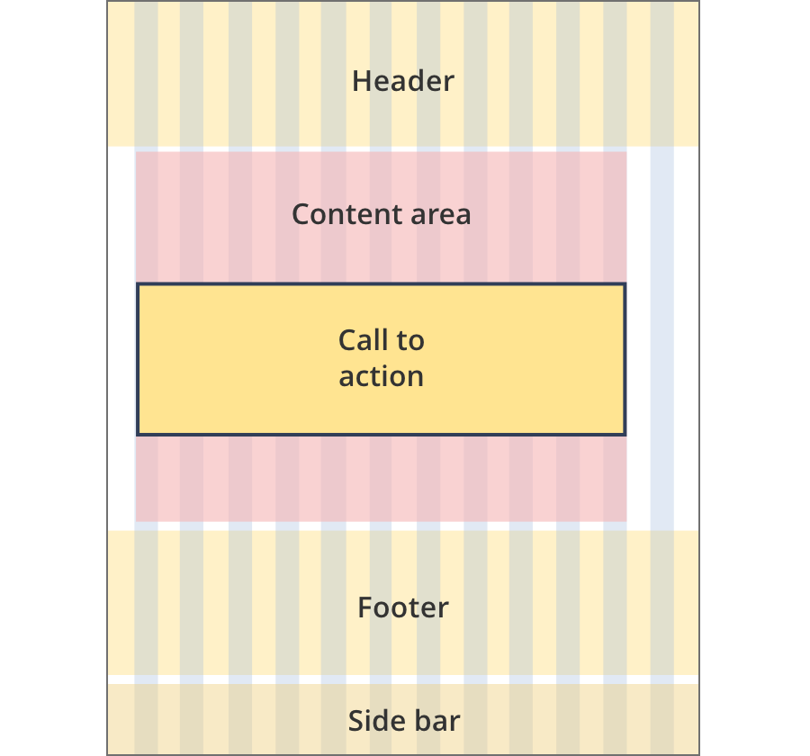
The content area is 12 grid-columns wide.
Call to action components span the full width of the content area.
The content area is 9 grid-columns wide.
Call to action components span the full width of the content area.
The content area is 10 grid-columns wide.
Call to action components span the full width of the content area.
The content area is 12 grid-columns wide.
Call to action components span the full width of the content area.
The content area is 8 grid-columns wide.
Call to action components span the full width of the content area.
The content area is 9 grid-columns wide.
Call to action components span the full width of the content area.
The content area is 12 grid-columns wide.
Call to action components span the full width of the content area.

The content area is 8 grid-columns wide.
Call to action components span the full width of the content area.

The content area is 12 grid-columns wide.
Call to action components span the full width of the content area.
The content area is 8 grid-columns wide.
Call to action tiles span the full width of the content area.
The content area is 11 grid-columns wide.
Call to action tiles span the full width of the content area.
The content area is 12 grid-columns wide.
Call to action tiles span the full width of the content area.
Guidelines for use
Purpose:
The CTA component is used for the single main action on a page.
It includes a summary of the action, an optional list of prerequisites and a button to complete the action.
When to use this component:
- The standard CTA component is typically used on transaction pages (e.g. for registrations) or internal program pages (to apply for a grant).
- Use the standard CTA when the user must complete an important high priority task.
Content rules:
- Only one per page.
- Must include description text so users know what they need to do.
- Can use bullet points or ticks for prerequisites, should limited to 3.
- Button text is an action, e.g. “Register a trade mark” or “Apply now” (4 word maximum).
Version history
5 June, 2024
- Split the call to action page into three separate pages. The download CTA and tool CTA are now separate pages.
19 September, 2023
- Added styling for call to actions used in tools. These call to action components use teal colouring.
8 August, 2023
- Added an additional layout (the Two column - tool page alternate layout).