Design
business.gov.au branding
No branding
All breakpoints
H2 level title, lorem ipsum dolor sit amet.
Title Lorem ipsum dolor sit amet, consectetur adipiscing elit. Integer erat arcu, venenatis et nibh non, finibus vehicula leo.
- Bullet points can be used in call out boxes.
- Integer erat arcu, venenatis et nibh non.
- Nullam aliquet nulla id arcu consectetur.
H3 level title, lorem ipsum dolor sit amet.
Title Lorem ipsum dolor sit amet, consectetur adipiscing elit. Integer erat arcu, venenatis et nibh non, finibus vehicula leo.
Phasellus porta rhoncus ante, in sollicitudin tellus. Suspendisse auctor libero a dui vehicula fermentum.
All breakpoints
Apply your brand specific colours and borders to the base call out boxes shown below.
H2 level title, lorem ipsum dolor sit amet.
Title Lorem ipsum dolor sit amet, consectetur adipiscing elit. Integer erat arcu, venenatis et nibh non, finibus vehicula leo.
- Bullet points can be used in call out boxes.
- Integer erat arcu, venenatis et nibh non.
- Nullam aliquet nulla id arcu consectetur.
H3 level title, lorem ipsum dolor sit amet.
Title Lorem ipsum dolor sit amet, consectetur adipiscing elit. Integer erat arcu, venenatis et nibh non, finibus vehicula leo.
Phasellus porta rhoncus ante, in sollicitudin tellus. Suspendisse auctor libero a dui vehicula fermentum.
Layouts
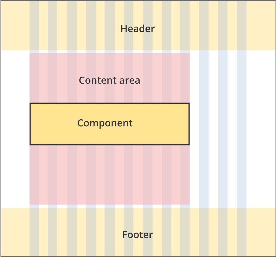
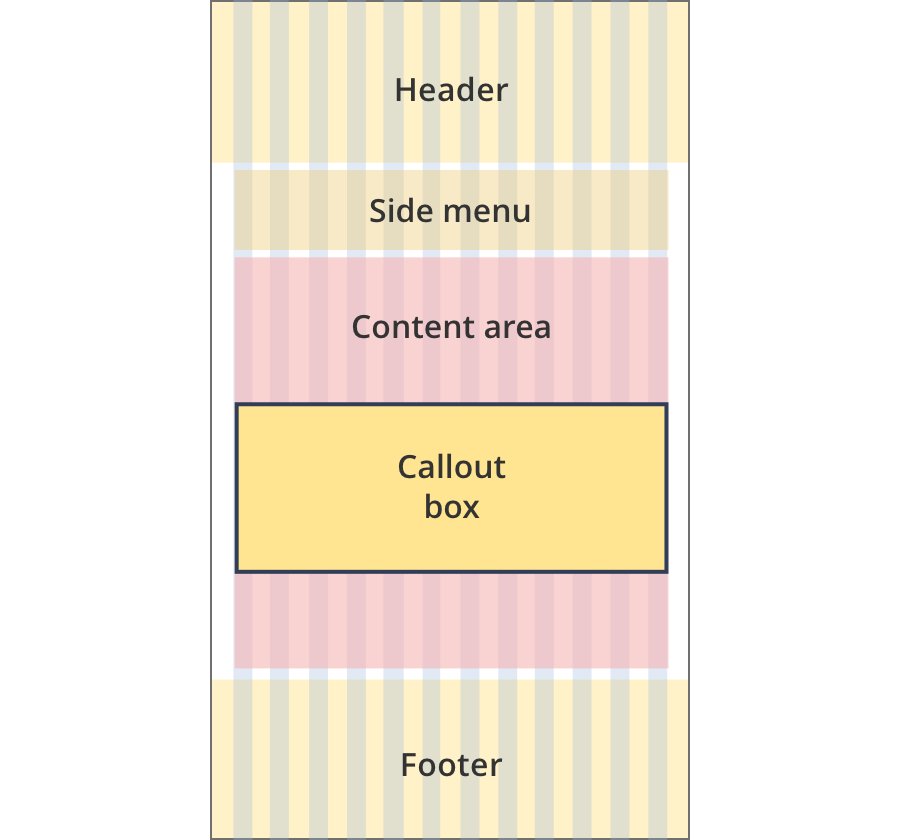
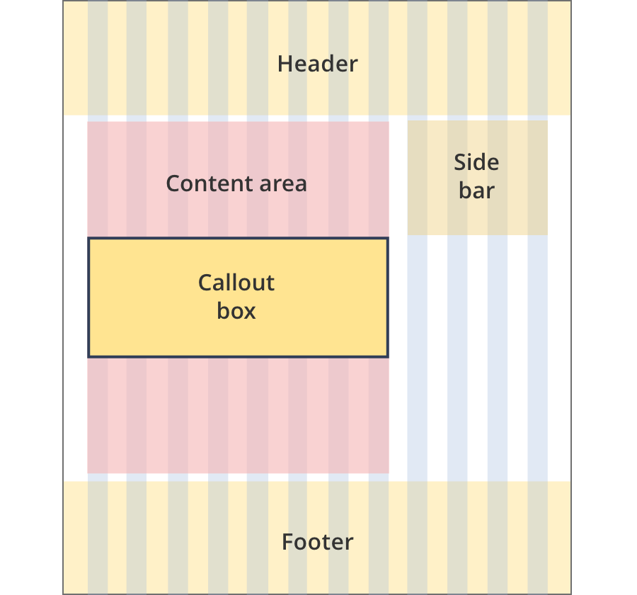
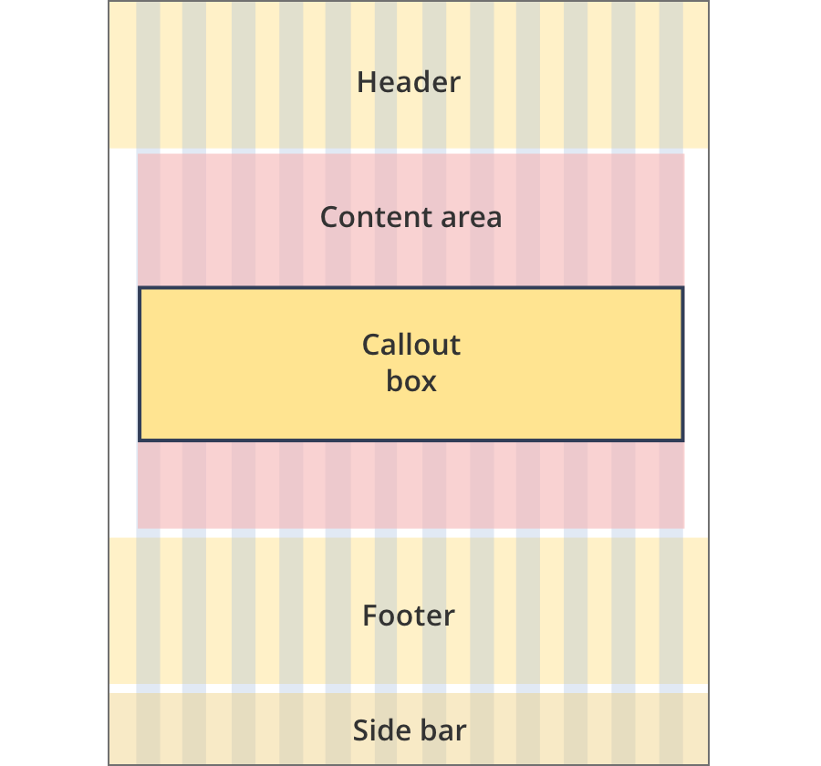
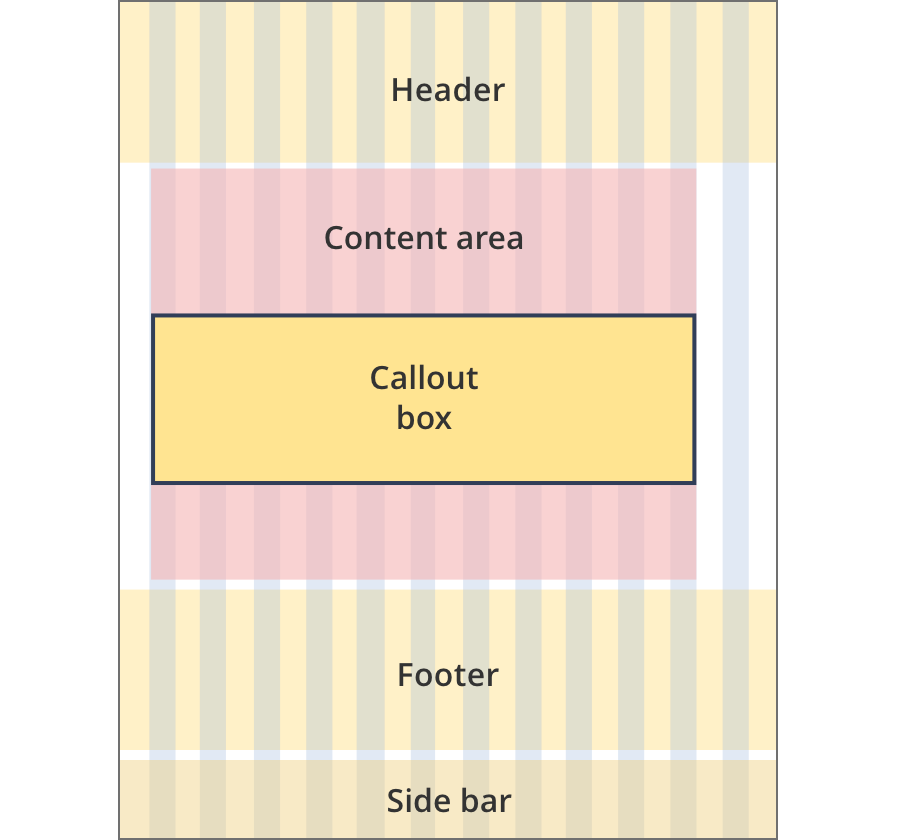
Call out boxes can be used on all page layouts except the Single column - navigation page layout and the two column - left filters layout.
Layout:

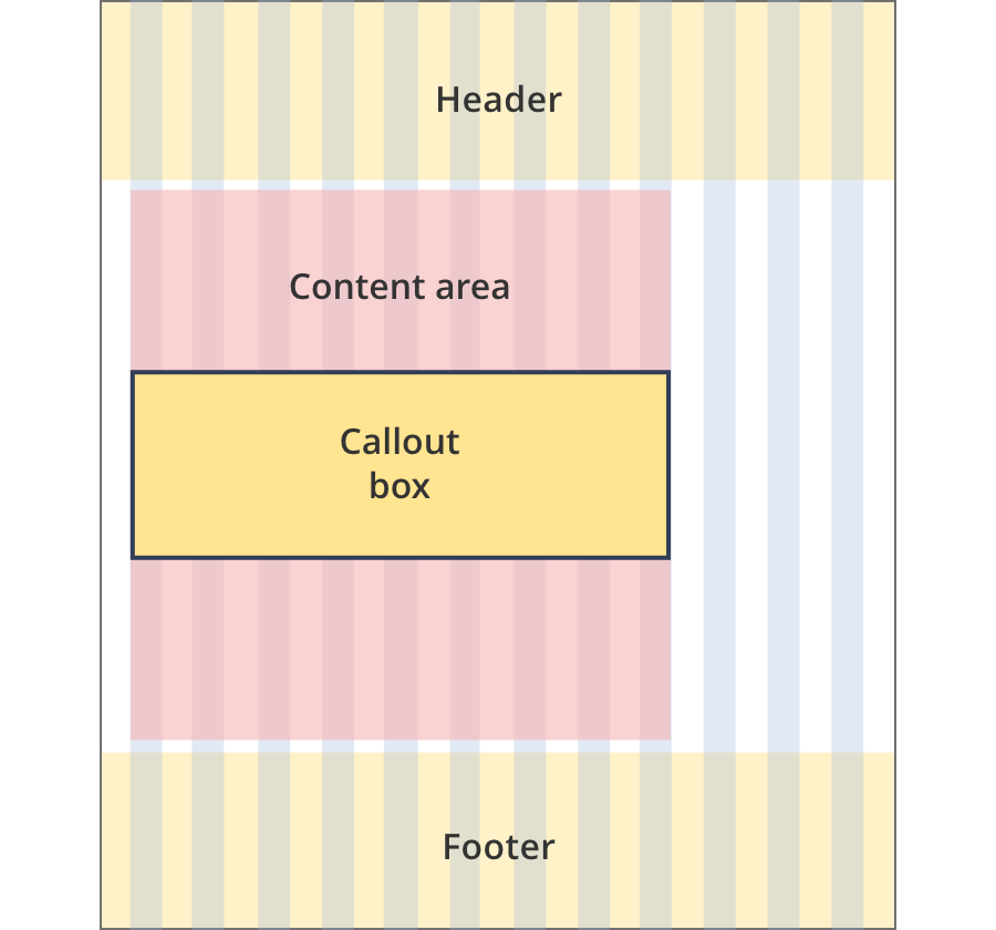
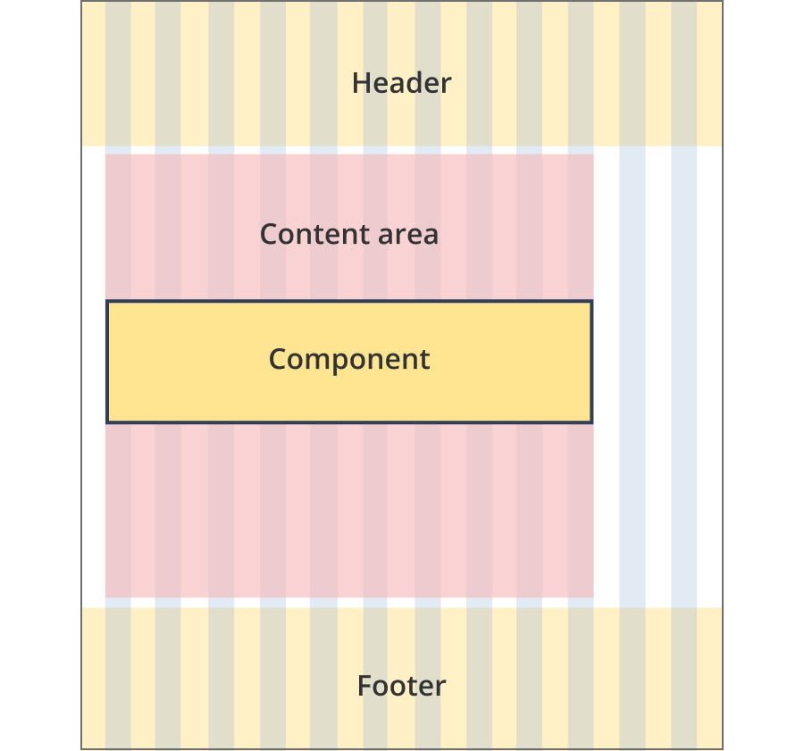
The content area is 8 grid-columns wide.
Call out boxes span the full width of the content area.
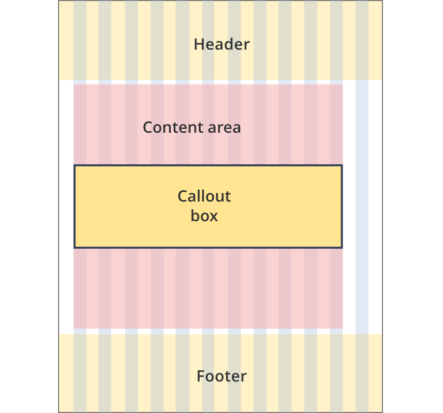
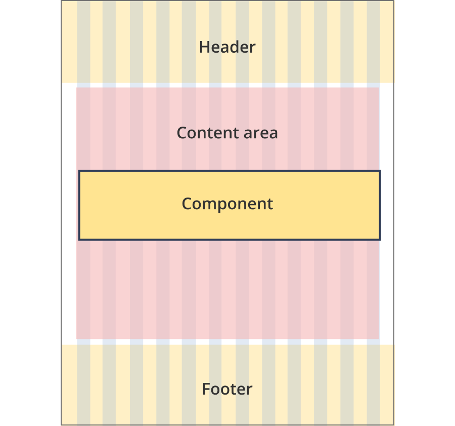
The content area is 9 grid-columns wide.
Call out boxes span the full width of the content area.
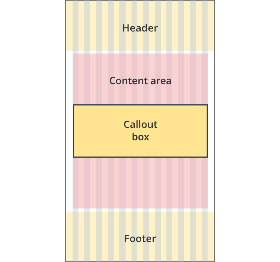
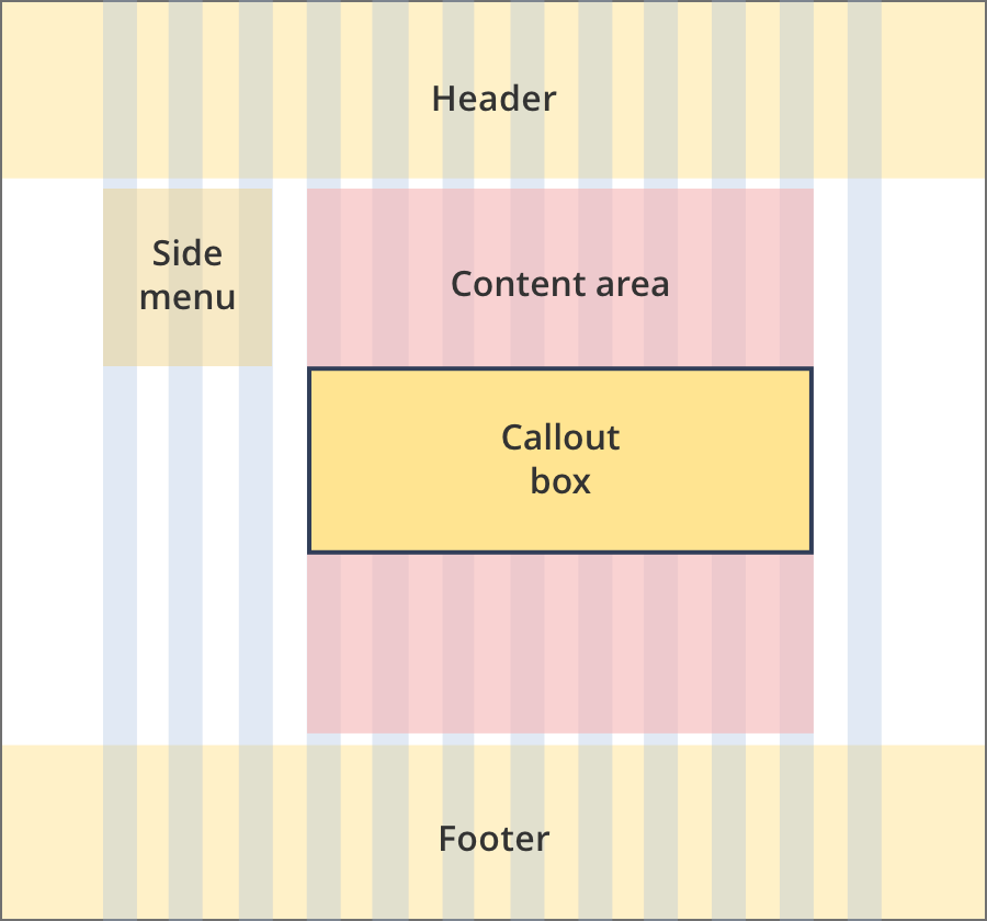
The content area is 11 grid-columns wide.
Call out boxes span the full width of the content area.
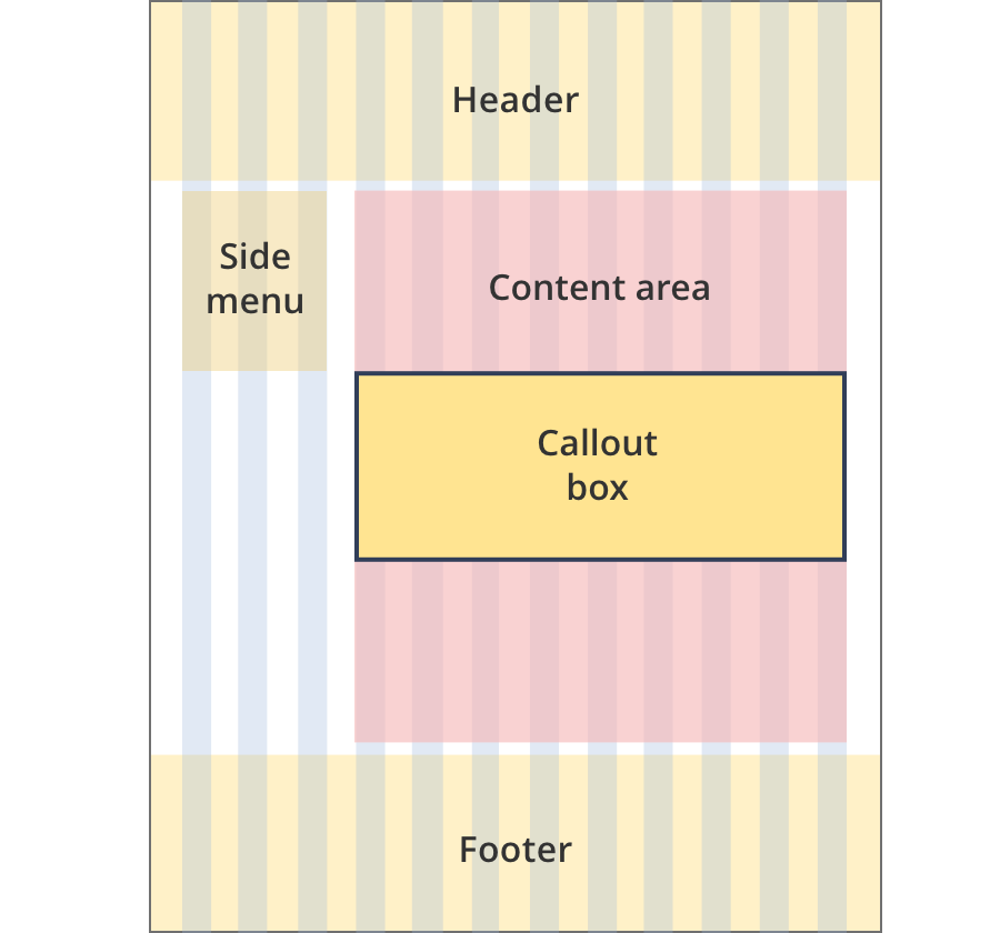
The content area is 12 grid-columns wide.
Call out boxes span the full width of the content area.
The content area is 9 grid-columns wide.
Call out boxes span the full width of the content area.
The content area is 10 grid-columns wide.
Call out boxes span the full width of the content area.
The content area is 12 grid-columns wide.
Call out boxes span the full width of the content area.
The content area is 8 grid-columns wide.
Call out boxes span the full width of the content area.
The content area is 9 grid-columns wide.
Call out boxes span the full width of the content area.
The content area is 12 grid-columns wide.
Call out boxes span the full width of the content area.
The content area is 8 grid-columns wide.
Call out boxes span the full width of the content area.
The content area is 12 grid-columns wide.
Call out boxes span the full width of the content area.

The content area is 8 grid-columns wide.
Call out box tiles span the full width of the content area.
The content area is 11 grid-columns wide.
Call out box tiles span the full width of the content area.

The content area is 12 grid-columns wide.
Call out box tiles span the full width of the content area.
Guidelines for use
Purpose:
The call out box component is used to highlight specific information within a content page.
When to use this component:
- Used to highlight important information in the context of the page, such as key tax dates.
- Used to notify users about updates or important information on other pages.
- To provide additional help, such as sample calculations and scenarios.
Content rules:
- Grant updates – high priority updates only.
- [h2] Update – [date month year].
- [h3] [Optional summary of change].
- Body content has a recommended 300 character limit.
Version history
8 August, 2023
- Added an additional layout (the Two column - tool page alternate layout).