Design
business.gov.au branding
No branding
Breakpoints:
Currently displaying the mobile design.
To see designs for other breakpoints please view this page on a larger screen.
Coloured background sections - colour variations
Approved icons
Breakpoints:
Currently displaying the mobile design.
To see designs for other breakpoints please view this page on a larger screen.
Apply your brand specific colours, borders and icons to the base call out link shown below.
Layouts
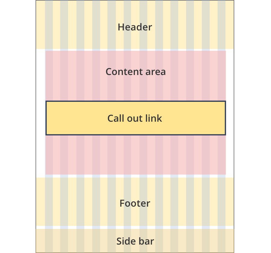
Call out links can be used on all page layouts except the Two column - filter page layout.
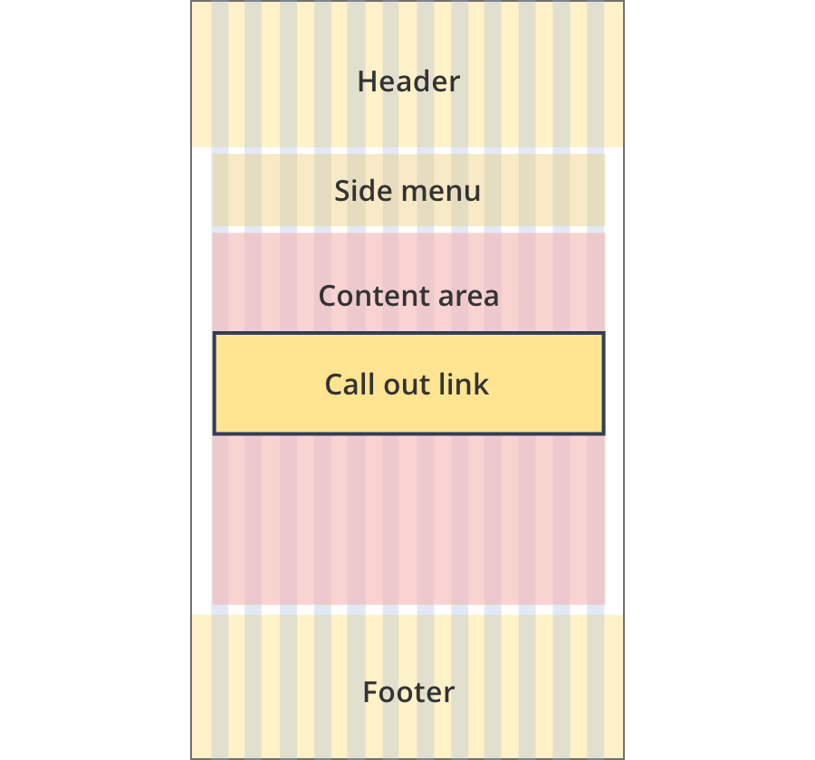
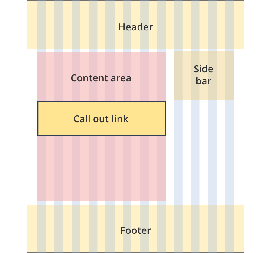
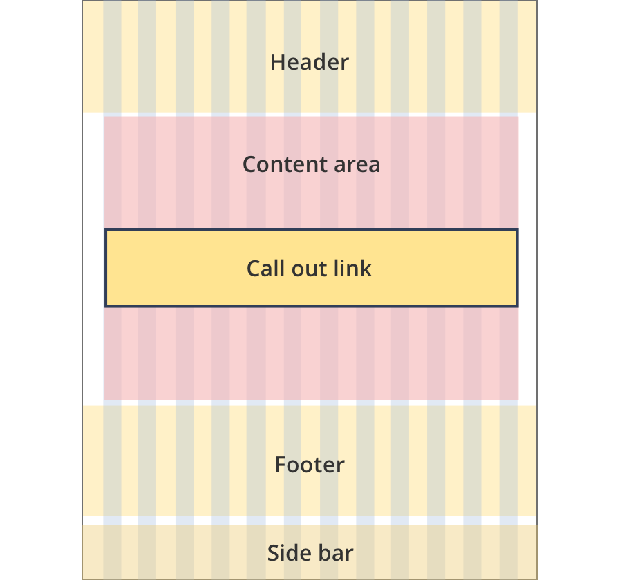
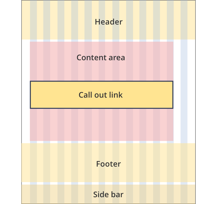
Layout:
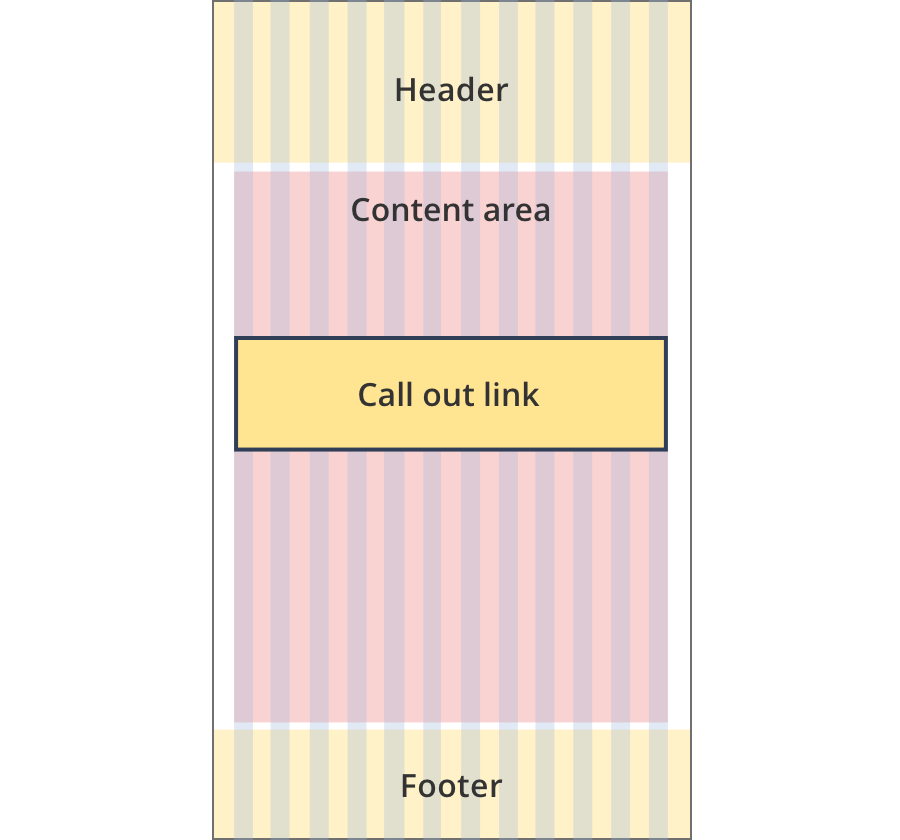
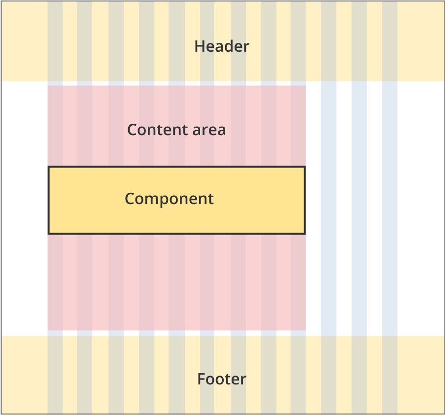
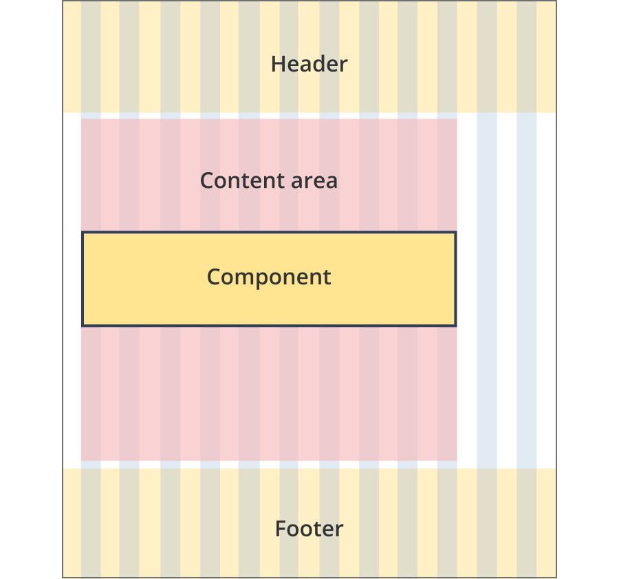
The content area is 12 grid-columns wide.
Call out link components span 8 grid-columns each.
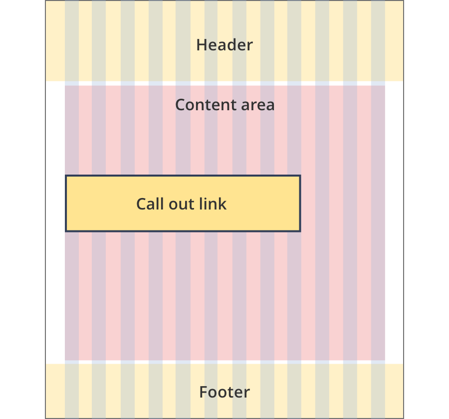
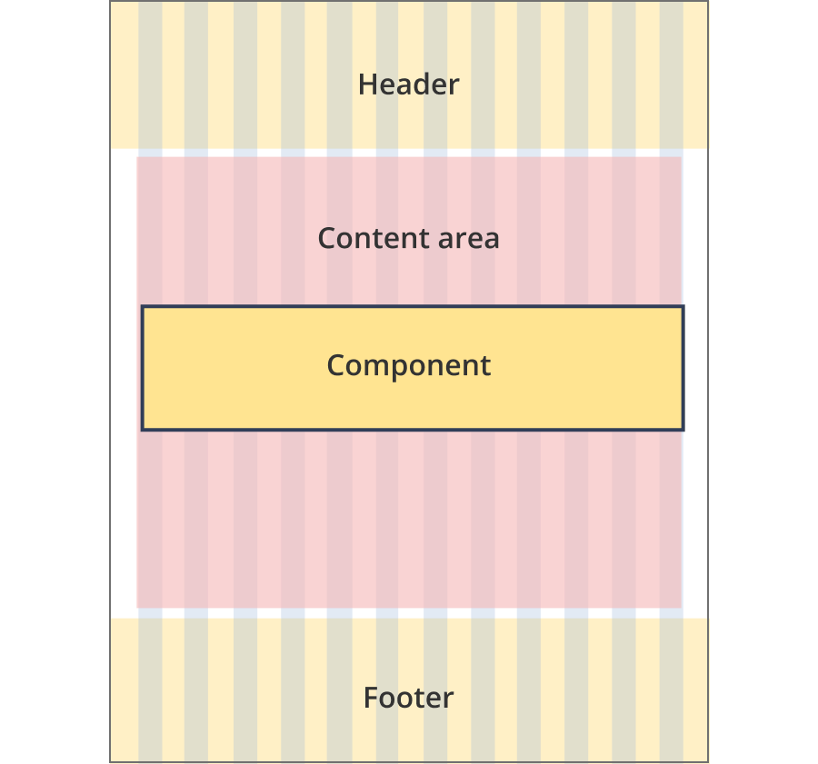
The content area is 12 grid-columns wide.
Call out link components span 9 grid-columns each.
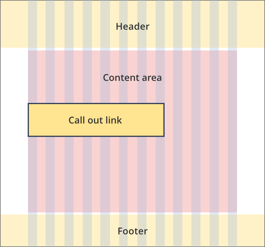
The content area is 12 grid-columns wide.
Call out link components span 12 grid-columns each.
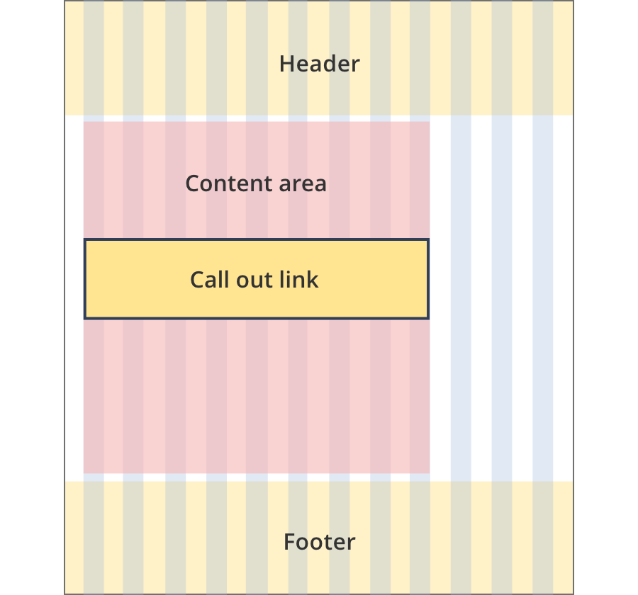
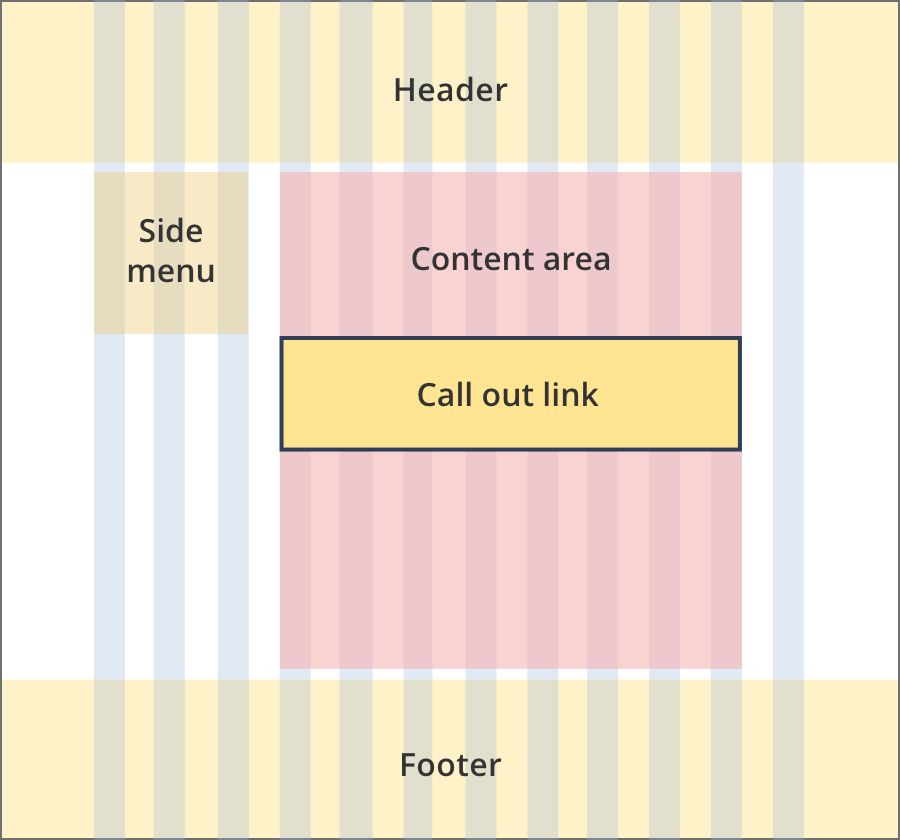
The content area is 8 grid-columns wide.
Call out link components span the full width of the content area.
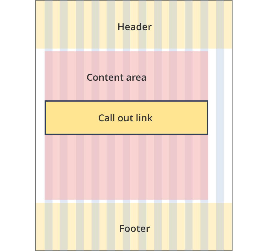
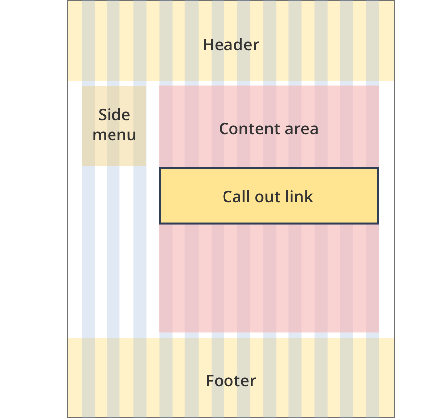
The content area is 9 grid-columns wide.
Call out link components span the full width of the content area.
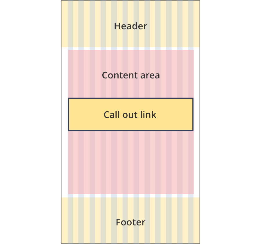
The content area is 11 grid-columns wide.
Call out link components span the full width of the content area.
The content area is 12 grid-columns wide.
Call out link components span the full width of the content area.
The content area is 9 grid-columns wide.
Call out link components span the full width of the content area.
The content area is 10 grid-columns wide.
Call out link components span the full width of the content area.
The content area is 12 grid-columns wide.
Call out link components span the full width of the content area.
The content area is 8 grid-columns wide.
Call out link components span the full width of the content area.
The content area is 9 grid-columns wide.
Call out link components span the full width of the content area.
The content area is 12 grid-columns wide.
Call out link components span the full width of the content area.
The content area is 8 grid-columns wide.
Call out link components span the full width of the content area.
The content area is 12 grid-columns wide.
Call out link components span the full width of the content area.

The content area is 8 grid-columns wide.
Call out link tiles span the full width of the content area.
The content area is 11 grid-columns wide.
Call out link tiles span the full width of the content area.
The content area is 12 grid-columns wide.
Call out link tiles span the full width of the content area.
Guidelines for use
Purpose:
The call out link component highlights a single link in a call out box, with an icon to show the destination type (e.g. email subscription or web page).
When to use this component:
- Call out links are generally used to promote subscription links for newsletters, updates and alerts.
- They may be used on both index and content pages.
Version history
8 August, 2023
- Added an additional layout (the Two column - tool page alternate layout).