Design
business.gov.au branding
No branding
Breakpoints:
Currently displaying the mobile design.
To see designs for other breakpoints please view this page on a larger screen.
Blue (default colour for information pages)
| Consideration | Sole trader | Company | |
|---|---|---|---|
| Business decisions are made by: | Sole trader | Directors | |
|
As a sole trader, you're responsible for all business decisions. In a company, the directors are responsible for business decisions and must make a record of certain decisions. If you're the only director, you have full control. If there is more than one director, the way the company will be run (including how decisions are made) will follow certain rules. These rules are usually set out in the company's constitution or replaceable rules. |
|||
| Setting up your business will cost: | $42+ | $576+ | |
Cost of setting up as a sole traderThe cost of setting up a sole trader depends on the type of business you want to set up. Sole trader start-up costs can include:
See our Start-up costing sheet for examples of other costs that are common in the first year of a business. Cost of setting up a companyThe cost of setting up a company is much higher compared to a sole trader. Company start-up costs include:
See our Start-up costing sheet for a list of examples of some of the other costs typical in the first year of a business. |
|||
| Setting up your business will be: | Easy | More complex | |
Setting up as a sole traderSetting up a sole trader structure is relatively easy. Generally, you're ready to go once you get your Australian Business Number (ABN) and register for any taxes, licences and permits. It's recommended you set up a separate bank account, but it's not necessary. Setting up as a companySetting up a company is more complicated, and you must understand your legal and tax obligations before registering. On top of the typical business and tax registrations, licences and permits you'll also need to set up a separate bank account and ensure the company has a registered office and principal place of business. Find out more about the volume of paperwork and legal requirements for a company. |
|||
| Switching business structures will be: | Easy | More difficult | |
|
A sole trader can easily switch to a partnership or company. A company can't easily change business structures. To change, you need to:
Lorem ipsum, dolor et. |
|||
| This row has no 'learn more' information: | Easy | More difficult | |
Teal (for tool pages)
| Consideration | Sole trader | Company | |
|---|---|---|---|
| Business decisions are made by: | Sole trader | Directors | |
|
As a sole trader, you're responsible for all business decisions. In a company, the directors are responsible for business decisions and must make a record of certain decisions. If you're the only director, you have full control. If there is more than one director, the way the company will be run (including how decisions are made) will follow certain rules. These rules are usually set out in the company's constitution or replaceable rules. |
|||
| Setting up your business will cost: | $42+ | $576+ | |
Cost of setting up as a sole traderThe cost of setting up a sole trader depends on the type of business you want to set up. Sole trader start-up costs can include:
See our Start-up costing sheet for examples of other costs that are common in the first year of a business. Cost of setting up a companyThe cost of setting up a company is much higher compared to a sole trader. Company start-up costs include:
See our Start-up costing sheet for a list of examples of some of the other costs typical in the first year of a business. |
|||
| Setting up your business will be: | Easy | More complex | |
Setting up as a sole traderSetting up a sole trader structure is relatively easy. Generally, you're ready to go once you get your Australian Business Number (ABN) and register for any taxes, licences and permits. It's recommended you set up a separate bank account, but it's not necessary. Setting up as a companySetting up a company is more complicated, and you must understand your legal and tax obligations before registering. On top of the typical business and tax registrations, licences and permits you'll also need to set up a separate bank account and ensure the company has a registered office and principal place of business. Find out more about the volume of paperwork and legal requirements for a company. |
|||
| Switching business structures will be: | Easy | More difficult | |
|
A sole trader can easily switch to a partnership or company. A company can't easily change business structures. To change, you need to:
Lorem ipsum, dolor et. |
|||
| This row has no 'learn more' information: | Easy | More difficult | |
Breakpoints:
Currently displaying the mobile design.
To see designs for other breakpoints please view this page on a larger screen.
Apply your brand specific colours, borders and icons to the base accordion shown below.
| Consideration | Sole trader | Company | |
|---|---|---|---|
| Business decisions are made by: | Sole trader | Directors | |
|
As a sole trader, you're responsible for all business decisions. In a company, the directors are responsible for business decisions and must make a record of certain decisions. If you're the only director, you have full control. If there is more than one director, the way the company will be run (including how decisions are made) will follow certain rules. These rules are usually set out in the company's constitution or replaceable rules. |
|||
| Setting up your business will cost: | $42+ | $576+ | |
Cost of setting up as a sole traderThe cost of setting up a sole trader depends on the type of business you want to set up. Sole trader start-up costs can include:
See our Start-up costing sheet for examples of other costs that are common in the first year of a business. Cost of setting up a companyThe cost of setting up a company is much higher compared to a sole trader. Company start-up costs include:
See our Start-up costing sheet for a list of examples of some of the other costs typical in the first year of a business. |
|||
| Setting up your business will be: | Easy | More complex | |
Setting up as a sole traderSetting up a sole trader structure is relatively easy. Generally, you're ready to go once you get your Australian Business Number (ABN) and register for any taxes, licences and permits. It's recommended you set up a separate bank account, but it's not necessary. Setting up as a companySetting up a company is more complicated, and you must understand your legal and tax obligations before registering. On top of the typical business and tax registrations, licences and permits you'll also need to set up a separate bank account and ensure the company has a registered office and principal place of business. Find out more about the volume of paperwork and legal requirements for a company. |
|||
| Switching business structures will be: | Easy | More difficult | |
|
A sole trader can easily switch to a partnership or company. A company can't easily change business structures. To change, you need to:
Lorem ipsum, dolor et. |
|||
| This row has no 'learn more' information: | Easy | More difficult | |
Layouts
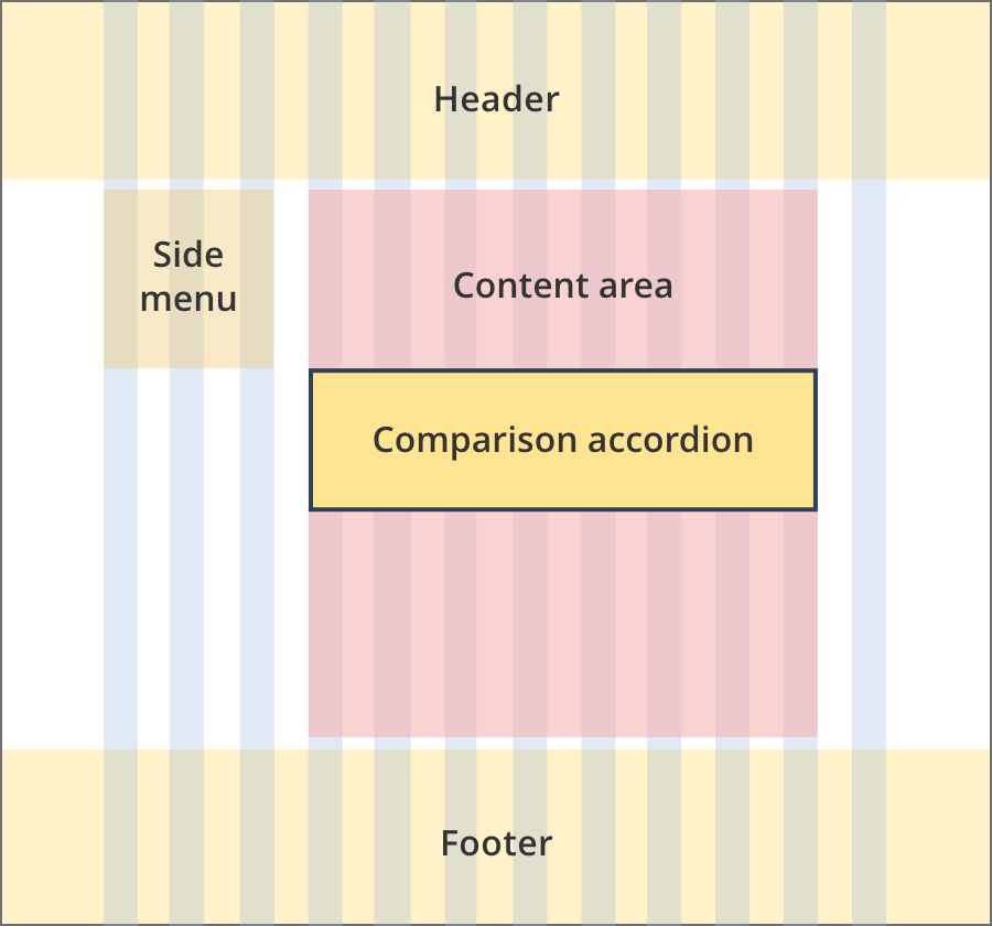
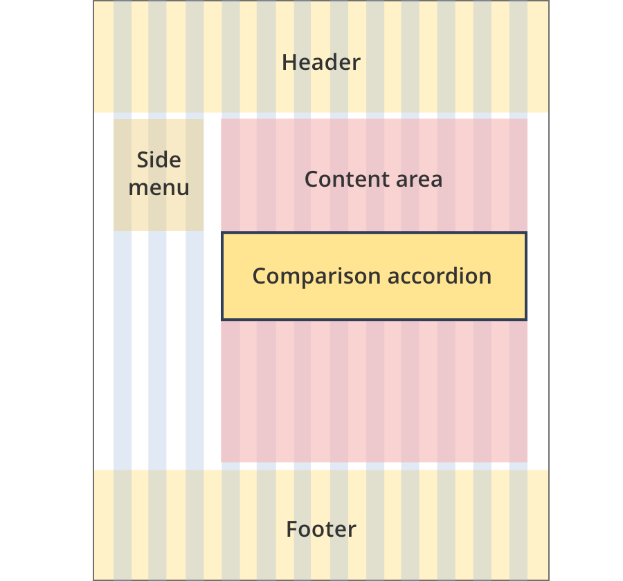
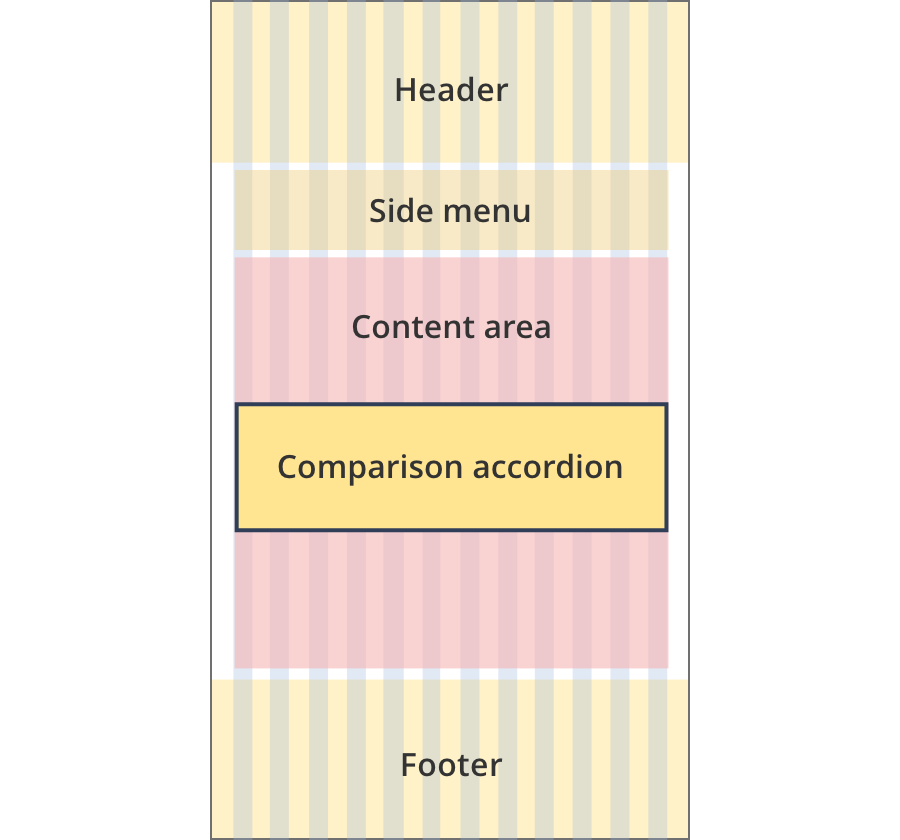
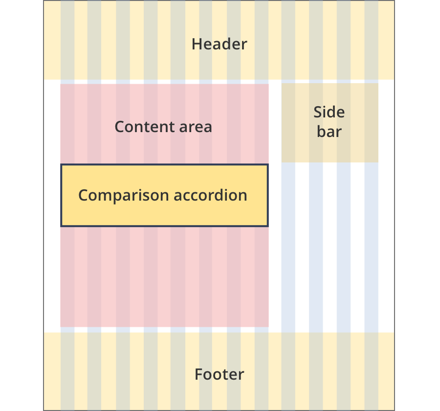
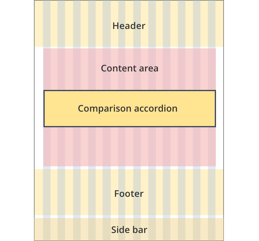
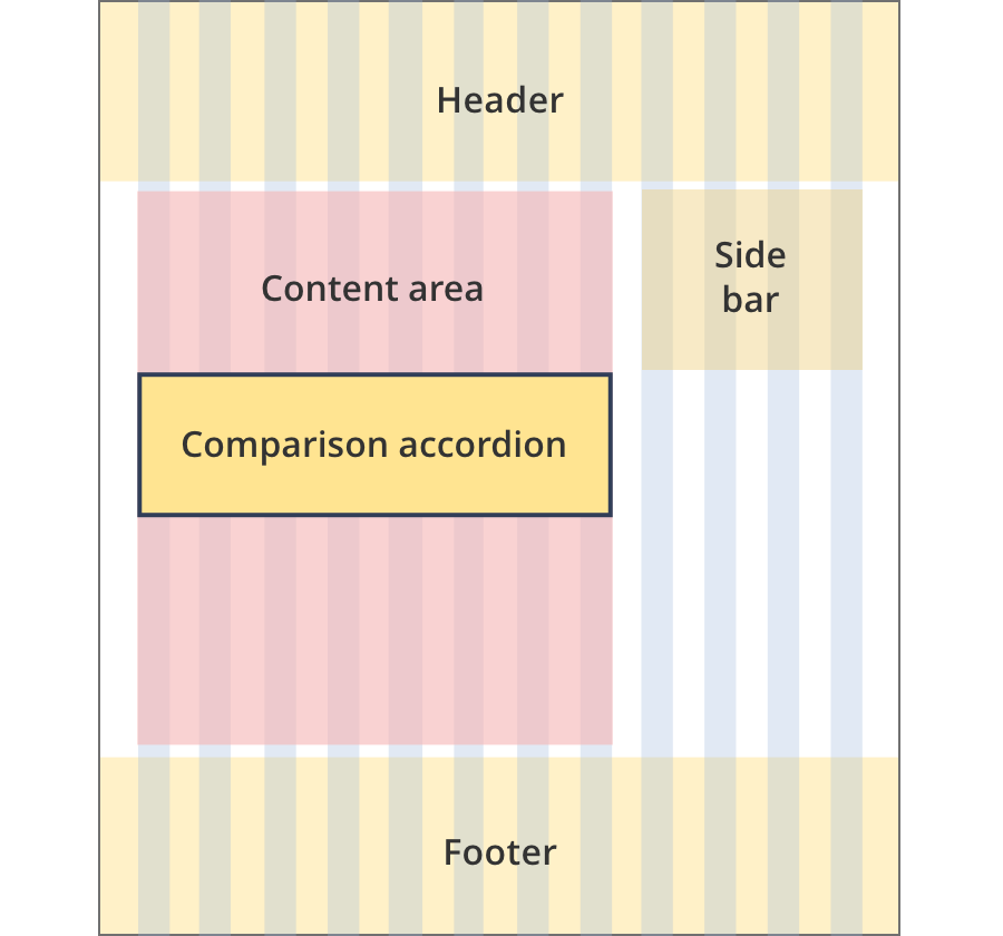
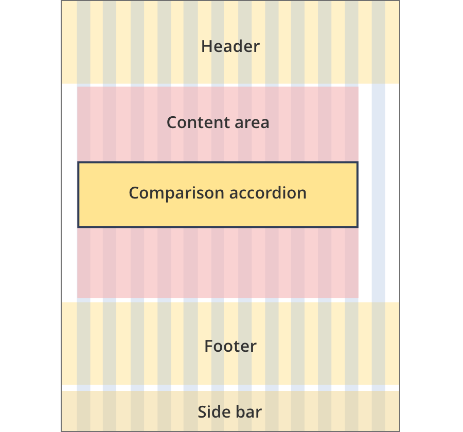
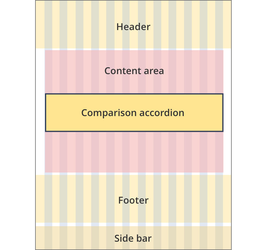
Comparison accordions can be used on all page layouts except the Single column - navigation page layout and the two column - left filter layout.
Layout:
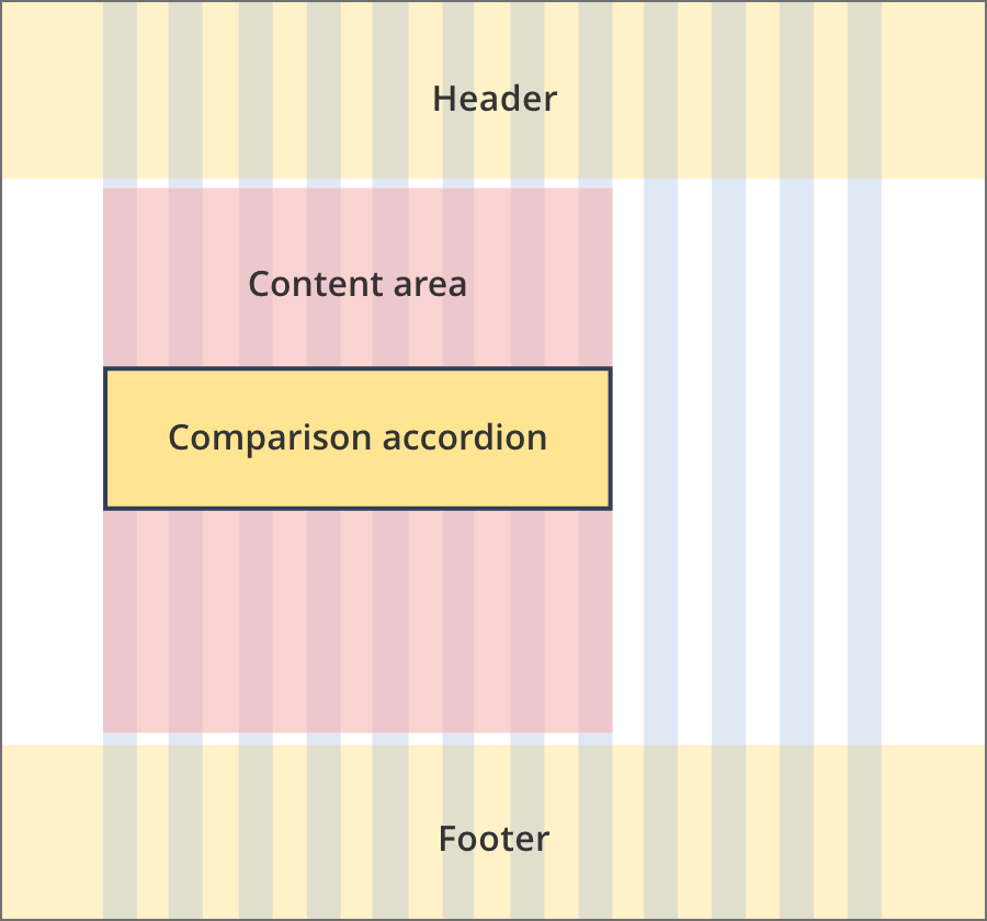
The content area is 8 grid-columns wide.
Comparison accordions span the full width of the content area.
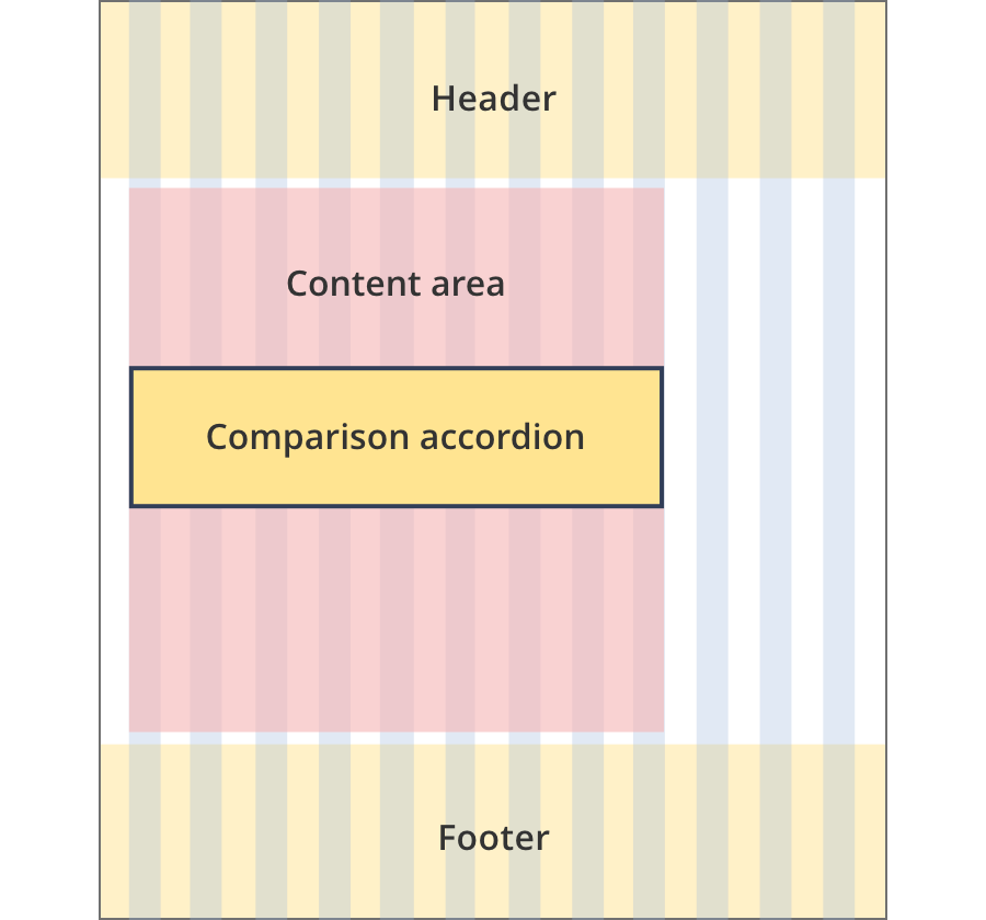
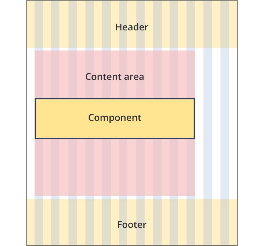
The content area is 9 grid-columns wide.
Comparison accordions span the full width of the content area.
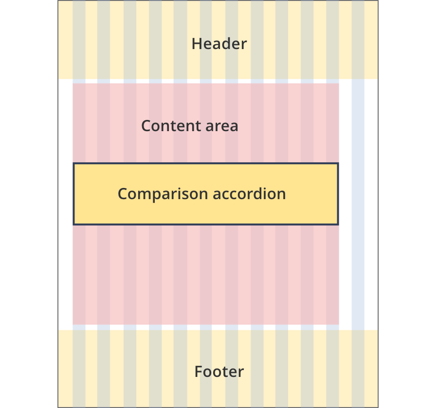
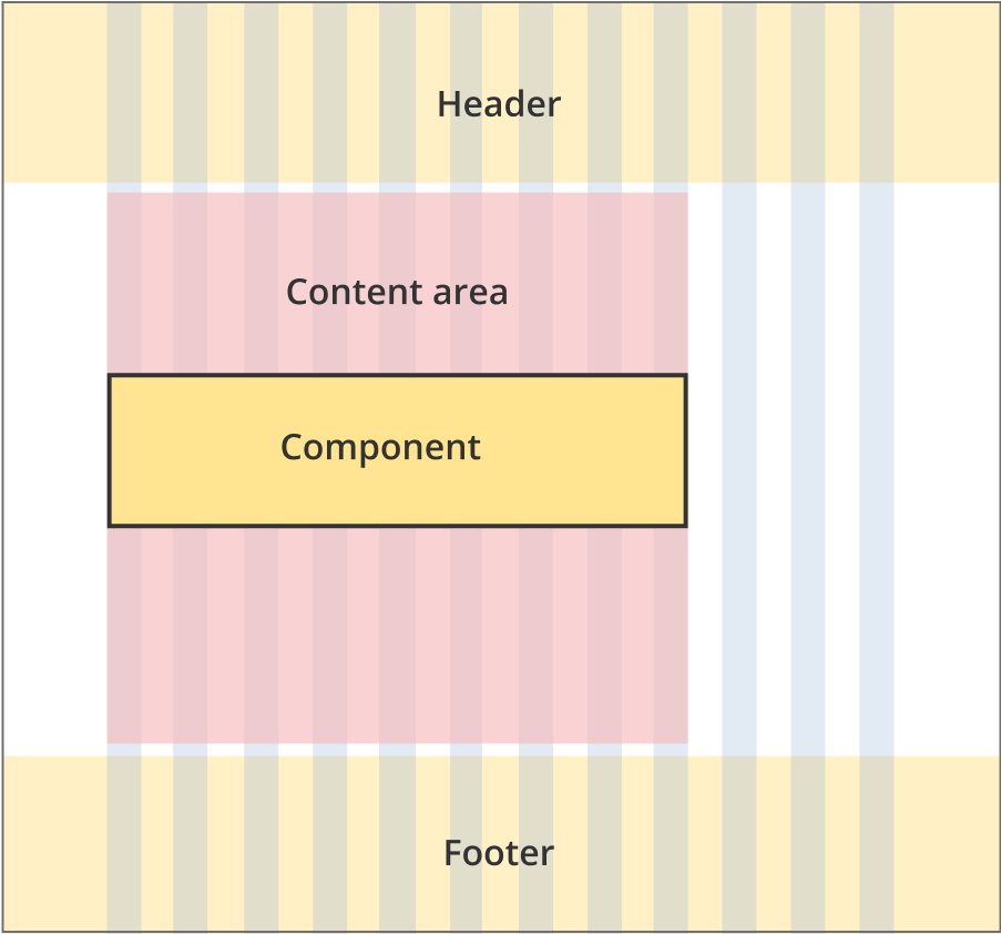
The content area is 11 grid-columns wide.
Comparison accordions span the full width of the content area.
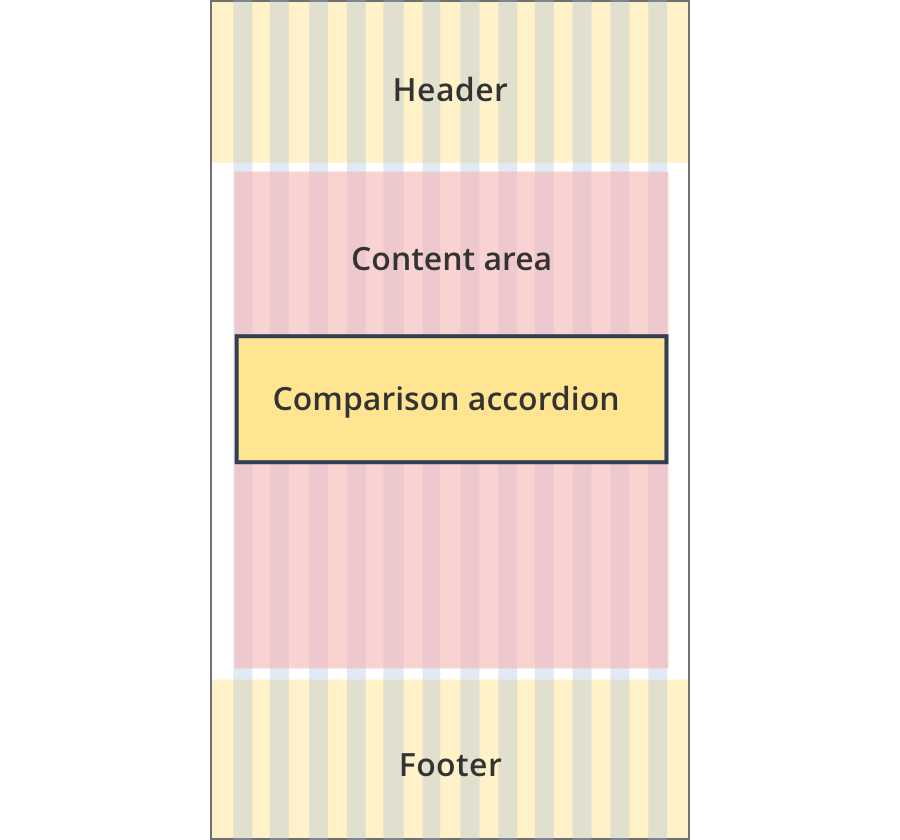
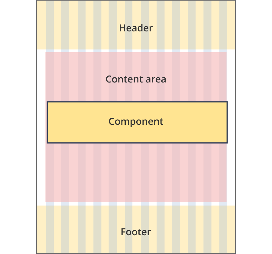
The content area is 12 grid-columns wide.
Comparison accordions span the full width of the content area.
The content area is 9 grid-columns wide.
Feature image components span the full width of the content area.
The content area is 10 grid-columns wide.
Feature image components span the full width of the content area.
The content area is 12 grid-columns wide.
Feature image components span the full width of the content area.
The content area is 8 grid-columns wide.
Comparison accordions span the full width of the content area.
The content area is 9 grid-columns wide.
Comparison accordions span the full width of the content area.
The content area is 12 grid-columns wide.
Comparison accordions span the full width of the content area.
The content area is 8 grid-columns wide.
Comparison accordions span the full width of the content area.
The content area is 12 grid-columns wide.
Comparison accordions span the full width of the content area.
The content area is 8 grid-columns wide.
Comparison accordions span the full width of the content area.
The content area is 11 grid-columns wide.
Comparison accordions span the full width of the content area.
The content area is 12 grid-columns wide.
Comparison accordions span the full width of the content area.
Guidelines for use
Purpose:
The comparison accordion is a variation of the standard accordion pattern. It provides a high-level comparison between two items. User's can use 'read more' links to expand each comparison row and read further detail on the differences between the items.
When to use this component:
- For highlighting the differences between two items, eg. the difference between two business structures.
Content rules:
- H5, p and li tags can be used in the expandable rows.
Version history
15 January, 2024
- Added an example of a row without 'learn more' information.
19 September, 2023
- Added the comparison accordion to the style guide (as a new component).