Design
business.gov.au branding
No branding
Breakpoints:
Currently displaying the mobile design.
To see designs for other breakpoints please view this page on a larger screen.
Default contact call out box
Contact information
- Phone:1300 XXX XXX
- Email:johnsmith@qwerty.com
- Address:123 Smithson St, Lyneham, Australian Capital Territory
- Website:webaddress.com
Adviser contact call out box
- Cost:Free
- Delivery type:In person services, Phone services, Online services
- Service area:City of Melbourne
Find out more
- Phone:03 9658 96581300 XXX XXX
- Email:johnsmith@qwerty.com
- Address:123 Smithson St, Lyneham, Australian Capital Territory
- Website:webaddress.comalternatesiteaddress.com
Layouts
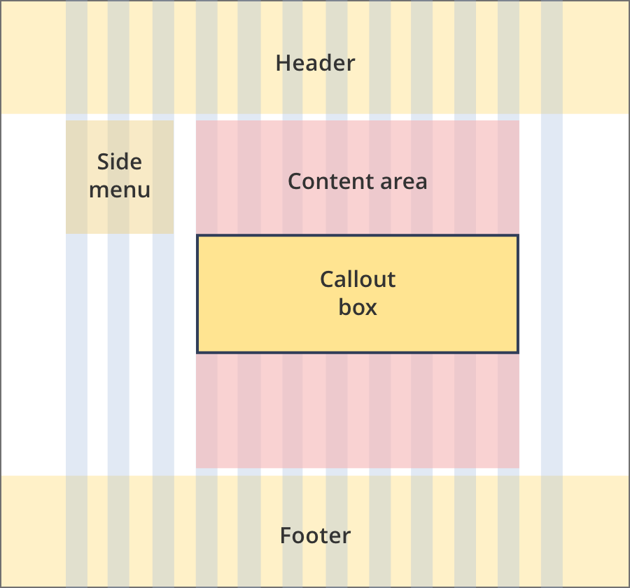
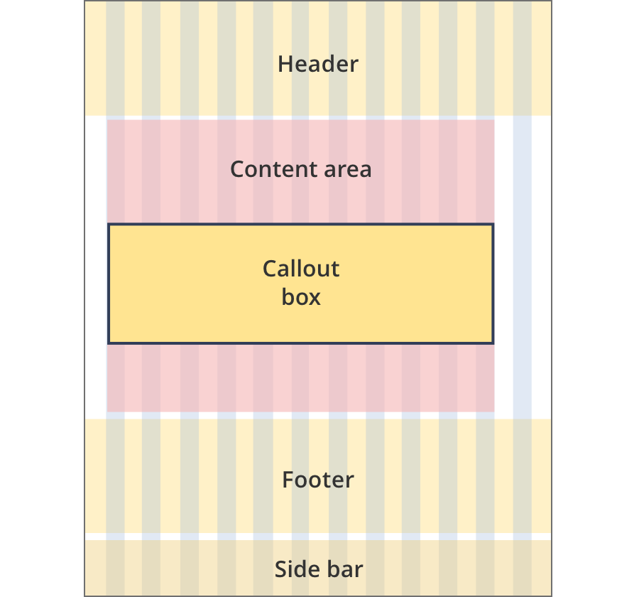
Call out boxes can be used on all page layouts except the Single column - navigation page layout and the Two column - filter page layout.
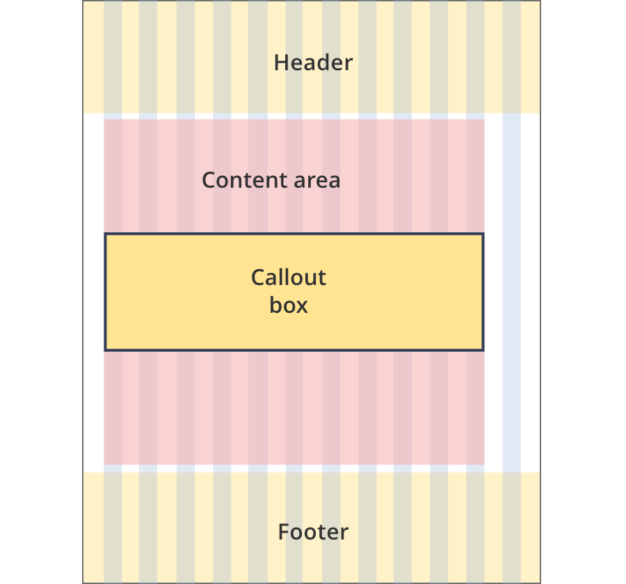
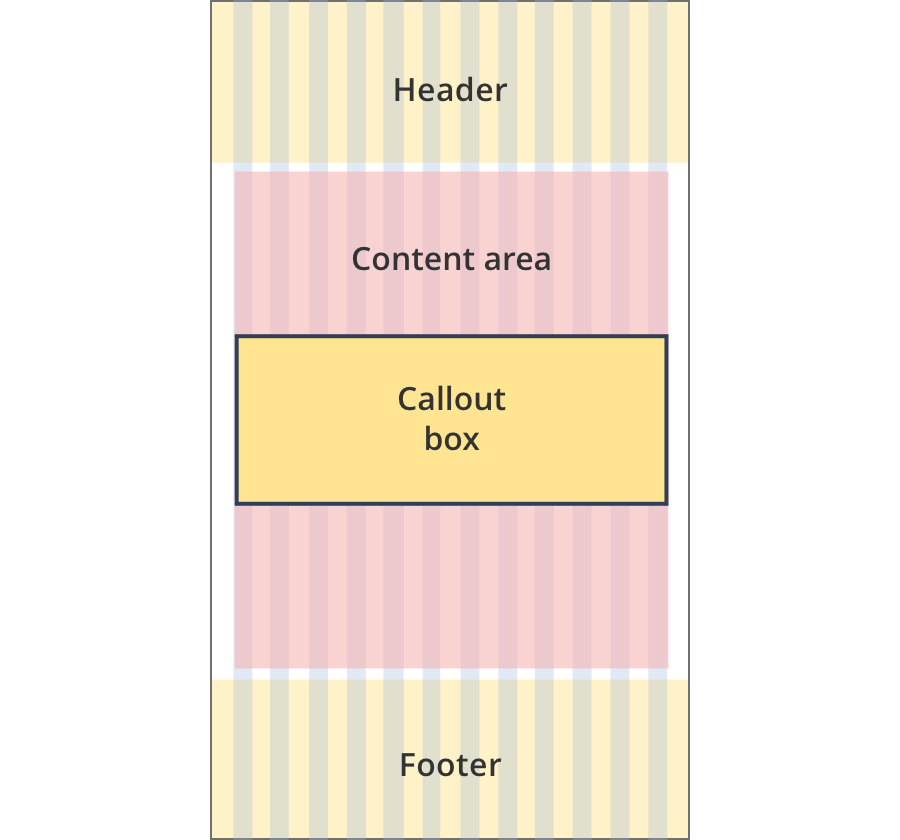
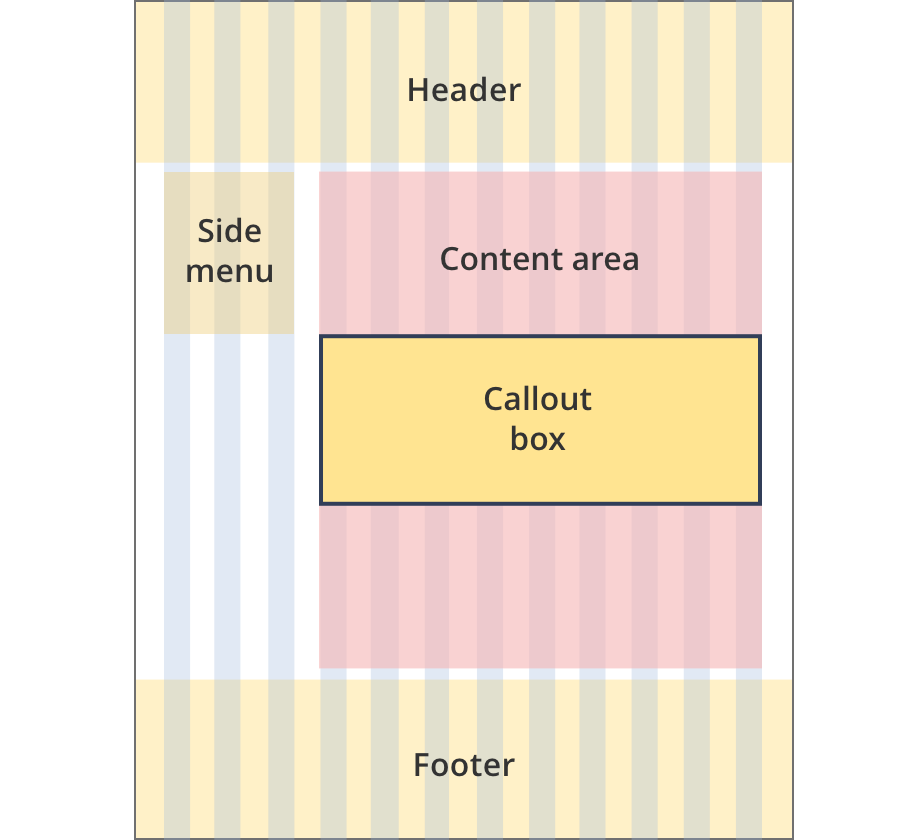
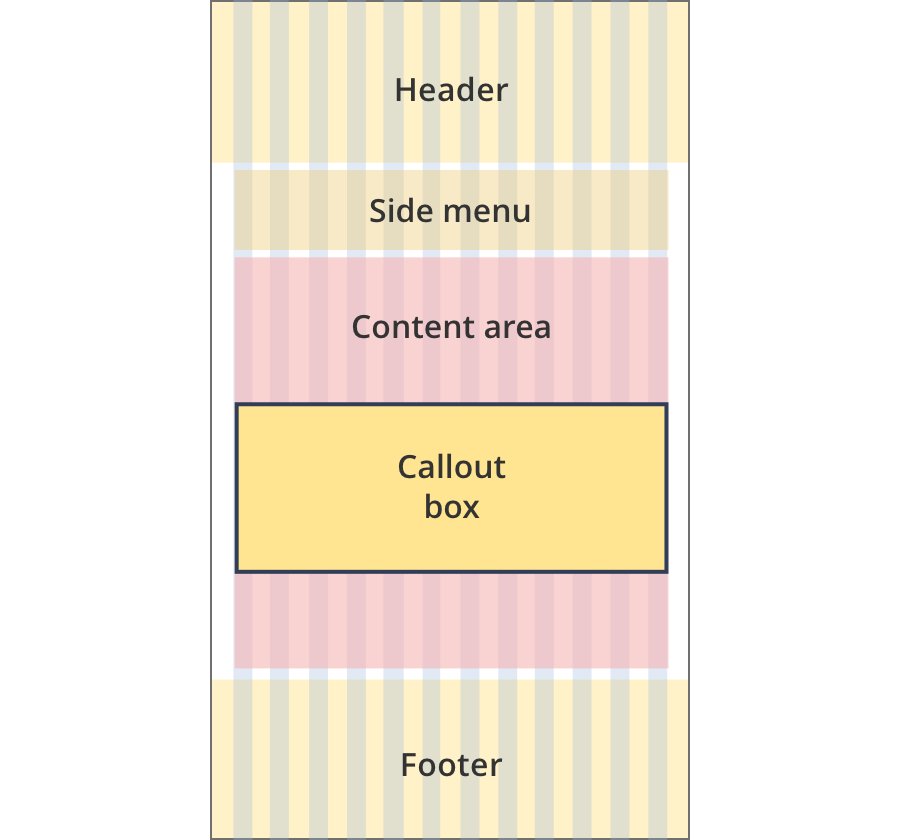
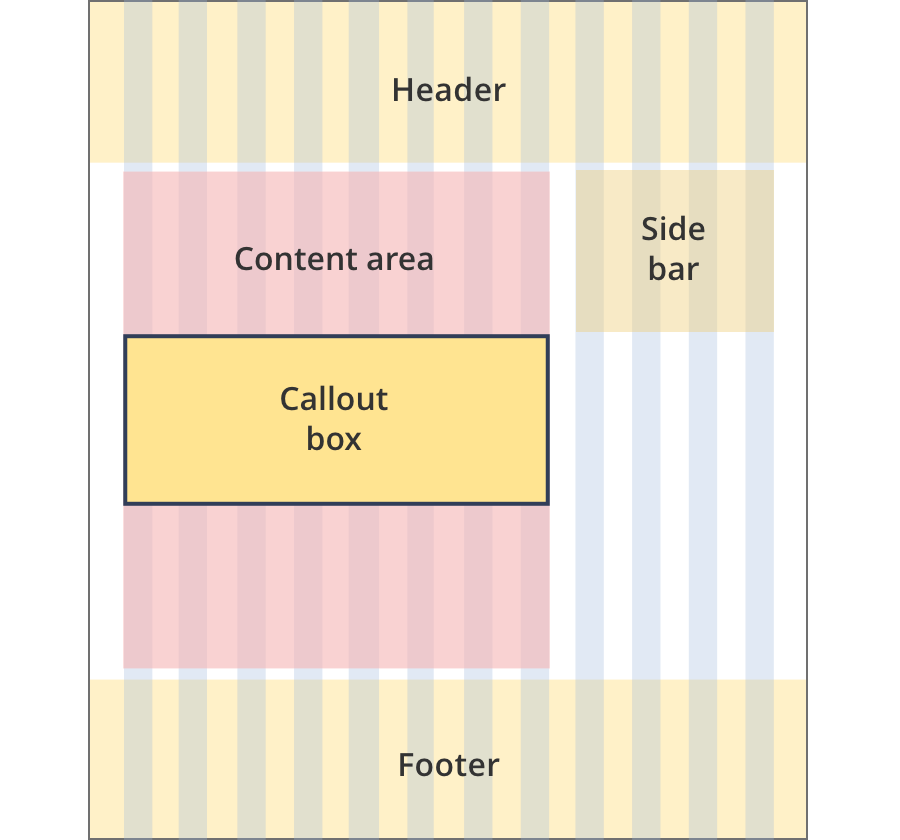
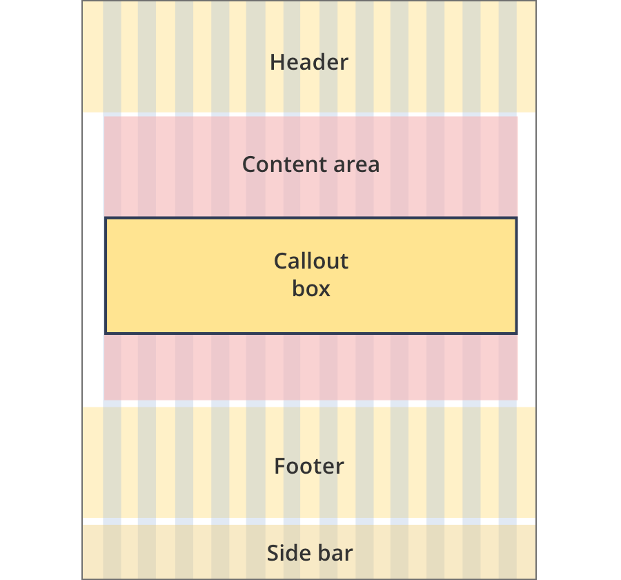
Layout:

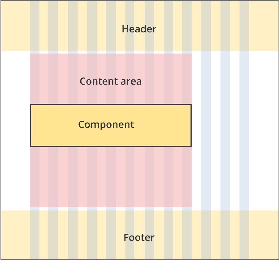
The content area is 8 grid-columns wide.
Call out boxes span the full width of the content area.
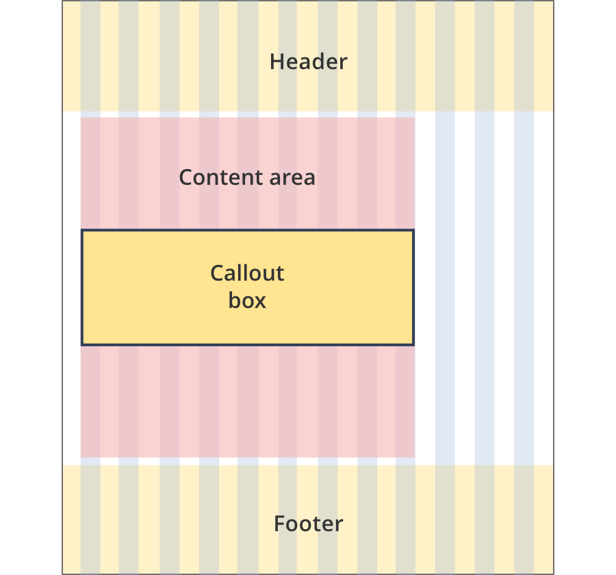
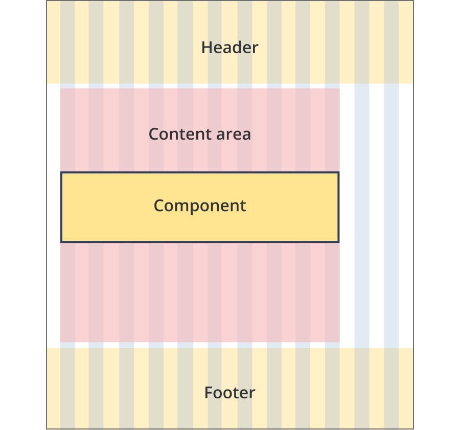
The content area is 9 grid-columns wide.
Call out boxes span the full width of the content area.
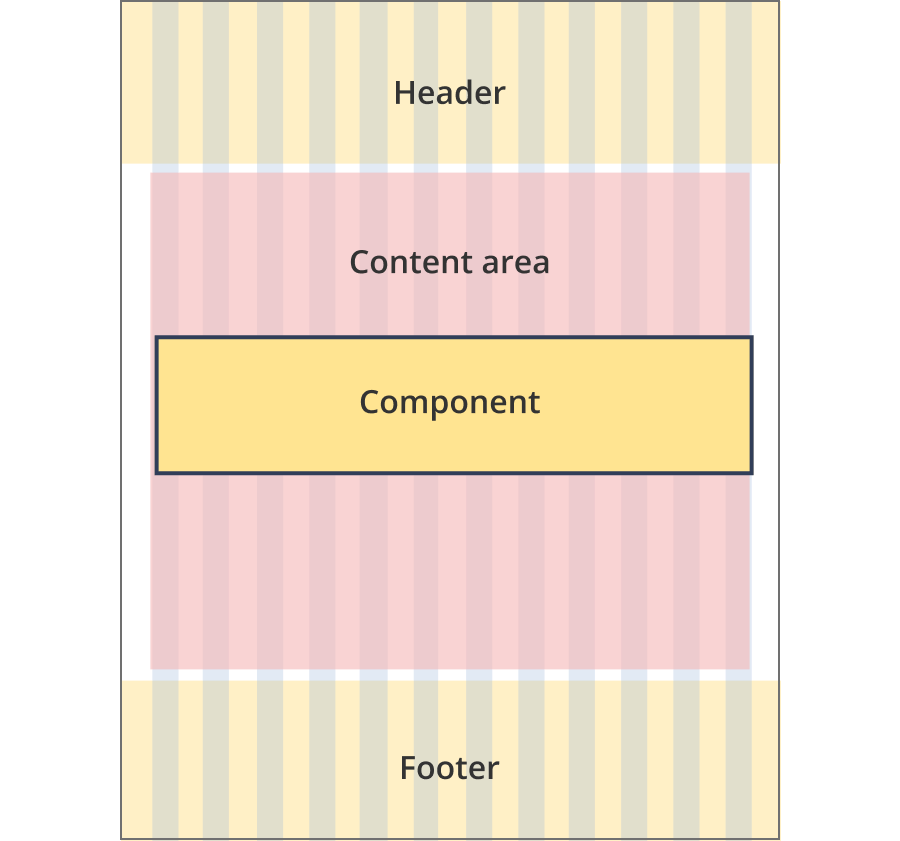
The content area is 11 grid-columns wide.
Call out boxes span the full width of the content area.
The content area is 12 grid-columns wide.
Call out boxes span the full width of the content area.
The content area is 9 grid-columns wide.
Call out boxes span the full width of the content area.
The content area is 10 grid-columns wide.
Call out boxes span the full width of the content area.
The content area is 12 grid-columns wide.
Call out boxes span the full width of the content area.
The content area is 8 grid-columns wide.
Call out boxes span the full width of the content area.
The content area is 9 grid-columns wide.
Call out boxes span the full width of the content area.
The content area is 12 grid-columns wide.
Call out boxes span the full width of the content area.
The content area is 8 grid-columns wide.
Call out boxes span the full width of the content area.
The content area is 12 grid-columns wide.
Call out boxes span the full width of the content area.

The content area is 8 grid-columns wide.
Call out box tiles span the full width of the content area.
The content area is 11 grid-columns wide.
Call out box tiles span the full width of the content area.

The content area is 12 grid-columns wide.
Call out box tiles span the full width of the content area.
Guidelines for use
Purpose:
The Contact call out box component is used to display contact details for the Business .gov.au contact centre, or one of its programs.
When to use this component:
- On pages that may require customer to contact the department for additional help. Generally these will be the program pages.
Content rules:
- There are pre-created fields on this component that should be used as per their determination (e.g. add phone number to the phone number field).
Version history
8 August, 2023
- Added an additional layout (the Two column - tool page alternate layout).