Design
business.gov.au branding
No branding
All breakpoints
Visible disclaimer
Disclaimer
Title Lorem ipsum dolor sit amet, consectetur adipiscing elit. Integer erat arcu, venenatis et nibh non, finibus vehicula leo.
- Bullet points can be used in call out boxes.
- Integer erat arcu, venenatis et nibh non.
Duis et dignissim risus, eget consectetur risus. Cras sed quam vel est dignissim laoreet eu eget eros. Suspendisse a semper erat. Etiam eleifend facilisis rutrum.
Hidden disclaimer
Coloured background sections - colour variations
Disclaimer
Title Lorem ipsum dolor sit amet, consectetur adipiscing elit. Integer erat arcu, venenatis et nibh non, finibus vehicula leo.
Duis et dignissim risus, eget consectetur risus. Cras sed quam vel est dignissim laoreet eu eget eros. Suspendisse a semper erat. Etiam eleifend facilisis rutrum.
All breakpoints
Apply your brand specific colours and borders to the base disclaimers shown below.
Visible disclaimer
Disclaimer
Title Lorem ipsum dolor sit amet, consectetur adipiscing elit. Integer erat arcu, venenatis et nibh non, finibus vehicula leo.
- Bullet points can be used in call out boxes.
- Integer erat arcu, venenatis et nibh non.
Duis et dignissim risus, eget consectetur risus. Cras sed quam vel est dignissim laoreet eu eget eros. Suspendisse a semper erat. Etiam eleifend facilisis rutrum.
Hidden disclaimer
Layouts
Disclaimer alerts can be used in all page layouts except the Two column - filter page layout.
Layout:
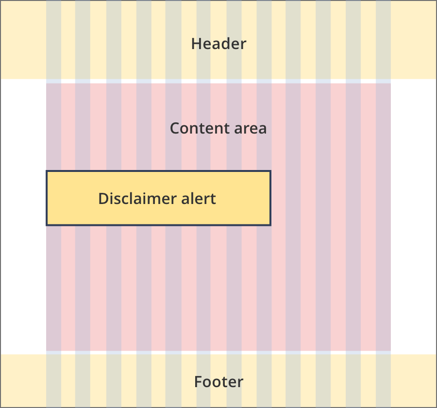
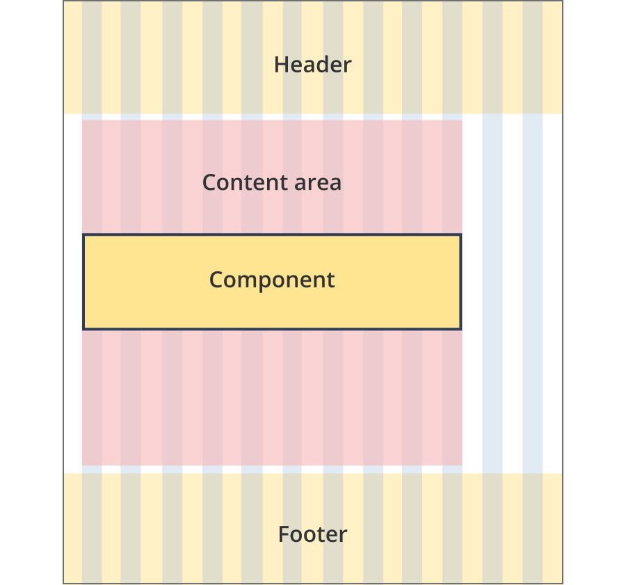
The content area is 12 grid-columns wide.
Disclaimer alerts span 8 grid-columns each.
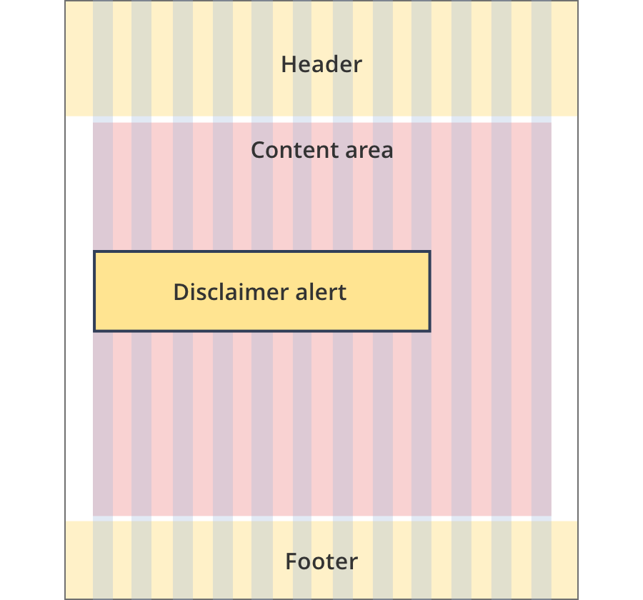
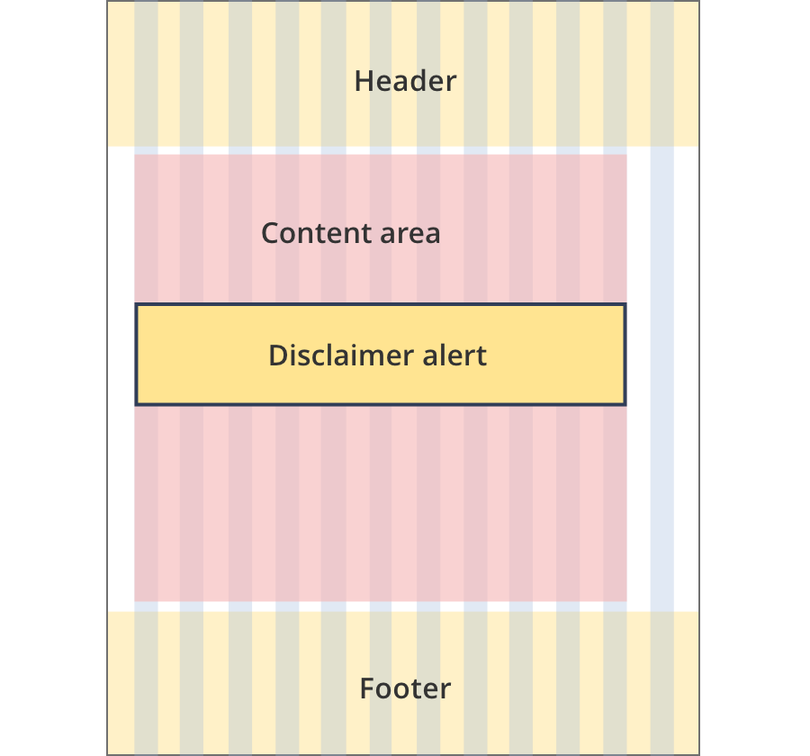
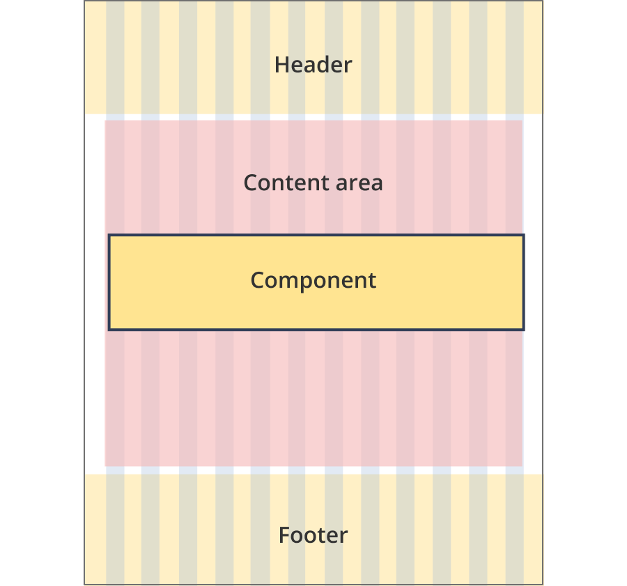
The content area is 12 grid-columns wide.
Disclaimer alerts span 9 grid-columns each.
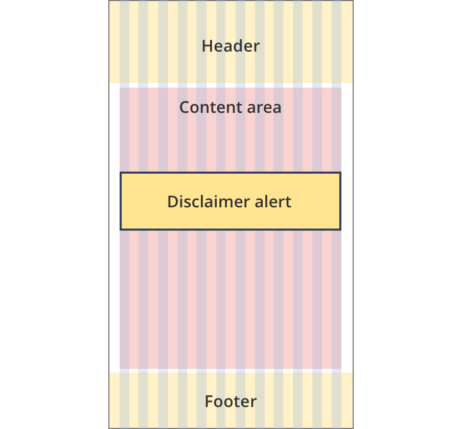
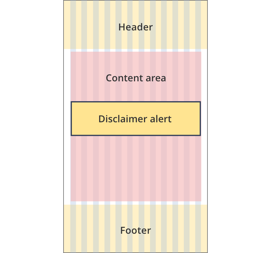
The content area is 12 grid-columns wide.
Disclaimer alerts span 12 grid-columns each.
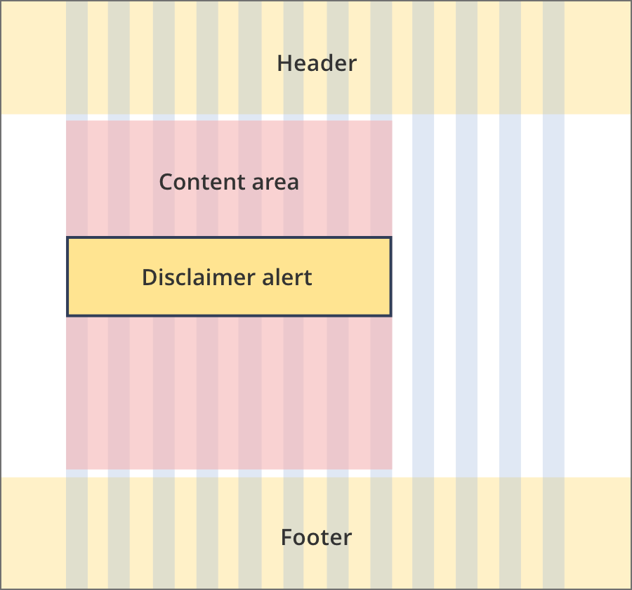
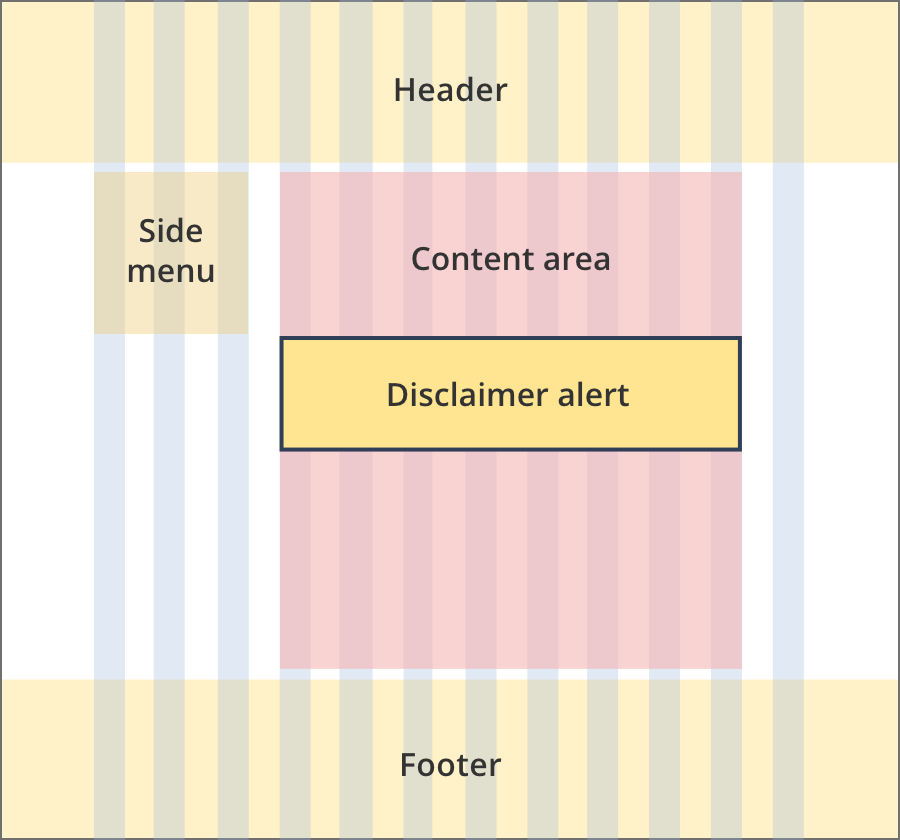
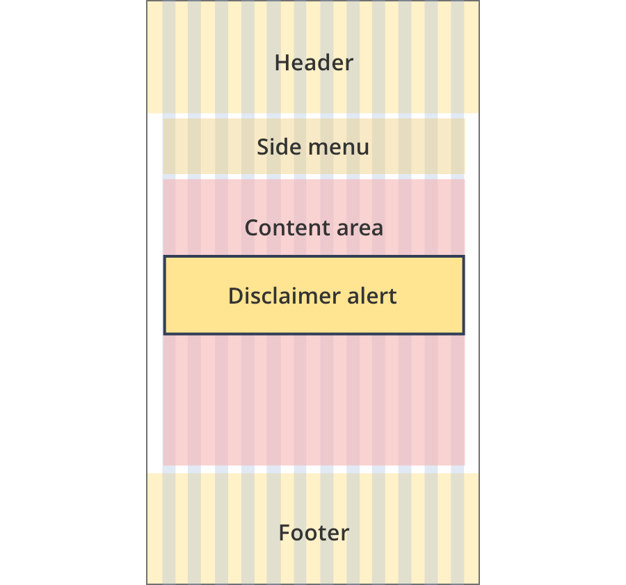
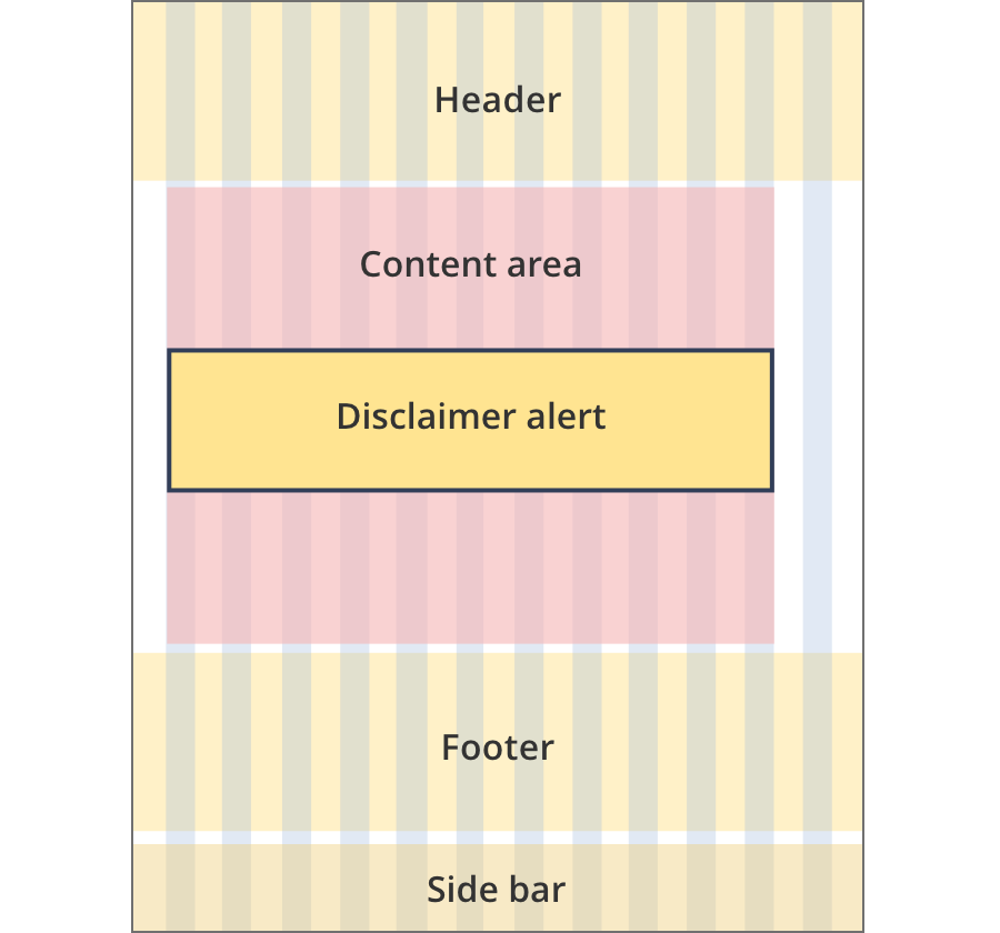
The content area is 8 grid-columns wide.
Disclaimer alerts span the full width of the content area.
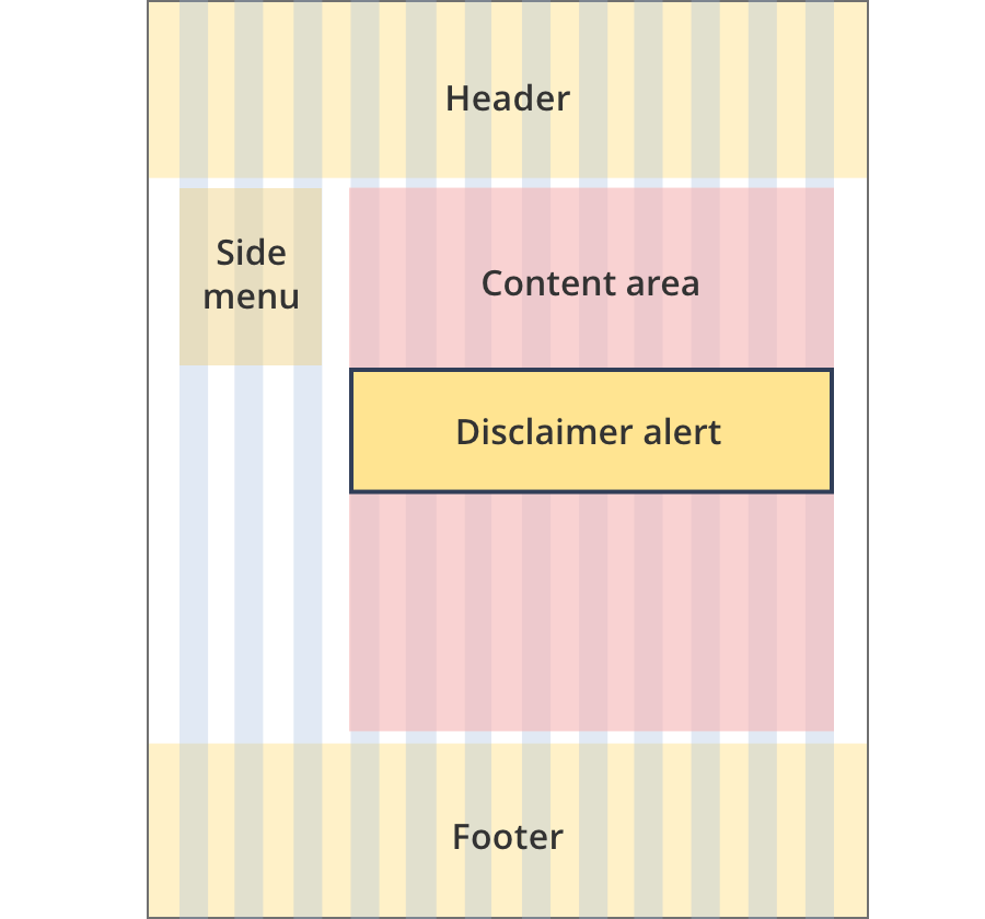
The content area is 9 grid-columns wide.
Disclaimer alerts span the full width of the content area.
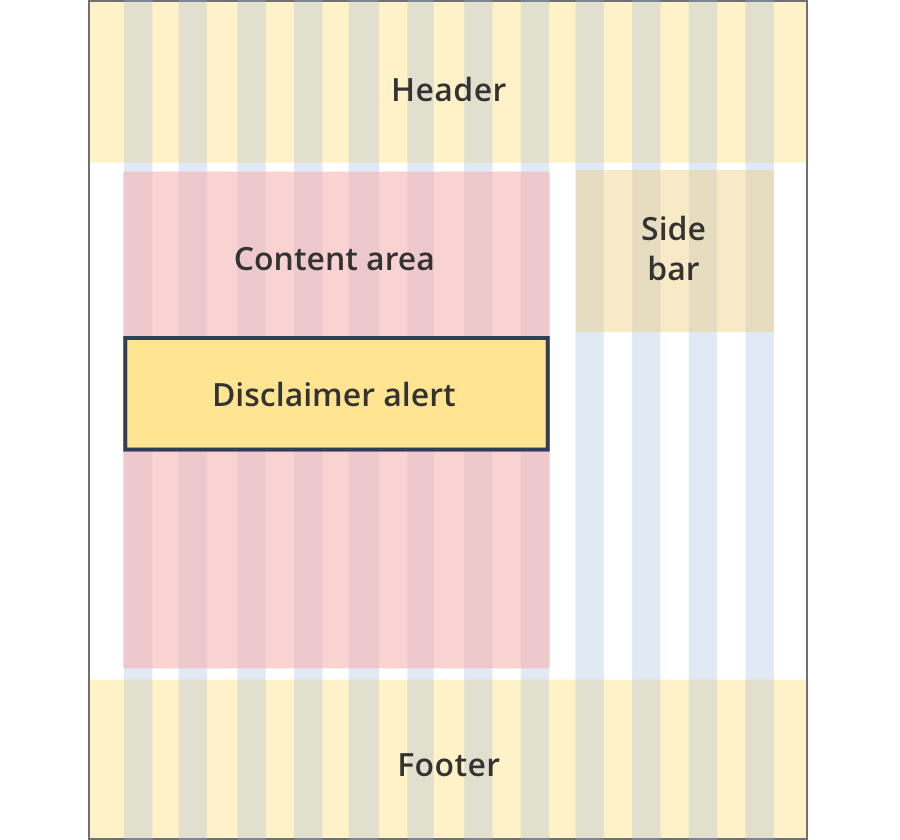
The content area is 11 grid-columns wide.
Disclaimer alerts span the full width of the content area.
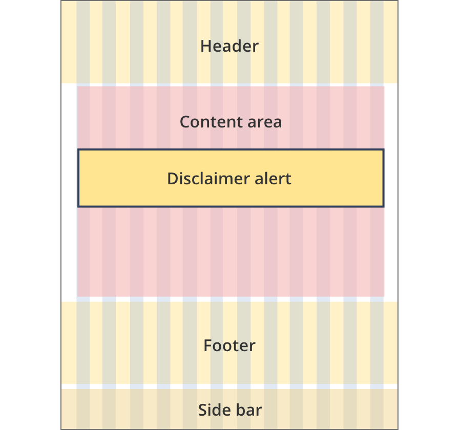
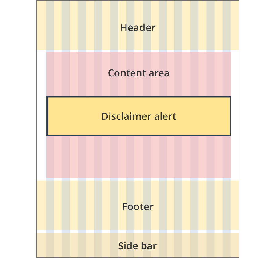
The content area is 12 grid-columns wide.
Disclaimer alerts span the full width of the content area.
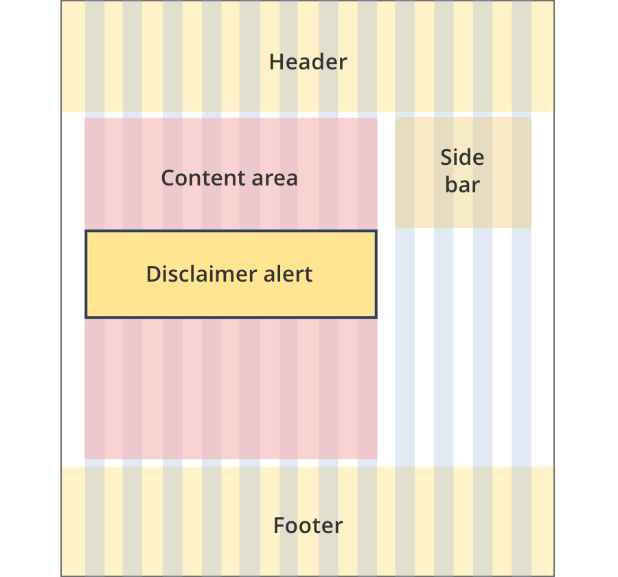
The content area is 9 grid-columns wide.
Disclaimer alerts span the full width of the content area.
The content area is 10 grid-columns wide.
Disclaimer alerts span the full width of the content area.
The content area is 12 grid-columns wide.
Disclaimer alerts span the full width of the content area.
The content area is 8 grid-columns wide.
Disclaimer alerts span the full width of the content area.
The content area is 9 grid-columns wide.
Disclaimer alerts span the full width of the content area.
The content area is 12 grid-columns wide.
Disclaimer alerts span the full width of the content area.
The content area is 8 grid-columns wide.
Disclaimer alerts span the full width of the content area.
The content area is 12 grid-columns wide.
Disclaimer alerts span the full width of the content area.
The content area is 8 grid-columns wide.
Disclaimers span the full width of the content area.
The content area is 11 grid-columns wide.
Disclaimers span the full width of the content area.
The content area is 12 grid-columns wide.
Disclaimers span the full width of the content area.
Guidelines for use
Purpose:
The disclaimer alert provides information that the user may want to know without highlighting it on the page. The information is often a warning that is legal in nature.
When to use this component:
Used to provide information the user may want to know, or that the department needs to disclose. Examples are content disclaimers or legal disclaimers.
The disclaimer alert should not be used for important information the user needs to know. Use the call out box or information notification instead.
Version history
8 August, 2023
- Added an additional layout (the Two column - tool page alternate layout).