Design
business.gov.au branding
No branding
Breakpoints:
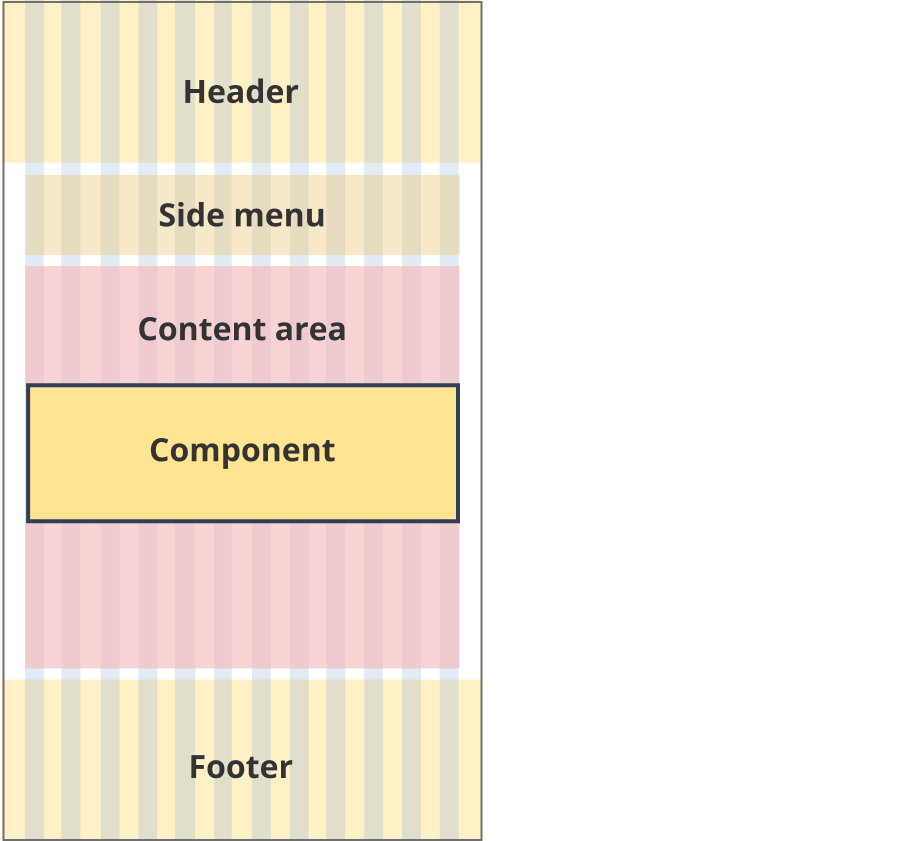
Currently displaying the mobile design.
To see designs for other breakpoints please view this page on a larger screen.
Coloured background sections
Breakpoints:
Currently displaying the mobile design.
To see designs for other breakpoints please view this page on a larger screen.
Apply your brand specific colours, borders and icons to the base support links shown below.
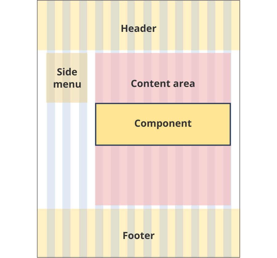
Layouts
Easy read pathway links can be used on the Single column - navigation page, Single column - information page and Two column - information page layouts.
Layout:
The content area is 12 grid-columns wide.
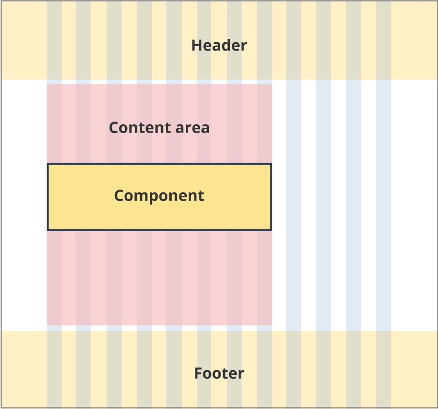
Easy read pathway links span 8 grid-columns each.
The content area is 12 grid-columns wide.
Easy read pathway links span 9 grid-columns each.
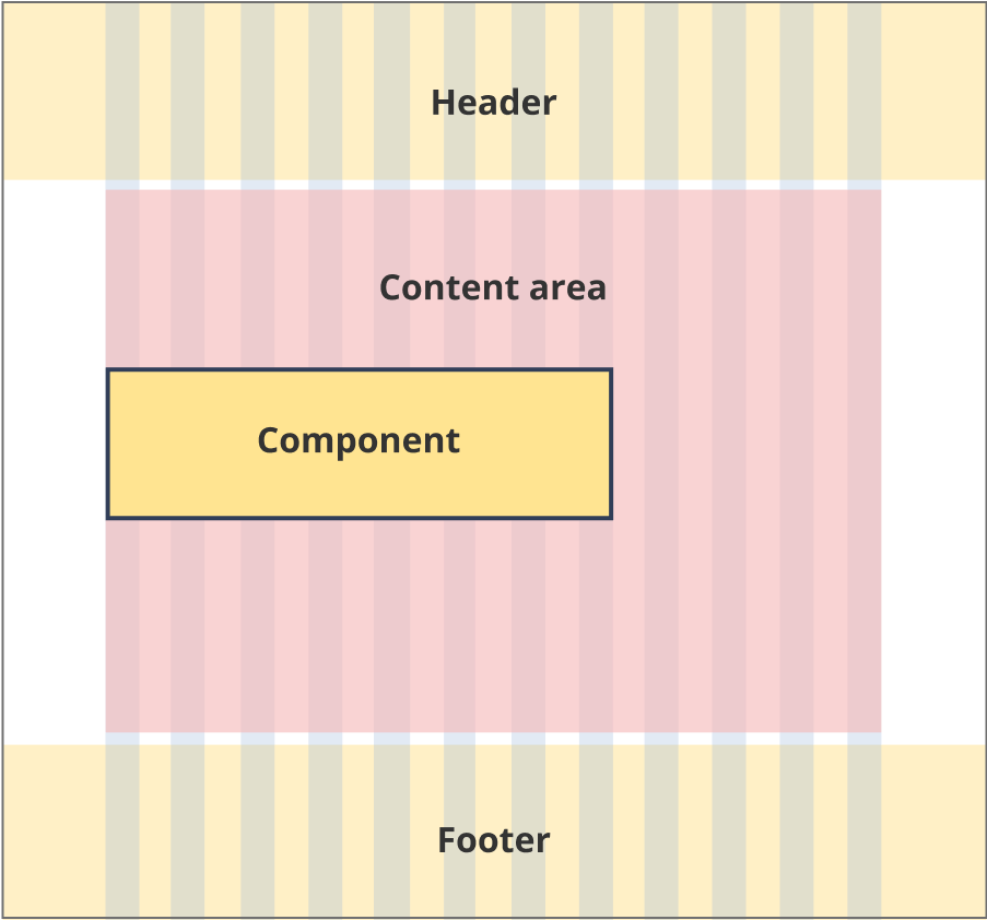
The content area is 12 grid-columns wide.
Easy read pathway links span 12 grid-columns each.
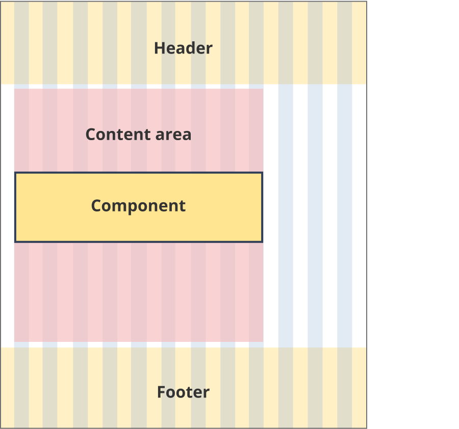
The content area is 8 grid-columns wide.
Easy read pathway links span the full width of the content area.
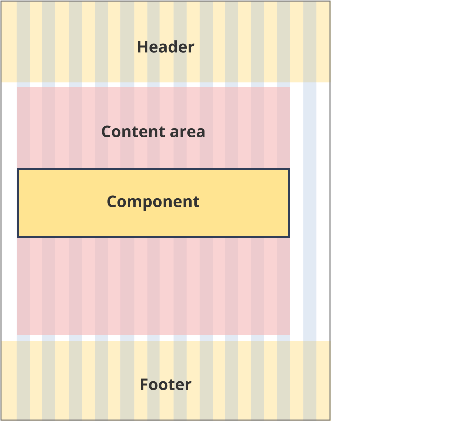
The content area is 9 grid-columns wide.
Easy read pathway links span the full width of the content area.
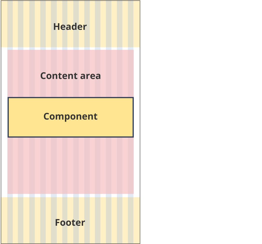
The content area is 11 grid-columns wide.
Easy read pathway links span the full width of the content area.
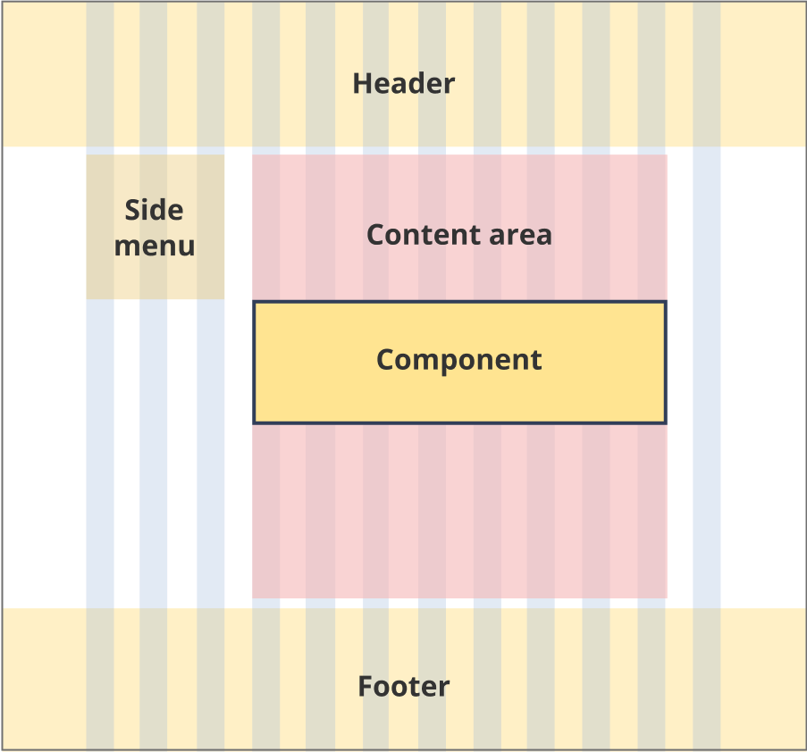
The content area is 12 grid-columns wide.
Easy read pathway links span the full width of the content area.
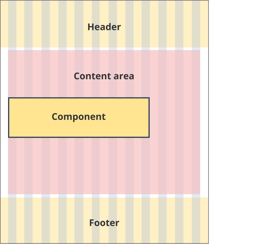
The content area is 8 grid-columns wide.
Easy read pathway links span the full width of the content area.
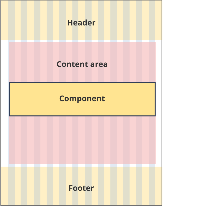
The content area is 9 grid-columns wide.
Easy read pathway links span the full width of the content area.
The content area is 12 grid-columns wide.
Easy read pathway links span the full width of the content area.
Guidelines for use
Purpose:
Provide a styled link to easy read content.
When to use this component:
- Use on information pages to link to related easy read content.
Version history
12 February, 2024
- Updated the mobile breakpoint from 576px to 768px.
4 December, 2023
- Added easy read pathway link to the style guide.