Design
business.gov.au branding
No branding
Breakpoints:
Currently displaying the mobile design.
To see designs for other breakpoints please view this page on a larger screen.
Layout: Single column - navigation page
Tip - Assess your business needs
Before you start, it’s a good idea to assess your business needs so you can choose the right person for your business. Think about:
- the tasks you need the employee to do
- any skills and qualifications they’ll require
- how busy the job will be
Announcement title
Lorem ipsum dolor sit amet, consectetur adipiscing elit. Sed sed dolor sed ipsum dapibus viverra at in enim. Quisque quam sapien, molestie a nibh at, commodo tincidunt urna. Aliquam erat volutpat.
Layouts: Single column - 2/3 width layout and two column layouts
Tip - Assess your business needs
Before you start, it’s a good idea to assess your business needs so you can choose the right person for your business. Think about:
- the tasks you need the employee to do
- any skills and qualifications they’ll require
- how busy the job will be
Announcement title
Lorem ipsum dolor sit amet, consectetur adipiscing elit. Sed sed dolor sed ipsum dapibus viverra at in enim. Quisque quam sapien, molestie a nibh at, commodo tincidunt urna. Aliquam erat volutpat.
Colour variations
Teal
Purple
Orange
Coloured background sections - colour variations
Teal
Purple
Orange
Approved icons
Breakpoints:
Currently displaying the mobile design.
To see designs for other breakpoints please view this page on a larger screen.
Apply your brand specific colours, borders and icons to the base feature boxes shown below.
Layout: Single column - navigation page
Tip - Assess your business needs
Before you start, it’s a good idea to assess your business needs so you can choose the right person for your business. Think about:
- the tasks you need the employee to do
- any skills and qualifications they’ll require
- how busy the job will be
Layouts: Single column - 2/3 width layout and two column layouts
Tip - Assess your business needs
Before you start, it’s a good idea to assess your business needs so you can choose the right person for your business. Think about:
- the tasks you need the employee to do
- any skills and qualifications they’ll require
- how busy the job will be
Layouts
Call out links can be used on all page layouts except the Two column - filter page layout.
Layout:
All breakpoints
The content area is 12 grid-columns wide.
Feature boxes span the full width of the content area.
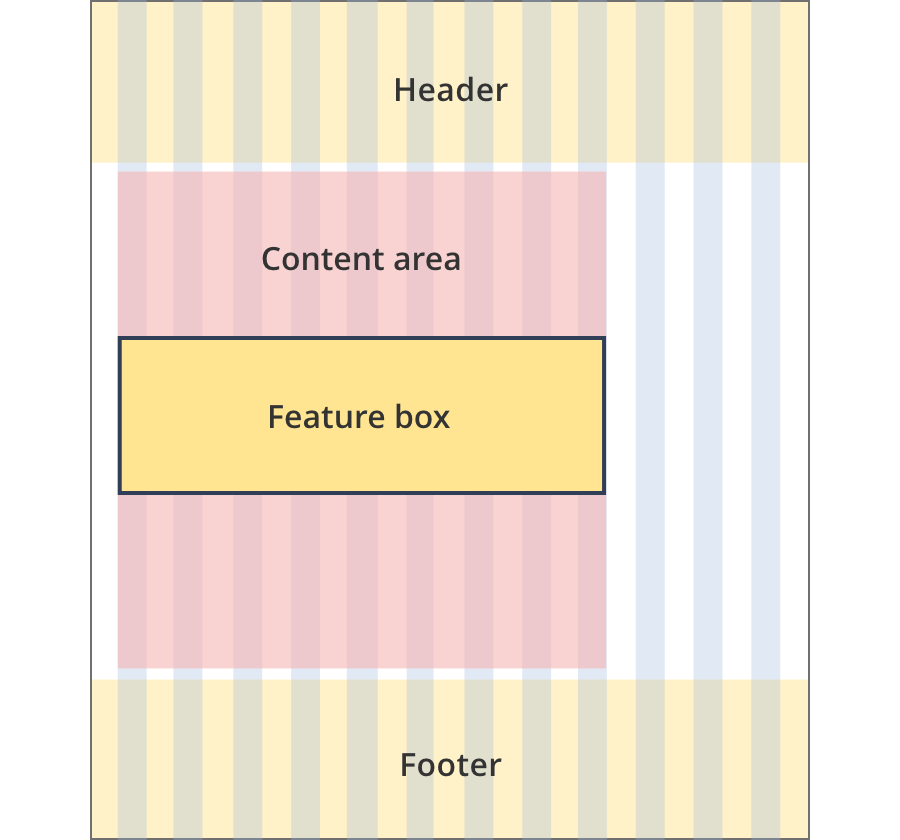
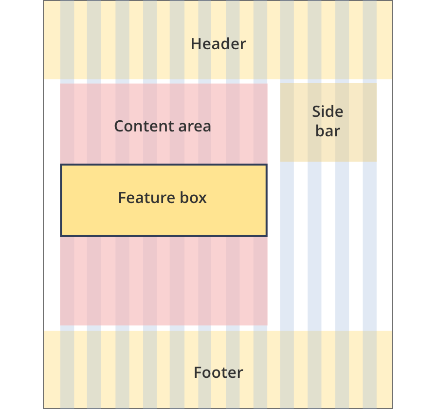
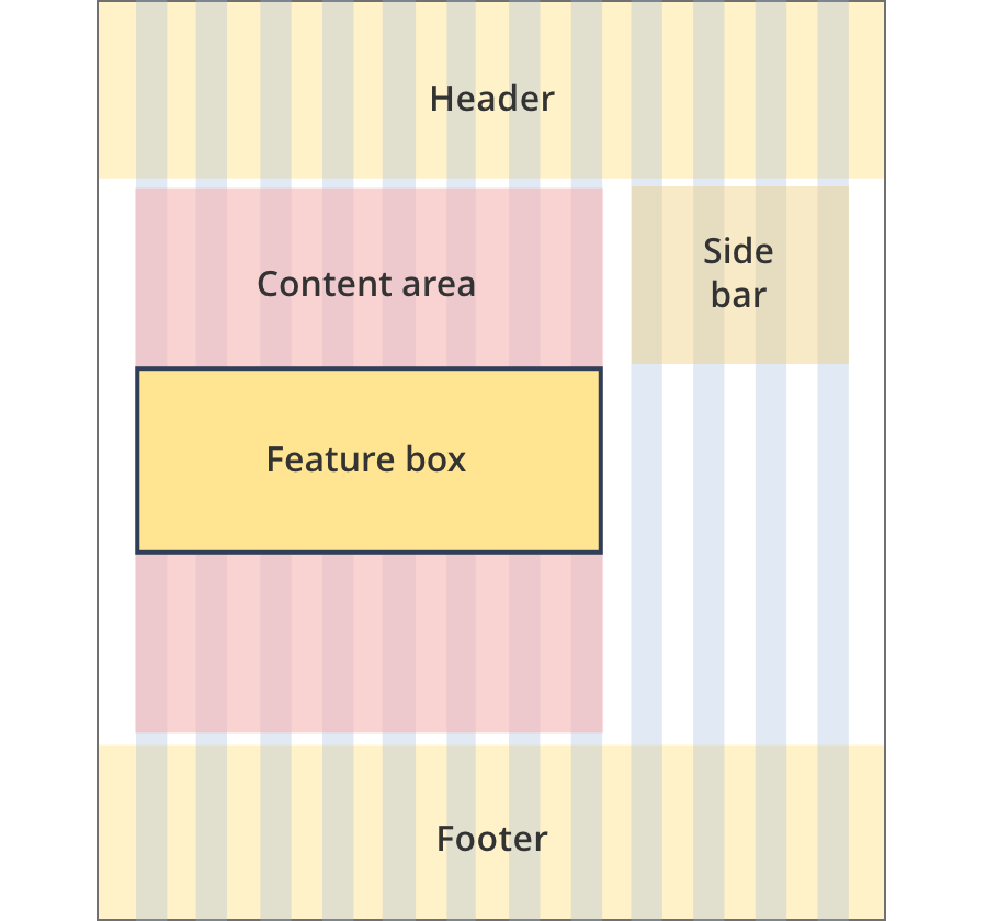
The content area is 8 grid-columns wide.
Feature boxes span the full width of the content area.
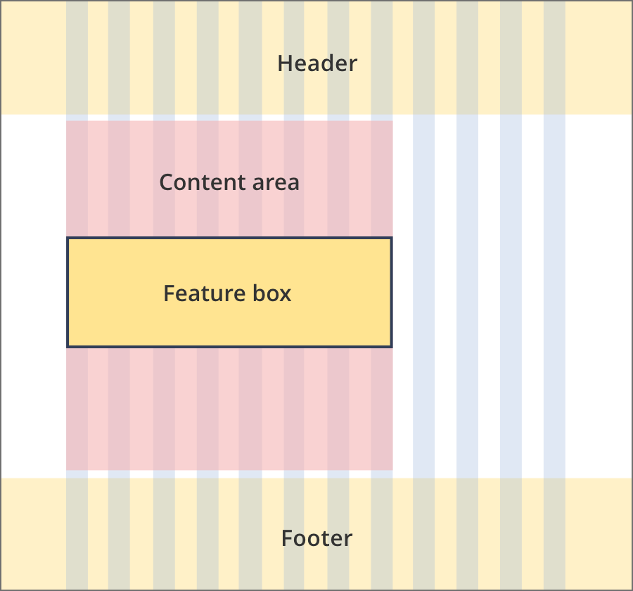
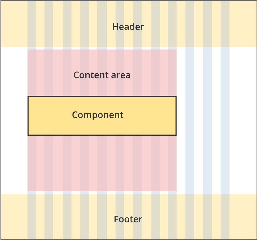
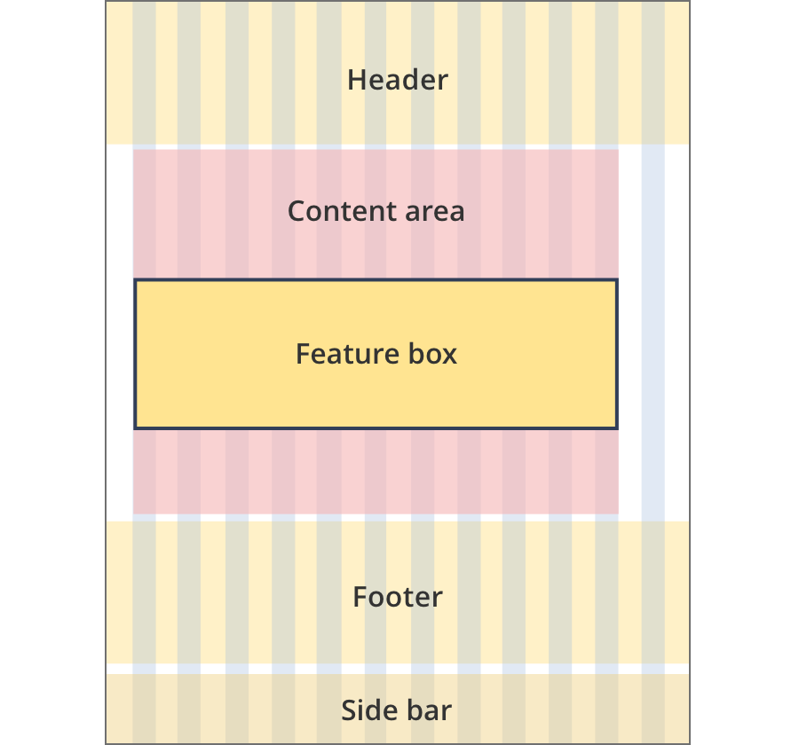
The content area is 9 grid-columns wide.
Feature boxes span the full width of the content area.
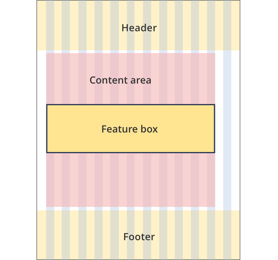
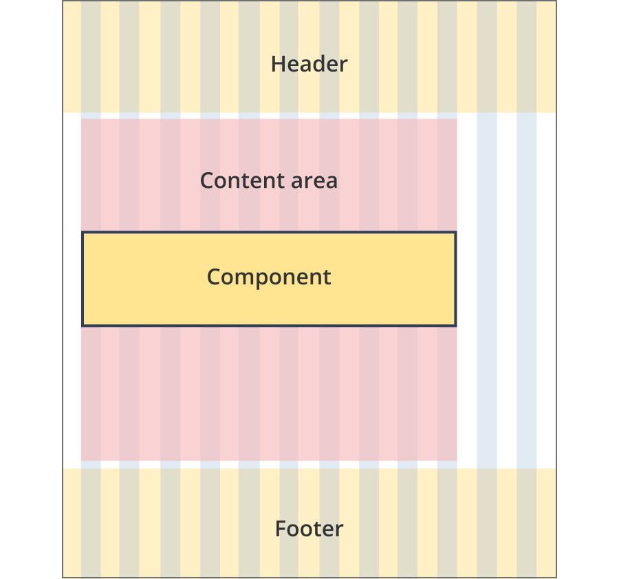
The content area is 11 grid-columns wide.
Feature boxes span the full width of the content area.
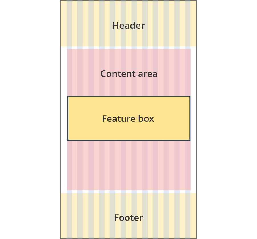
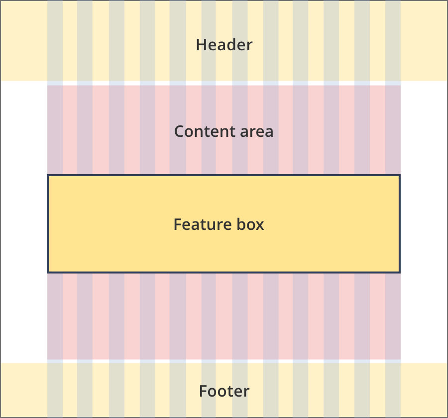
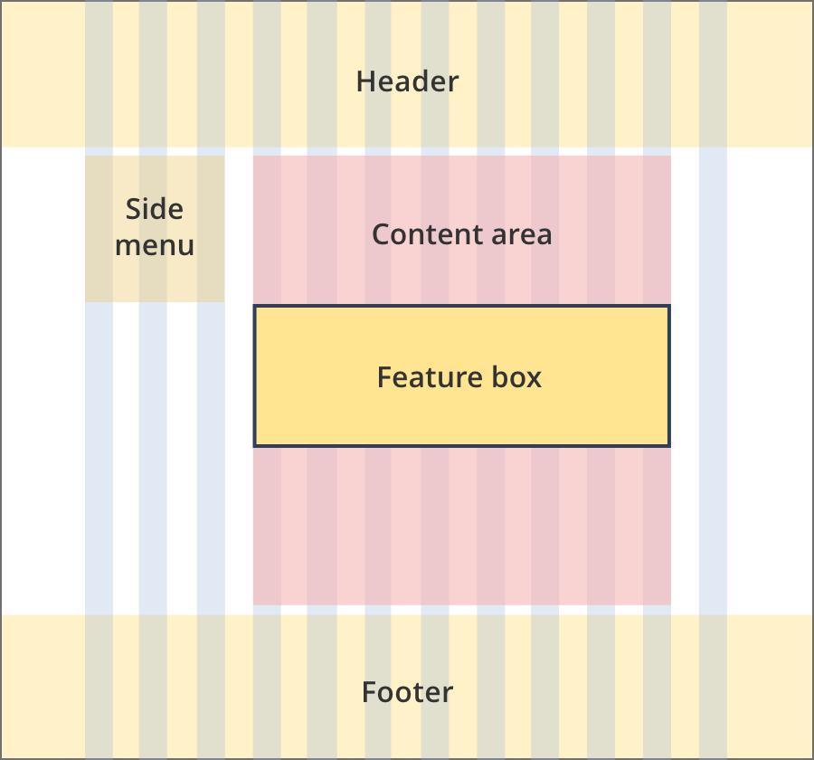
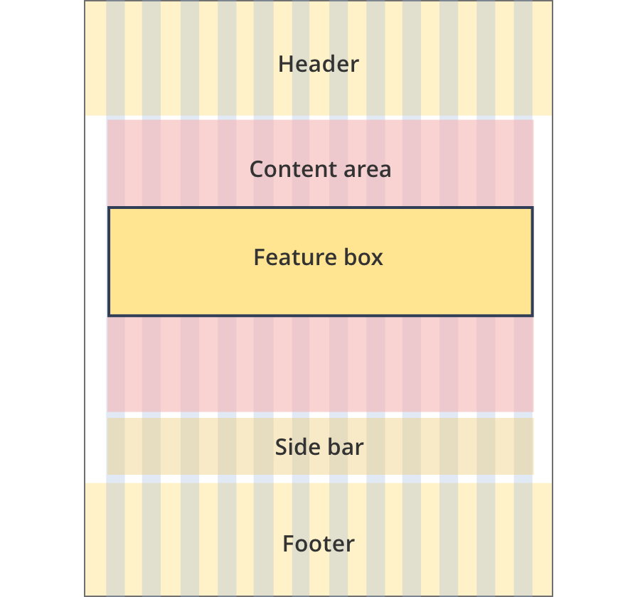
The content area is 12 grid-columns wide.
Feature boxes span the full width of the content area.
The content area is 9 grid-columns wide.
Feature box components span the full width of the content area.
The content area is 10 grid-columns wide.
Feature box components span the full width of the content area.
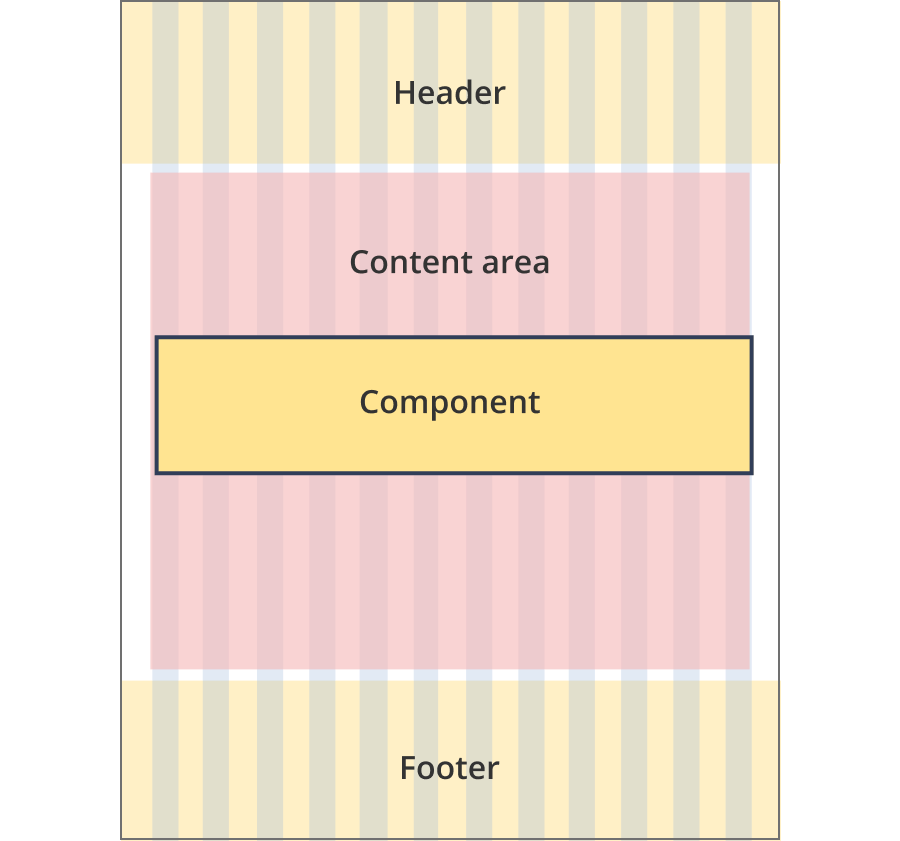
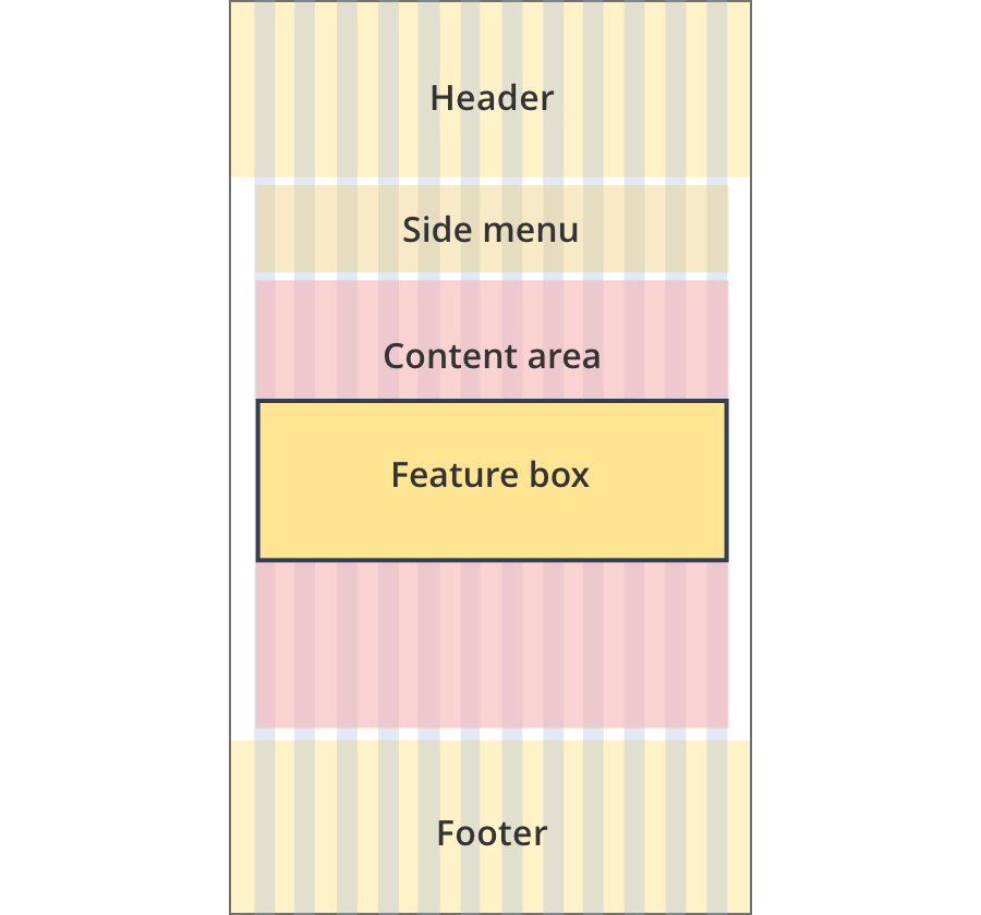
The content area is 12 grid-columns wide.
Feature box components span the full width of the content area.
The content area is 8 grid-columns wide.
Feature boxes span the full width of the content area.
The content area is 9 grid-columns wide.
Feature boxes span the full width of the content area.
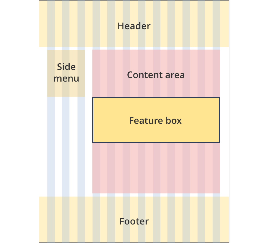
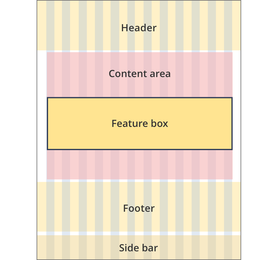
The content area is 12 grid-columns wide.
Feature boxes span the full width of the content area.
The content area is 12 grid-columns wide.
Feature boxes span the full width of the content area.
The content area is 8 grid-columns wide.
Feature boxes span the full width of the content area.
The content area is 11 grid-columns wide.
Feature boxes span the full width of the content area.
The content area is 12 grid-columns wide.
Feature boxes span the full width of the content area.
Guidelines for use
Purpose:
Feature boxes highlight certain information in the context of a page.
When to use this component:
Used to highlight examples or latest news that may be of interest to the user. Typical uses can include:
- Announcements
- Latest news
- Examples and case studies
- Tips
Version history
18 October, 2024
Added an additional icon for announcements.
8 August, 2023
Added an additional layout (the Two column - tool page alternate layout).