Design
business.gov.au branding
No branding
Breakpoints:
Currently displaying the mobile design.
To see designs for other breakpoints please view this page on a larger screen.
Breakpoints:
Currently displaying the mobile design.
To see designs for other breakpoints please view this page on a larger screen.
Apply your brand specific colours and borders to the base accordion shown below.
Layouts
Accordions can be used on the Single column - information page layout and the Two column - information page layout .
Layout:
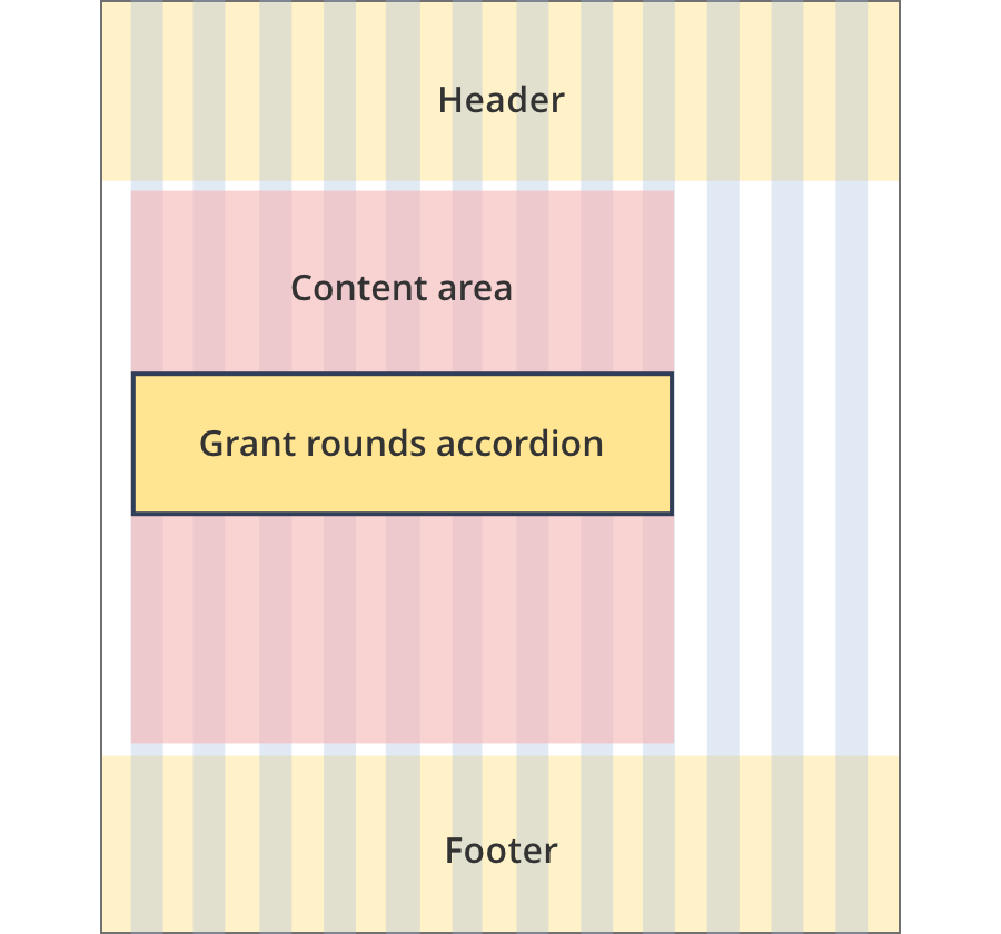
The content area is 8 grid-columns wide.
The grant rounds accordion spans the full width of the content area.
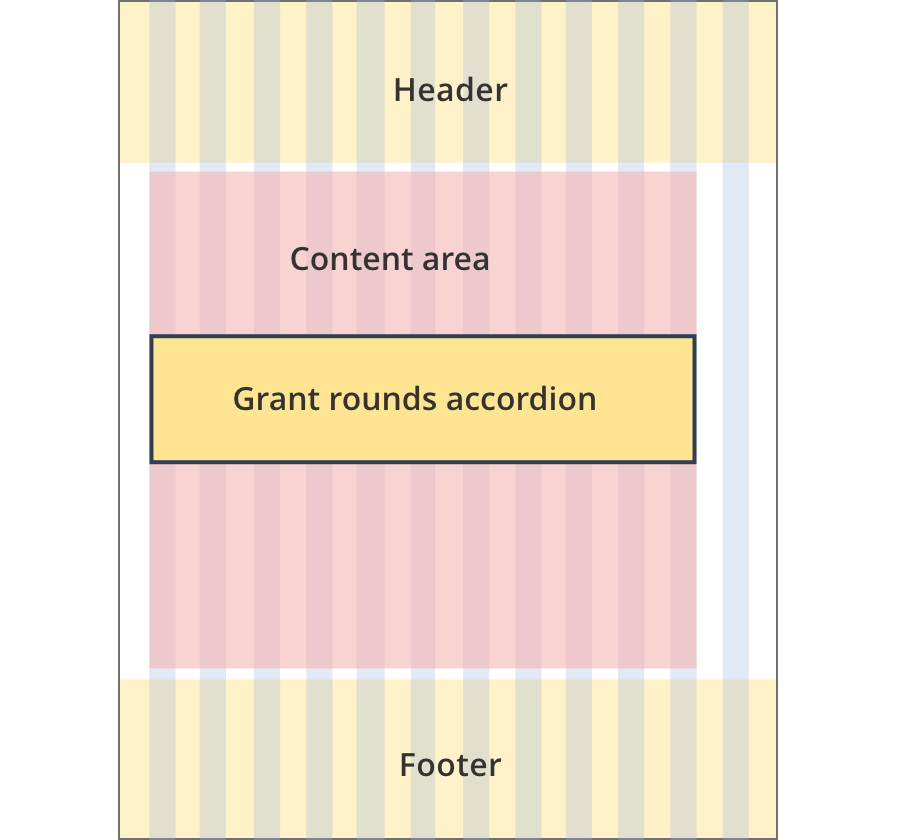
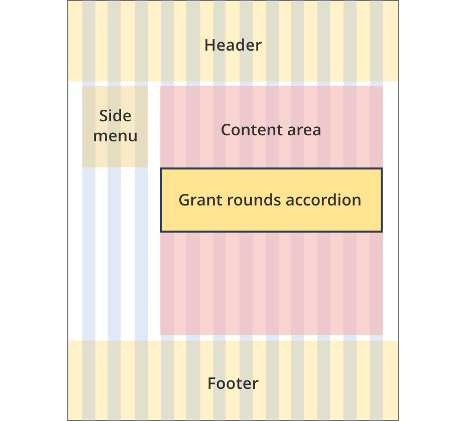
The content area is 9 grid-columns wide.
The grant rounds accordion spans the full width of the content area.
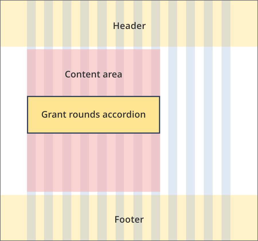
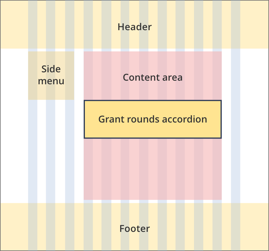
The content area is 11 grid-columns wide.
The grant rounds accordion spans the full width of the content area.
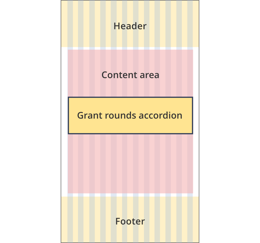
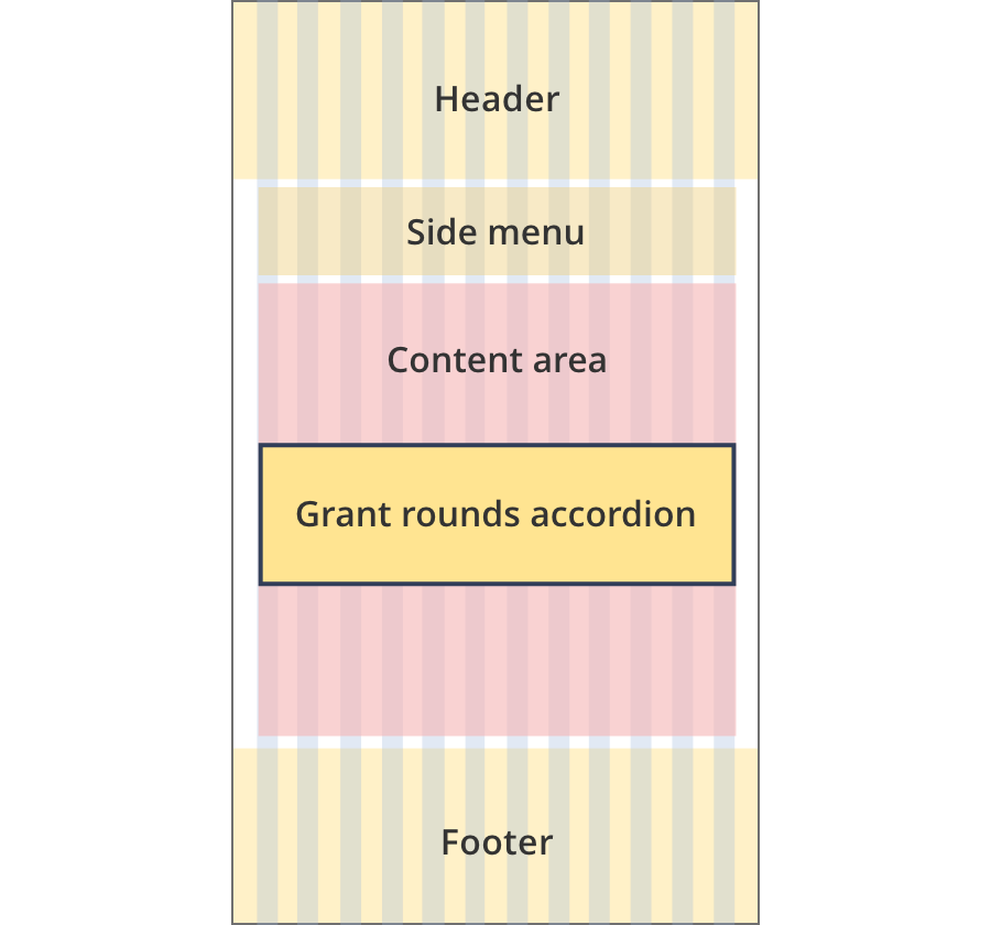
The content area is 12 grid-columns wide.
The grant rounds accordion spans the full width of the content area.
The content area is 8 grid-columns wide.
The grant rounds accordion spans the full width of the content area.
The content area is 9 grid-columns wide.
The grant rounds accordion spans the full width of the content area.
The content area is 12 grid-columns wide.
The grant rounds accordion spans the full width of the content area.
Guidelines for use
Purpose:
The grant rounds accordion provides links to a series of connected grant opportunities.
When to use this component:
- Used on internal and external grant pages when there are multiple rounds of the grant / opportunity.
Content rules:
- The grant rounds accordion should be used as a single accordion item with all related rounds listed within that item.
- The 'open all' link should not be used as the accordion should always be a single item.
Version history
22 August, 2023
- Updated the padding and corner radius on grant status tags. Corner radius is 4px. Padding is 2px above and below and 8px on the left and right. Padding measurements include border widths when tags have a visible border.