Design
business.gov.au branding
No branding
Breakpoints:
Currently displaying the mobile design.
To see designs for other breakpoints please view this page on a larger screen.
Get a checklist version of this guide as a Word document.
Breakpoints:
Currently displaying the mobile design.
To see designs for other breakpoints please view this page on a larger screen.
Apply your brand specific colours, borders and button to the base guide checklist call to action shown below.
Get a checklist version of this guide as a Word document.
Layouts
The guide checklist call to action is used on the Two column - guide page layout.
Layout: Two column - guide page
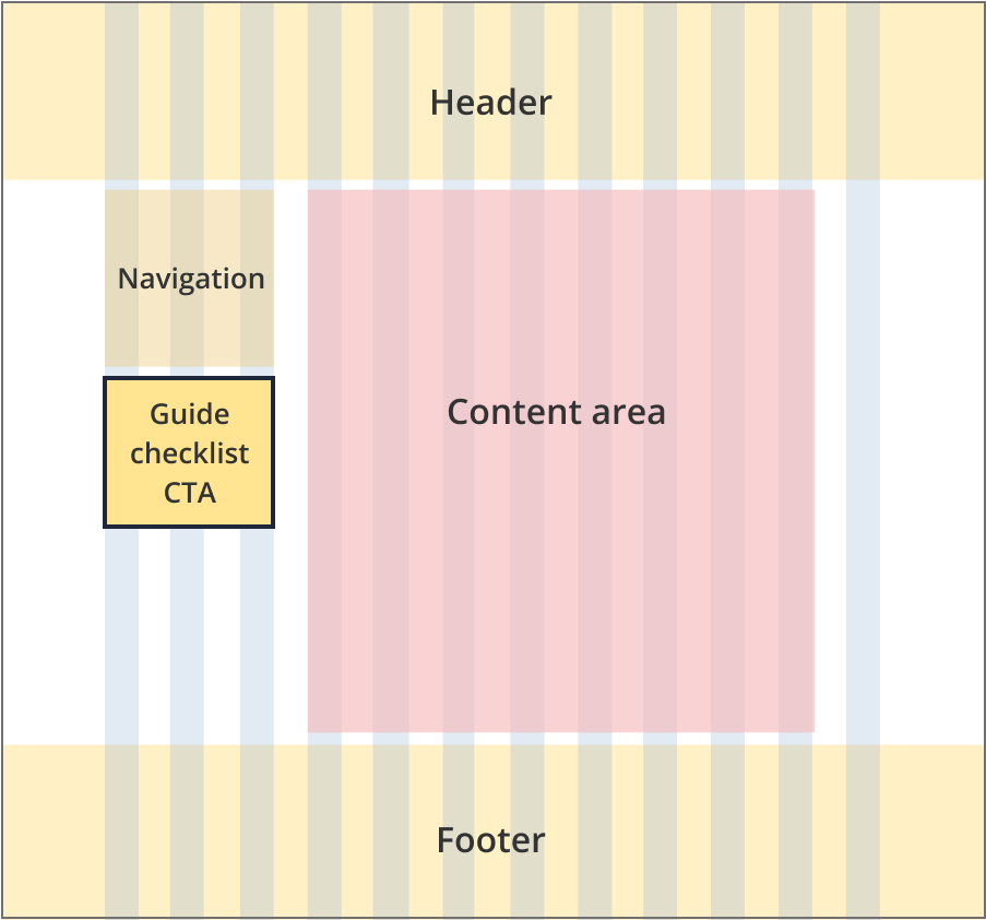
The guide checklist call to action sits to the left of the content (underneath the guide navigation) and is 3 grid-columns wide.
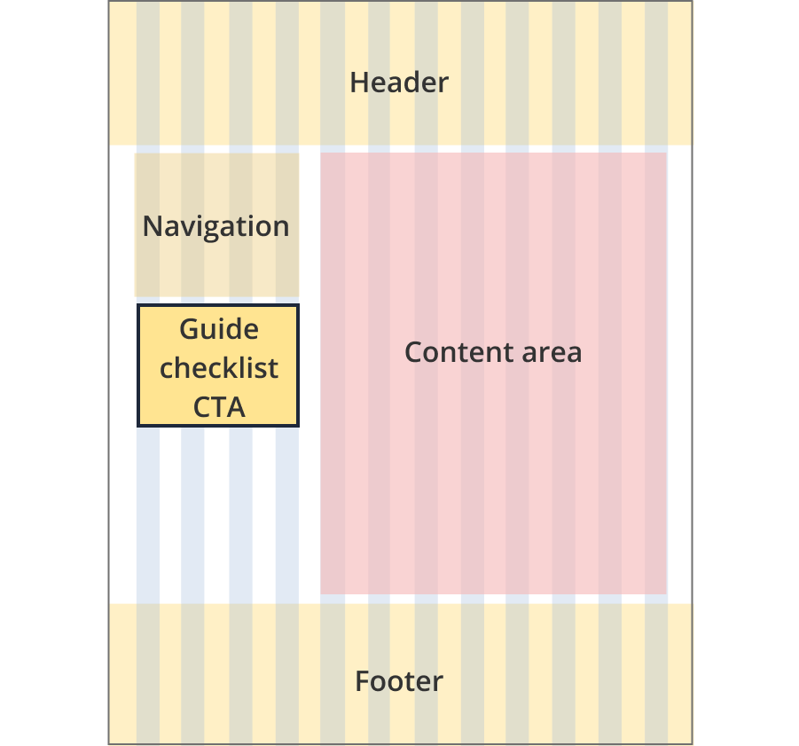
The guide checklist call to action sits to the left of the content (underneath the guide navigation) and is 4 grid-columns wide.
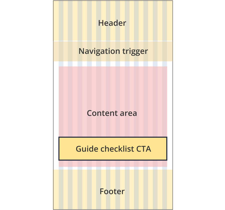
The guide checklist call to action sits at the bottom of the page (underneath the guide section).
Guidelines for use
Purpose:
The Guide checklist CTA component is used to provide the user with access to a checklist version of business.gov.au guide content.
Users can choose to email or download the checklist.
When to use this component:
- Used exclusively on business.gov.au guide pages.
Version history
25 June, 2024
- Created the guide checklist call to action page.