Design
business.gov.au branding
No branding
Breakpoints:
Currently displaying the mobile design.
To see designs for other breakpoints please view this page on a larger screen.
Step 1 of 6: Make key decisions
Breakpoints:
Currently displaying the mobile design.
To see designs for other breakpoints please view this page on a larger screen.
Apply your brand specific colours, borders and button styles to the base guide vertical navigation shown below.
Step 1 of 6: Make key decisions
Layouts
Guide vertical navigation is used on the Two column - guide page layout.
Layout: Two column - guide page
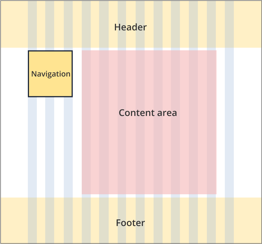
The guide navigation sits to the left of the content and is 3 grid-columns wide.
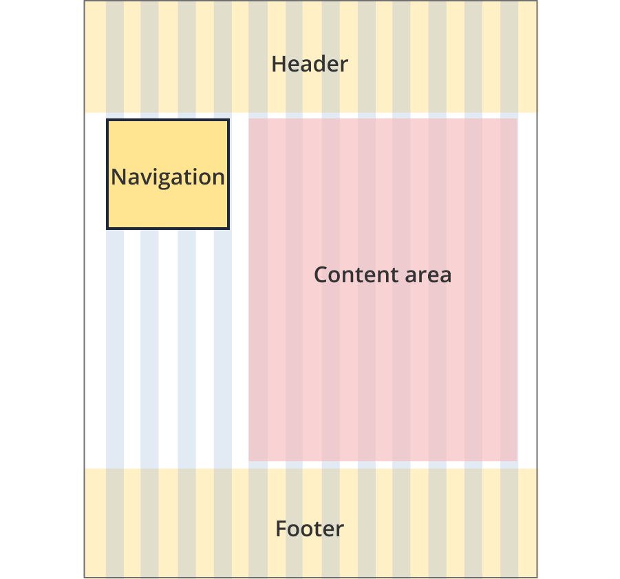
The guide navigation sits to the left of the content and is 4 grid-columns wide.
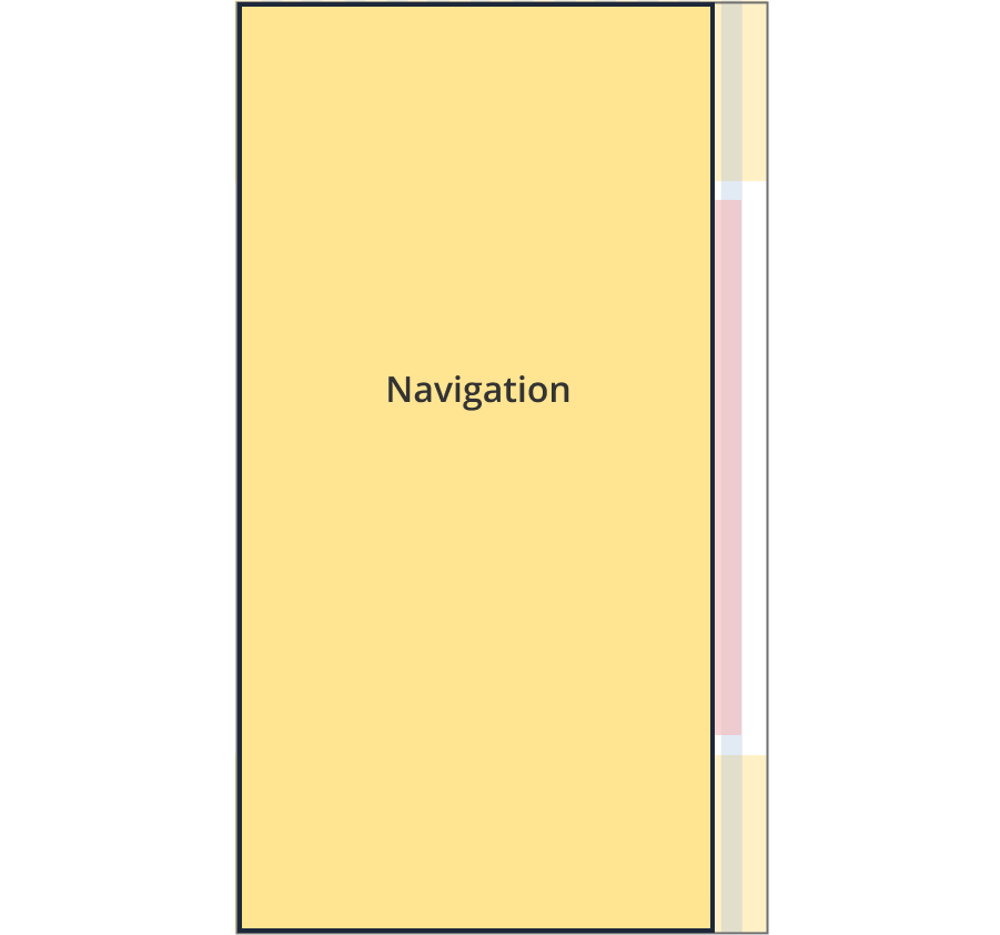
The guide navigation is not visible on screen. It is accessed through a trigger button located above the page content. The trigger has sticky behaviour and is fixed to the top of the screen on scroll.
When triggered the navigation slides in from the left filling 90% of the screen width.
Guidelines for use
Purpose:
Guide vertical navigation is used to guide users through a series of connected pages or steps. It displays where the user is up to and provides links to other connected pages. It provides a high level overview of all associated information through links to content presented in a series of accordions.
When to use this component:
- Used in the business.gov.au guide pattern
Version history
24 June, 2024
- Created the guide vertical navigation component page.