Design
Breakpoints:
Currently displaying the mobile design.
To see designs for other breakpoints please view this page on a larger screen.

Layouts
The home banner is used in the Single column - navigation page layout.
Layout: Single column - navigation page
All breakpoints
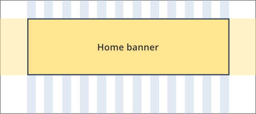
The home banner is 12 grid-columns wide.
The blue background behind home banner components stretches full width of the screen.
Guidelines for use
The home banner consistents of a collection of components that are only used on the business.gov.au home page. They should not appear elsewhere on the site.
Home page feature image
The home page feature image consistents of a photo and short site description. It is a required component and must always appear on the home page.
Home page alert
The home page alert is an optional component that sits under the home page feature image. Only ONE alert should be used, there should never be multiple instances of the alert on the home page.
When to use the home page alert:
- The home page alert banner is used in level 3 emergency situations that may affect a large number of Australian businesses such as COVID-19 or natural disasters like floods or bushfires.
- The home page banner will not be used to communicate outages or performance issues, this will be triaged and managed through the global alert banner process.
Menu highlight buttons
The menu highlight buttons link to the top level category pages listed under 'business information' in the main menu. They are a required component for the business.gov.au home page.