Design
business.gov.au branding
No branding
All breakpoints
Image component with caption

Morbi sit amet nunc eget nisl eleifend viverra nec consequat nunc. Proin mauris quam, rhoncus feugiat euismod nec, imperdiet in lorem.
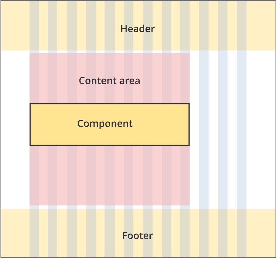
Image component without caption

All breakpoints
Apply your brand specific colours to the base image component shown below.

Morbi sit amet nunc eget nisl eleifend viverra nec consequat nunc. Proin mauris quam, rhoncus feugiat euismod nec, imperdiet in lorem.
Layouts
Images can be used on all page layouts except the Single column - navigation page layout and the Two column - filter page layout.
Layout:
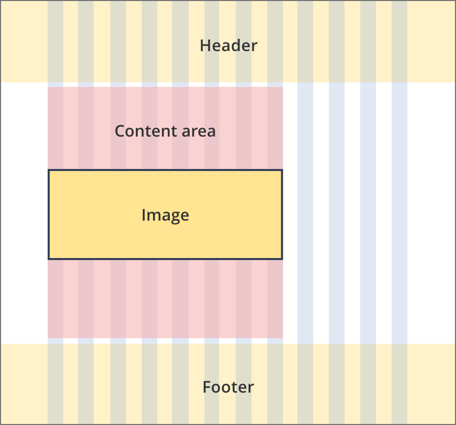
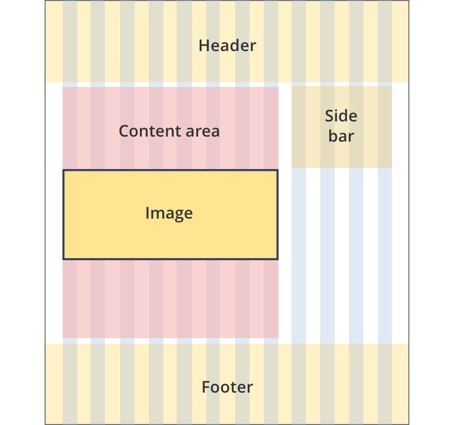
The content area is 8 grid-columns wide.
Images span the full width of the content area.
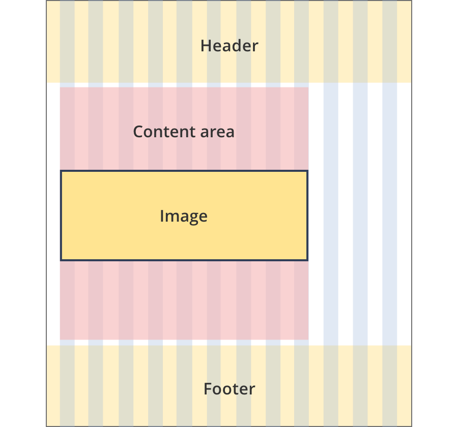
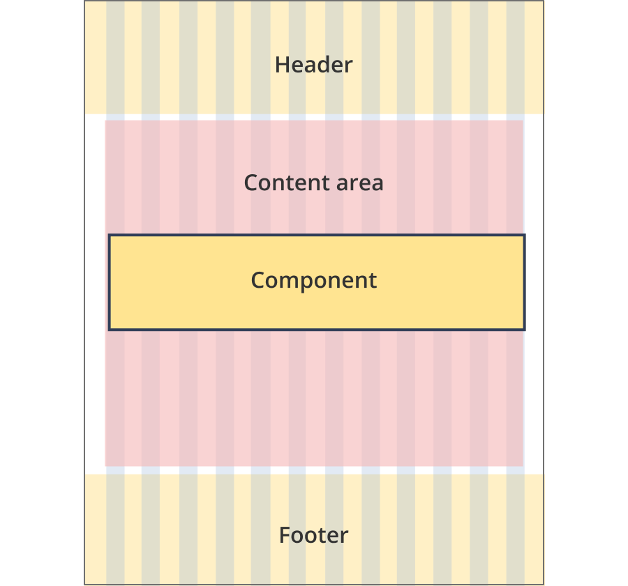
The content area is 9 grid-columns wide.
Images span the full width of the content area.
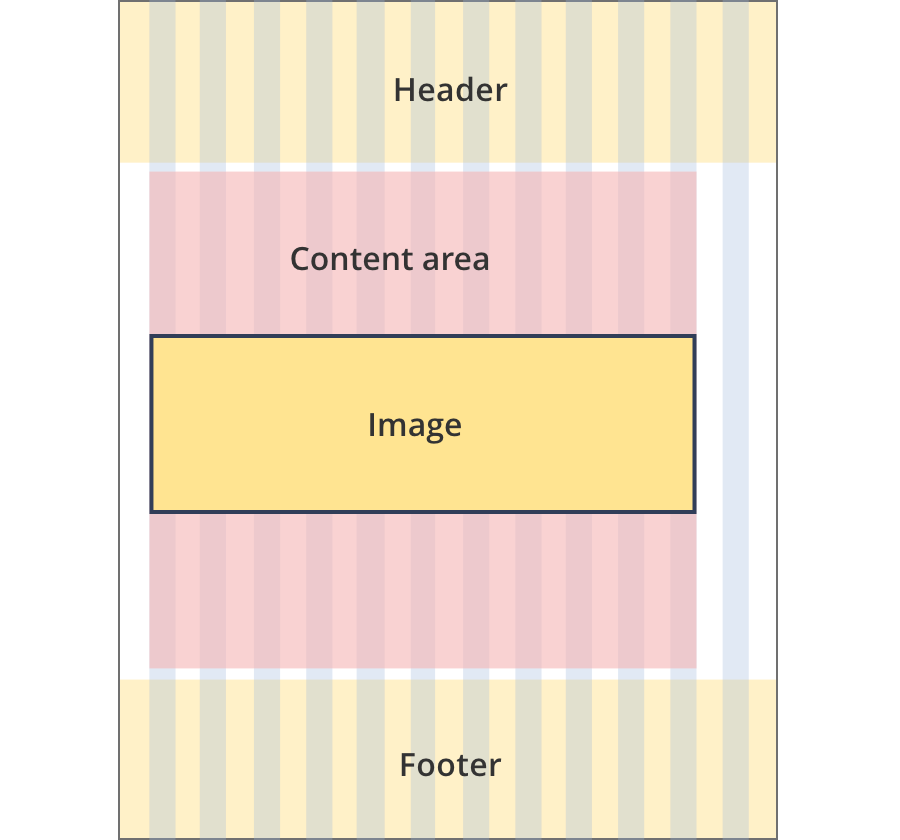
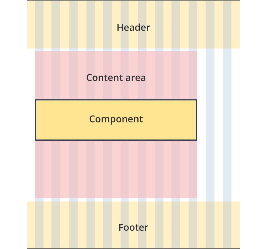
The content area is 11 grid-columns wide.
Images span the full width of the content area.
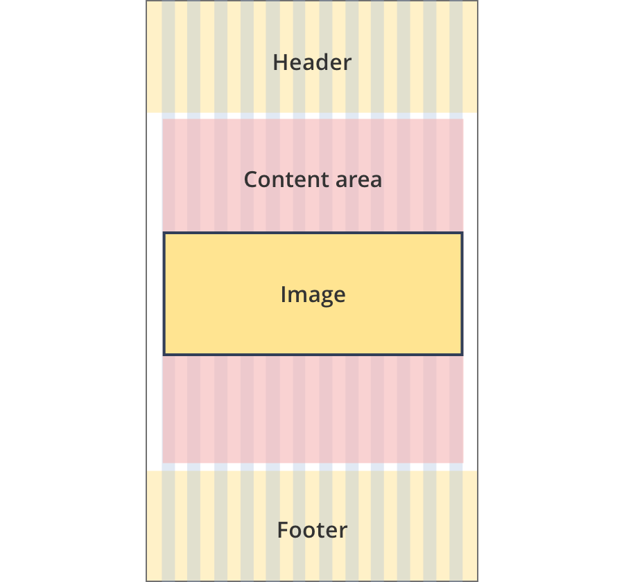
The content area is 12 grid-columns wide.
Images span the full width of the content area.
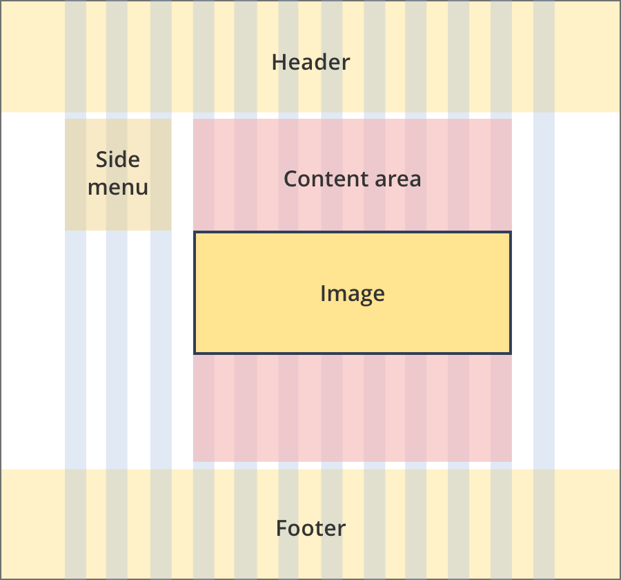
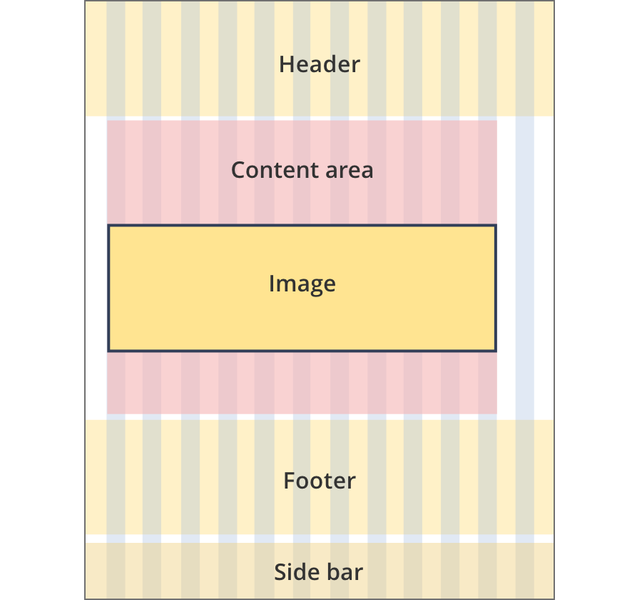
The content area is 8 grid-columns wide.
Images span the full width of the content area.
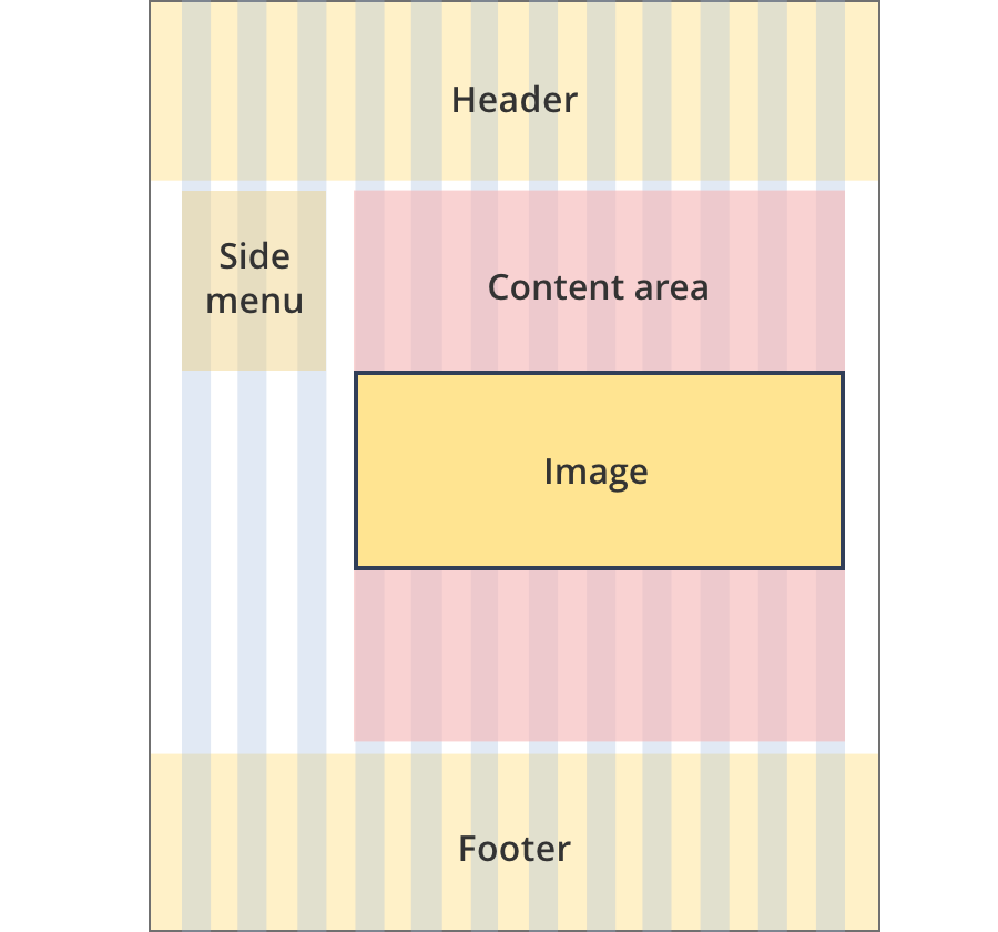
The content area is 9 grid-columns wide.
Images span the full width of the content area.
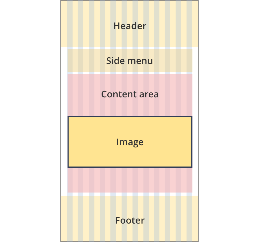
The content area is 12 grid-columns wide.
Images span the full width of the content area.
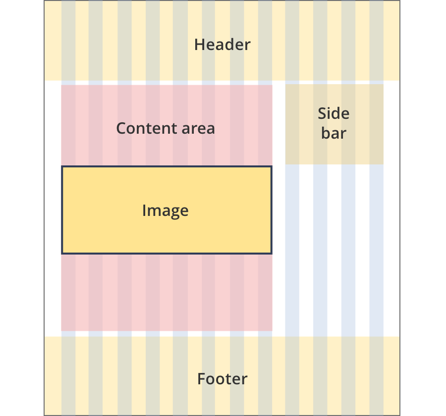
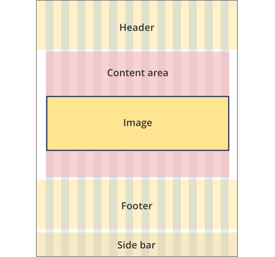
The content area is 9 grid-columns wide.
Image components span the full width of the content area.
The content area is 10 grid-columns wide.
Image components span the full width of the content area.
The content area is 12 grid-columns wide.
Image components span the full width of the content area.
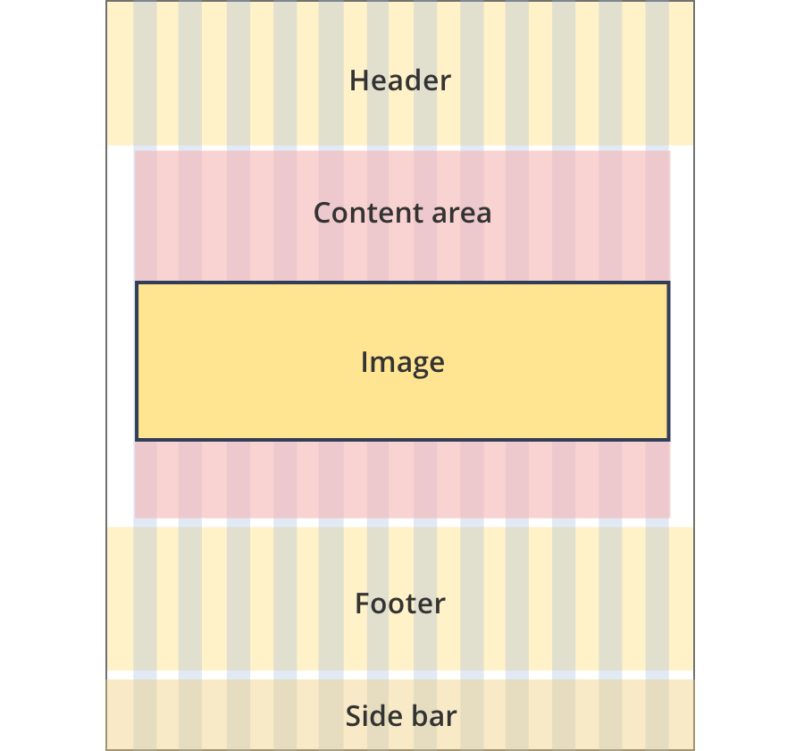
The content area is 8 grid-columns wide.
Images span the full width of the content area.
The content area is 12 grid-columns wide.
Images span the full width of the content area.
The content area is 8 grid-columns wide.
Images span the full width of the content area.
The content area is 11 grid-columns wide.
Images span the full width of the content area.
The content area is 12 grid-columns wide.
Images span the full width of the content area.
Guidelines for use
Purpose:
The image component displays a single image in a content page. This component includes a short optional caption below the image.
When to use this component:
- Image components are mostly used on news articles and customer story pages.
- Avoid unnecessary images, especially on high priority pages – use words rather than images for accessibility reasons.
Content rules:
- Don’t use captions for stock photos e.g. in news articles.
- Informative images should always have alt text in a content page.
- Decorative images, for example stock photos in news or resource articles, must have null (empty) alt text – don’t insert a space [alt=””].
Version history
8 August, 2023
- Added an additional layout (the Two column - tool page alternate layout).