Design
business.gov.au branding
No branding
Breakpoints:
Currently displaying the mobile design.
To see designs for other breakpoints please view this page on a larger screen.
- Balonne
- Flinders
- Quilpie
- Banana
- Goondiwindi
- Richmond
- Barcaldine
- Lockyer Valley
- Scenic Rim
- Barcoo
- Longreach
- Somerset
Breakpoints:
Currently displaying the mobile design.
To see designs for other breakpoints please view this page on a larger screen.
Apply your brand specific borders to the base list group shown below.
- Balonne
- Flinders
- Quilpie
- Banana
- Goondiwindi
- Richmond
- Barcaldine
- Lockyer Valley
- Scenic Rim
- Barcoo
- Longreach
- Somerset
Layouts
List groups can be used on all page layouts except the Two column - filter page layout.
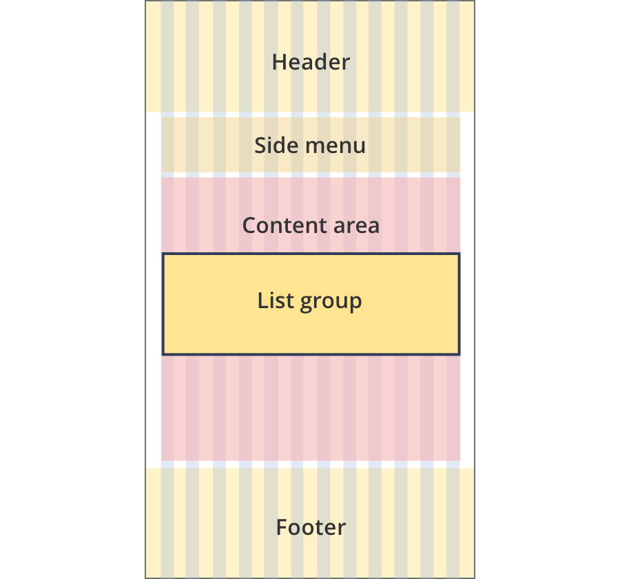
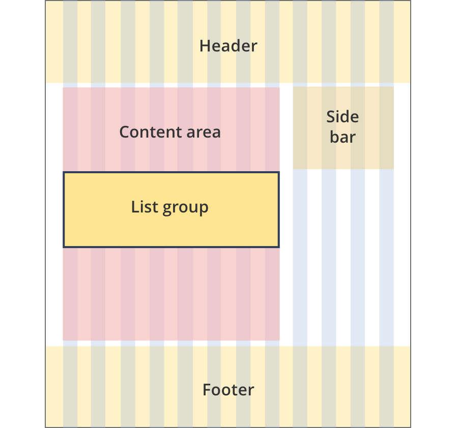
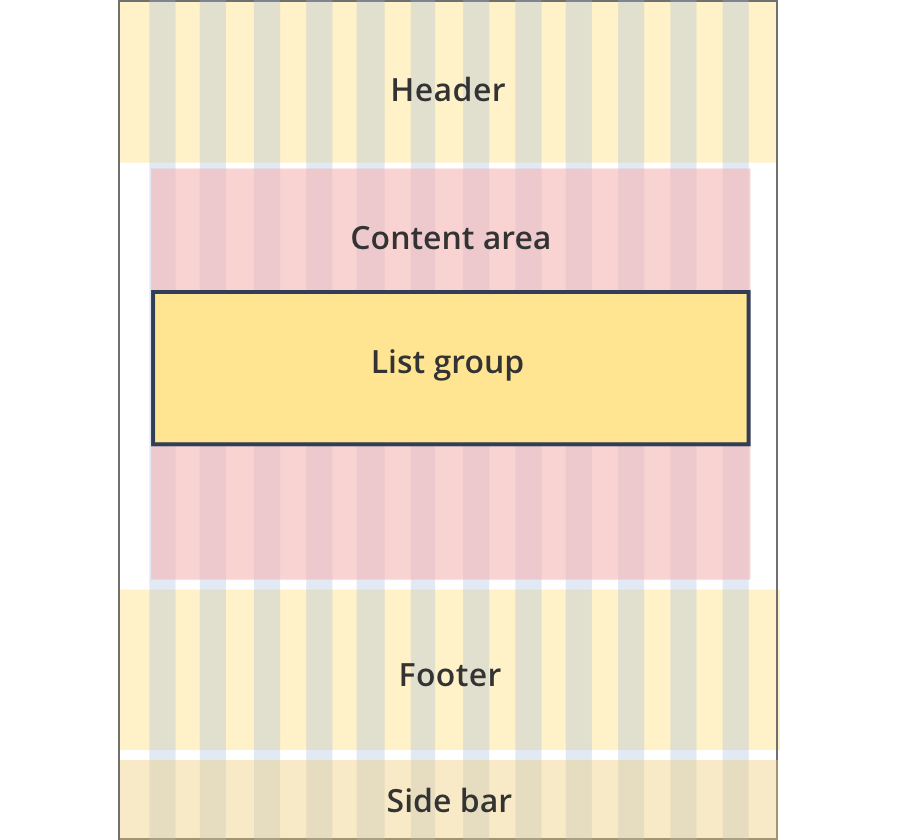
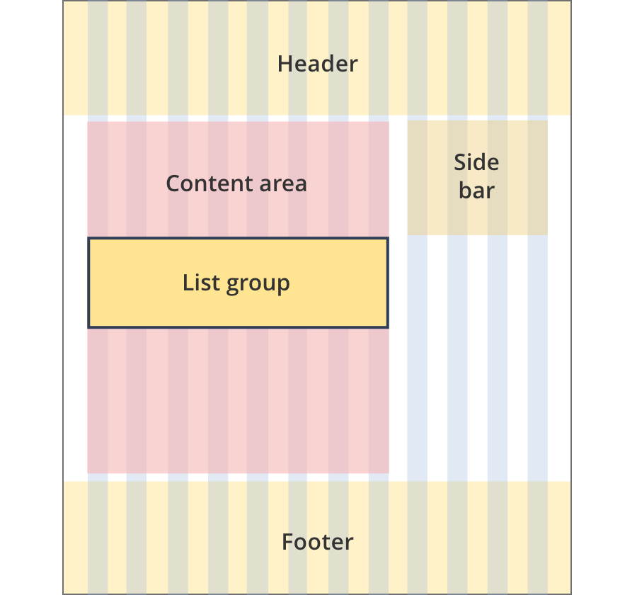
Layout:
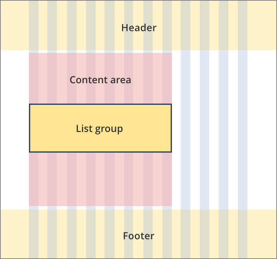
The content area is 12 grid-columns wide.
List groups span 8 grid-columns each.
The content area is 12 grid-columns wide.
List groups span 9 grid-columns each.
The content area is 12 grid-columns wide.
List groups span 12 grid-columns each.
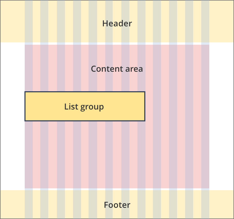
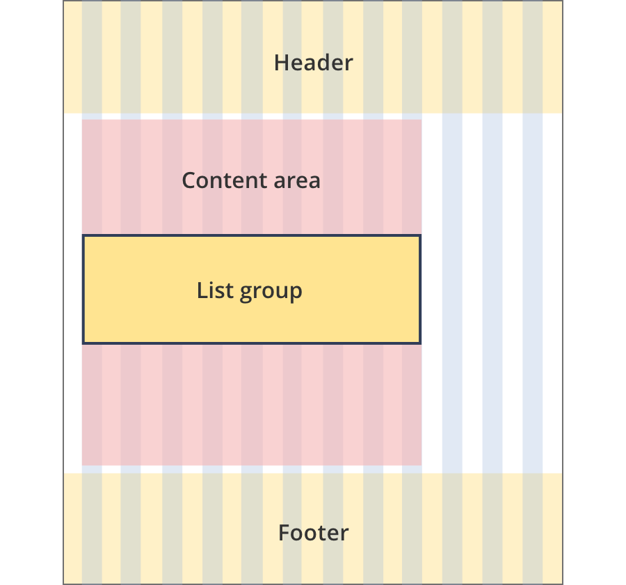
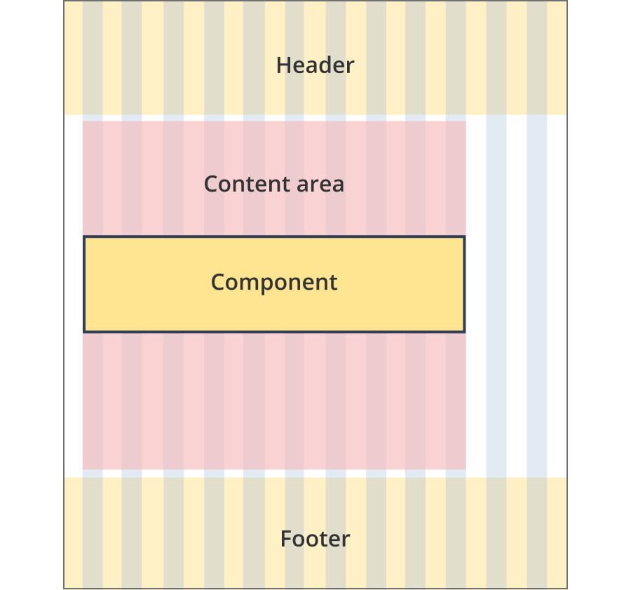
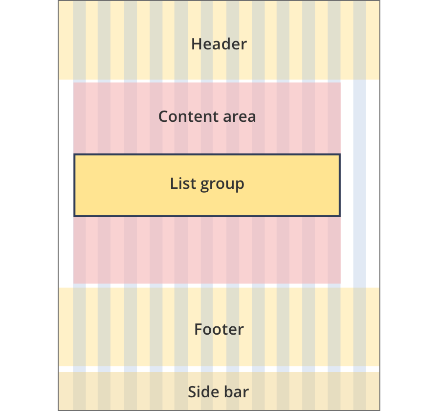
The content area is 8 grid-columns wide.
List groups span the full width of the content area.
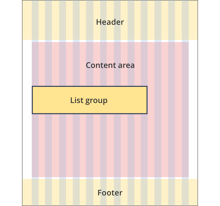
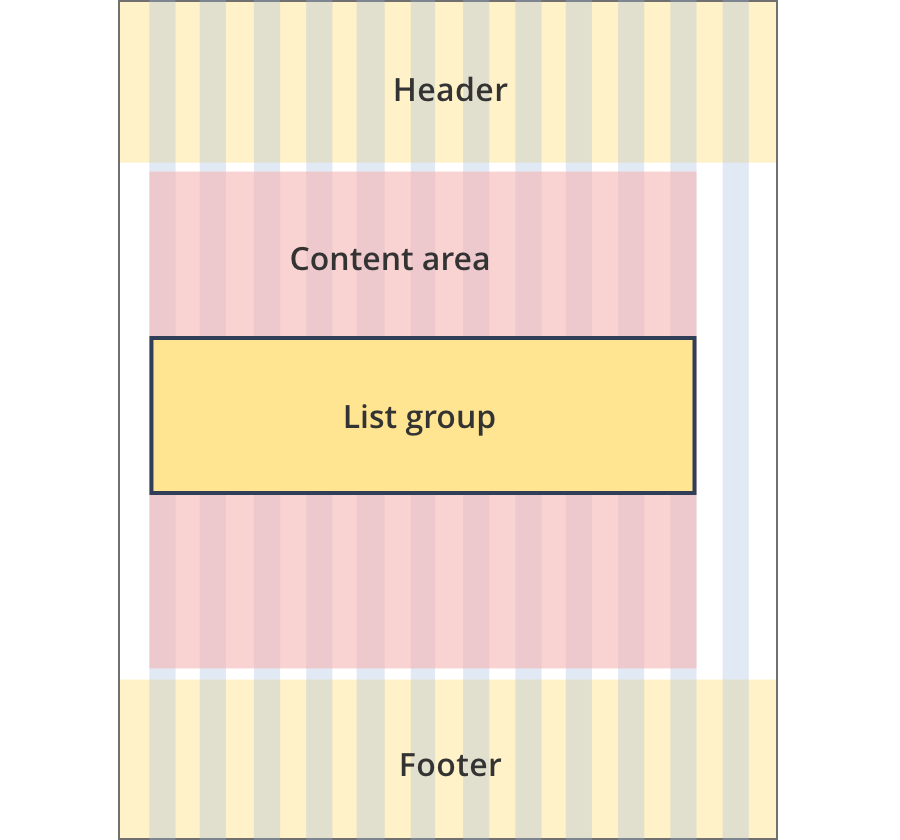
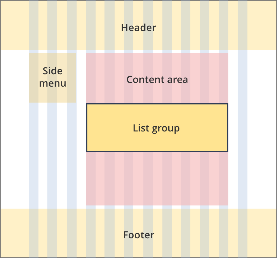
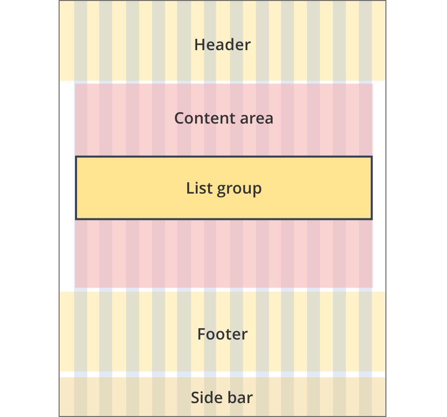
The content area is 9 grid-columns wide.
List groups span the full width of the content area.
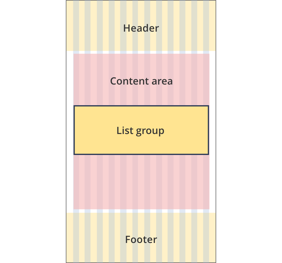
The content area is 11 grid-columns wide.
List groups span the full width of the content area.
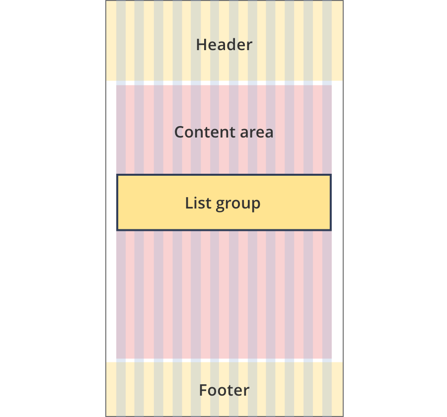
The content area is 12 grid-columns wide.
List groups span the full width of the content area.
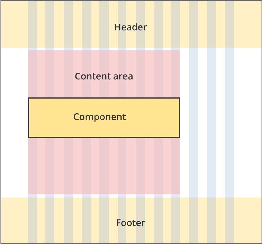
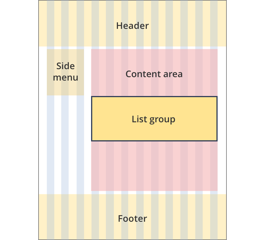
The content area is 9 grid-columns wide.
List group components span the full width of the content area.
The content area is 10 grid-columns wide.
List group components span the full width of the content area.
The content area is 12 grid-columns wide.
List group components span the full width of the content area.
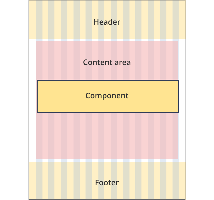
The content area is 8 grid-columns wide.
List groups span the full width of the content area.
The content area is 9 grid-columns wide.
List groups span the full width of the content area.
The content area is 12 grid-columns wide.
List groups span the full width of the content area.
The content area is 8 grid-columns wide.
List groups span the full width of the content area.
The content area is 12 grid-columns wide.
List groups span the full width of the content area.
The content area is 8 grid-columns wide.
List groups span the full width of the content area.
The content area is 11 grid-columns wide.
List groups span the full width of the content area.
The content area is 12 grid-columns wide.
List groups span the full width of the content area.
Guidelines for use
Purpose:
List groups display information in an easy to scan grid of rows and columns.
When to use this component:
- For large lists that would be easier to scan when displayed in a grid format.
Version history
8 August, 2023
- Added an additional layout (the Two column - tool page alternate layout).