Design
business.gov.au branding
No branding
Breakpoints:
Currently displaying the mobile design.
To see designs for other breakpoints please view this page on a larger screen.
Category page
Category page header
The long description can be used to briefly describe the contents of the page.

Topic & information pages
Topic or information page header
The long description can be used to briefly describe the contents of the page.
News page
News page header
Published: 21 June 2022
The long description can be used to briefly describe the contents of the page.
Grants and program page
Grants page header
Colour variations
Breakpoints:
Currently displaying the mobile design.
To see designs for other breakpoints please view this page on a larger screen.
Apply your brand specific colours and images to the base page headers shown below.
Page header with image
Page title
The long description can be used to briefly describe the contents of the page.

Page header without image
Page title
Last updated: 21 June 2022
The long description can be used to briefly describe the contents of the page.
Layouts
Page headers are used on all page layouts.
Bootstrap classes for header content
- All headers except the category page header: .col-sm-12 .col-lg-10 .col-xl-8
- Category page header (includes text area and image): .col-12
Default header grid layout
Layout: All layouts
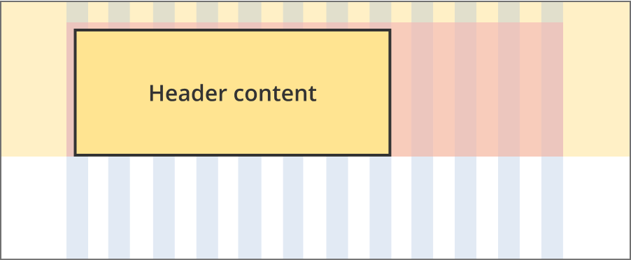
The header content area is 8 grid-columns wide.
The coloured header container is 12 grid-columns wide.
The gradient background extends full width of the viewport.
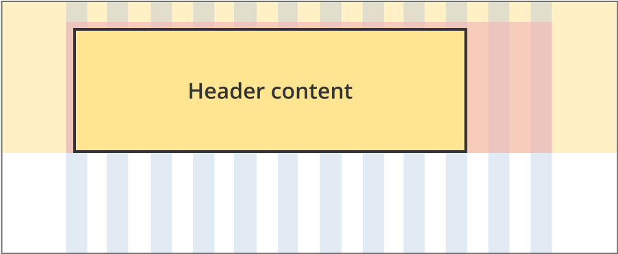
The header content area is 10 grid-columns wide.
The coloured header container is 12 grid-columns wide.
The gradient background extends full width of the viewport.
The content area is 12 grid-columns wide.
The coloured header container is 12 grid-columns wide.
The gradient background extends full width of the viewport.
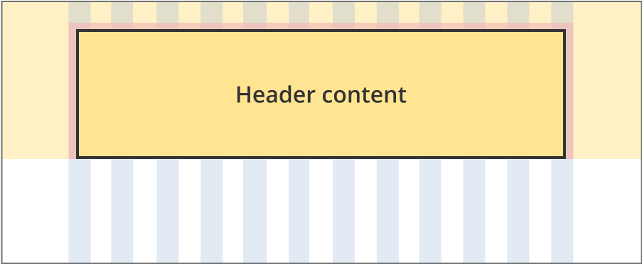
Category page grid layout
Layout: All layouts
All breakpoints
The content area is 12 grid-columns wide.
The coloured header container is 12 grid-columns wide.
The gradient background extends full width of the viewport.
Guidelines for use
Purpose:
A page header helps users understand what the content of the page is about and its relevance to them. It includes the primary H1 (page title), a label and a supporting page description.
Headers for grant landing pages
These differ from all other headers. They use a plain English title as the H1, and the grant name is displayed in the label field – this is also the page title in this case.
When to use this component:
- Page headers are built into every page pattern and the component doesn’t need to be added manually.
Content rules:
- H1: Recommended 90 character limit
- Description: Recommended 250 character limit