Design
business.gov.au branding
No branding
Layouts
THe print and share utility component is used on all page layouts except the Two column - filter page layout.
Layout:
All breakpoints
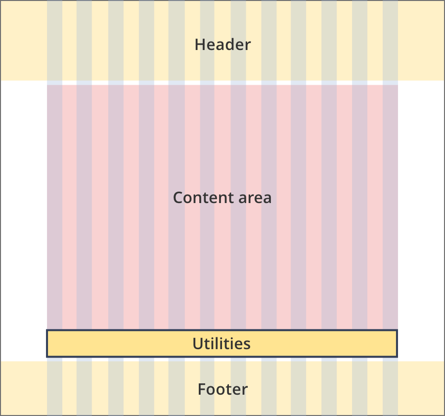
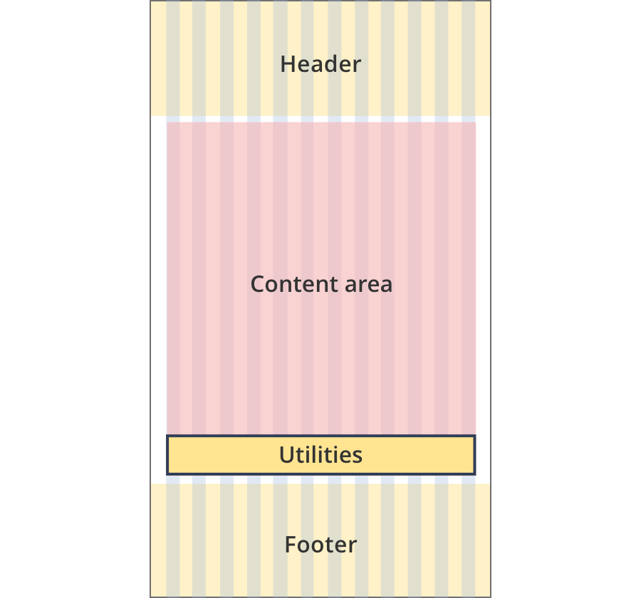
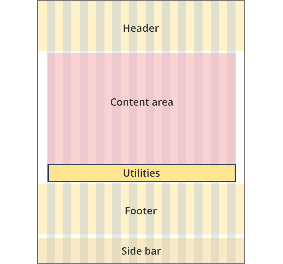
The content area is 12 grid-columns wide.
The print and share component spans the full width of the content area. Content within the component is aligned to the right.
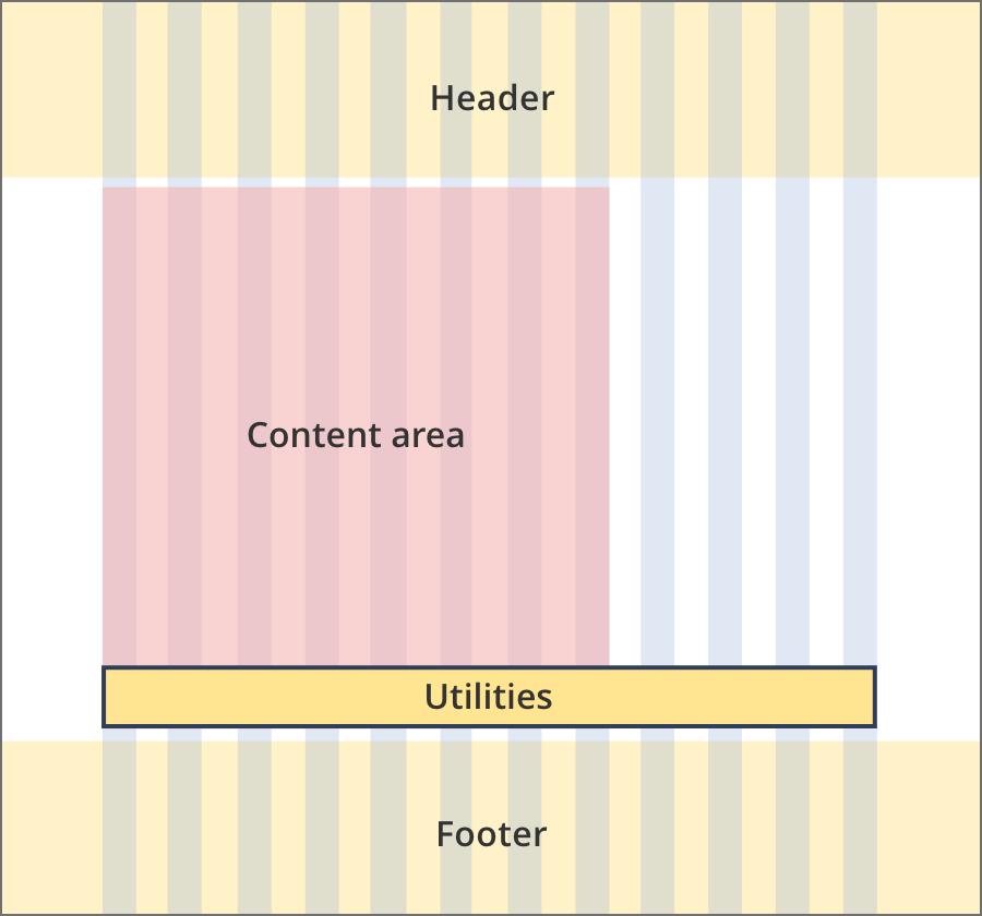
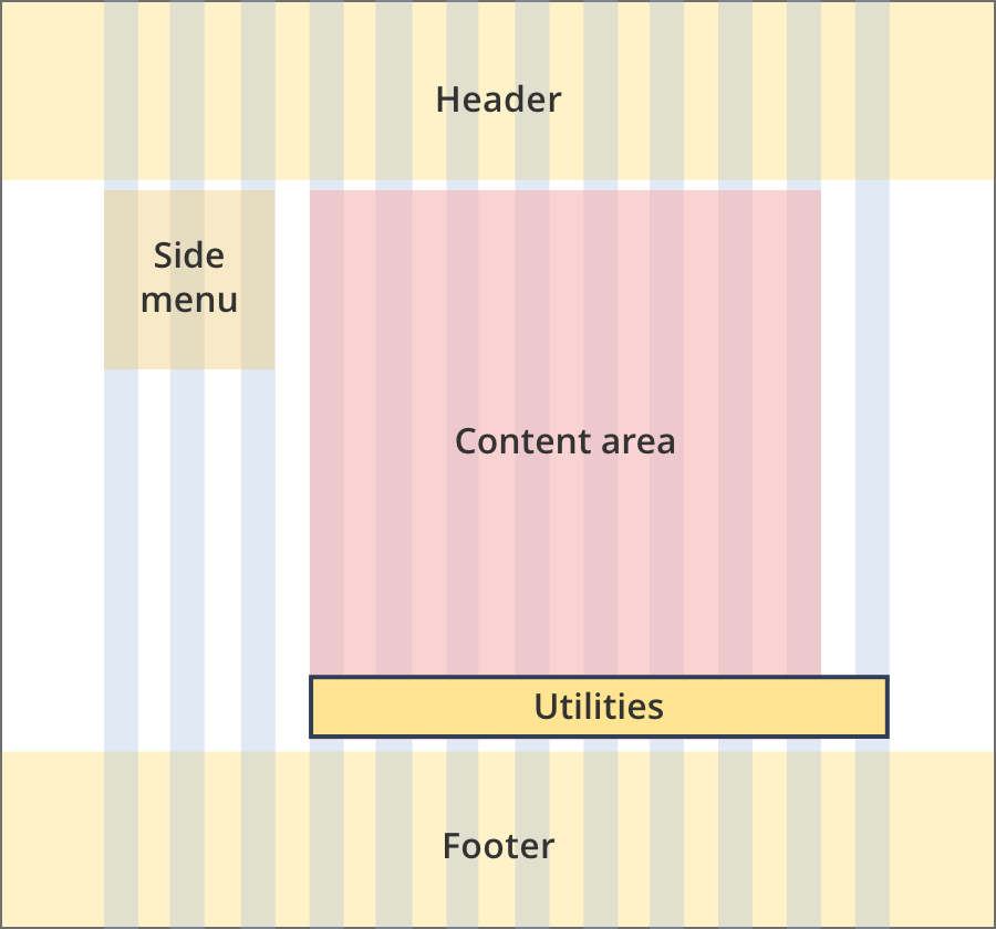
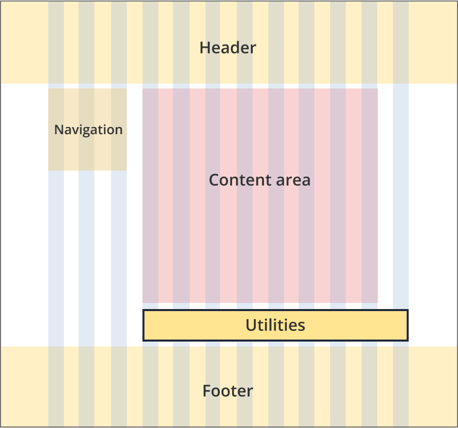
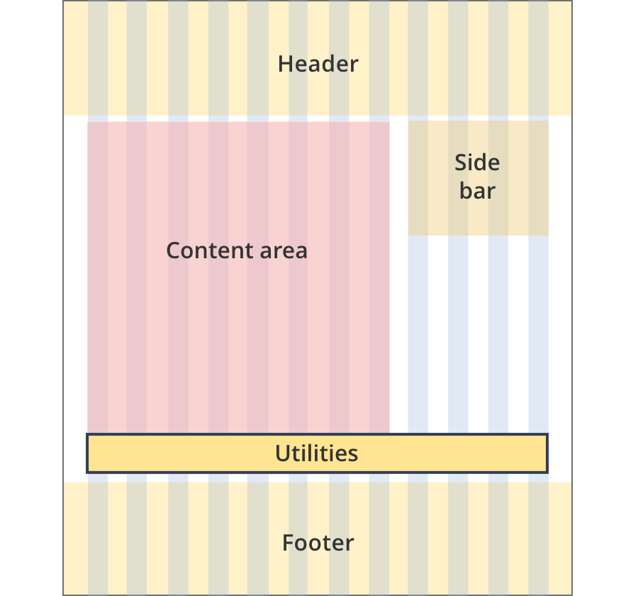
The content area is 8 grid-columns wide.
The print and share component spans 12 grid-columns. Content within the component is aligned to the right.
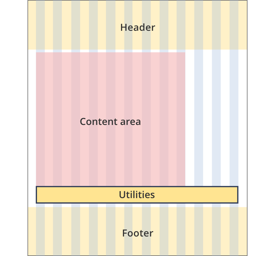
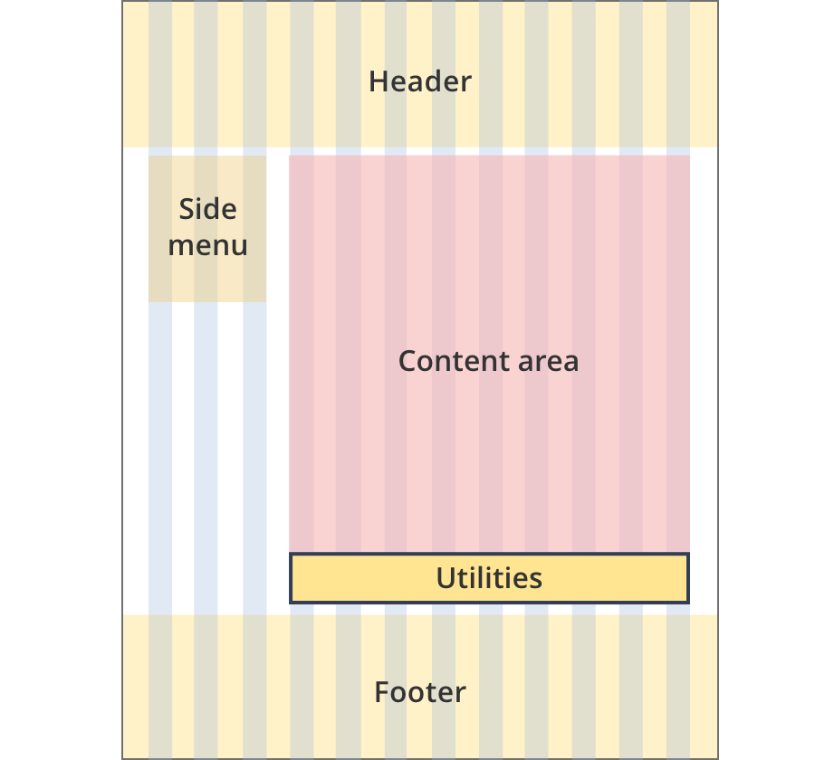
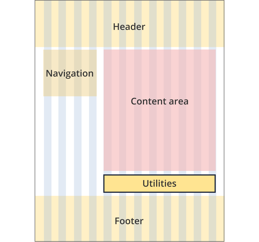
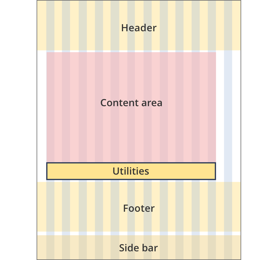
The content area is 9 grid-columns wide.
The print and share component spans 12 grid-columns. Content within the component is aligned to the right.
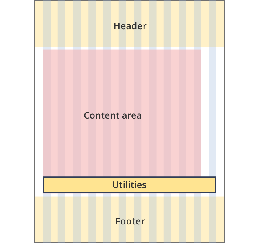
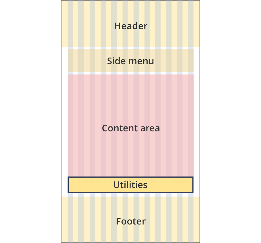
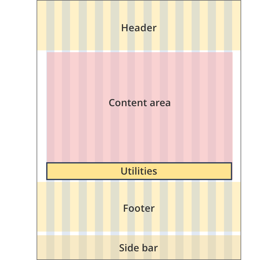
The content area is 11 grid-columns wide.
The print and share component spans 12 grid-columns. Content within the component is aligned to the right.
The content area is 12 grid-columns wide.
The print and share component spans 12 grid-columns. Content within the component is aligned to the right.
The content area is 8 grid-columns wide.
The print and share component spans 12 grid-columns. Content within the component is aligned to the right.
The content area is 9 grid-columns wide.
The print and share component spans the full width of the content area. Content within the component is aligned to the right.
The content area is 12 grid-columns wide.
The print and share component spans the full width of the content area. Content within the component is aligned to the right.
The content area is 8 grid-columns wide.
The print and share component spans 12 grid-columns. Content within the component is aligned to the right.
The content area is 8 grid-columns wide.
The print and share component spans 12 grid-columns. Content within the component is aligned to the right.
The content area is 12 grid-columns wide.
The print and share component spans 12 grid-columns. Content within the component is aligned to the right.
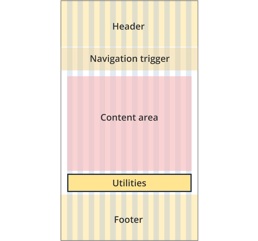
The content area is 8 grid-columns wide.
The print and share component spans 12-grid-columns. Content within the component is aligned to the right.
The content area is 12 grid-columns wide.
The print and share component spans 12-grid-columns. Content within the component is aligned to the right.
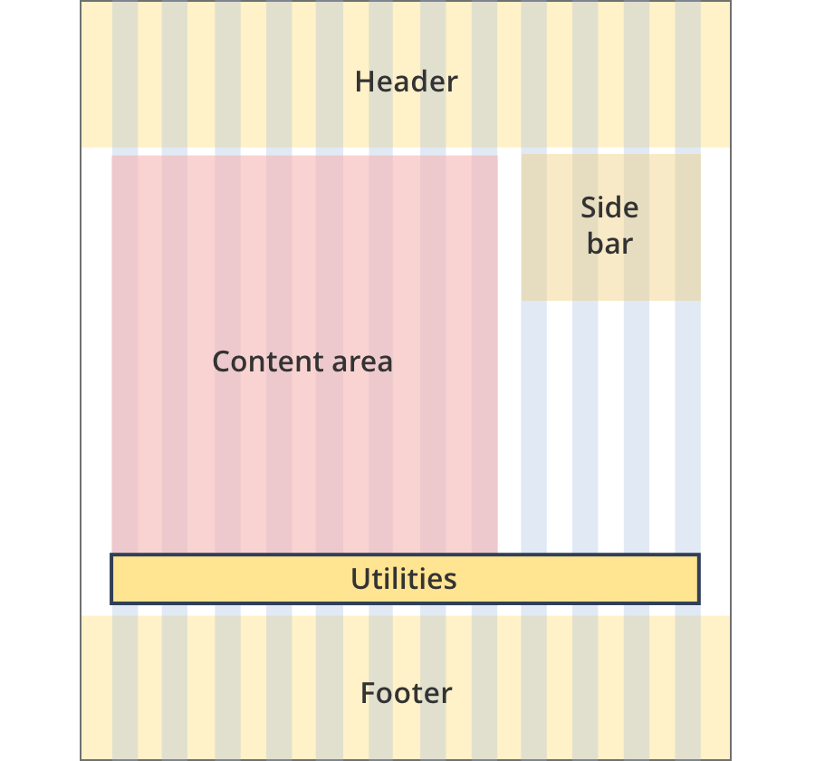
The content area is 8 grid-columns wide.
The print and share component spans 12-grid-columns. Content within the component is aligned to the right.
The content area is 11 grid-columns wide.
The print and share component spans 12-grid-columns. Content within the component is aligned to the right.
The content area is 12 grid-columns wide.
The print and share component spans 12-grid-columns. Content within the component is aligned to the right.
Guidelines for use
Purpose:
Enables users to share or save page content.
When to use this component:
- Used across every page of the website to ensure a consistent user experience.
- The component is placed at the bottom of site pages, just above the footer.
Version history
26 June, 2024
- Added an additional layout (the Two column - guide page layout).
8 August, 2023
- Added an additional layout (the Two column - tool page alternate layout).