Design
business.gov.au branding
No branding
Layout: All layouts
Un-named steps
Named steps
Colour variations
Blue
Teal
Layout: All layouts
Apply your brand specific colours to the base progress bars shown below.
Un-named steps
Named steps
Layouts
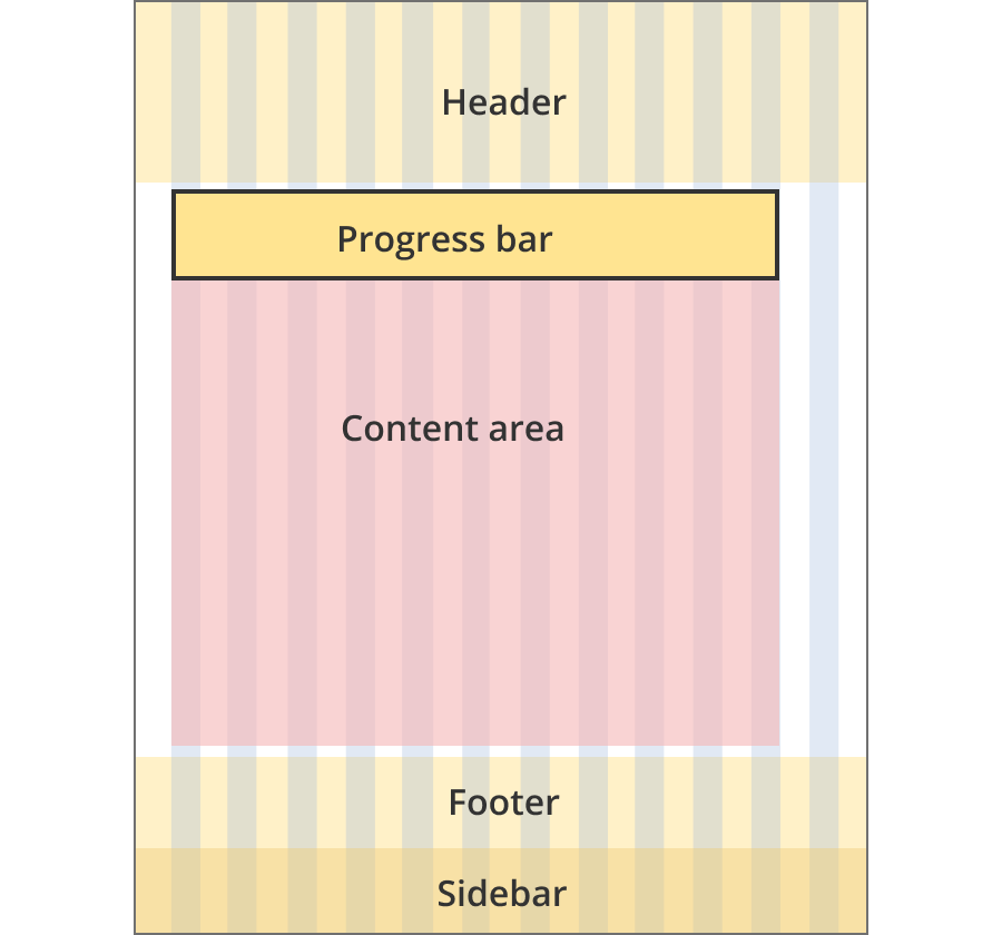
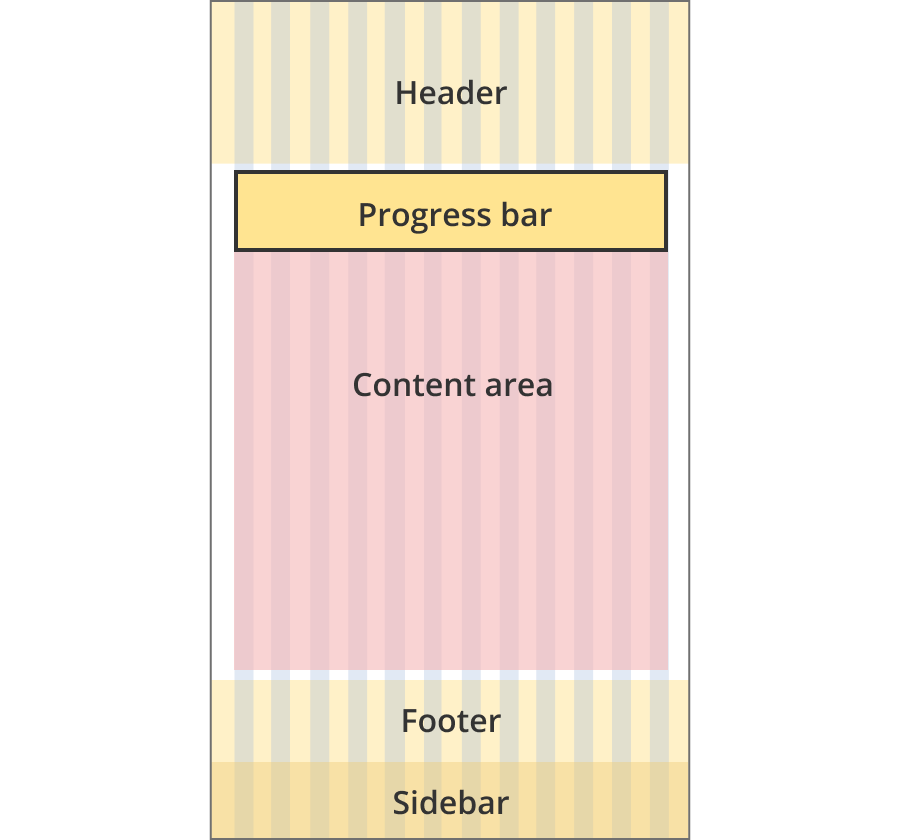
Progress bars can be used on the Single column - information page layout, the Single column - tool page layout and the Two column - tool page alternate layout.
Layout:
The content area is 8 grid-columns wide.
Progress bars span the full width of the content area.
The content area is 9 grid-columns wide.
Progress bars span the full width of the content area.
The content area is 11 grid-columns wide.
Progress bars span the full width of the content area.
The content area is 12 grid-columns wide.
Progress bars span the full width of the content area.
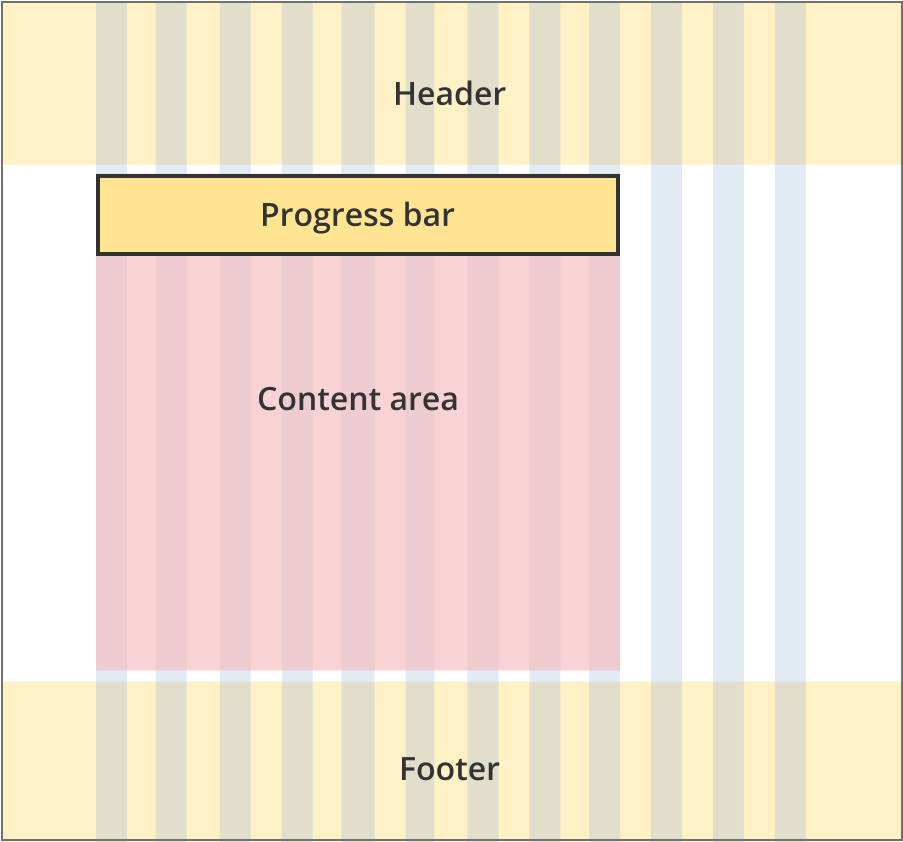
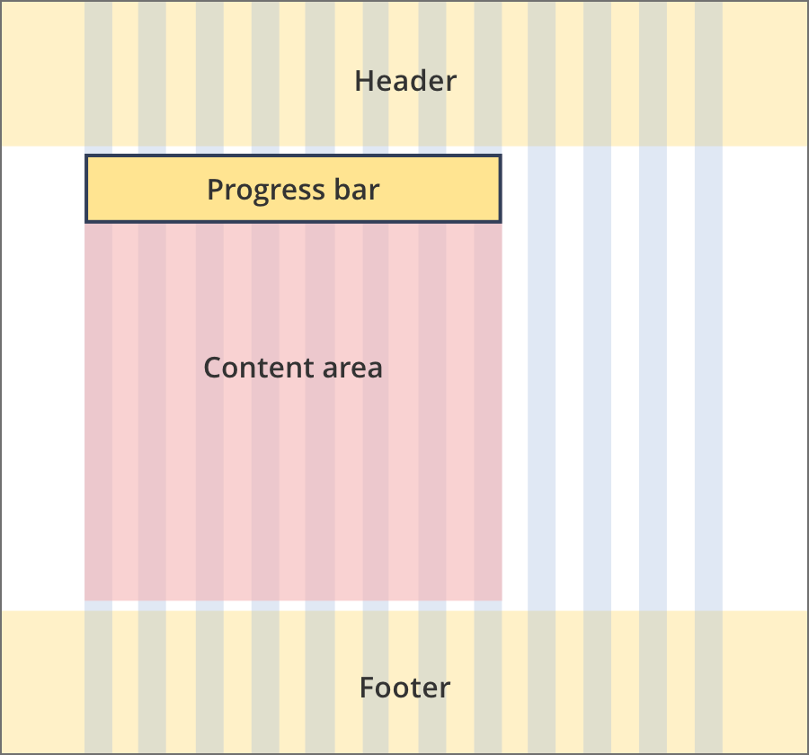
The content area is 9 grid-columns wide.
The progress bar spas the full width of the content area.
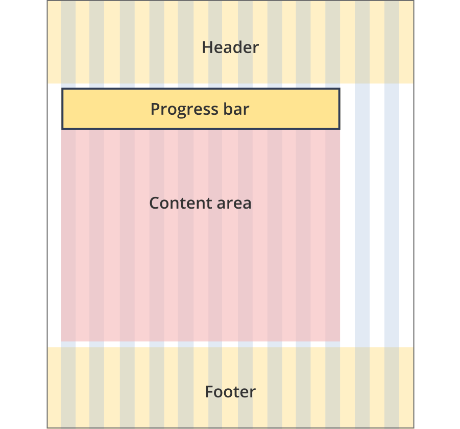
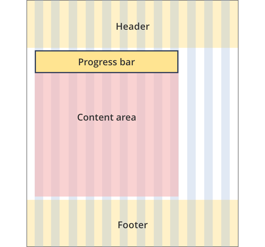
The content area is 10 grid-columns wide.
The progress bar spans the full width of the content area.
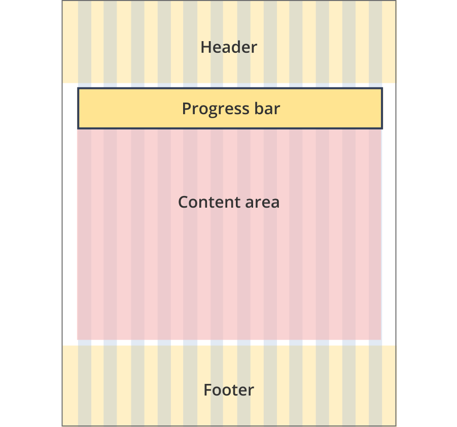
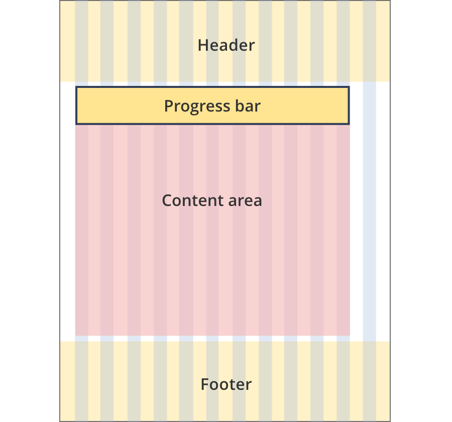
The content area is 12 grid-columns wide.
The progress bar spans the full width of the content area.
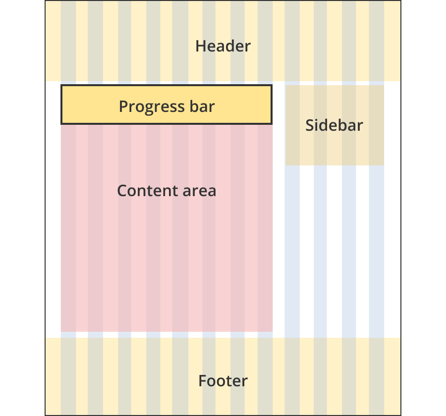
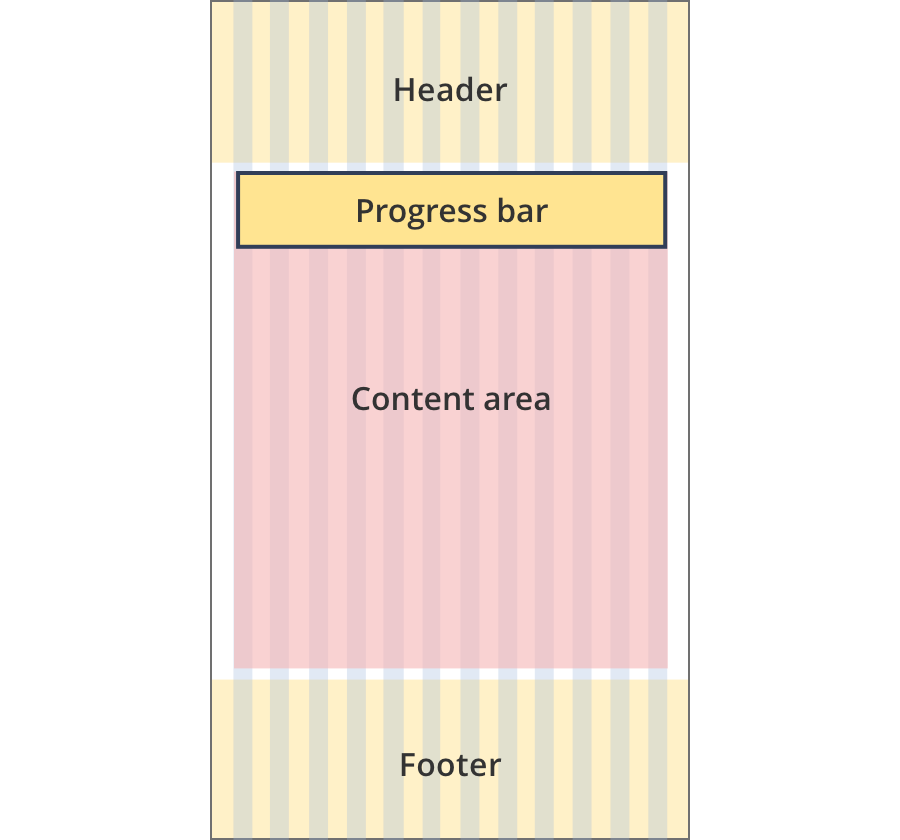
The content area is 8 grid-columns wide.
The progress bar spans the full width of the content area.
The content area is 11 grid-columns wide.
The progress bar spans the full width of the content area.
The content area is 12 grid-columns wide.
The progress bar spans the full width of the content area.
Guidelines for use
Purpose:
The progress bar visually shows the user how far they have progressed through a process. Progress bars are not used for navigation.
When to use this component:
Un-named steps progress bar
This is the default progress bar and shows progress through an entire process.
Named steps progress bar
This progress bar shows the progress of sub-steps within a larger process. Naming each step makes it clear the progress refers to a particular step, rather than the whole process.