Design
business.gov.au branding
No branding
Breakpoints:
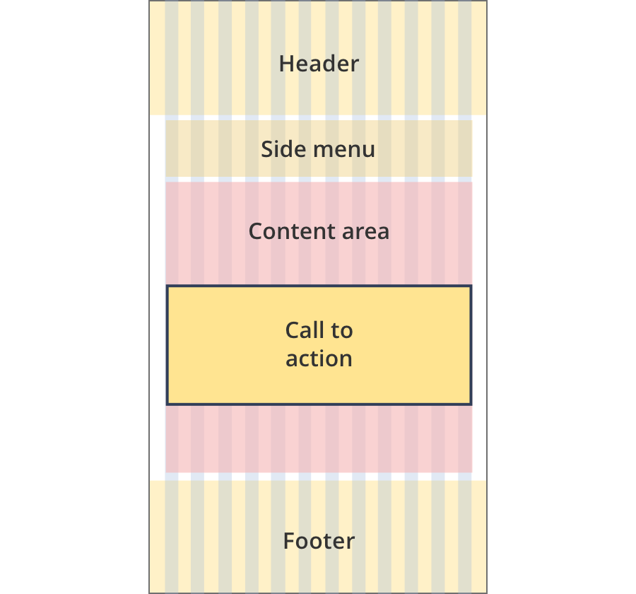
Currently displaying the mobile design.
To see designs for other breakpoints please view this page on a larger screen.
Style note
Call to action titles can be either heading level 2, 3 or 4 (H2, H3 or H4).
You can apply for most of your registrations with the Business Registration Service.
This includes applying for your:
- Business tax file number
- Australian business number
- Goods & Services Tax (GST)
You can save your list of recommended regulations by printing or emailing them. This will help you remember what to include when you apply for your registrations.
Breakpoints:
Currently displaying the mobile design.
To see designs for other breakpoints please view this page on a larger screen.
Apply your brand specific colours and borders to the base call to action components shown below.
You can apply for most of your registrations with the Business Registration Service.
This includes applying for your:
- Business tax file number
- Australian business number
- Goods & Services Tax (GST)
Layouts
Call to action components can be used on all page layouts except the Single column - navigation page layout and the two column.
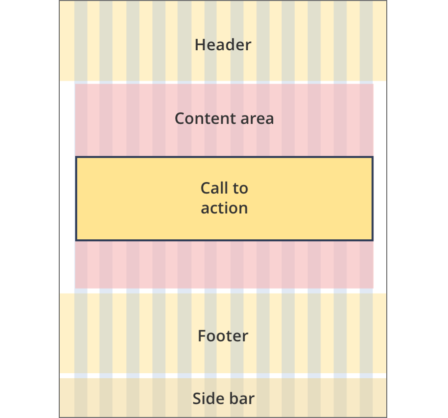
Layout:
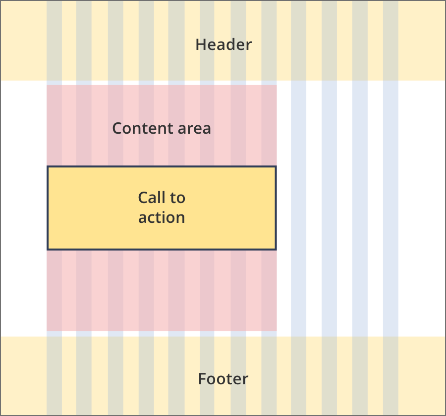
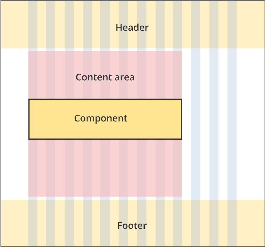
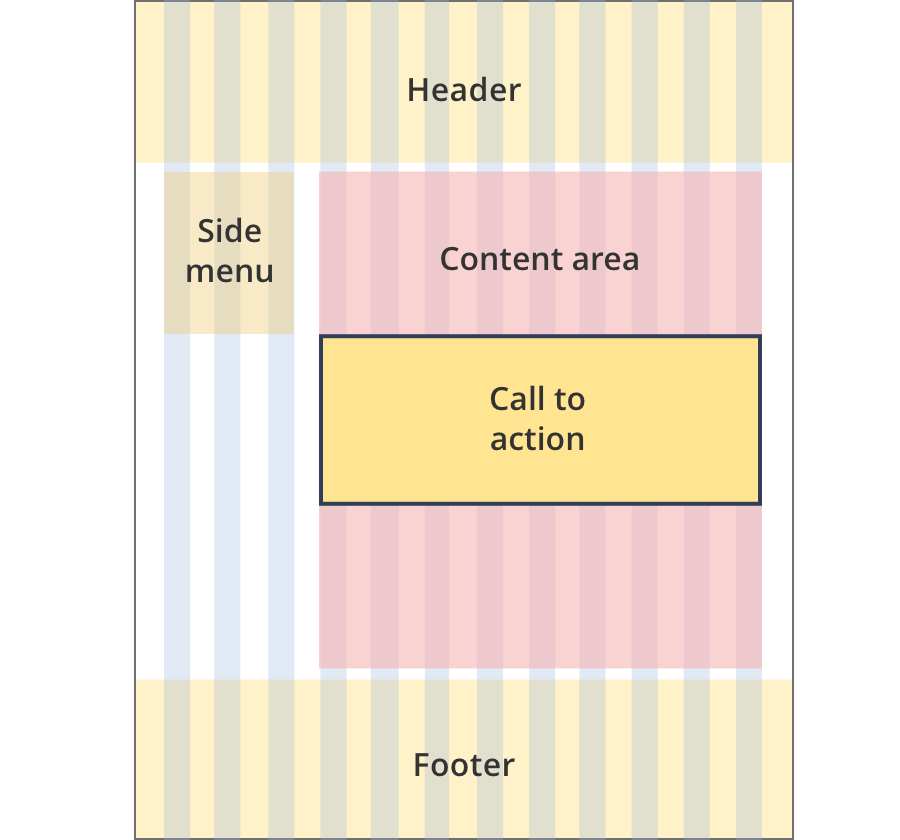
The content area is 8 grid-columns wide.
Call to action components span the full width of the content area.
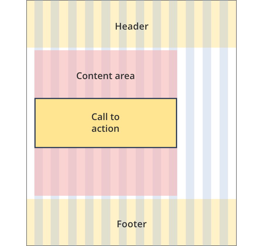
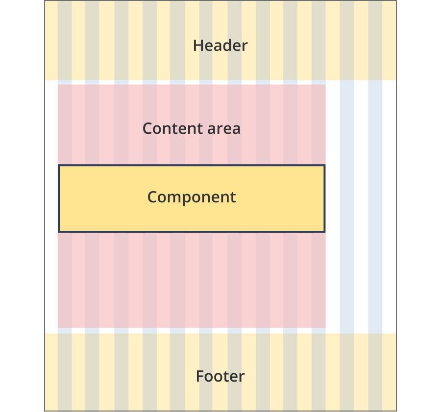
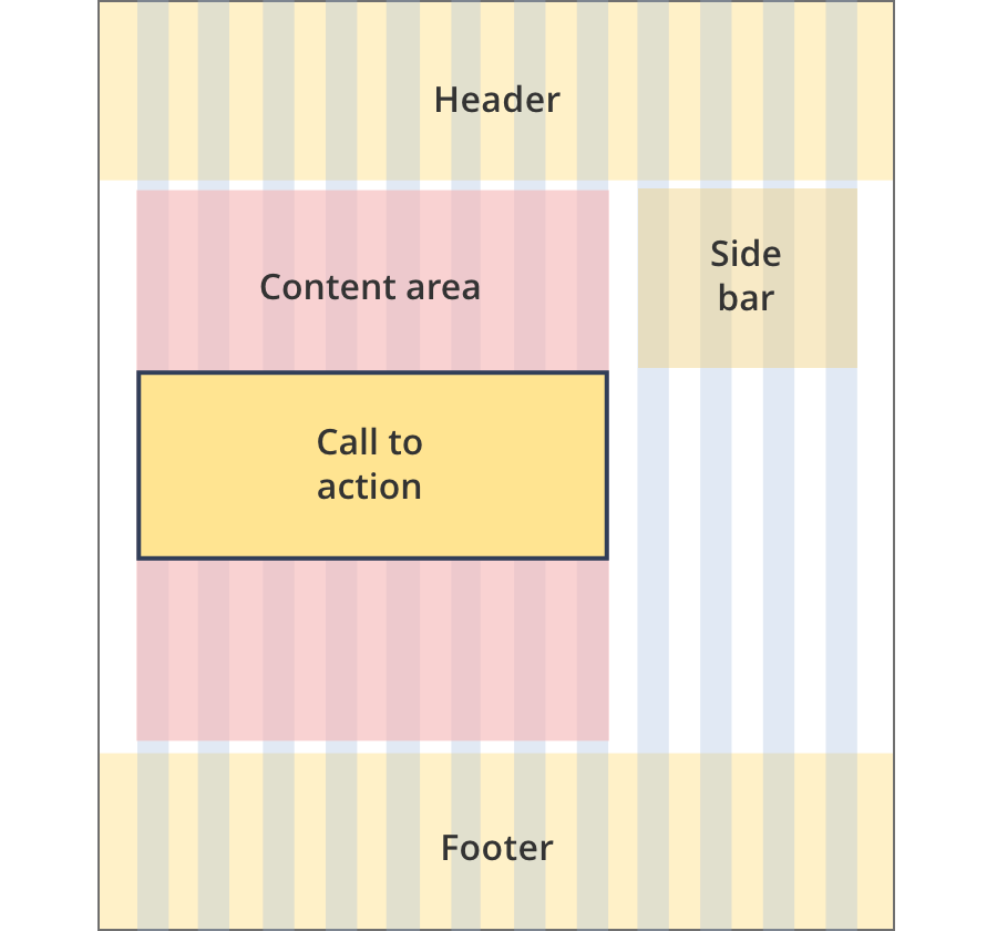
The content area is 9 grid-columns wide.
Call to action components span the full width of the content area.
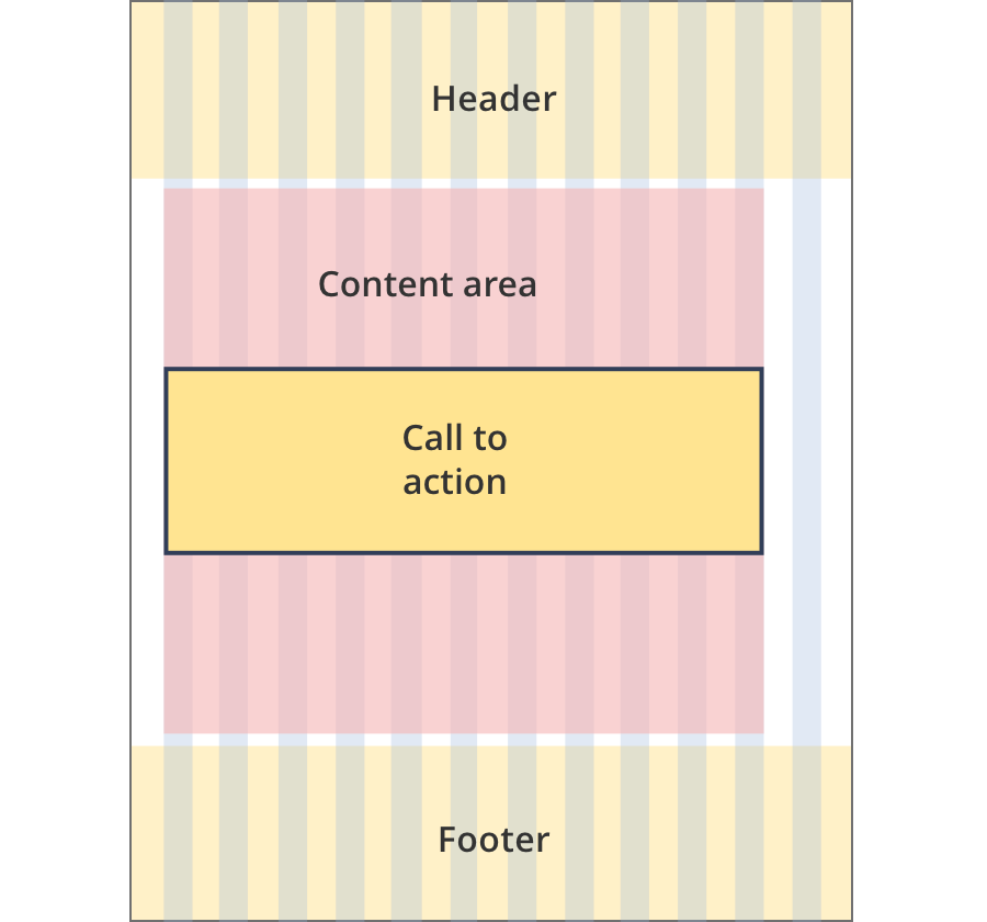
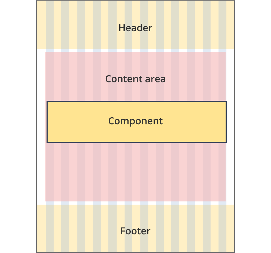
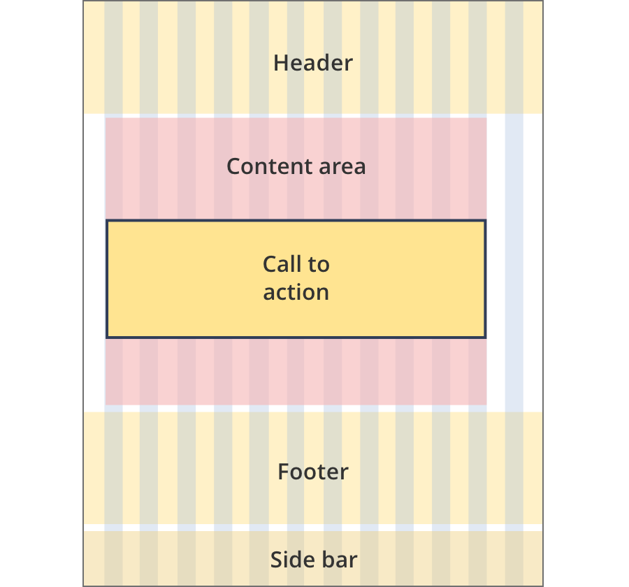
The content area is 11 grid-columns wide.
Call to action components span the full width of the content area.
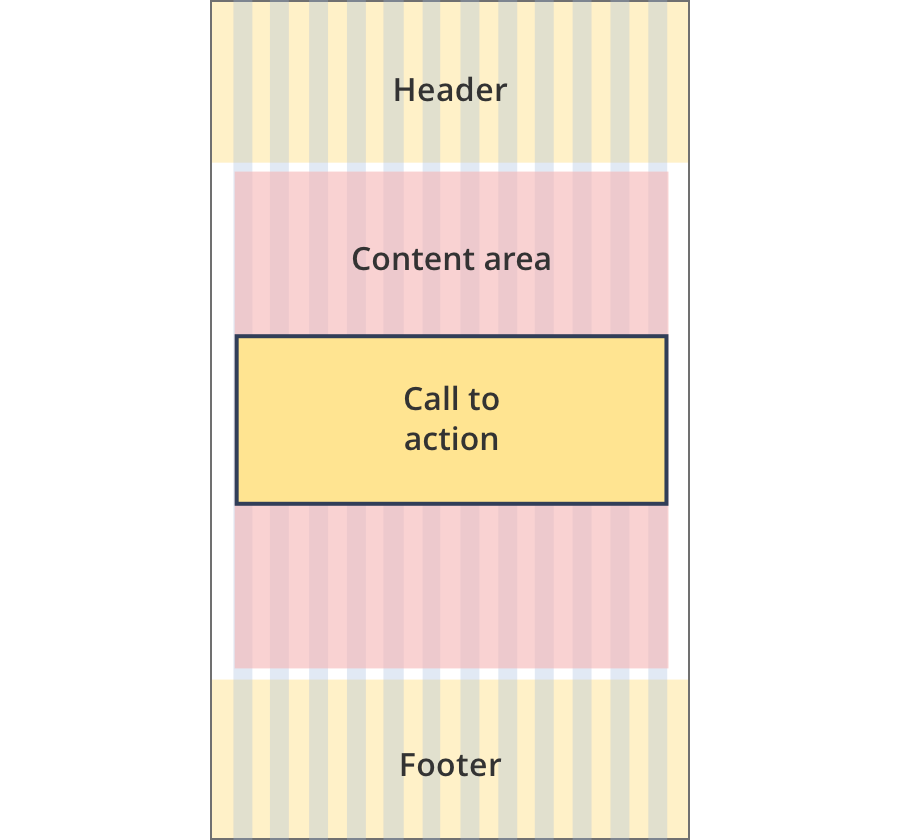
The content area is 12 grid-columns wide.
Call to action components span the full width of the content area.
The content area is 9 grid-columns wide.
Call to action components span the full width of the content area.
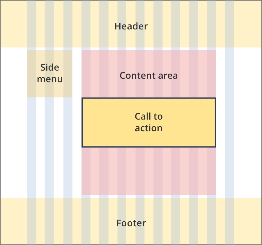
The content area is 10 grid-columns wide.
Call to action components span the full width of the content area.
The content area is 12 grid-columns wide.
Call to action components span the full width of the content area.
The content area is 8 grid-columns wide.
Call to action components span the full width of the content area.
The content area is 9 grid-columns wide.
Call to action components span the full width of the content area.
The content area is 12 grid-columns wide.
Call to action components span the full width of the content area.

The content area is 8 grid-columns wide.
Call to action components span the full width of the content area.

The content area is 12 grid-columns wide.
Call to action components span the full width of the content area.
The content area is 8 grid-columns wide.
Call to action tiles span the full width of the content area.
The content area is 11 grid-columns wide.
Call to action tiles span the full width of the content area.
The content area is 12 grid-columns wide.
Call to action tiles span the full width of the content area.
Guidelines for use
Purpose:
These components are used in business.gov.au tools only.
When to use this component:
- Generally used on tool results pages to highlight actions users can take after cusing the tool.
Version history
5 June, 2024
- Split the call to action page into three separate pages. The download CTA and tool CTA are now separate pages.
19 September, 2023
- Added styling for call to actions used in tools. These call to action components use teal colouring.
8 August, 2023
- Added an additional layout (the Two column - tool page alternate layout).