Design
business.gov.au branding
No branding
Breakpoints:
Currently displaying the mobile design.
To see designs for other breakpoints please view this page on a larger screen.
Sole trader
A sole trader structure may be right for you.
A sole trader is the simplest form of business structure and can be inexpensive and easy set up.
As a sole trader you’re responsible for everything in your business including debts, losses and day-to-day decisions. You can employ people too.
Breakpoints:
Currently displaying the mobile design.
To see designs for other breakpoints please view this page on a larger screen.
Apply your brand specific colours, borders and button styles to the base tool result components shown below.
Sole trader
Based on your selections the sole trader structure might suit your business needs.
A sole trader is an individual and the sole owner of the business.
The income your business makes belongs to you. You report the income on your individual tax return and pay tax on your business income at your income tax rate.
You're responsible for all decisions and losses in your business. This means you have complete control over your business, but it also means your personal assets are at risk if things go wrong.
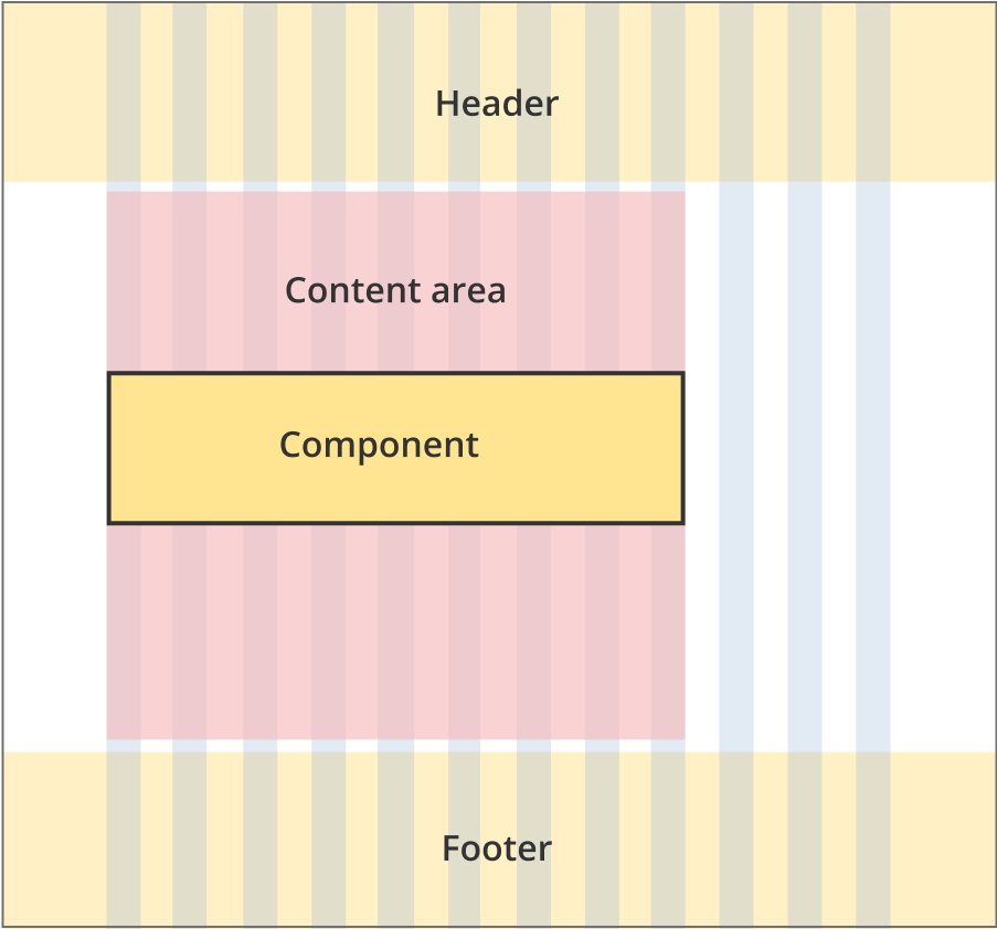
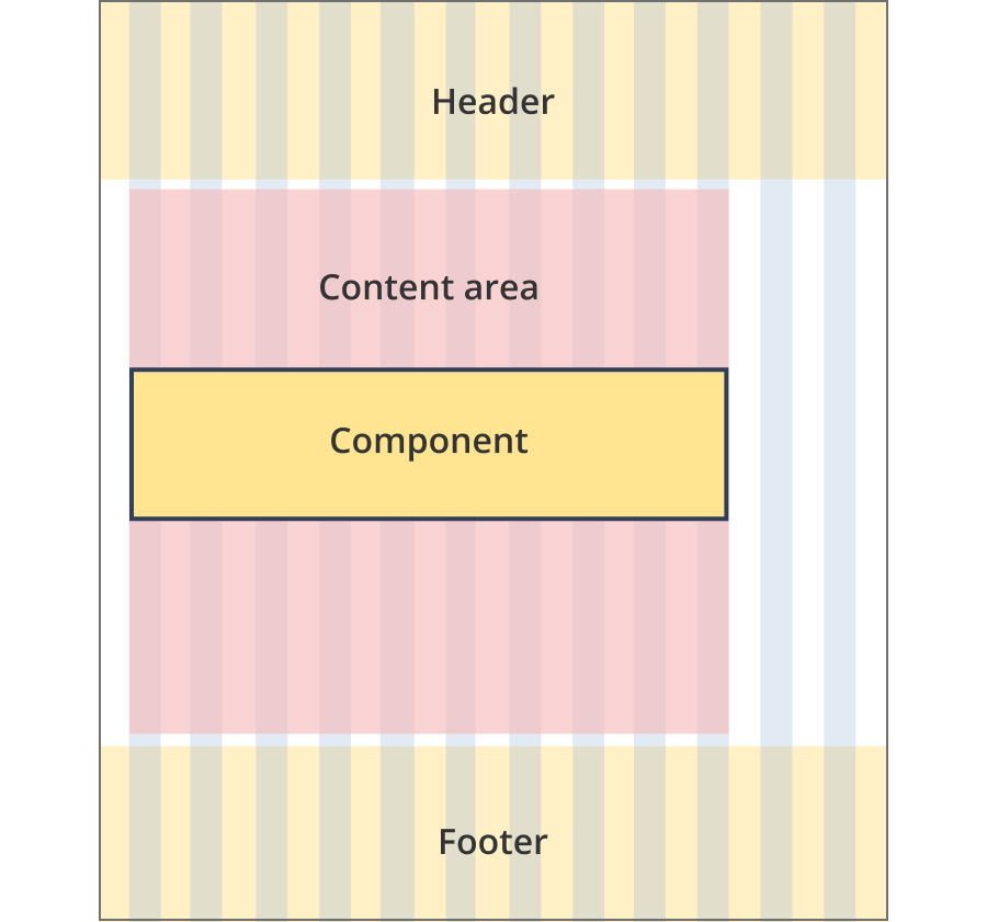
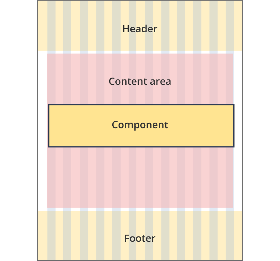
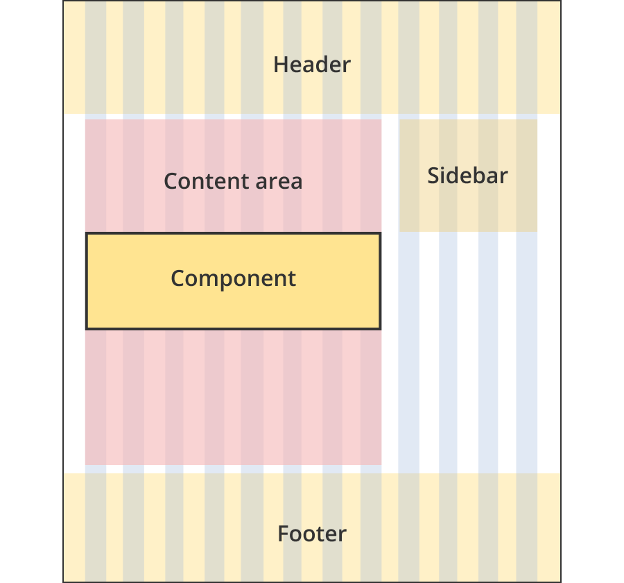
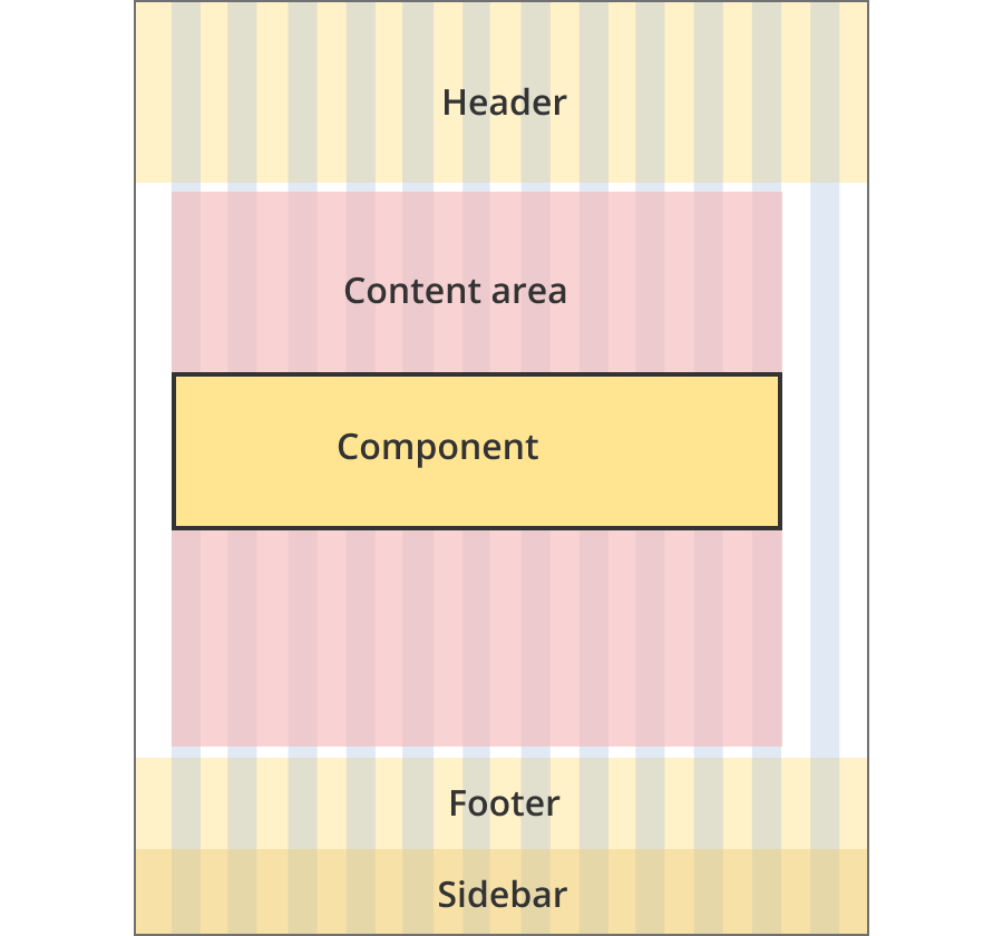
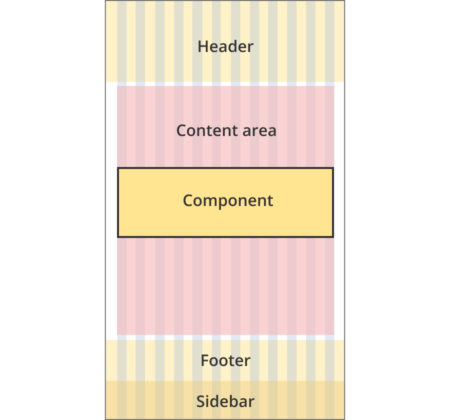
Layouts
Tool result components can be used on the Single column - information page layout, the Single column - tool page layout and the Two column - tool page alternate layout.
Layout:
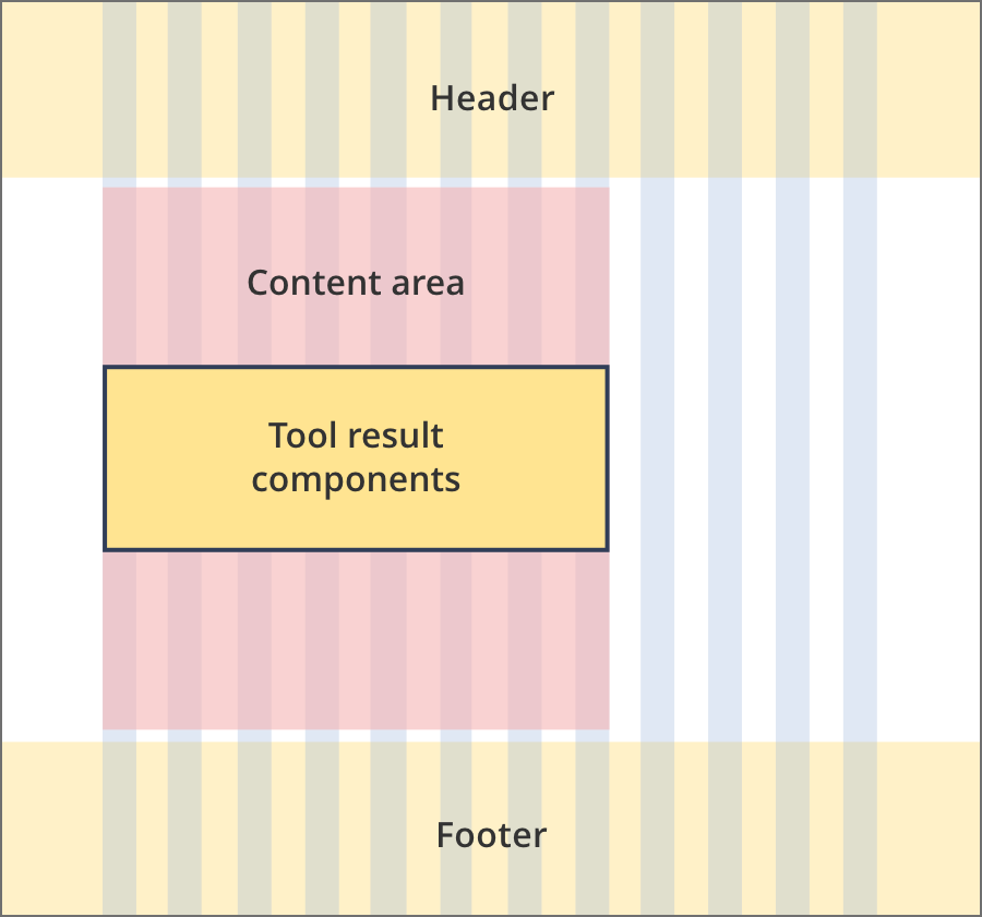
The content area is 8 grid-columns wide.
Tool result components span the full width of the content area.
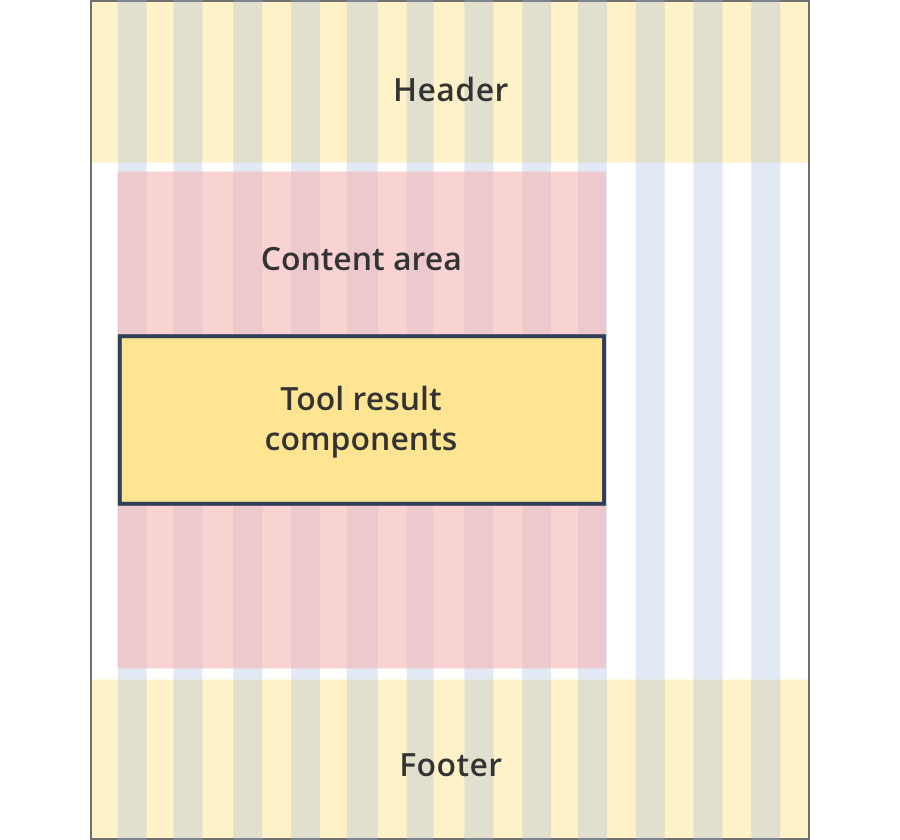
The content area is 9 grid-columns wide.
Tool result components span the full width of the content area.
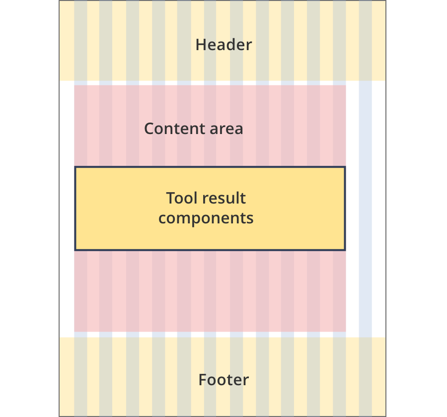
The content area is 11 grid-columns wide.
Tool result components span the full width of the content area.
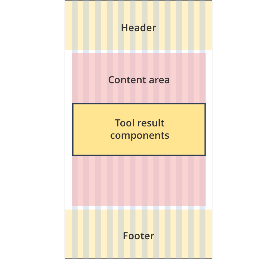
The content area is 12 grid-columns wide.
Tool result components span the full width of the content area.
The content area is 9 grid-columns wide.
Tool result components span the full width of the content area.
The content area is 10 grid-columns wide.
Tool result components span the full width of the content area.
The content area is 12 grid-columns wide.
Tool result components span the full width of the content area.
The content area is 8 grid-columns wide.
Tool result components span the full width of the content area.
The content area is 11 grid-columns wide.
Tool result components span the full width of the content area.
The content area is 12 grid-columns wide.
Tool result components span the full width of the content area.
Guidelines for use
Purpose:
Results components allow the user to review and edit results from a process or tool they have stepped through. Edit links return the user to the appropriate page in a tool so they can change their answer.
When to use these components:
- Used at the end of business.gov.au tools
Version history
6 June, 2024
- Split the tool results components page into 4 separate pages.
5 March, 2024
- Removed the 'learn more' section from the results call out.
19 September, 2023
- Added a new design pattern, the results call out.
- Added an alternative colour version for the results accordion ('results accordion - yellow').
18 August, 2023
- Update all edit buttons from lowercase 'e' to uppercase 'E'.