Design
business.gov.au branding
No branding
Breakpoints:
Currently displaying the mobile design.
To see designs for other breakpoints please view this page on a larger screen.
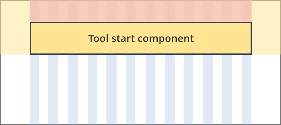
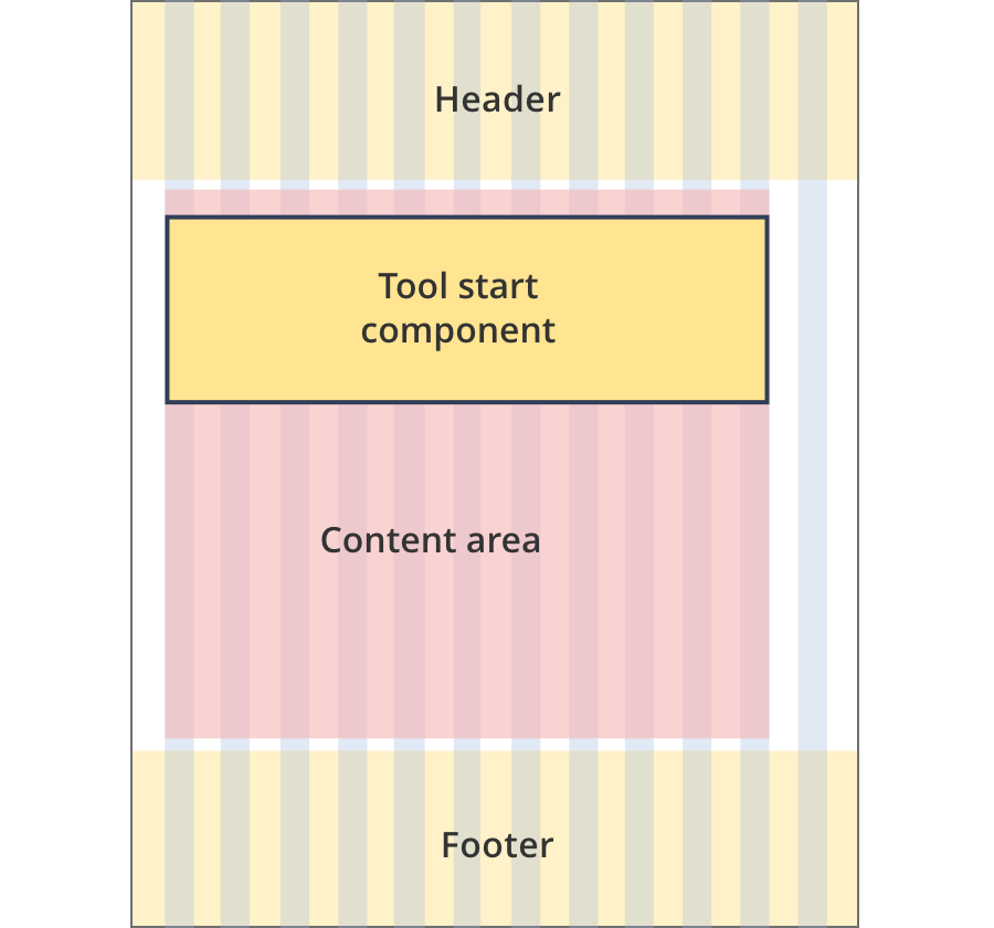
Start component within a tool header
Grants and programs finder
How this tool can help you
If you’re doing business in Australia, this guided search will help you find grants, funding and support programs from across government.
Answer a few questions about your business to find grants and programs you may be eligible for.
Time to complete
Less than 5 minutes
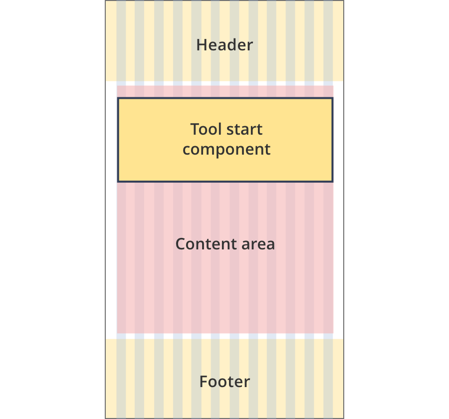
Start component in page content
Note: border is optional. It should be used when the coloured start box needs to be visually grouped with content below.
Who can use this tool
Use this tool if you are working on a development or major project. It will help you understand which Government approvals you need.
Time to complete
Around 10 minutes
What you’ll need
You don’t need any documentation up front to use this tool.
What you'll get
This tool can help you work out:
- the Australian Government approvals you need, and
- the approvals process you must consider
Breakpoints:
Currently displaying the mobile design.
To see designs for other breakpoints please view this page on a larger screen.
Apply your brand specific colours, borders, icons and button styles to the base start components shown below.
Start component within a tool header
Grants and programs finder
How this tool can help you
If you’re doing business in Australia, this guided search will help you find grants, funding and support programs from across government.
Answer a few questions about your business to find grants and programs you may be eligible for.
Time to complete
Less than 5 minutes
Start component in page content
Who can use this tool
Use this tool if you are working on a development or major project. It will help you understand which Government approvals you need.
Time to complete
Around 10 minutes
What you’ll need
You don’t need any documentation up front to use this tool.
What you'll get
This tool can help you work out:
- the Australian Government approvals you need, and
- the approvals process you must consider
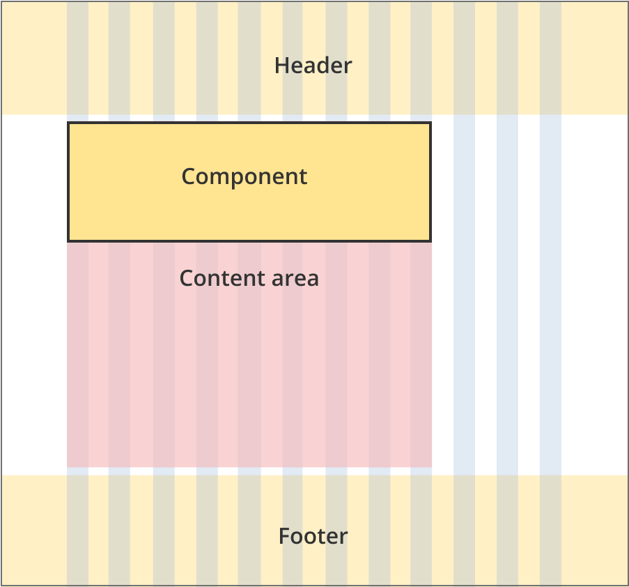
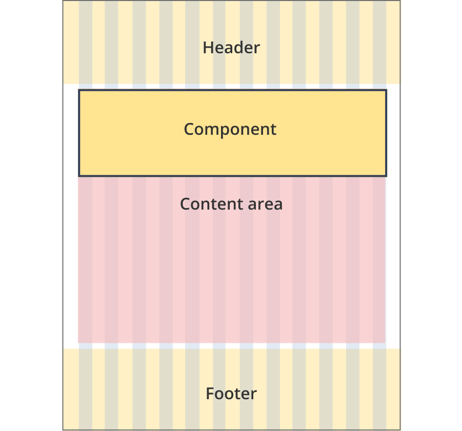
Layouts
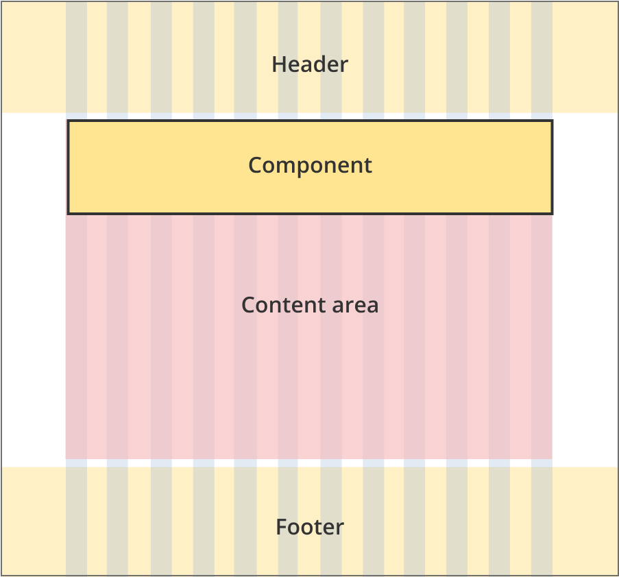
Start components within a tool header
Start components within a tool header display the same on all page layouts.
Layout: All layouts
All breakpoints
The content area is 12 grid-columns wide.
The tool start component is 12 grid-columns wide.
The gradient background extends full width of the viewport.
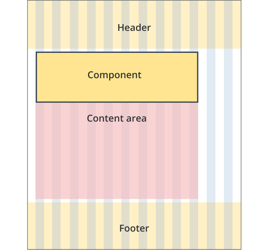
Start components within page content
Start components within page content can be used all single column page layouts.
Layout:
All breakpoints
The content area is 12 grid-columns wide.
Tool start components are full width spanning 12 grid-columns each.
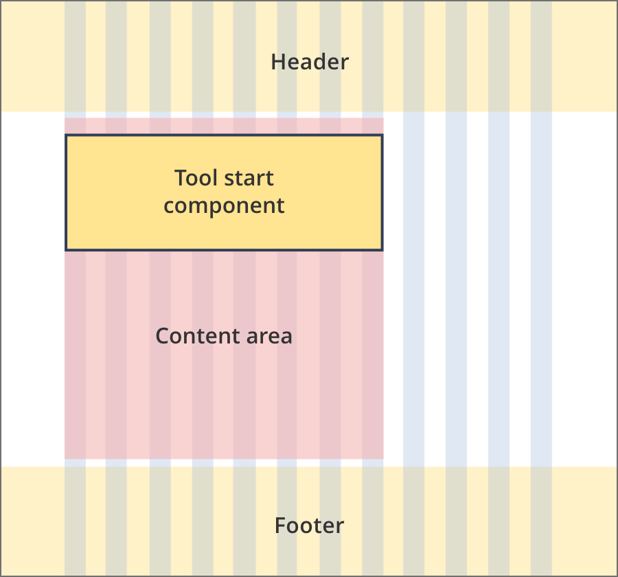
The content area is 8 grid-columns wide.
Tool start components span the full width of the content area.
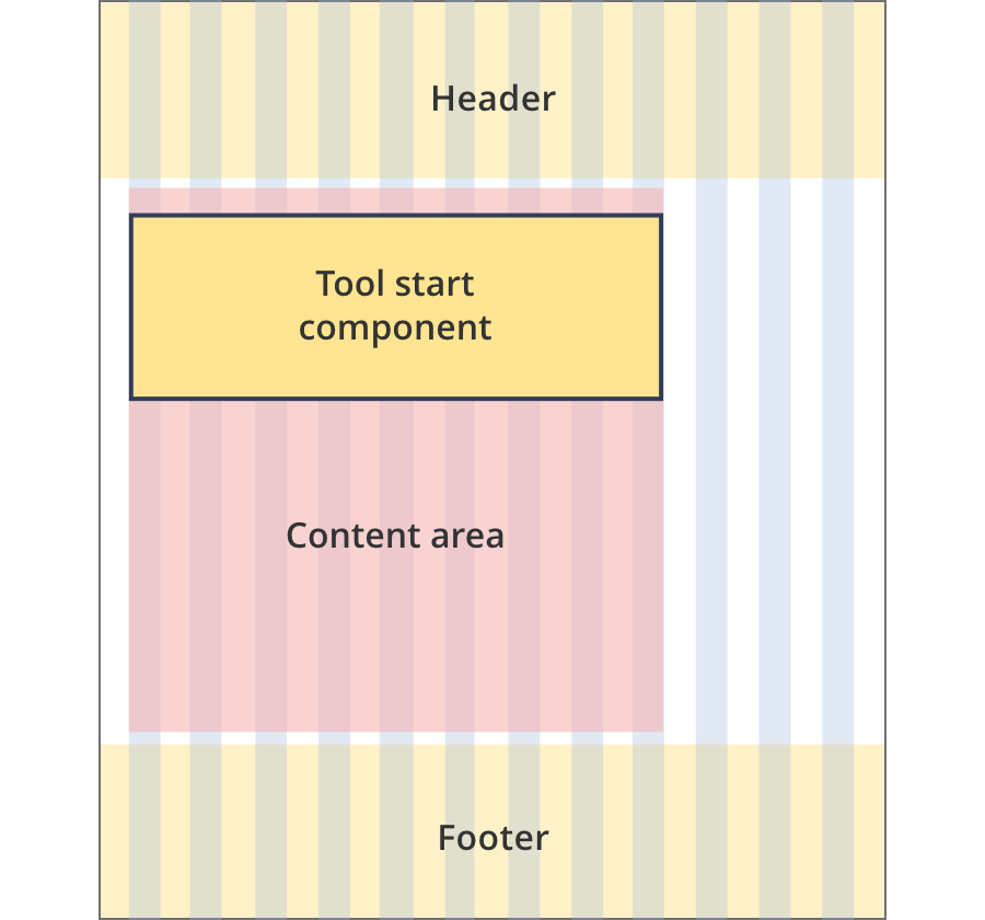
The content area is 9 grid-columns wide.
Tool start components span the full width of the content area.
The content area is 11 grid-columns wide.
Tool start components span the full width of the content area.
The content area is 12 grid-columns wide.
Tool start components span the full width of the content area.
The content area is 9 grid-columns wide.
Tool start components span the full width of the content area.
The content area is 10 grid-columns wide.
Tool start components span the full width of the content area.
The content area is 12 grid-columns wide.
Tool start components span the full width of the content area.
Guidelines for use
Purpose:
The start component is designed to highlight a tool start button while also providing a short description of the tool's purpoose
When to use this component:
- Start components can be used on tool landing pages. They should only ever appear on the first page of a tool or process.
Content rules:
- Descriptions should focus on what the user can use the tool for
- Less important information can be displayed under the start button box.
- When used placed in page (rather than the header) the tool start component should be the first item in the content.