Tool pages
Landing page
Before starting page
Questions page
Review page
Finalise page
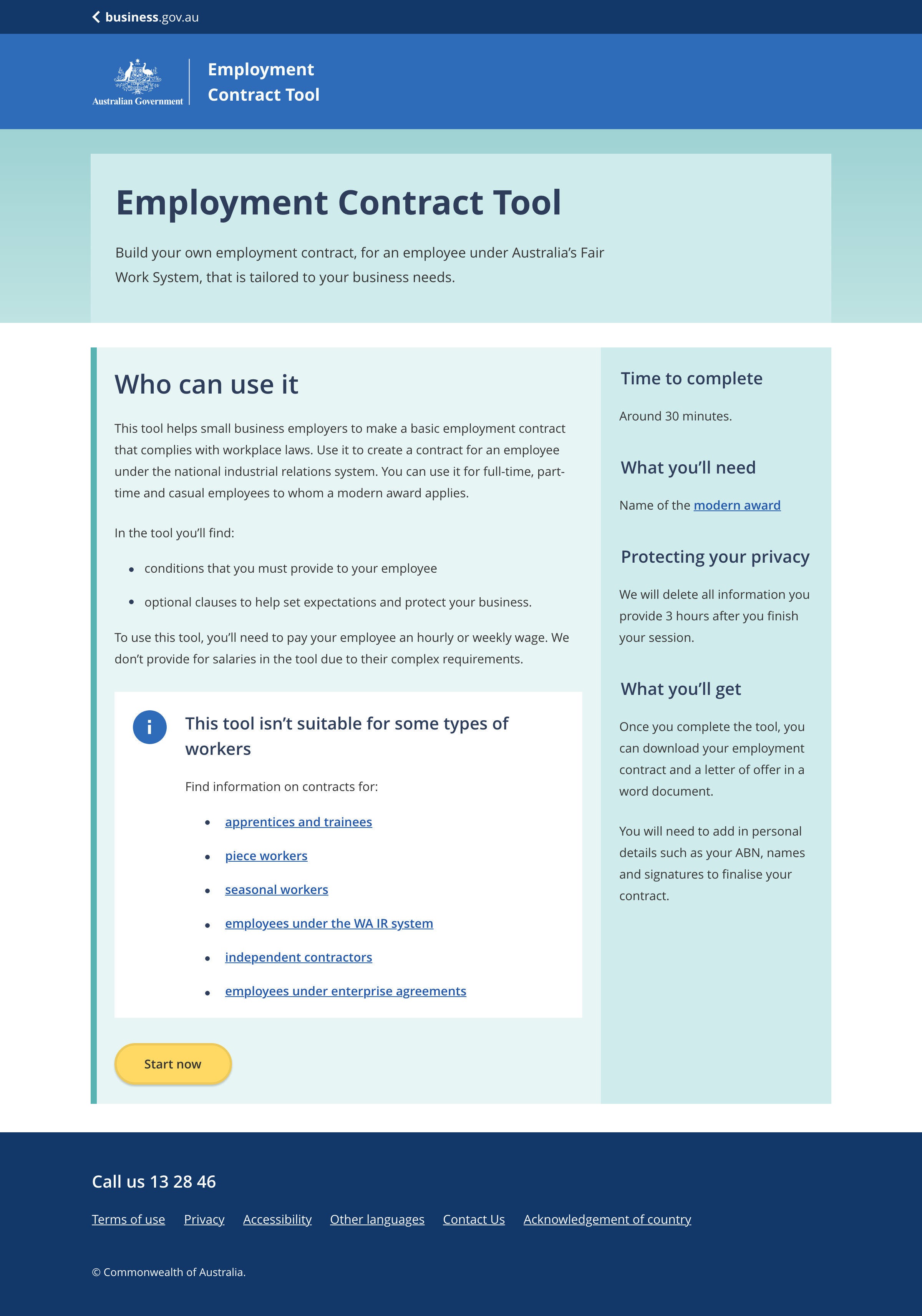
The name of the tool
- Maximum character limit of 50.
A short paragraph that expands on what the tool provides and why it is important.
- The supporting text should explain the benefit of the tool.
- Maximum character limit of 350.
A short paragraph explaining who the tool is for and why they would want to use it.
Optional. Provide information on who should not be using the tool.
An estimate of the amount of time needed to complete the tool.
A short paragraph explaining anything the user will need to complete the tool.
- Requirements to include:
- Any documents the user may need while using the tool, e.g. driver licence or medicare card.
- Any information the user may need to look up during the process, e.g. the name of an award.
- When multiple requirements are listed use bullet points.
A short paragraph explaining the outcome of using the tool.
Include specific information about what the user will receive e.g.:
- an employment contract and a letter of offer in a word document
- information on the Australian government approvals you will need
The button that starts the tool.
- Button wording should be a clear call to action. e.g 'Start now'
- Maximum of four words in the text on the button.
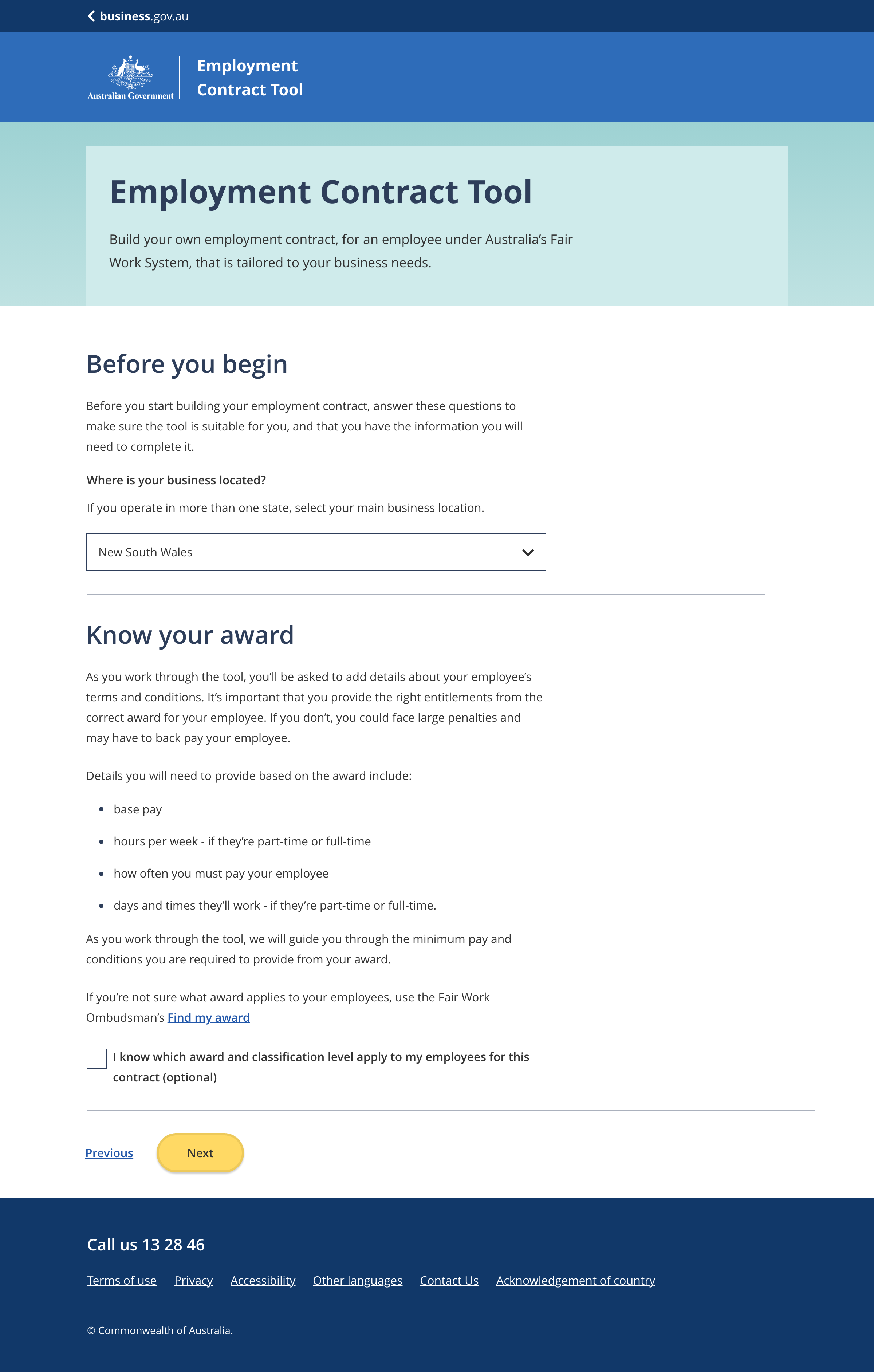
An optional page / section providing any additonal information the user needs before starting the tool process.
Use this page pattern when:
- there is too much preliminary information to include on the landing page, or
- preliminary information is dymanic and changes with user input.
Buttons for navigating through the tool.
- The 'previous' link and 'next' button appear on all pages between the landing page and the review page.
- The wording for navigation links should always be 'previous' and 'next'.
- Styling for the button group must remain consistent throughout the tool:
- The 'previous' link is always styled as an in-text link.
- The 'next' button is always styled as a primary button.
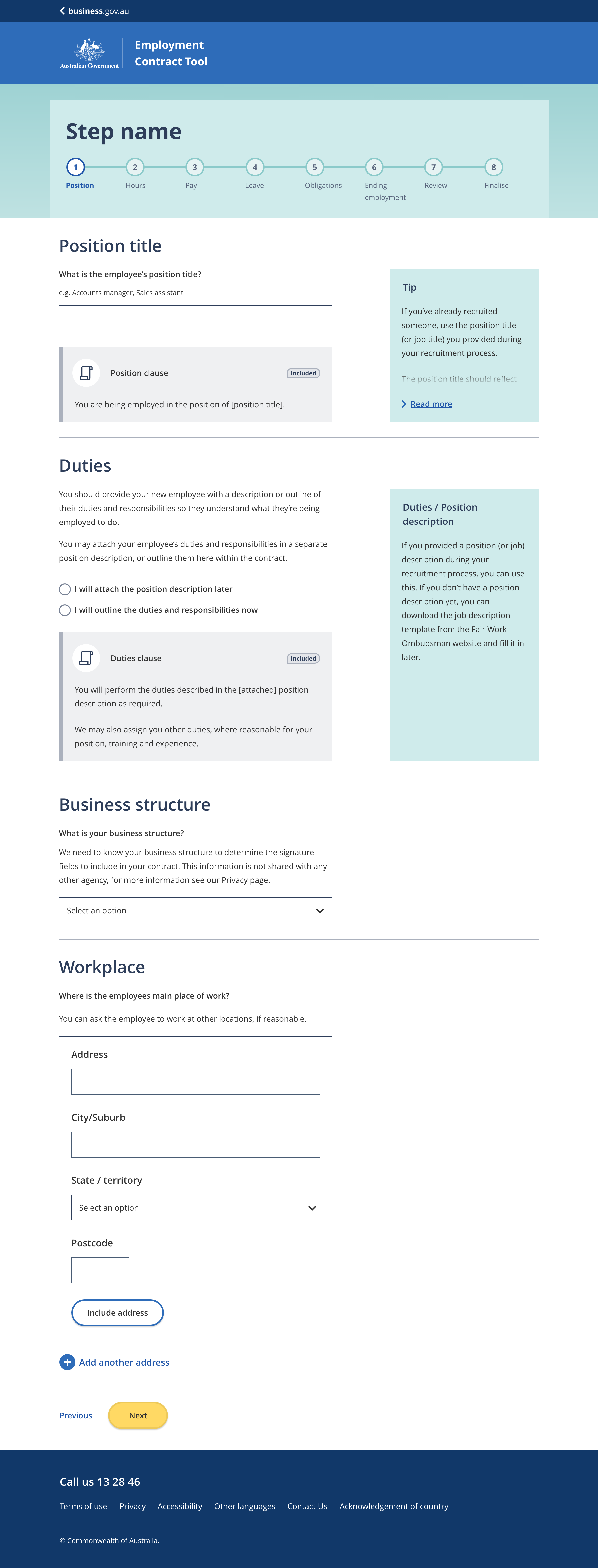
The name of the step within the tool.
One step per page.
Step names should be short and clearly explain what the questions within relate to. Ideally, names consist of one or two words. e.g.:
- Position
- Obligations
Question titles should be short and clearly explain what the question is about. Ideally, titles consist of one or two words. e.g.:
- Annual leave
- Pay rate
Questions are designed to help tailor the information provided by the tool.
Provide any information the user may need to properly understand the question. This may include:
- why the question is important
- how the question may apply to their situation
- links to further infromation
Input fields to allow the user to answer questions. Input fields can be in many formats including:
- Radio buttons
- Text inputs (free text entry)
- Dropdown selects
- Checkboxes
Dynamic clauses related to a specific question. Clause boxes are interactive, when the user answers a question the text within the clause is updated to include their answer.
Dynamic clause boxes include:
- The name of the clause
- The clause text (including any user input text)
- An include/ included tag
Tips to help the user answer the question. Tips should be used to provide additional useful information rather than essential information.
When multiple inputs are required to answer a question they are grouped together in a form field. Form fields need a button for the user to add their responses to the tool once they have completed all the field inputs.
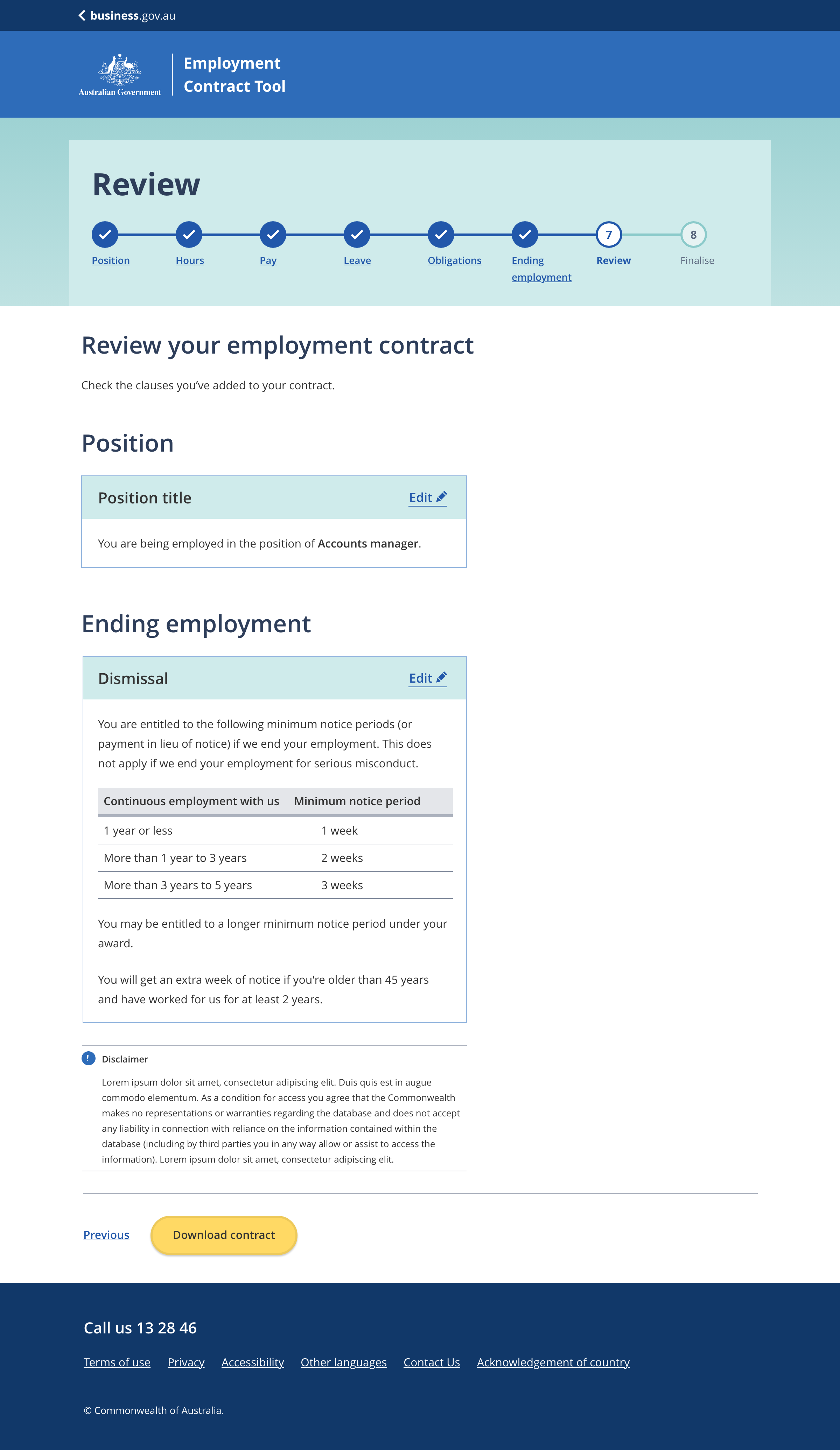
The review page title should be short and clearly explain that the page is for reviewing all answers entered into the tool. The review page is generally the last step in the tool.
The review page is split into sections based on the tool steps. Each section uses the step name as the section title.
Users answers entered throught the tool are displayed in each section.
Edit links take the user back to a question within the tool so they can change an answer.
An optional disclaimer related to information the tool provides.
On the review page the next button changes to a call to action button.
- Button wording should be a clear call to action. e.g 'Download contract'
- Maximum of four words in the text on the button.
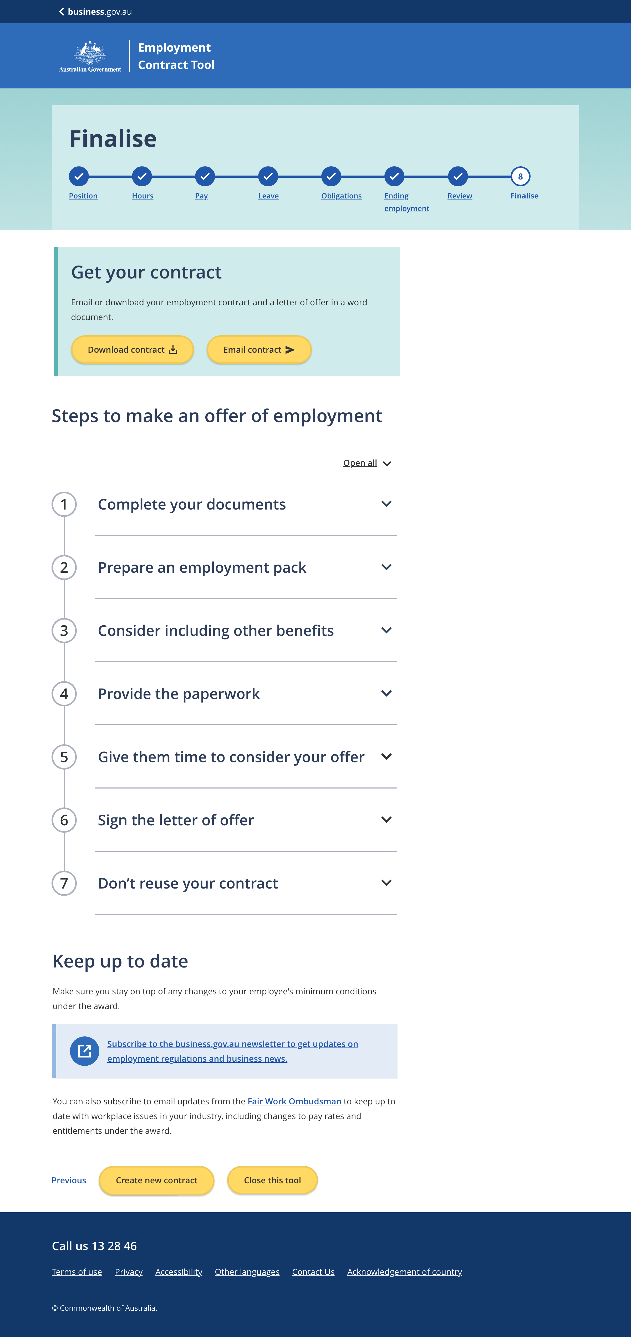
The email / download call to action is used to provide users with the ability to downoad or email a document. The component includes a verification process for verifying the users email address.
Further actions the user can consider taking. This section could include:
- Further information the user may need to seek.
- Actions the user still needs to do.
- Links to other tools and resources the user may find helpful.
The lightweight checklist pattern can be used to help highlight each step.
Provide information about how to keep up to date with content provided in the tool. This section could also be a contact us section for contact information.
Guidelines for use
Purpose
Question and answer (Q&A) tools guide the user through a series of questions designed to help provide them with information tailored to their situation.
Use Q&A tools when the user needs to:
- find a tailored subset of a large amount of information,
- tailor a document to their specific circumstances.
The external Q&A tool pattern is for business.gov.au branded tools that are not hosted on the main business.gov.au domain. It incorporates the subsite header and subsite footer.
Related components
- Sibsite header
- Tool start component
- Buttons and links
- Stepped navigation
- Checkboxes and radio buttons
- Text inputs
- Dropdown select
- Clause / regulation box
- Information sidebar
- Form fields
- Combined results and edit component
- Email / download call to action
- Lightweight checklist accordion
- Disclaimer alerts
- Subsite footer