Page anatomy
Page layout
The resource article page uses the single column - information page layout.
A short, catchy headline summarising the topic and purpose.
- Less formal than other page titles for other content types.
- Maximum character limit of 50.
A short paragraph that expands on what the main action on the page is and why it is important.
- The supporting text should explain who the page is for, what the user will learn and the benefit of the page.
- Maximum character limit of 350.
- Maximum character limit of 90.
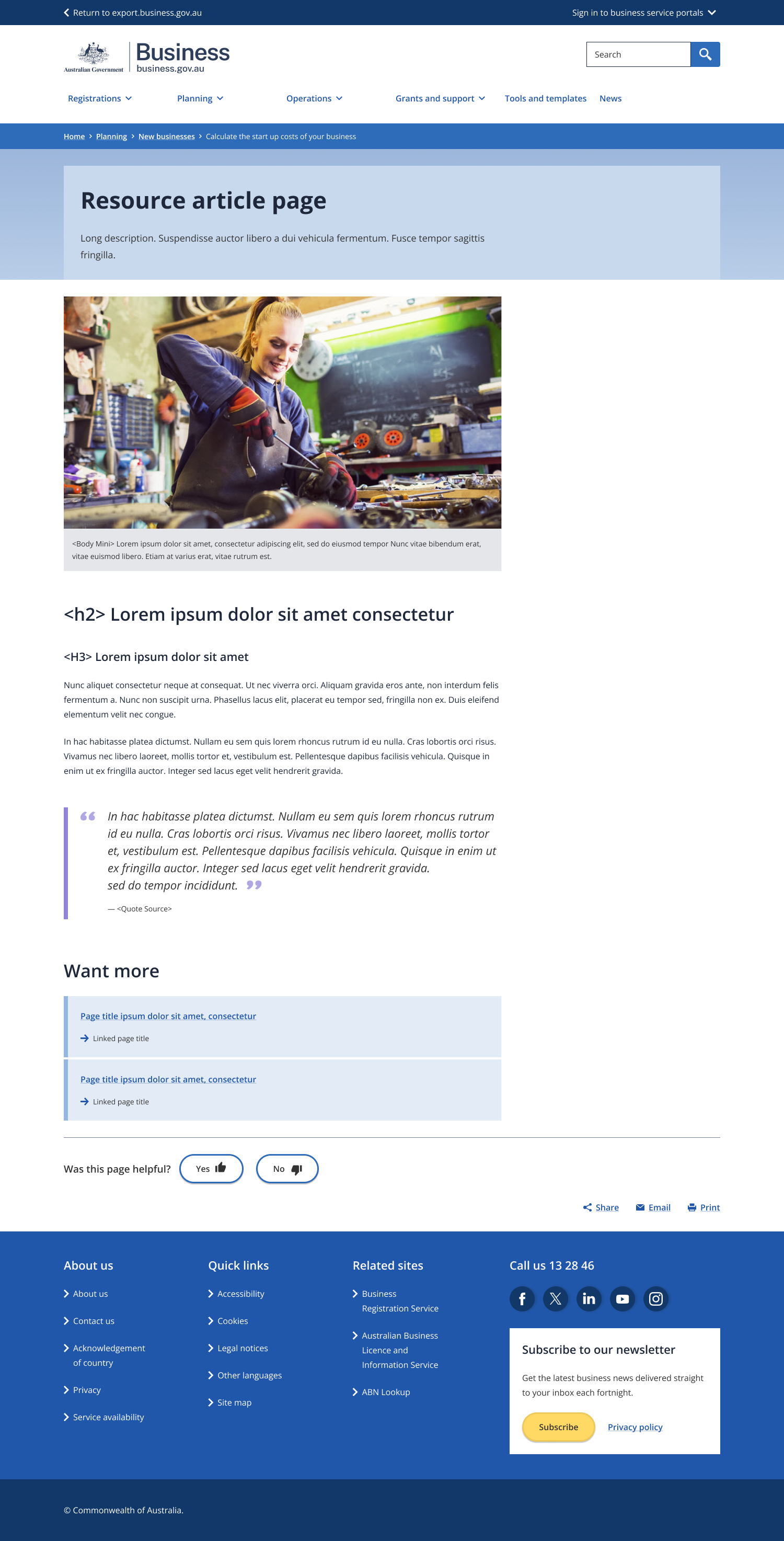
Supporting media to enhance the content.
- Maximum of one image or video per page.
- Image should always be the first element after the header.
- Avoid logos as images or on images.
Short titles used to break up the content into sub-topics.
- Maximum of three per page.
- Avoid replicating the page title.
The main text content of the article apart from H2 sub-headings.
- Word limit of 800.
- Each sub-section should have a maximum of two paragraphs.
Used to highlight a quote
- No more than one pull quote per resource article.
Used to direct the user to what they might find most helpful next.
- Always use “Want more?” for the heading.
- All links should be internal links.
- Should direct users to longer pieces of content (e.g. 101 or tutorial pages).
- Maximum of three links.
Guidelines for use
Purpose
A resource article page is a short, sharp page styled like an article that helps a user with a quick, simple topic or task.
It should always include:
- Focus on a single topic that has been shaped into a short, simple message.
- An engaging headline that clearly communicates the hook.
- A more engaging, less formal voice.
- Links to additional information.
- A relevant image.
It must NOT include:
- Overly long message (i.e. in excess of 1000 words).
- Short-term content that expires quickly that would be better communicated in a news article.
- Complicated how-to’s ;or explanations that would be better suited to a tutorial.
- More than three pathways to other website resources.