Tool pages
Page layout
The tiled page with guided search uses the two column - filter page layout.
Start page
Multi-select questions
Single select questions
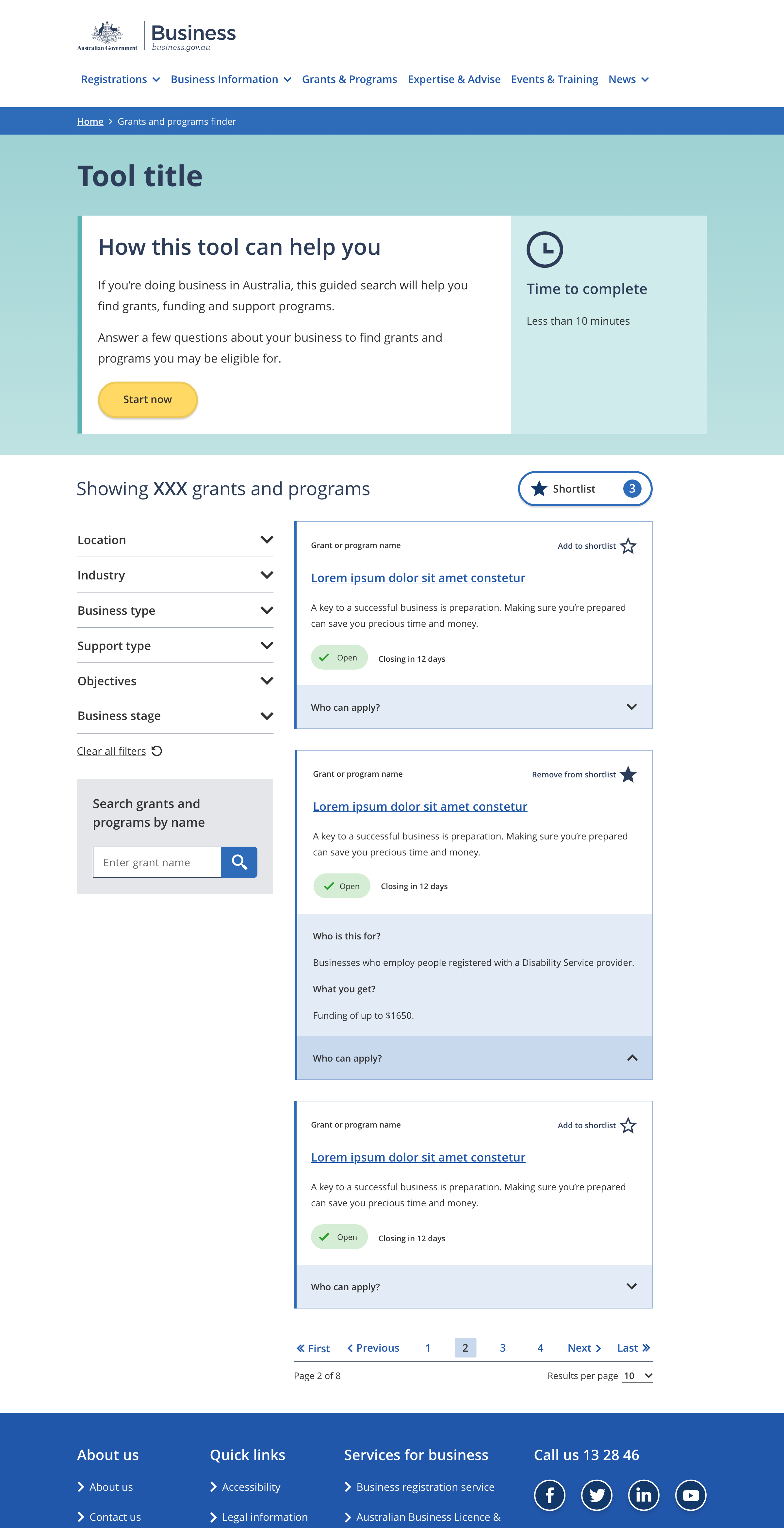
The name of the tool
- Maximum character limit of 50.
A short paragraph explaining who the tool is for and why they would want to use it.
An estimate of the amount of time needed to complete the tool.
The button that starts the guided search.
- Button wording should be a clear call to action. e.g 'Start now'
- Maximum of four words in the text on the button.
The results showing number highlights the number of information tiles available. When the page loads the showing number is set to the total number of items available. When the user interacts with the filters to refine the set of tiles the showing number changes accordingly.
The showing number text should describe the type of information being displayed, e.g. 'Showing XX grants and programs'
Links to a modal that displays a list of user shortlisted items.
The filters allow users to refine the current set of information tiles using a series of checkboxes, dropdown selects and / or text input fields.
Filter configurations vary from tool to tool.
Result tiles are used to link to business.gov au pages.
Tile designs vary between tools but generally have a title that relates to the linked page title and a short description.
The pagination links provide a way to navigate through multiple pages of result tiles.
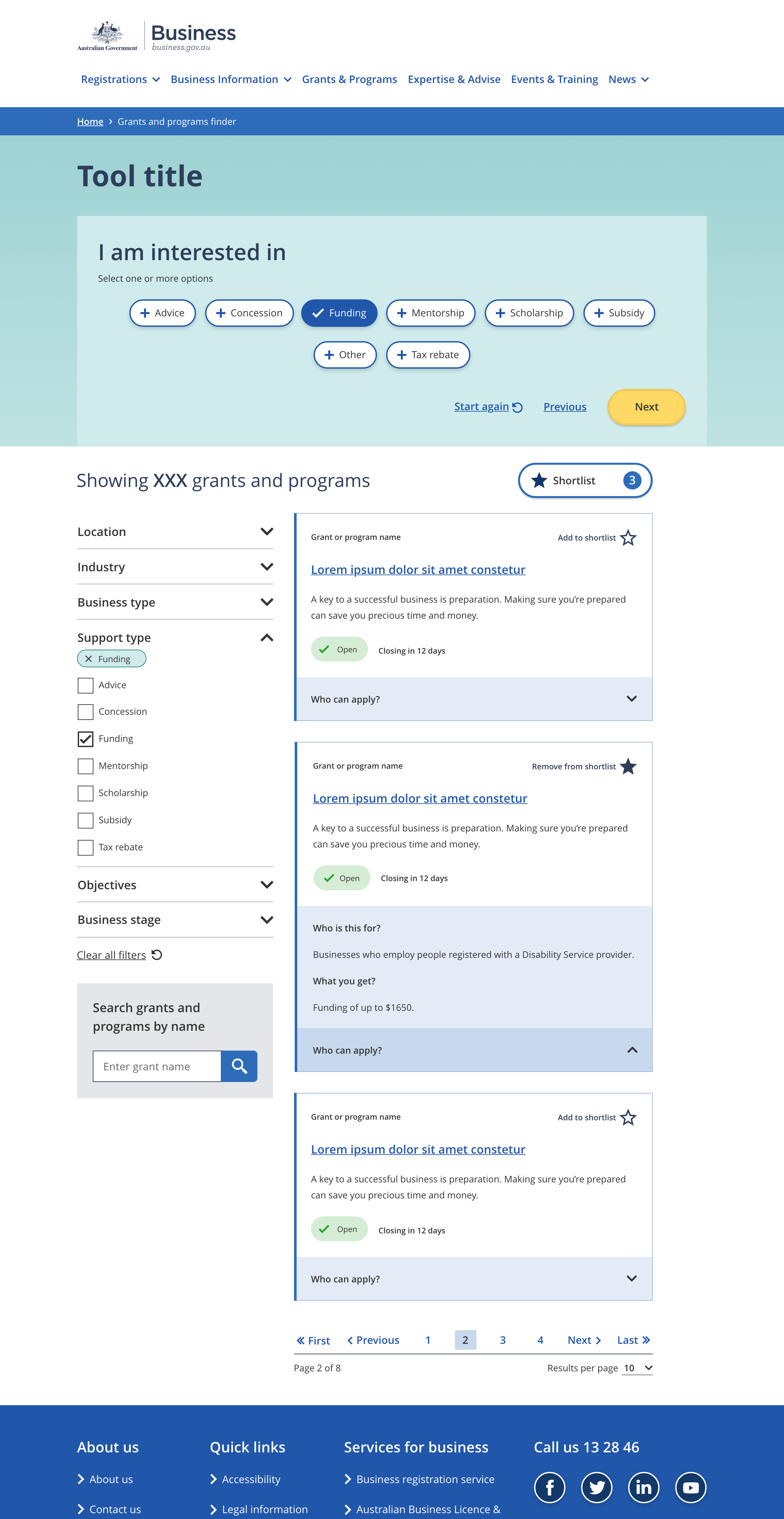
A short statement that leads in to user selected answers. e.g.:
- 'I am looking for assistance with'
- 'My business is operating in'
Generally there is one question per screen with the exception being questions that are a subset of the first question.
Optional instructions to help the user understand how to answer the question.
Options the user can select to answer the question.
User selected answers are ticked to make it clear they are currently selected.
Buttons for navigating through the tool.
- The 'next' button appears on all question pages except the last one.
- The 'start again' link appears on all question pages.
- The 'previous' link appears on all question pages except the first one.
- The wording for navigation links should always be 'start again', 'previous', and 'next'.
- Styling for the button group must remain consistent throughout the tool:
- The 'start again' and 'previous' links are always styled as in-text links.
- The 'next' button is always styled as a primary button.
Every question has a matching filter. The answer options displayed for a question must be the same as the options in the matching filter.
When a user selects an answer to a question the same filter option is selected and vice versa. There is always a direct match between the options selected in the filters and in the questions.
Filter bubbles indicate which options are currently selected. They also provide a way for users to unselect options.
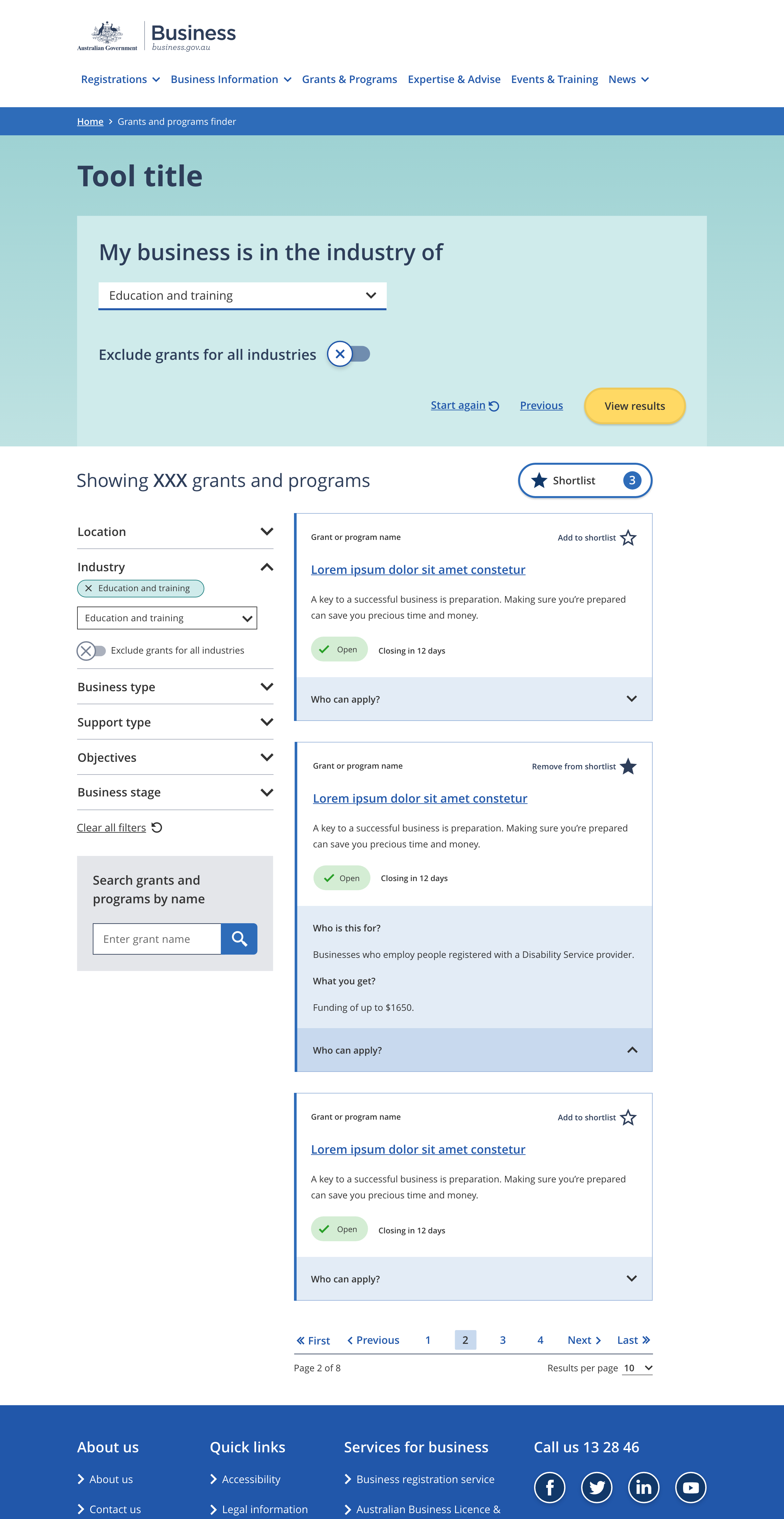
A short statement that leads in to user selected answers. e.g.:
- 'My business is operating as a'
- 'My business is in the industry of'
Generally there is one question per screen with the exception being questions that are a subset of the first question.
A dropdown select allowing users to choose one option in response to the question.
A simple yes / no option. The toggle question is usually used as a secondary question.
The 'view results' button replaces the 'next' button on the last page. Clicking on it scrolls the user down to the result items.
Every question has a matching filter. The answer options displayed for a question must be the same as the options in the matching filter.
When a user selects an answer to a question the same filter option is selected and vice versa. There is always a direct match between the options selected in the filters and in the questions.
Guidelines for use
Purpose
Tiled pages with a guided search provide users with a series of links to related information such as a set of grants and programs.
Questions in the guided search can be used to refine the number of items helping users to find information that is relevant to them. In addition to the guided search this tool pattern includes filters that also provde a way to refine the items displayed.
Examples of this pattern are the business.gov.au grants and program finder.