Page anatomy
Page layout
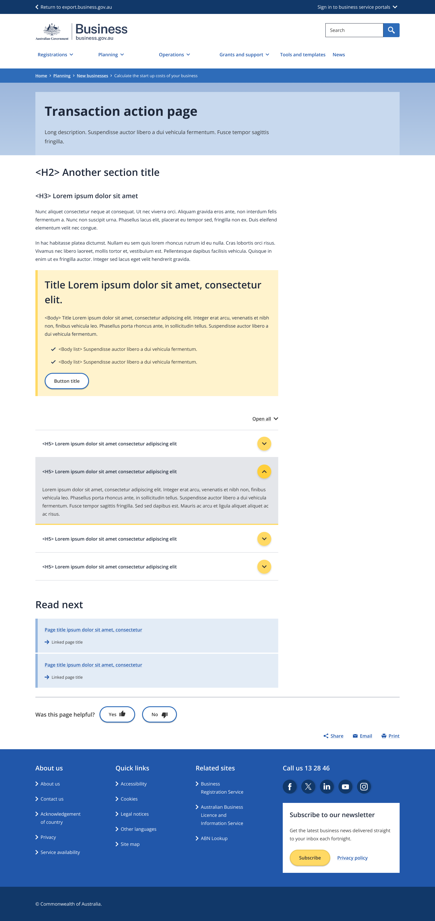
The transaction action page uses the single column - information page layout.
A direct, short title focused on the main action the user will complete on the page.
- Maximum character limit of 50.
- Start with “Register for…” or “Search for..”
A short paragraph that expands on what the main action on the page is and why it is important.
Rules for long description:
- The supporting text should explain who the page is for, what the user will learn and the benefit of the page.
- Maximum character limit of 350.
Rules for short description:
- The short description will not appear on page, it is used for the topic page tile description (populated from metadata).
- The supporting text always following the format of [intro phrase] [sub-topic], [sub-topic] and [sub-topic], so you can [user outcome].
- Use one of these three intro phrases: “learn how to”, “understand” or “find out”.
- Include the top three keywords for the page.
- Maximum character limit of 90.
Short titles used to break up the content into sub-topics.
- Maximum length of one line.
- Don’t hyperlink the headings.
- Avoid replicating the page title.
This should help explain what the transaction or service is about, who it applies to and what the end goal is.
- No more than two blocks above the CTA.
- No more than two paragraphs each block.
The call to action is the main reason why this page exists. This box should only contain information about the form or service.
- Only use one CTA per page.
- Maximum of 50 characters in heading text.
- Title must include the name of the tool/form
- Maximum of 200 characters in body text.
- The text must cover what the business needs to do before actioning the CTA or a quick description of the tool.
- A max of three dot points can be included if there are important steps or information that must be known before completing the tool/form. This excludes other tools that must be completed.
- Avoid hyperlinks in the text.
- The call to action must include an action. E.g. Register… or Search…
- Maximum of four words in the text on the button.
- CTA can be an internal or external resource.
Used to house frequently asked questions or information about the transaction action the user is completing.
- Only use one group per page.
- Maximum of 9 accordion items/questions.
- Maximum of 60 characters in item heading.
- Maximum of 600 characters in body text of each item.
An optional component used to direct the user to what they might find most helpful next when there is a logical next step.
- Always use “Read next” for the heading.
- Maximum of one link.
- The link should always be internal.
Guidelines for use
Purpose
A transaction page is a page that gives the user with enough information to complete a single transaction-based task confidently and quickly.
It should always include:
- One clear action with an outcome for the user highlighted with a strong call to action (CTA) to complete the task.
- A short explanation of what the task is.
- Simple information in a list format to help the user qualify/disqualify themselves quickly.
- Information on what a user needs to know/prepare before completing the task.
- Information to address common concerns or question related to the task.
- The name of the agency the task is related to.
- An outcome for the user.
It can also include:
- The benefits of completing the task for the user.
It must NOT include:
- Multiple confusing actions or more than one call to action.
- A CTA that is too far down the page (i.e. well below the fold when the page loads)
- Long pages or too much detail.
- Anything that detracts or distracts from the main CTA.
- More than one piece of content the user is directed to at the bottom of the page.
