Vertical grid
The business.gov.au website uses the bootstrap 12 column grid with the following modifications:
- The maximum container width on the page is 1320px.
- At screen widths less than 1320px the container width is 64px less than the screen width (32px on either side).
- At screen widths less than 576px the container is 48px less than the screen width (24px on each side).
- The gutter between columns is 32px.
- An additional breakpoint of ≥350px is occassionally used.
Grid breakpoints
| xs | bga xs | sm | md | lg | xl | |
|---|---|---|---|---|---|---|
| Minimum screen width | <576px | ≥350px | ≥576px | ≥768px | ≥992px | ≥1200px |
| Gutter | 16px | 16px | 32px | 32px | 32px | 32px |
Page layouts
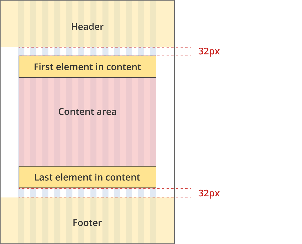
Single column - navigation page layout
This layout is typically used for navigation pages. Page patterns that use this layout include:
- Home page
- Category pages
- Topic pages
- Customer stories landing pages
- News page
Bootstrap classes
- Body content: .col-12
All breakpoints
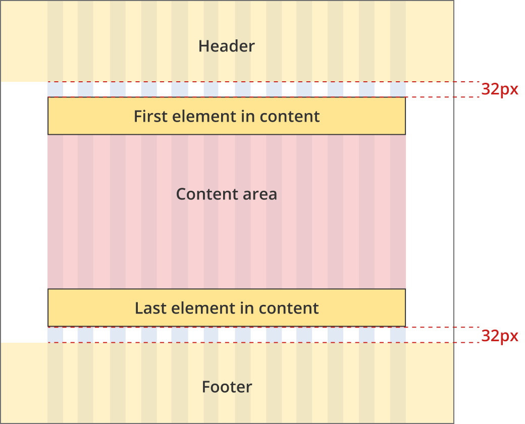
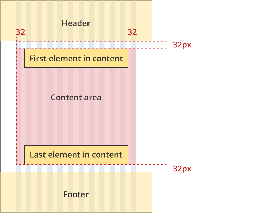
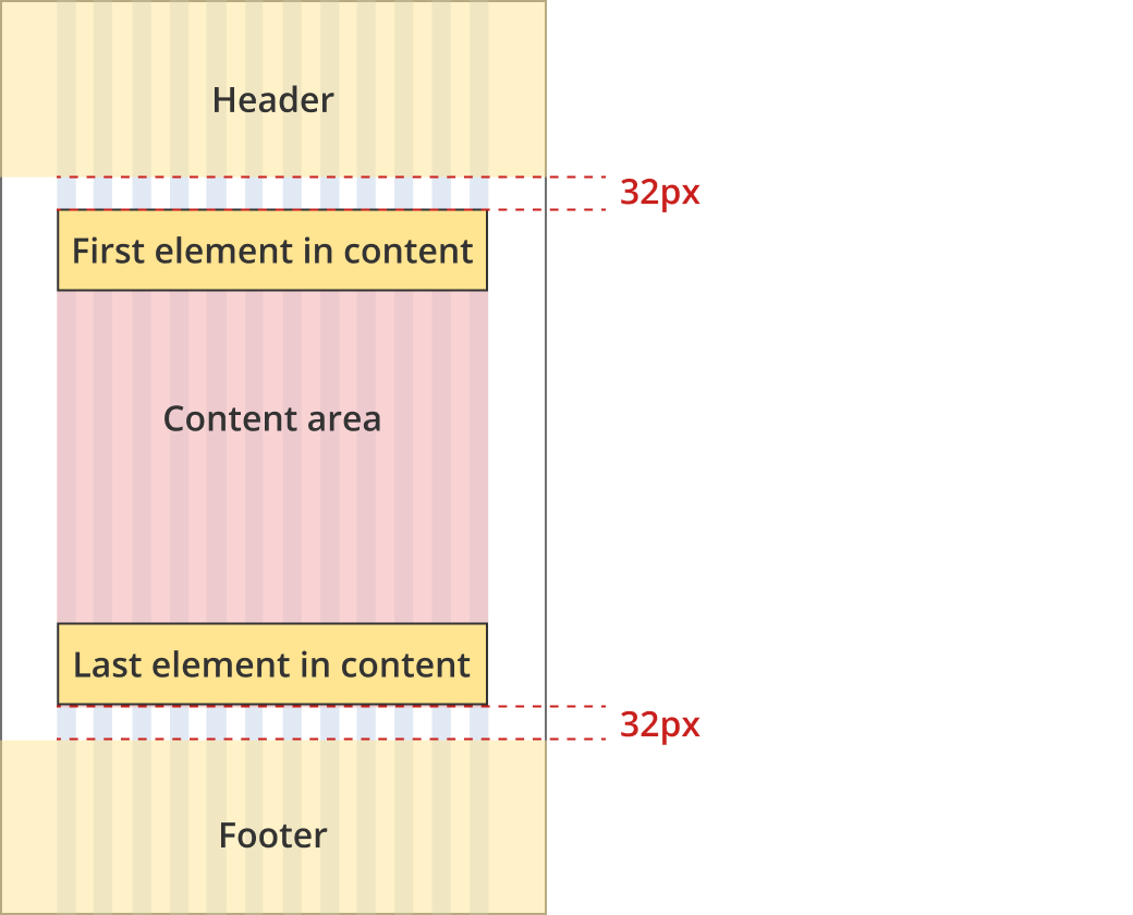
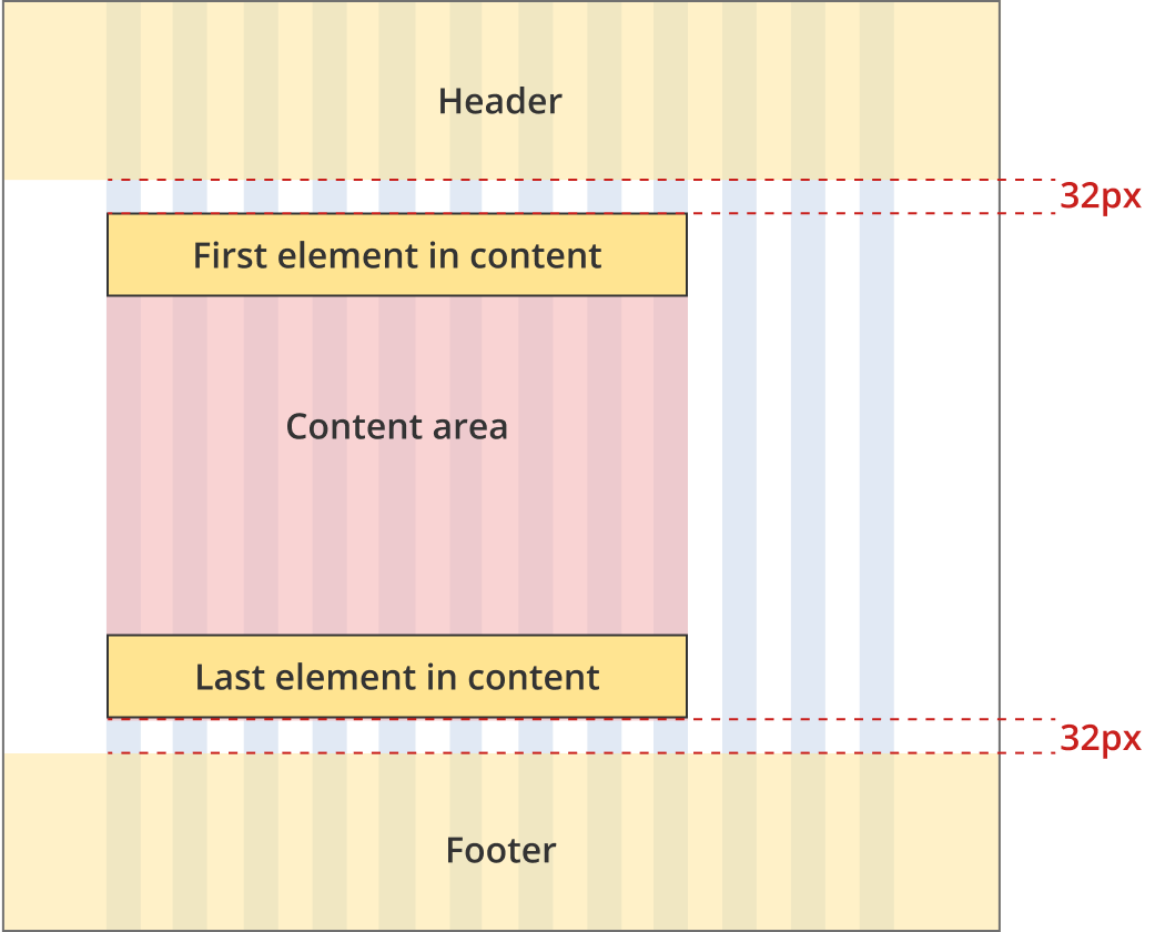
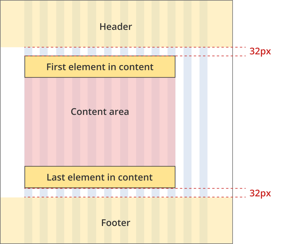
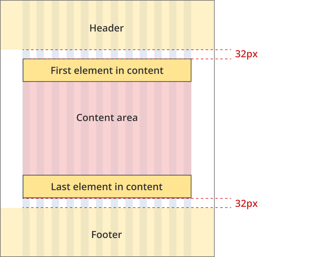
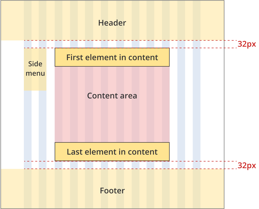
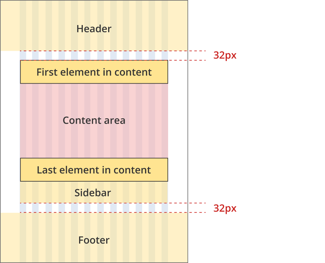
The content area is 12 grid-columns wide.
The content area has a 32px margin above and below.
The first element within the content area has zero margin and padding above (regardless of what element it is).
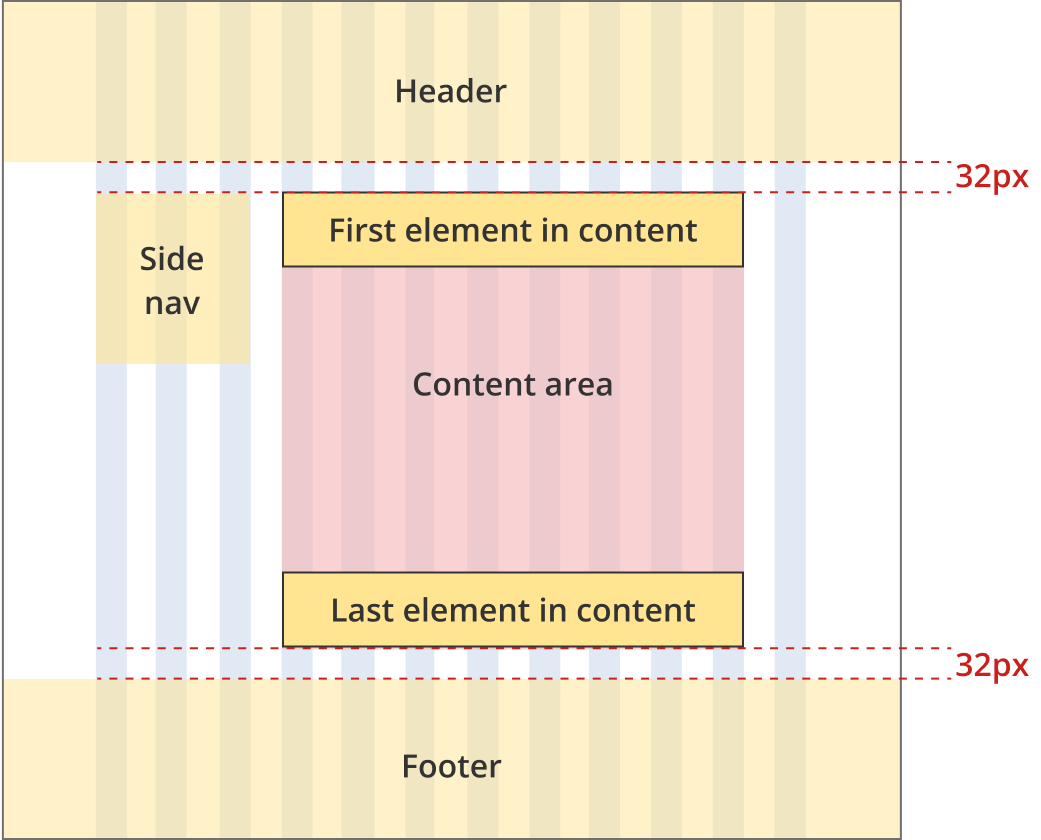
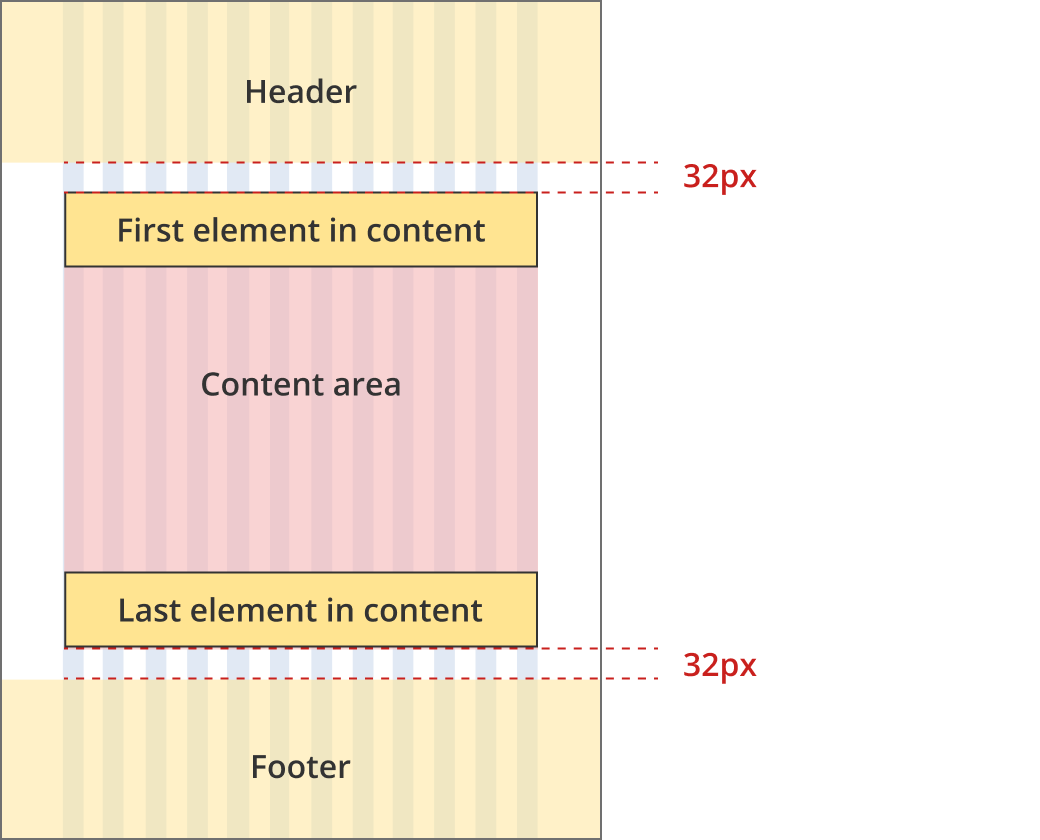
Single column - information page layout
This layout is typically used for information pages. Page patterns that use this layout include:
- Resource article page
- External grants landing page
- Customer story (single) page
Bootstrap classes
- Body content: .col-12 .col-md-11 .col-lg-9 .col-xl-8
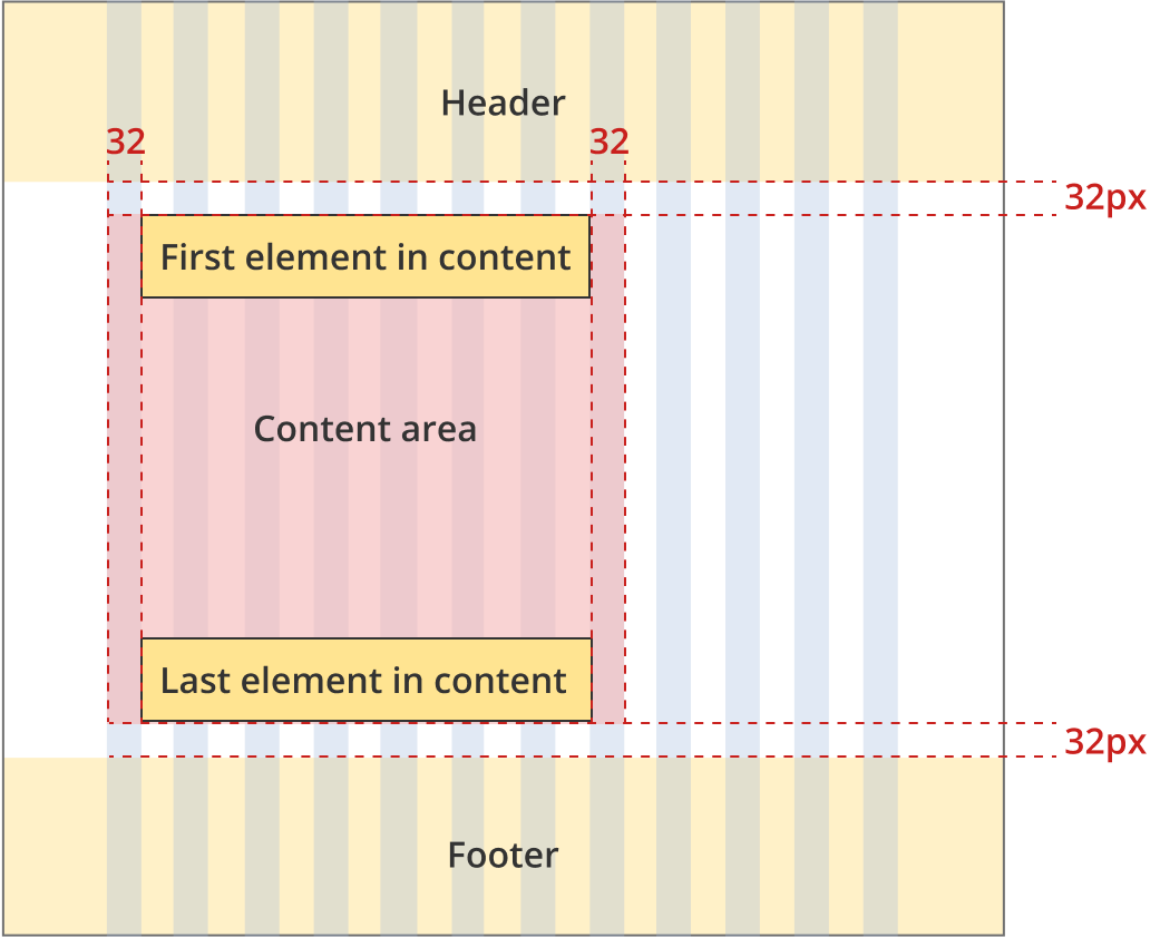
The content area is 8 grid-columns wide. The content area is aligned to the left side of the page.
The content area has a 32px margin above and below.
The first element within the content area has zero margin and padding above (regardless of what element it is).
The content area has left and right padding of 32px.
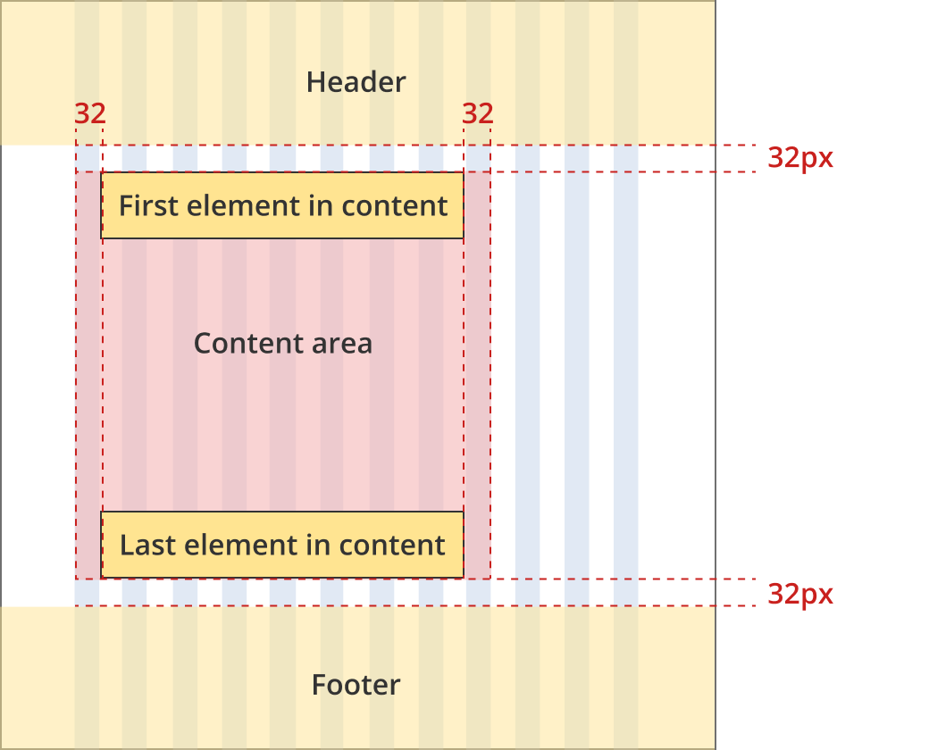
The content area is 9 grid-columns wide. The content area is aligned to the left side of the page.
The content area has a 32px margin above and below.
The first element within the content area has zero margin and padding above (regardless of what element it is).
The content area has left and right padding of 32px.
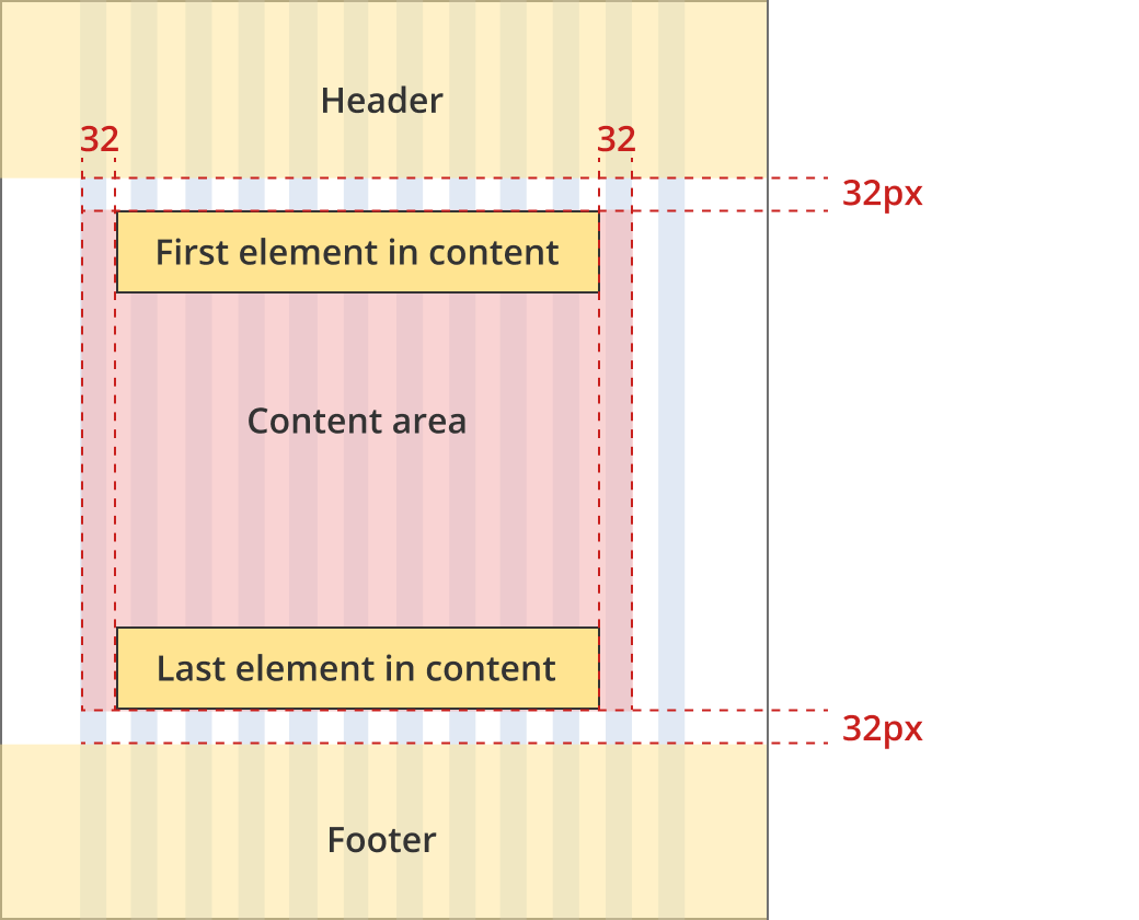
The content area is 11 grid-columns wide. The content area is aligned to the left side of the page.
The content area has a 32px margin above and below.
The first element within the content area has zero margin and padding above (regardless of what element it is).
The content area has left and right padding of 32px.
The content area is 12 grid-columns wide.
The content area has a 32px margin above and below.
The first element within the content area has zero margin and padding above (regardless of what element it is).
The content area has left and right padding of 32px.
The content area is 12 grid-columns wide.
The content area has a 32px margin above and below.
The first element within the content area has zero margin and padding above (regardless of what element it is).
The content area has no padding left or right.
Single column - tool page layout
This layout is typically used for information pages in tools that require more width than standard information pages. Page patterns that use this layout include:
- Tool landing page
- Tool review / finalise page
Bootstrap classes
- Body content: .col-12 .col-lg-10 .col-xl-9
The content area is 9 grid-columns wide. The content area is aligned to the left side of the page.
The content area has a 32px margin above and below.
The first element within the content area has zero margin and padding above (regardless of what element it is).
The content area has left and right padding of 32px.
The content area is 10 grid-columns wide. The content area is aligned to the left side of the page.
The content area has a 32px margin above and below.
The first element within the content area has zero margin and padding above (regardless of what element it is).
The content area has left and right padding of 32px.
The content area is 12 grid-columns wide.
The content area has a 32px margin above and below.
The first element within the content area has zero margin and padding above (regardless of what element it is).
The content area has no padding left or right.
Two column - information page layout
This layout is typically used for information pages. Page patterns that use this layout include:
- 101 page
- Tutorial page
- Internal grants landing page
Bootstrap classes
- Left side menu: .col-12 .col-sm-3
- Body content: .col-12 .col-sm-9 .col-xl-8
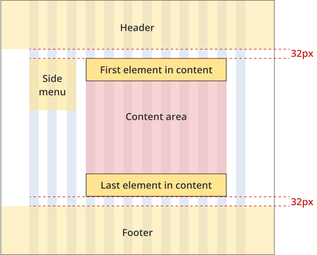
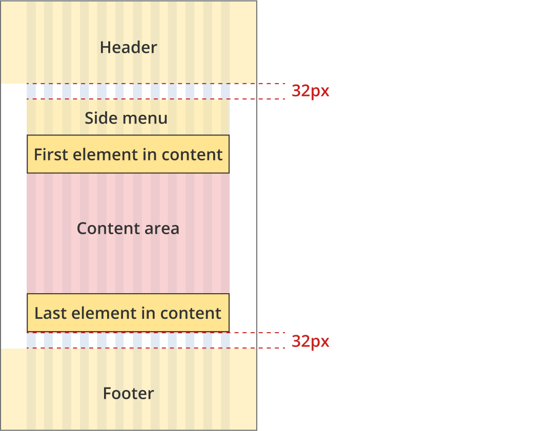
The left side menu is 3 grid-columns wide. The content area is 8 grid-columns wide.
The area containing the side menu and the content has a 32px margin above and below.
The first element within the content area and the side menu have zero margin and padding above (regardless of what element it is).
The left side menu is 3 grid-columns wide. The content area is 9 grid-columns wide
The area containing the side menu and the content has a 32px margin above and below.
The first element within the content area and the side menu have zero margin and padding above (regardless of what element it is).
The content area and the left side menu are both 12 grid-columns wide.
The area containing the side menu and the content has a 32px margin above and below.
The first element within the content area and the side menu have zero margin and padding above (regardless of what element it is).
Two column - ABLIS information page layout
This layout is used for ABLIS information pages.
Bootstrap classes
- Left side menu: .col-12 .col-md-3 .col-lg-2
- Body content: .col-12 .col-md-9 .col-xl-8
The left side menu is 2 grid-columns wide. The content area is 8 grid-columns wide.
The area containing the side menu and the content has a 32px margin above and below.
The first element within the content area and the side menu have zero margin and padding above (regardless of what element it is).
The left side menu is 32 grid-columns wide. The content area is 9 grid-columns wide
The area containing the side menu and the content has a 32px margin above and below.
The first element within the content area and the side menu have zero margin and padding above (regardless of what element it is).
The left side menu is 3 grid-columns wide. The content area is 9 grid-columns wide
The area containing the side menu and the content has a 32px margin above and below.
The first element within the content area and the side menu have zero margin and padding above (regardless of what element it is).
The content area and the left side menu are both 12 grid-columns wide.
The area containing the side menu and the content has a 32px margin above and below.
The first element within the content area and the side menu have zero margin and padding above (regardless of what element it is).
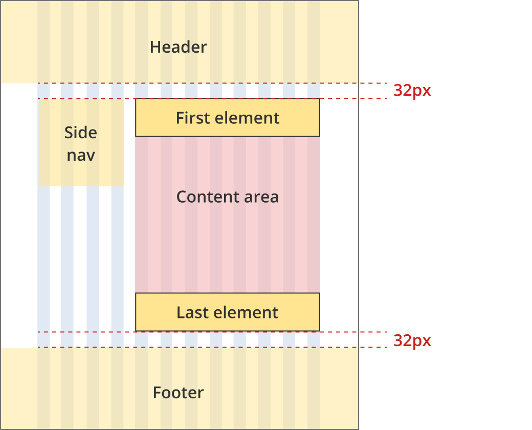
Two column - guide page layout
This layout is typically used for tools with vertical side navigation including:
- Guide pages
- ABLIS question pages
Bootstrap classes
- Left side menu: .col-12 .col-md-4 .col-xl-3
- Body content: .col-12 .col-md-8 or .col-12 .col-md-8 .col-xl-9
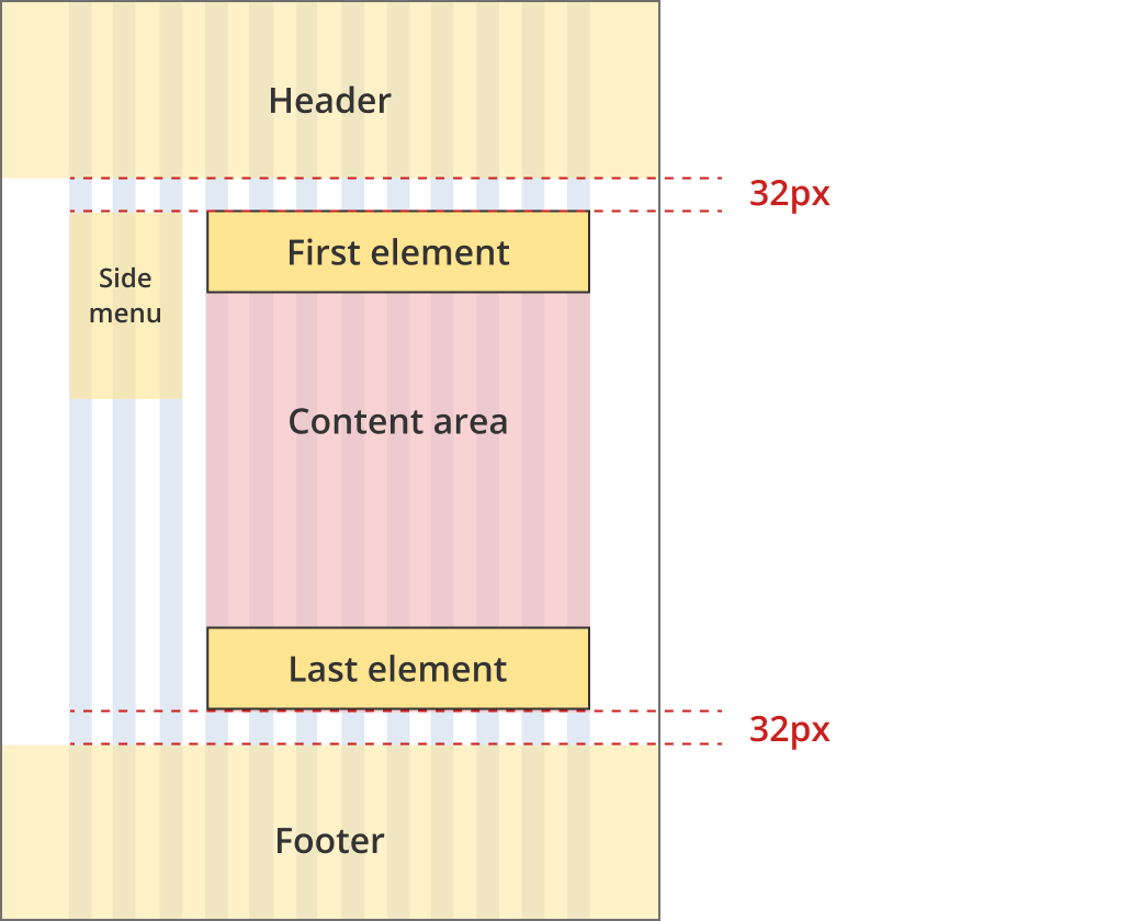
The left side menu is 3 grid-columns wide. The content area is 8 grid-columns wide*.
The area containing the side menu and the content has a 32px margin above and below.
The first element within the content area and the side menu have zero margin and padding above (regardless of what element it is).
* A layout variation exists for tools needing a wider content area. In this breakpoint the content area can also be 9 grid-columns wide.
The left side menu is 4 grid-columns wide. The content area is 8 grid-columns wide
The area containing the side menu and the content has a 32px margin above and below.
The first element within the content area and the side menu have zero margin and padding above (regardless of what element it is).
The content area and the left side menu are both 12 grid-columns wide.
The area containing the side menu and the content has a 32px margin above and below.
The first element within the content area and the side menu have zero margin and padding above (regardless of what element it is).
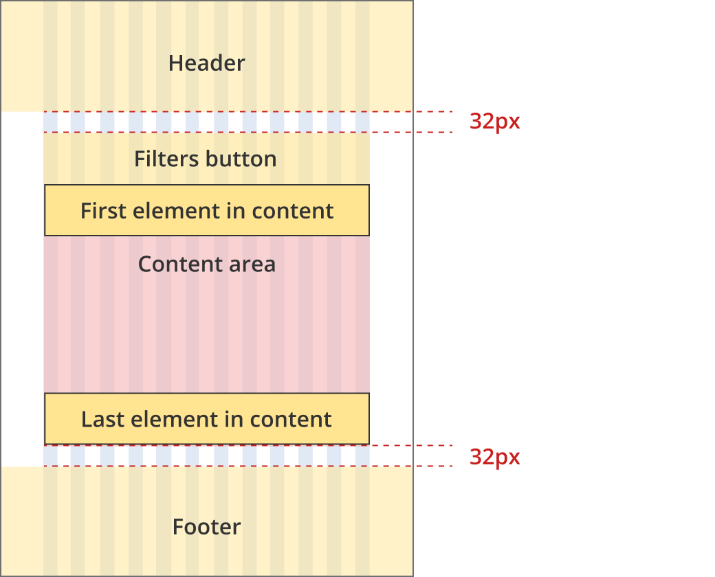
Two column - filter page layout
This layout is used for search and finder tool result pages including:
- business.gov.au search results page
- Grants and programs finder tool
- Adviser finder tool
- Events finder tool
Bootstrap classes
- Left filters: .col-12 .col-md-4
- Body content: .col-12 .col-md-8 .col-xl-7
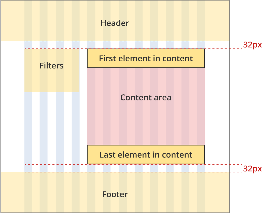
The left filter area is 4 grid-columns wide. The content area is 8 grid-columns wide
The areas containing the filters and the content have a 32px margin above and below.
The first elements within the content and filter areas have zero margin and padding above (regardless of what element it is).
The content area and the filter area are both 12 grid-columns wide.
Filter visibility can be turned on and off with a mobile filter button.
The areas containing the filters and the content have a 32px margin above and below.
The first elements within the content and filter areas have zero margin and padding above (regardless of what element it is).
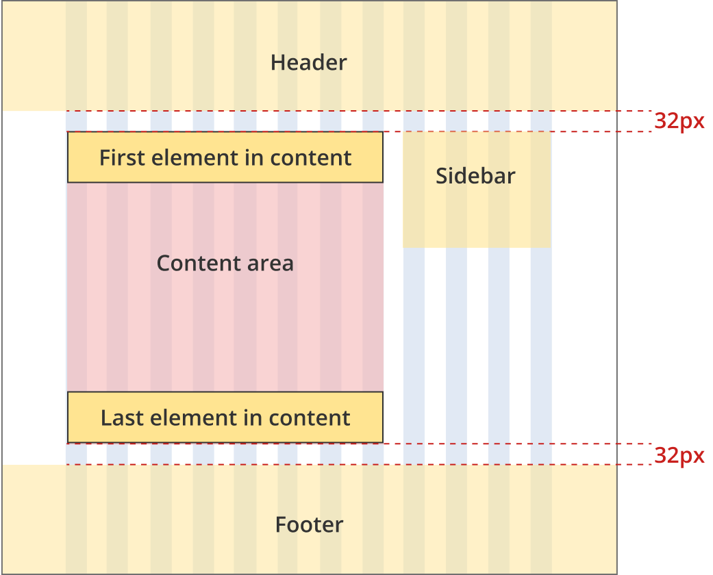
Two column - tool page layout
This layout is only used for pages that require a sidebar such as checklists and tools. It should not be used for general information pages or nagivation pages.
Bootstrap classes
- Body content: .col-12 .col-md-8
- Right sidebar: .col-12 .col-md-4

The right sidebar is 4 grid-columns wide. The content area is 8 grid-columns wide
The area containing the sidebar and the content has a 32px margin above and below.
The first element within the content area has zero margin and padding above (regardless of what element it is).
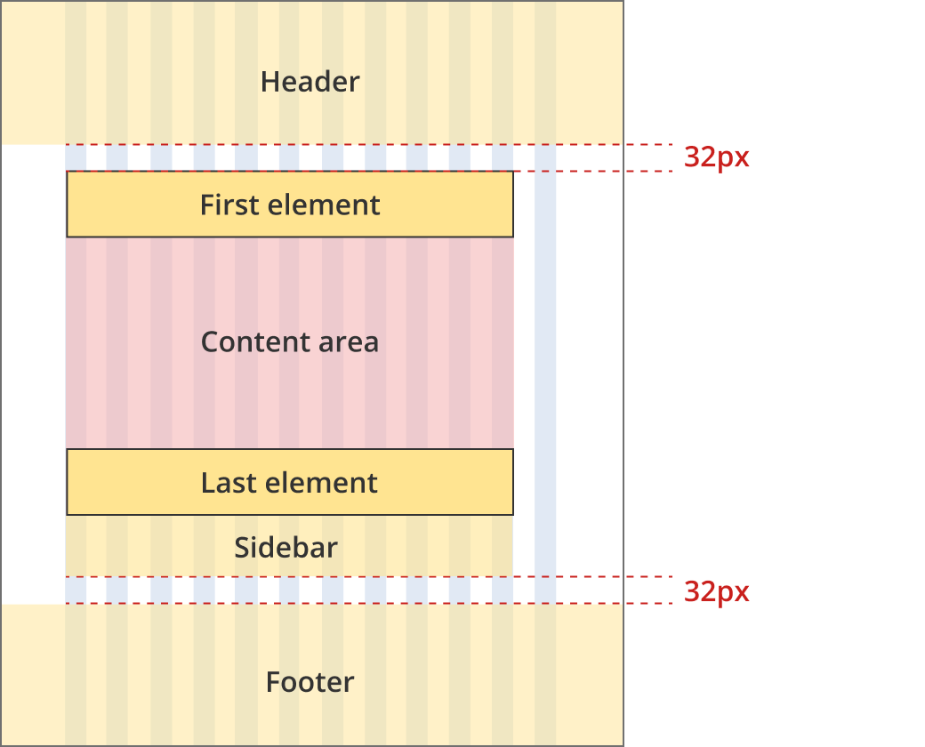
The content area and the right sidebar are both 12 grid-columns wide. The right sidebar may be fixed to the bottom of the screen.
The area containing the sidebar and the content has a 32px margin above and below.
The first element within the content area has zero margin and padding above (regardless of what element it is).
Two column - tool page alternate layout
This layout is only used for pages that require a sidebar such as checklists and tools. It should not be used for general information pages or nagivation pages.
Bootstrap classes
- Body content: .col-12 .col-md-11 .col-lg-8
- Right sidebar: .col-12 .col-md-11 .col-lg-4
The right sidebar is 4 grid-columns wide. The content area is 8 grid-columns wide
The area containing the sidebar and the content has a 32px margin above and below.
The first element within the content area has zero margin and padding above (regardless of what element it is).
The content area is 11 grid-columns wide.
The right sidebar is 11 grid-columns wide.
The area containing the content has a 32px margin above and below.
The first element within the content area has zero margin and padding above (regardless of what element it is).
The content area and the right sidebar are both 12 grid-columns wide.
The area containing the content has a 32px margin above and below.
The first element within the content area has zero margin and padding above (regardless of what element it is).
Coloured background sections
Coloured background sections should always have a heading (usually a h2 level heading).
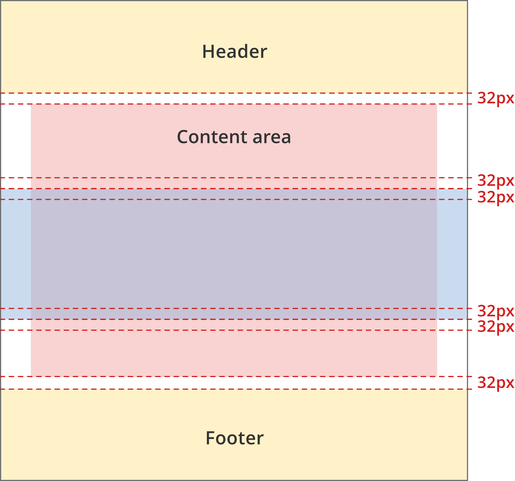
These sections should have 32px padding top and bottom as well as 32px margin top and bottom. The blue background colour extends left and right to the edge of the viewport.
Margin and padding elements within the coloured background sections remain the same as in the rest of the content.
Where to use coloured background sections
Coloured background sections are only used in a few specific places:
- The home page, category pages and topic pages can have sections with a light blue background (#C7D9EE) to help group navigation tiles.
- The ABLIS home page has a section with a teal background (#8BCACA). This section is used to highlight the ABLIS guided search start component.
Tool sections
Section Divider example
Section content
Title for next section
The first element in a section has zero top padding/margins applied. The last element in a section has zero bottom padding/margins applied.
The sections have 32px margin top and bottom so there is a 32px space above and below each section divider.
Tools use sections to help users understand how questions and content is grouped. There are three patterns for section divider use.
Sections at the question level.
Use section dividers between questions when a tool is structured with one topic per page. Generally there will only be one H2 level title on each page. Note that questions that contain a lot of information, or include dynamic information are still one question in this scenario.
The section divider width equals the content area width in these tools.

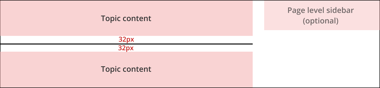
Sections at the topic level - no sidebar.
Use section dividers between topics (some of which may contain multiple questions) in tools that have more than one topic per page. Often there will be multiple H2 titles on these pages, one for each section.
The section divider width equals the content area width in these tools.
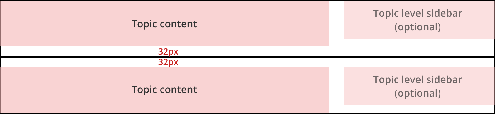
Sections at the topic level - with information sidebar
Use section dividers between topics(some of which may contain multiple questions) in tools that have more than one topic per page. Often there will be multiple H2 titles on these pages, one for each section.
When sections have corresponding information sidebars the section divider width equals the full page width.
Version history
7 May, 2024
- Added tool section information.
8 August, 2023
- Added an additional layout, the Two column - tool page alternate layout. This layout will be used for the Lean business plan builder.