Design
business.gov.au branding
No branding
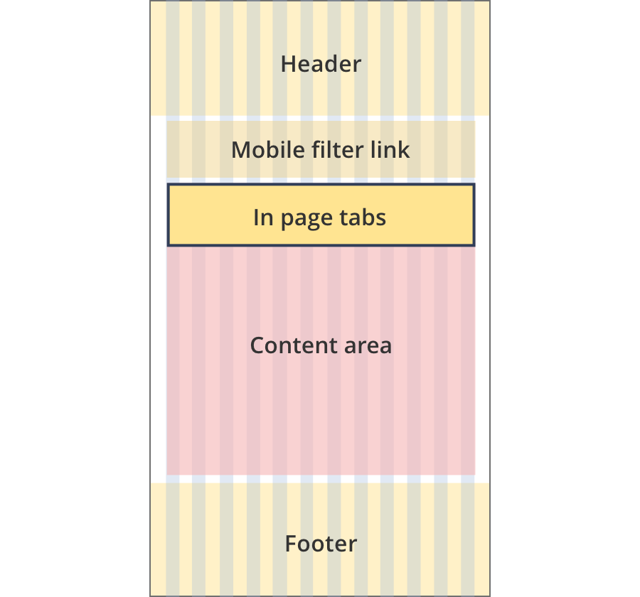
Breakpoints:
Currently displaying the mobile design.
To see designs for other breakpoints please view this page on a larger screen.
List view
Map view
Content for the first tab.
The first tab is visible by default when the page loads.
Content for the second tab is shown when the second tab is clicked on.
Coloured background sections - colour variations
List view
Map view
Content for the first tab.
Content for the second tab.
Breakpoints:
Currently displaying the mobile design.
To see designs for other breakpoints please view this page on a larger screen.
Apply your brand specific colours and borders to the base in page tabs shown below.
List view
Map view
Content for the first tab.
The first tab is visible by default when the page loads.
Content for the second tab is shown when the second tab is clicked on.
Layouts
In page tabs can be used on the Two column - filter page layout.
Layout: Two column - filter page
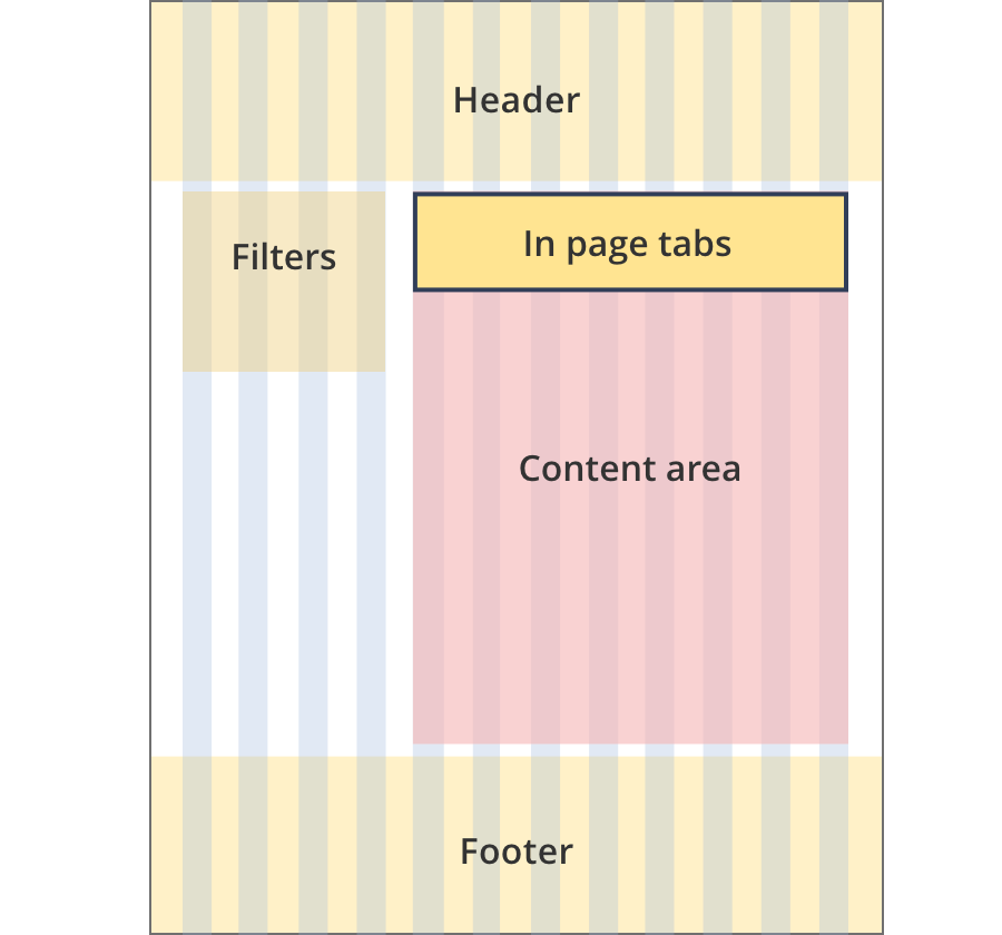
The content area spans 8 grid-columns.
In page tabs span the full width of the content area.
The content area spans 12 grid-columns.
In page tabs span the full width of the content area.
Guidelines for use
Purpose:
Allow the user to switch between related content that belongs at the same hierarchy level.
When to use this component:
In page tabs are not currently in use on business.gov.au.
An intended future use for in page tabs is to provide a way to switch between a list view and a map view in the adviser finder result page.
Content rules:
In page tabs should have a maximum of 3 tabs. If more tabs are required consider placing content on separate pages instead.