Design
business.gov.au branding
No branding
All breakpoints
Colour variations
All breakpoints
Layouts
The information sidebar can be used in Two column - tool page layout. It should not be used in other layouts.
Layout: Two column - tool page
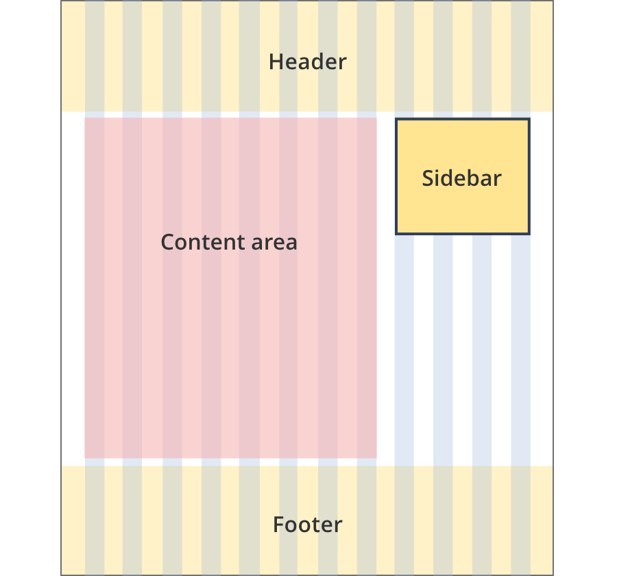
The content area is 8 grid-columns wide.
Sidebars sit to the right of the content area and span 4 grid-columns.
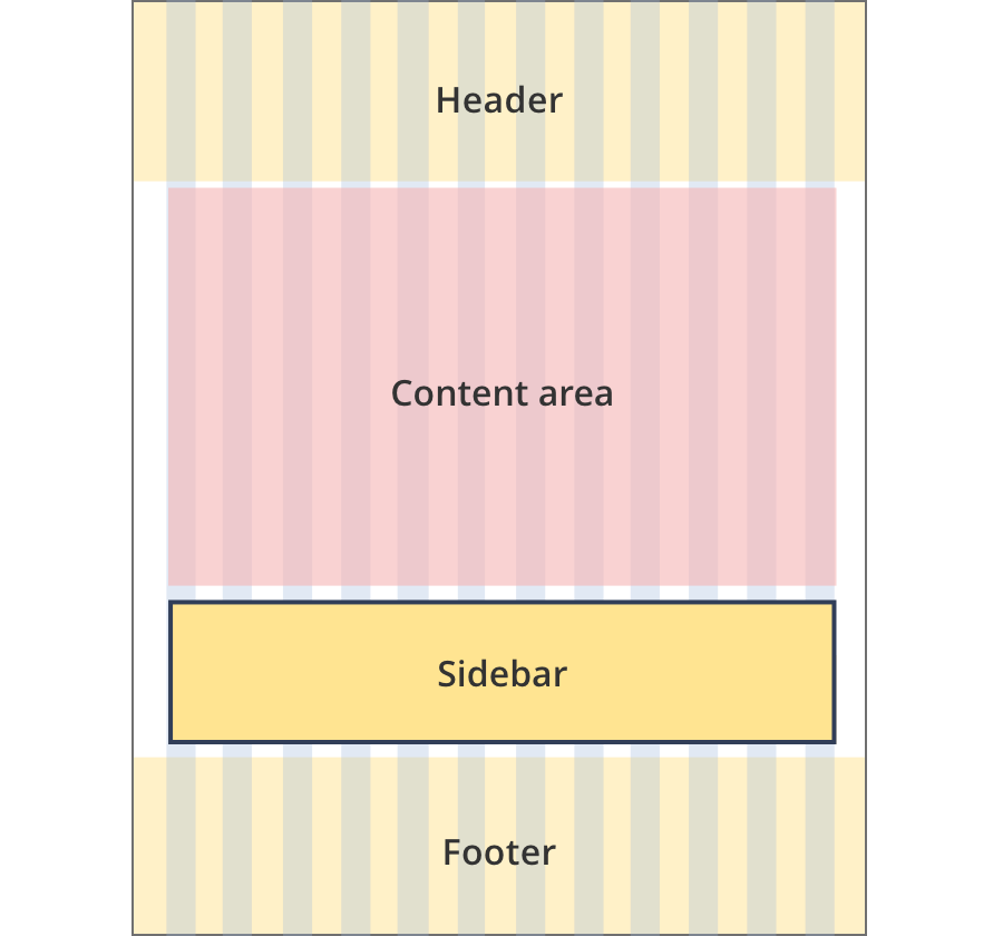
The content area is 12 grid-columns wide.
Sidebars span the full width of the content area. In general they stack below the right side content.
Guidelines for use
Purpose:
The information sidebar is used to highlight useful information in the context of a process or step.
When to use this component:
- Used in tools for information the user may find useful but is not of high importance.
Style rules:
- The height of the sidebar is equal to the height of the content on the right side of the section. When sidebar content extends past this height it is hidden and revealed with a "Read more" button.
Content rules:
- Information sidebars have a recommended 1200 character limit. Character limits above this length cause too much scrolling for the user.