Design
business.gov.au branding
No branding
Breakpoints:
Currently displaying the mobile design.
To see designs for other breakpoints please view this page on a larger screen.
Breakpoints:
Currently displaying the mobile design.
To see designs for other breakpoints please view this page on a larger screen.
Apply your brand specific colours, icons and button styles to the base standard pathways shown below.
Layouts
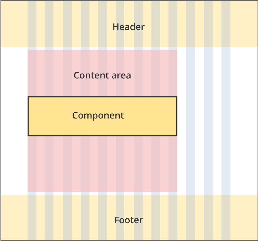
The in page feedback form can be used on all layouts.
Layout:
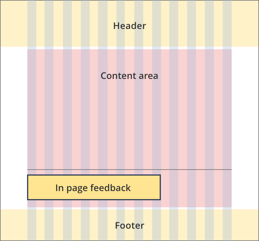
The content area is 12 grid-columns wide.
The in page feedback component spans 8 grid-columns.The line above the component spans 12 grid-columns
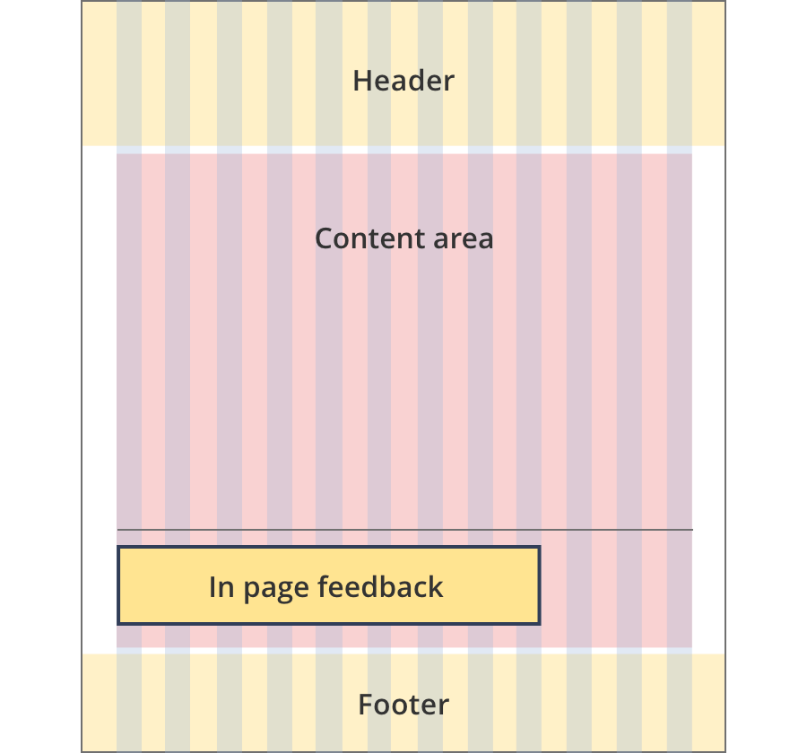
The content area is 12 grid-columns wide.
The in page feedback component spans 9 grid-columns.
The line above the component spans 12 grid-columns
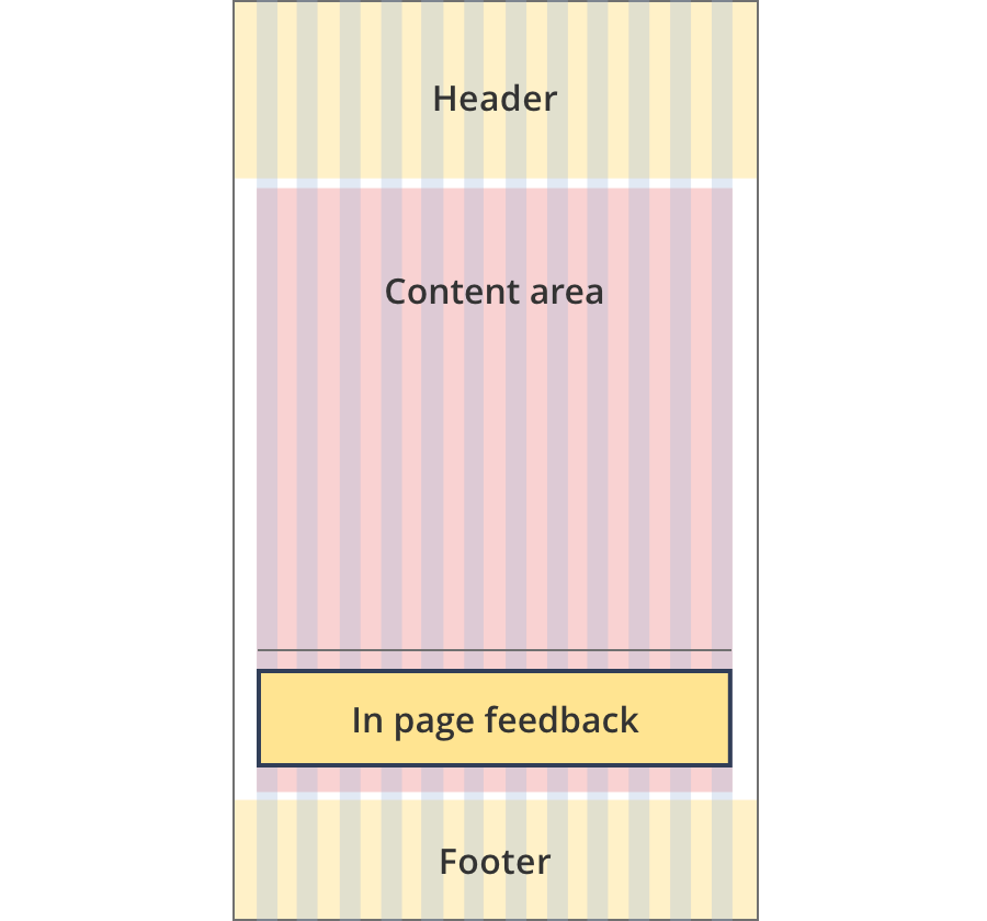
The content area is 12 grid-columns wide.
The in page feedback component spans 12 grid-columns.
The line above the component spans 12 grid-columns
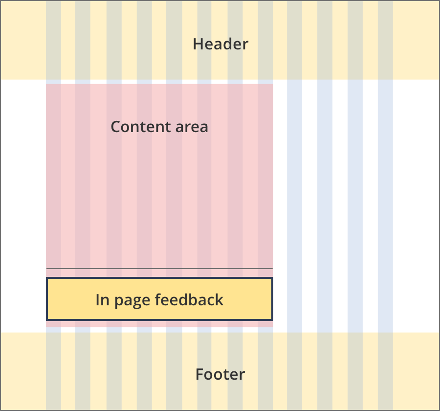
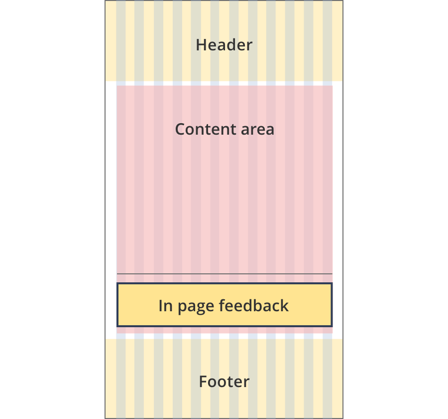
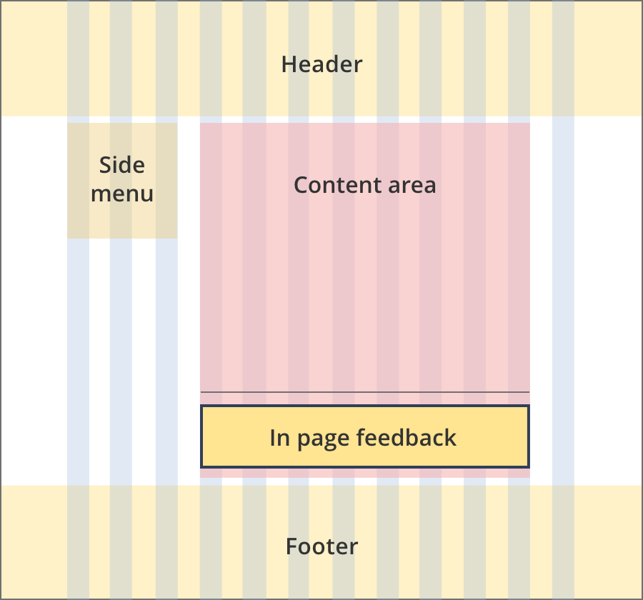
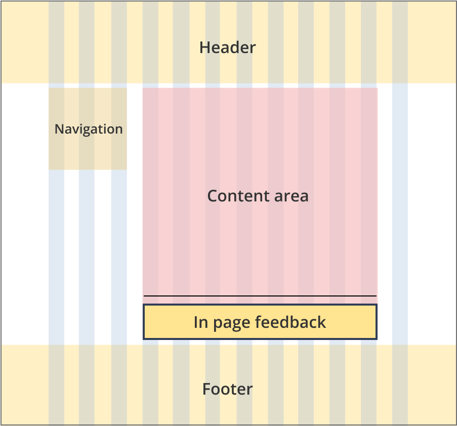
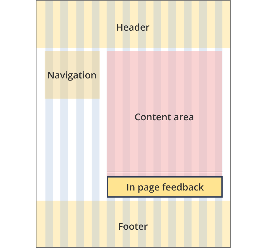
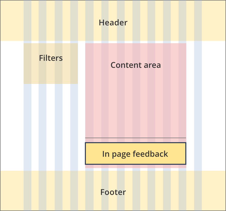
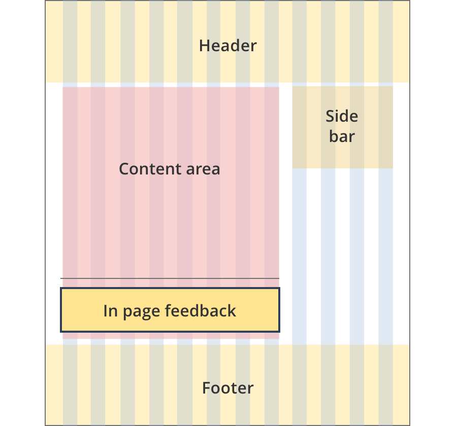
The content area is 8 grid-columns wide.
The in page feedback component spans the full width of the content area.
The line above the component also spans the full width of the content area.
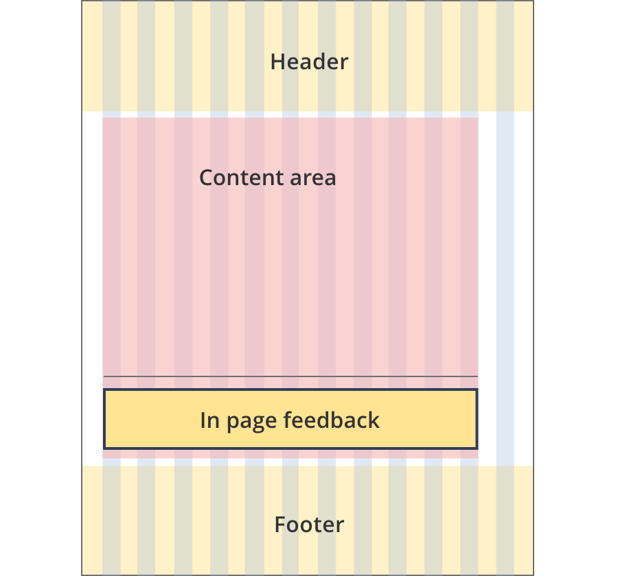
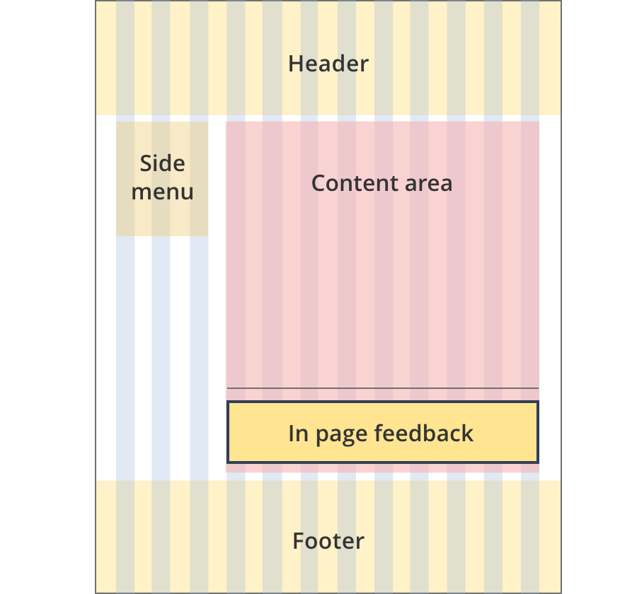
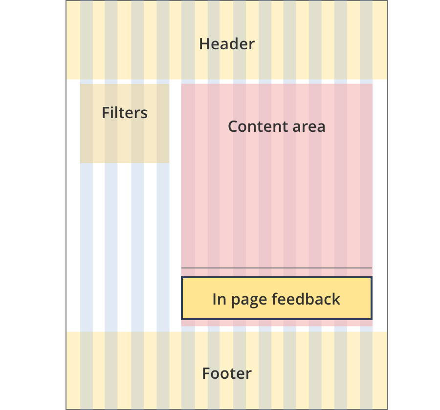
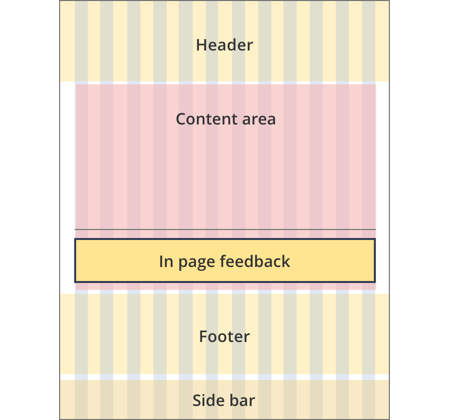
The content area is 9 grid-columns wide.
The in page feedback component spans the full width of the content area.
The line above the component also spans the full width of the content area.
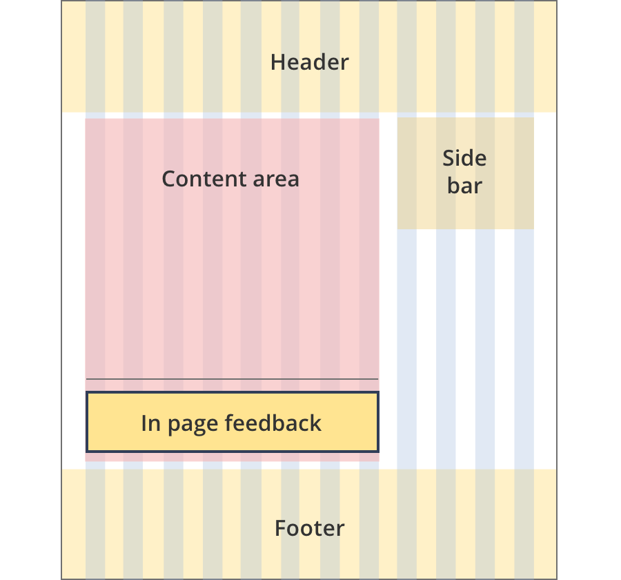
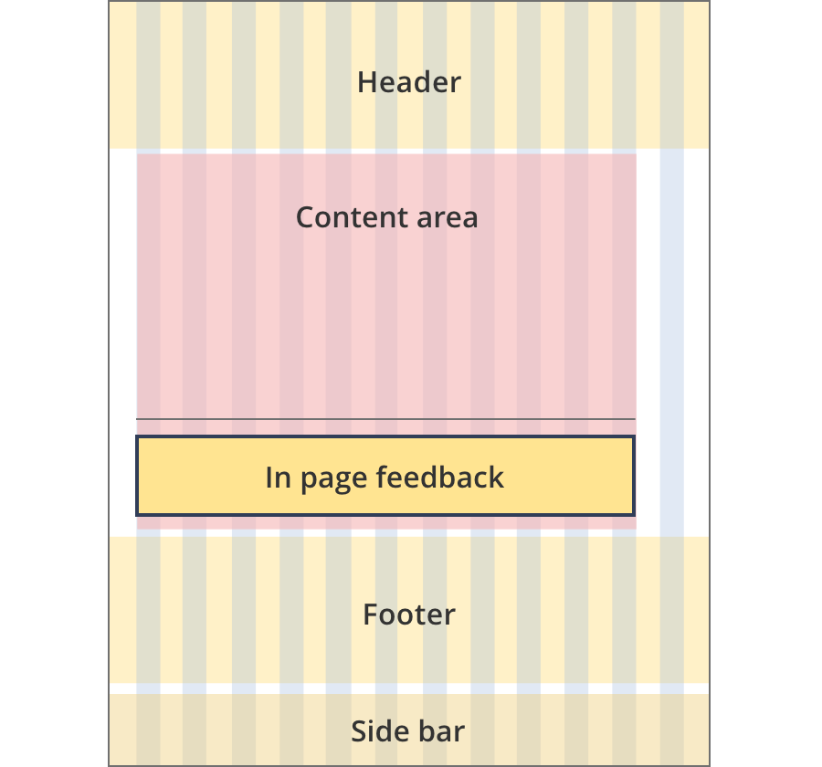
The content area is 11 grid-columns wide.
The in page feedback component spans the full width of the content area.
The line above the component also spans the full width of the content area.
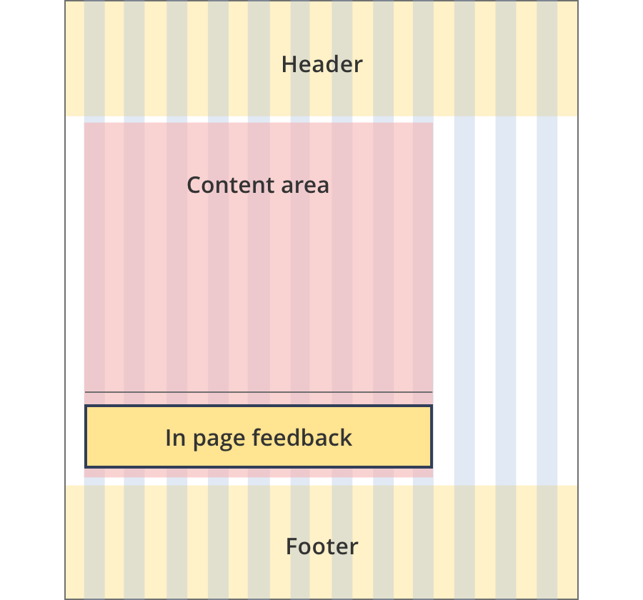
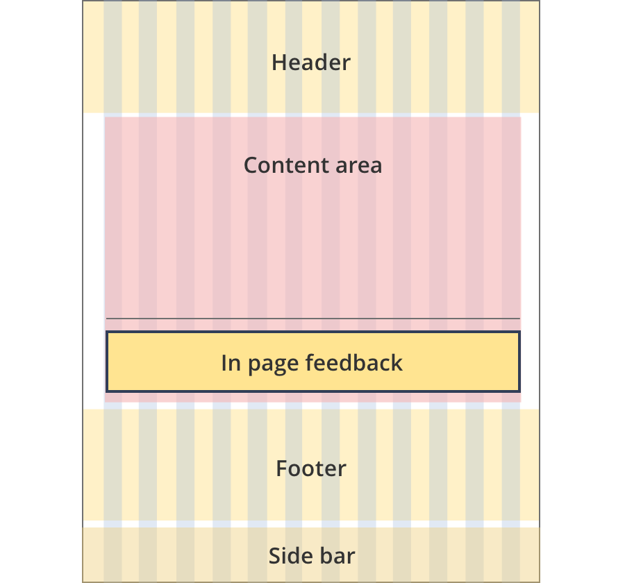
The content area is 12 grid-columns wide.
The in page feedback component spans the full width of the content area.
The line above the component also spans the full width of the content area.
The content area is 9 grid-columns wide.
In page feedback components span the full width of the content area.
The content area is 10 grid-columns wide.
In page feedback components span the full width of the content area.
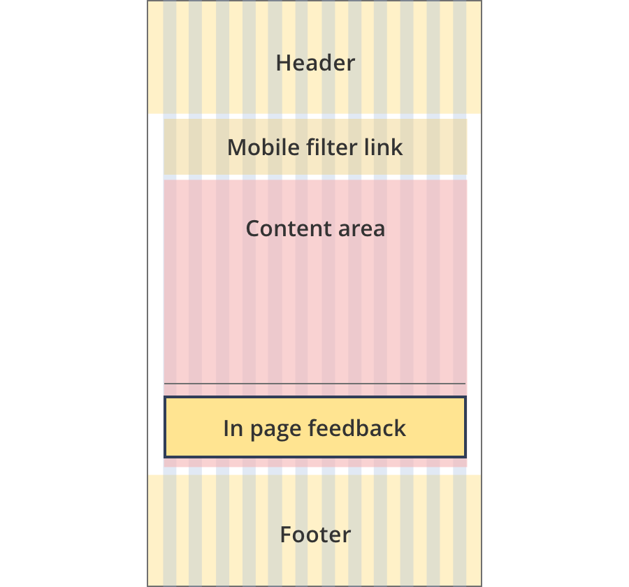
The content area is 12 grid-columns wide.
In page feedback components span the full width of the content area.
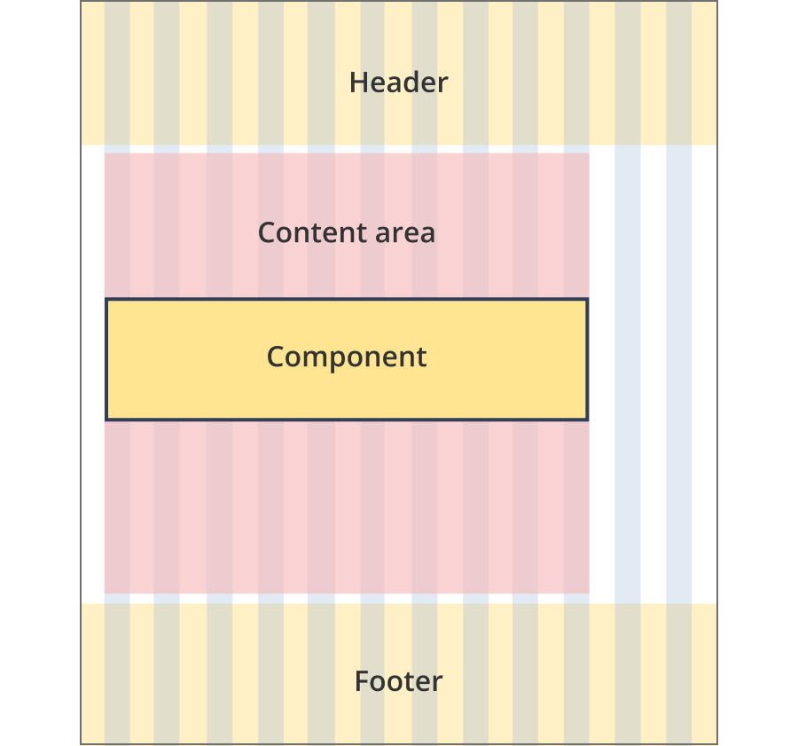
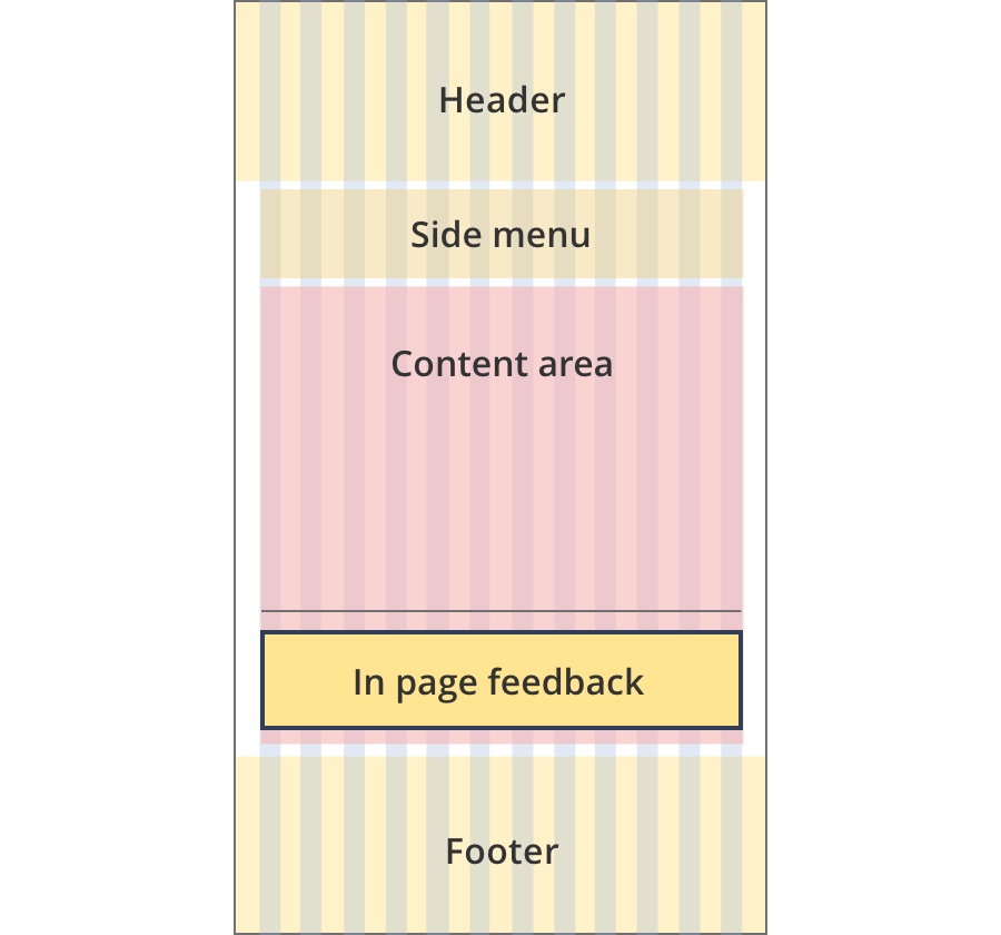
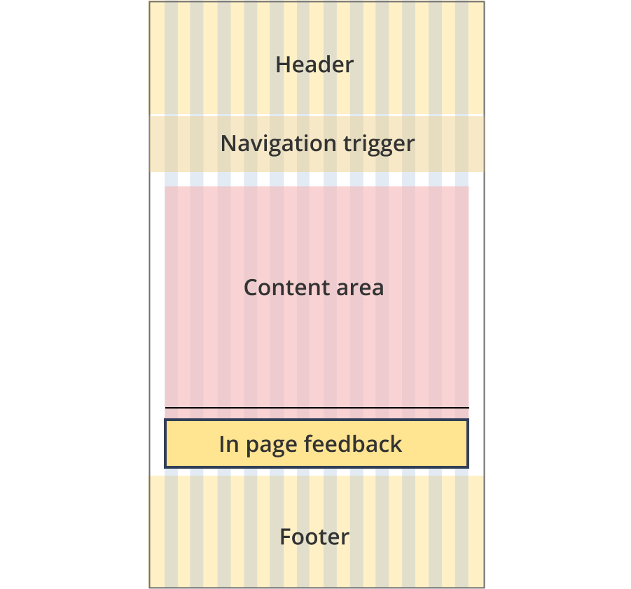
The content area is 8 grid-columns wide.
The in page feedback component spans the full width of the content area.
The line above the component also spans the full width of the content area.
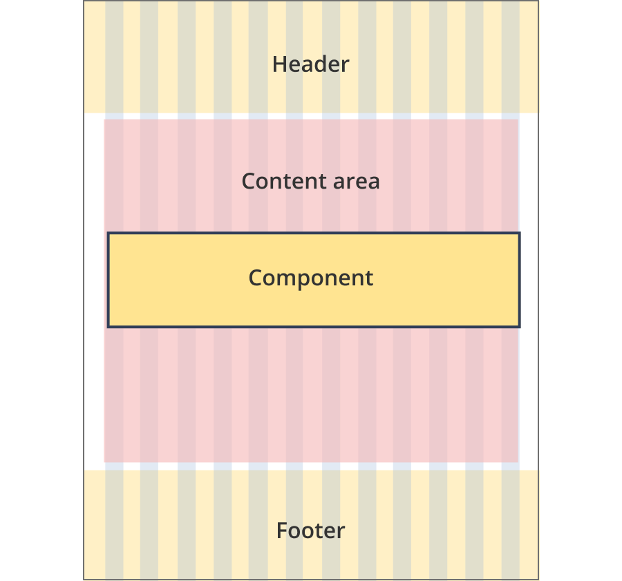
The content area is 9 grid-columns wide.
The in page feedback component spans the full width of the content area.
The line above the component also spans the full width of the content area.
The content area is 12 grid-columns wide.
The in page feedback component spans the full width of the content area.
The line above the component also spans the full width of the content area.
The content area is 8 grid-columns wide.
The in page feedback component spans the full width of the content area.
The content area is 8 grid-columns wide.
The in page feedback component spans the full width of the content area.
The content area is 12 grid-columns wide.
The in page feedback component spans the full width of the content area.
The content area is 7 grid-columns wide.
The in page feedback component spans the full width of the content area.
The line above the component also spans the full width of the content area.
The content area is 8 grid-columns wide.
The in page feedback component spans the full width of the content area.
The line above the component also spans the full width of the content area.
The content area is 12 grid-columns wide.
The in page feedback component spans the full width of the content area.
The line above the component also spans the full width of the content area.
The content area is 8 grid-columns wide.
The in page feedback component spans the full width of the content area.
The content area is 11 grid-columns wide.
The in page feedback component spans the full width of the content area.
The content area is 12 grid-columns wide.
The in page feedback component spans the full width of the content area.
Guidelines for use
Purpose
The in page feedback form is used to capture simple feedback from users in the context of a page.
When to use this component:
- Can be used on all business.gov.au pages.
Version history
1 July, 2024
- Added an additional layout (the Two column - guide page layout).
8 August, 2023
- Added an additional layout (the Two column - tool page alternate layout).