Design
business.gov.au branding
No branding
Breakpoints:
Currently displaying the mobile design.
To see designs for other breakpoints please view this page on a larger screen.
Layouts
Pagination is used on the Two column - filter page layout.
Layout: Two column - filter page
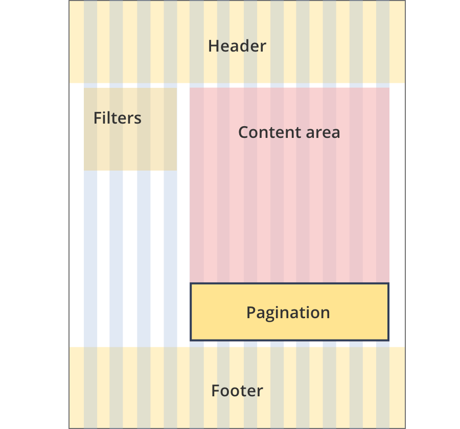
The content area is 8 grid-columns wide.
Pagination spans the full width of the content area.
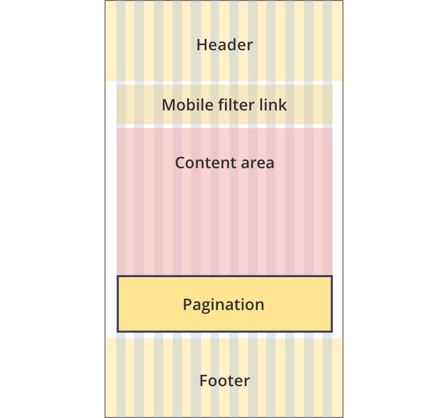
The content area is 12 grid-columns wide.
Pagination spans the full width of the content area.
Guidelines for use
Purpose
Pagination provides links for navigating between a series of connected pages.
When to use this component:
- Typically used on search or tool result pages when a set of results would be too long to present on one page.
Version history
5 August 2024
- Updated the background colour of the 'current' state from light blue to dark blue (#2157AA) in order to meet accessibility requirements.
- Updated the background colour of the 'current' state when the item is in focus.