Design
business.gov.au branding
No branding
Breakpoints:
Currently displaying the mobile design.
To see designs for other breakpoints please view this page on a larger screen.
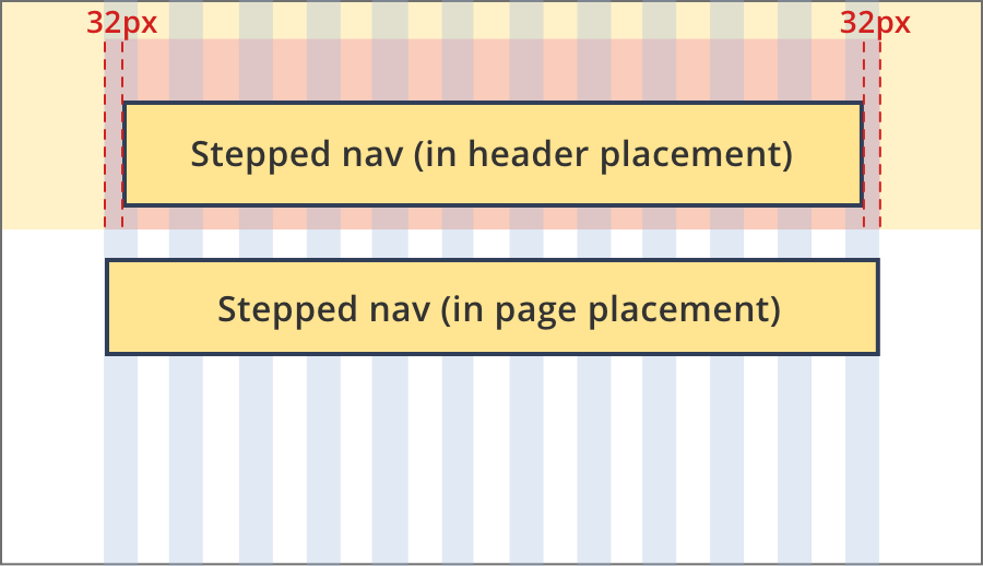
Stepped navigation within a tool header
Stepped navigation in the context of a page.
Breakpoints:
Currently displaying the mobile design.
To see designs for other breakpoints please view this page on a larger screen.
Apply your brand specific colours and borders to the base stepped navigation shown below.
Layouts
Stepped navigation can be used on all page layouts except the Two column - filter page layout.
Layout: All layouts
All breakpoints
The content area is 12 grid-columns wide.
Stepped navigation components are 12 grid-columns wide.
Stepped navigation components should only appear once in a page. They can be placed in the header (for tools) or at the top of the page content area.
Guidelines for use
Purpose:
Stepped navigation guides users through a process that is completed in a set order. It displays where the user is up to and allows then to navigate back to previous steps.
Users cannot navigate forward to uncompleted steps using this component.
When to use this component:
- Used in tools or forms that require the user to complete a series of steps.
Version history
19 September, 2023
- Updated the mobile styling for the in page stepped navigation.