Design
business.gov.au branding
No branding
Breakpoints:
Currently displaying the mobile design.
To see designs for other breakpoints please view this page on a larger screen.
Breakpoints:
Currently displaying the mobile design.
To see designs for other breakpoints please view this page on a larger screen.
Apply your brand specific colours and borders to the base vertical stepped navigation shown below.
Layouts
Vertical stepped navigation is used on the Two column - guide page layout.
Layout: Two column - guide page
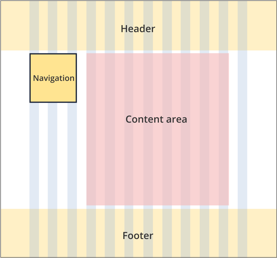
The navigation sits to the left of the content and is 3 grid-columns wide.
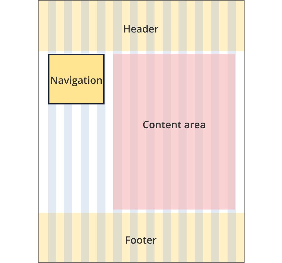
The navigation sits to the left of the content and is 4 grid-columns wide.
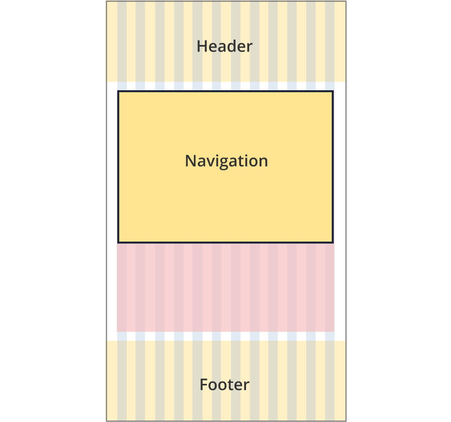
The navigation is not visible on screen. It is accessed through a trigger button located above the page content.
When triggered the navigation slides down and is 12 columns wide.
Guidelines for use
Purpose:
Vertical stepped navigation guides users through a process that is completed in a set order. It displays where the user is up to and allows then to navigate back to previous steps. It works in the same way as horizontal stepped navigation but is displayed vertically down the page.
Users cannot navigate forward to uncompleted steps using this component.
When to use this component:
- Used in tools or forms that require the user to complete a series of steps.
- The preferred stepped navigation for tools is the horizontal pattern. Vertical stepped navigation should only be used when there are too many steps to be accommodated by the horizontal navigation (more than eight steps).
Version history
6 June, 2025
- Created the vertical stepped navigation component page.