Checkbox filter
Description of the page
Description of the page
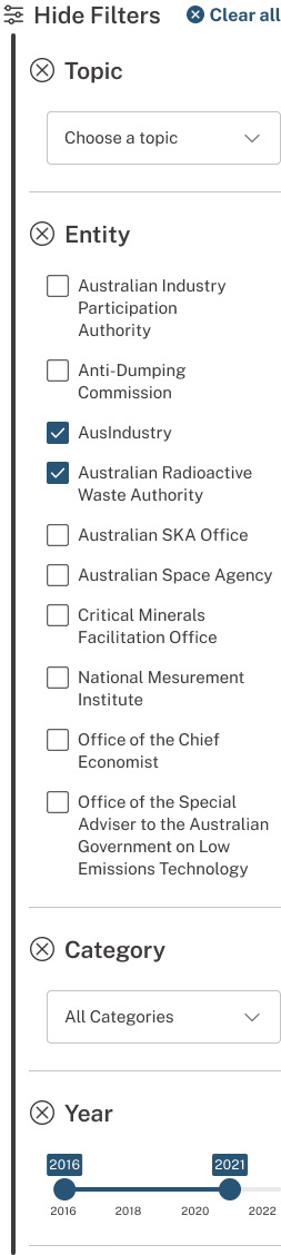
This filter allows users to choose one or more options from a range of options, and to explore and discover content using key, high-level filter types. It’s used within the filter group on the filtered landing homepage and search landing page.
None.
This filter appears on the news homepage and topic pages to simplify content search with key filter types: Category, entity, and published year. Multiple options can be selected at once to filter content.
The user may select multiple options. Selecting an empty checkbox will cause the selected state. Selecting it again will return the checkbox to the unselected state.
This filter component style is the standard approach for displaying filters on lists.
Unselected: An empty, unselected checkbox. Selected: A filled checkbox with a tick.